Hi,
Not sure what the preferred way to report a problem is. I have posted it on GitHub as well:
https://github.com/telerik/kendo-react/issues/1519
Could someone help me out with this issue?
Thank you in advance.
Hi,
Please check this example
https://stackblitz.com/edit/react-bri58e?file=app%2Fmain.jsx
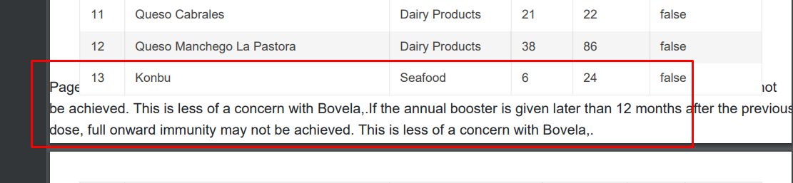
We wanted to break the page once its started overlapping the footer.
Current Behaviour
When a table is created in the text editor and multiple columns are selected an error is thrown.
Errors:
TypeError: Cannot read properties of undefined (reading 'localsInner')
TypeError: Cannot read properties of undefined (reading 'eq')
Expected Behaviour
When a table is created in the text editor and multiple columns are selected an error must not appear and the user must be able to merge or split the cells.
MInimal Reproduction
I'm providing a reproduction from Kendo React code examples.
https://stackblitz.com/edit/react-su15wr?file=app%2Fmain.tsx
Package
"@progress/kendo-react-editor": "^5.11.0"
Hi Team,
For MenuItem target="_blank" feature is not there. Please enable the same. which will be helpful as menu is the face of app.
Regards,
Revanth
It would be nice to have natively some kind of copy-paste of data between excel and kendo
more and more clients are requesting this feature but currently it is pretty difficult to implement..
being more specific the expected behavior should be:
user copying a range of cells from excel
pastes it into a grid cell
data should spread starting from the cell where it was pasted and inserting new rows if there are not enough to contain all the content
then user should be able to copy a range of cells/rows or a single row and paste it to excel
Hi,
If you use kendo-theme-bootstrap for most Kendo React inputs, it results in bootstrap styling being applied to the input e.g. https://www.telerik.com/kendo-react-ui/components/dateinputs/datepicker/ or https://www.telerik.com/kendo-react-ui/components/dropdowns/combobox/. With the Bootstrap theme selected the DatePicker and Combobox have blue shadows on focus.
This is not true for the DropDrownList: https://www.telerik.com/kendo-react-ui/components/dropdowns/dropdownlist/. The border on focus does not match Bootstrap styling.
Kind regards,
David

Currently the React DateRangePicker component shows its calendar popup any time either of the date text inputs are focused.
It would be nice to have more control over this behavior buy providing a prop to customize what actions open the popup.
Our use case is that currently the DateRangePicker (as of v5.11.0) cannot be used to make a 508 accessibility compliant site (reference support ticket 1597095 : which IMO is a bug, but trying to also find a workaround that we can roll out quickly) due to the way the popup breaks tab order in the browser. If keyboard users could tab into the Start/End inputs without the popup opening, then they could type in a date and tab to the next control (currently they cannot because the popup breaks tab order). A mouse user clicking into the input would be fine to see the popup. So having a prop to specify the auto-open should happen in click, not on focus, with a keyboard shortcut to open the popup if they want it (which already exists as alt+down), would be an easy workaround to get us back into 508 compliance.
I could imagine such a pop to control auto-open of the calendar popup to take one of 3 values; 'focus' (same behavior as current) 'click' (open on click, but not on keyboard focus) 'none' (no auto open. user can press alt+down to open).
I have attached files, in which there is an app bar content there is a dropdown in the dropdown there are four elements, in that I need four drawer container on the left side as I attached by clicking the single dropdown, how can I attach 4 drawer container in a single project
Thank you
Current Behaviour
When I lock columns In data grid with resizable columns - for example 1st and 3th and resize the 1st one - after we scroll horizontally the 3th column goes on top of the 1st column. This happens when we haven't set a width prop.
Expected Behaviour
Resized columns not overflowing on each other when scrolling horizontally and don't have width prop.
MInimal Reproduction
I'm providing a reproduction from Kendo React code examples.
https://stackblitz.com/edit/react-xvxy59?file=app%2Fmain.jsx
Hi, I am Lavanya!
in my dropdown list, there are horizontal layouts I need to change to the vertical dropdown list
and also I have attached bar data in that I need to make a dropdown filter of the month how can I use that
];
this is my data I want to use a column chart using this data x-axis as month and y-axis sales how can i use this data
Hello,
Currently, it is possible to switch between both numeric and input types in Kendo grid pagination but in our application we have design to display both numeric and input control types on load. so request to please help with that feature.
Thanks
Add support for complex object array filter of DataSourceRequest.
let dataSourceRequestFilterComplexObjectArray = {
  filter: {
    logic: "and",
    filters: [
      {
        field: "users[name]", // OR with dot notation -> "users[someObject].name"
        operator: "eq",
        value: "Bill"
      }
    ]
  }
};
I am using KendoReact Draggable and Droppable and we find a bug when using it. This bug even happen in the official demo.
The bug is described below:
When a droppable area is rendered out of the originall window size, the droppable cannot detect the onDragEnter() & onDropLeave(), of course onDrop neither.
it seems that kendo did not handle when user scroll while dragging the draggables, so that when the draggables was dragged to a zone out of the original window size, it failed to detect it.(Figure4)
I have also found another bug which is when you drag the draggables and scroll, the draggable will somehow detacted with the cursor, but I somehow already fixed it. Maybe it gives some hint for you to fix this bug, maybe.