Bug report
Reproducible in mobile mode enabled

1. Open below demo and enable mobile mode
2. Refresh
https://demos.telerik.com/kendo-ui/grid/editing
Current behavior
Error is thrown, grid not bound
Expected/desired behavior
No error shall appear
Environment
Kendo UI version: 2020.3.1021
jQuery version: x.y
Browser: [Chrome | Firefox ]
Hi,
I updated my project to Kendo UI for jQuery 2020.3.1021 but then all Grids stopped working on mobile or tablet devices. When downgrading to 2020.3.930 grids works fine. Also tried it with 2020.3.1028 but same issue.
I have tested it on iPad, iPad Pro, Samsung S10. Same issue with Chrome/Edge Chromium and emulate a mobile/tablet device.
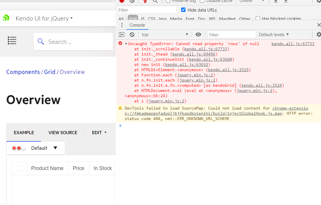
In the browser console you can see the javascript error: "Cannot read property 'rows' of null".
Reproduction of the problem:
- Go to https://demos.telerik.com/kendo-ui/grid/index
- Hit F12 top open the Developer toolbar
- Click on "Toogle device toolbar" (CTRL + SHIFT + M)
- Choose any device, ex: iPad, iPhone
- Reload page to make the changes take effect
- Click on "Run live demo"
- Grid not loading!!
- Console is showing a JavaScript error: "Cannot read property 'rows' of null"
### Feature Request
The TypeScript definitions of the Kendo UI Grid are missing the "editable" object - the object that is built runtime when the grid enters edit mode.
### Environment
* **Kendo UI version:** 2020.3.915
* **jQuery version:** 1.12.4
* **Browser:** [all]
Bug report
When the dataSource is set with the setDataSource method
Reproduction of the problem
Dojo example.
- Run the dojo
- Click the button
- Focus the first Grid cell. Press and hold the Down Arrow key to navigate through the rows
Current behavior
The scroll position is not updated while scrolling and navigation stops at 10347.
Expected/desired behavior
Scroll position is properly updated and the user can navigate to the end of the page.
Environment
- Kendo UI version: 2020.3.915
- jQuery version: x.y
- Browser: [all ]
Bug report
Selecting cells from the frozen table in Frozen columns + selectable: "multiple cell" scenario selects the bellow cells from the non-frozen table
Reproduction of the problem
Open below Dojo
https://dojo.telerik.com/exobAcEl
Scroll the horizontal scrollbar to the right.
Select some cells from the frozen table.
Move the scroller back to its original position.
Expected/desired behavior
Cells from the non-frozen table shall not be selected.
EnvironmentKendo UI version: [all]
Browser: all
Bug report
Draggable does not respect dragging object width in Grid upon dragging a column
Reproduction of the problem
Open below Dojo
https://dojo.telerik.com/iSiSeCeb
Drag Shipped Date column from the right corner
Huge gap appear between the dragged column object and the pointer
Expected/desired behavior
Pointer shall be over the dragged object
EnvironmentKendo UI version: [all]
Browser: all
Bug report
In Grid Multi filtering checkboxes and their labels are misaligned.
Reproduction of the problem
In the official demo: https://demos.telerik.com/kendo-ui/grid/filter-multi-checkboxes
Expected/desired behavior
Checkboxes and labels shall be aligned.
Workaround:
The following CSS can be applied:
<style>
       .k-label span {
         vertical-align: top;
       }
</style>
Dojo: https://dojo.telerik.com/OgiYEBiB
Environment
Kendo UI version: [all]
Browser: [all ]
Create Grid with scrollable, resizable, navigable settings set to true in RTL (Chrome Version 85.0.4183.121 (Official Build) (64-bit))
- If scroll exists, resize in column will not work
- after scrolling the scroll to left, when try to edit inline cell in left side, scroll eventually go back to the scroll start position(in the right) and cell is closed for edit(have no option to edit grid with big amount of columns)
- after scrolling the scroll to left, mouse hover to column header removes all column headers, the headers appears after moving the scroll to the start position
Link to Dojo:
https://dojo.telerik.com/IZInOVUd/4
video:
https://drive.google.com/file/d/1pQa4UVLcMUg929JgTtKJ1udxIAbWtn0m/view
Regards,
Hi Team,
I'd like to request the functionality to allow the user to select the ALL option while using GroupPaging.
Thank you
When there are a lot of columns on the page and a column is shown, it is shown at its original position in the grid columns array.
It would be much better from a user experience point of view if the column is shown where the user clicked on the column menu to show the hidden column.
Bug report
Grid Filter Inputs Value Switch after filter is applied and filter menu reopened
Current behavior
When the second input in the filter menu is provided and grid filtered after reopening the filter menu the filtered value is bonded to the first input
Dojo to reproduce:
https://dojo.telerik.com/UXajIbey
Steps to reproduce:
1. Open filter menu for "Event Date" column
2. Set a filter value on the second DatePicker input and hit the Filter button
3. Reopen the filter menu on the same column
Expected/desired behavior
The filtered value shall be bonded to the input user has provided
Environment
Kendo UI version: all
Browser: all
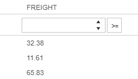
It would be great if the selected operator could be made visible in a filter row. For instance when I select the operator "Is greater than or equal to" the filter button icon should reflect this operator option. Something like this:
Bug report
When the Grid is used with MVVM, if there is a footer template defined for a given column and 'data-auto-bind' is set to false, the footer template is not rendered properly.
Reproduction of the problem
- Open this Dojo and run it. See the expected footerTemplate result
- Change the 'data-auto-bind' property to false
- Run the project again
Current behavior
The footerTemplate defined for the "Unit" column is displayed under "ProductName"
Expected/desired behavior
The footerTemplate defined for the "Unit" column should be displayed under the "Unit" column
Environment
- Kendo UI version: 2020.2.617
- jQuery version: x.y
- Browser: [all]
Hi,
I would like to request the configuration of the Search Panel to have a custom search function. For example, I could use this to modify search results(ie. ignore accents).
Thank you!
Bug report
Group Header appears multiple times on PDF Export if the group is separated onto multiple pages
Reproduction of the problem
Run the following Dojo:
https://dojo.telerik.com/itOpeGON/6
Click on export to PDF
Open the PDF
Scroll down until you reach Venezuela to see there are two headers for the same group
Expected/desired behavior
Only one group header shall be present at the export
Environment
Kendo UI version: all
Browser: all
It is very urgent for my project with Angular 8.
Would you please consider adding this feature?
If so, when do you plan adding it?
I am working on a project with Angular 8.
I am using Kendo detailed template to represent the data.
It is very needed for my project to have this working with locked columns.
In your documentation I have read that this is not possible yet.
Would you please consider adding this feature?
If so, when do you plan adding it?
Issue that I have can be observed on any grid with checkbox selection and filtering enabled at the same time (I edit this demo https://demos.telerik.com/kendo-ui/grid/checkbox-selection by adding filtering an already I can see my problem).
I have a grid with 10 records with checkbox selection, filtering and "persistSelection" option enabled. I select a single record with a checkbox. I use filtering and only 5 records remain visible, selected record is not visible (didn't match the filter). When I clear the filter my selected record remains checked. If I do the same but filtering causes all records to disappear then after clearing the filter my selected record is no longer checked. So we can see that selection persistence works differently depending on results of filtering. That is confusing and looks like a bug.
Hi Team,
I am using the Kendo UI version [kendo/2020.1.114] and CSS - [kendo.default-v2.min] for adaptive rendering. I am facing issue to use Kendo Grid Adaptive Rendering feature in our Application as I am using KendoComboBox to bind String type fields and KendoNumericTextBox for Decimal and Integer type values. These are all working fine in WEB view but not working in Mobile View. All the kendo input controls are converted into normal html controls in Mobile Mode and break the KendoComboBox and NumericTextBox by default feature in Kendo Grid Filter and numeric textboxes also allowing to input string values. So Please look into and help us to resolve this problem.
Thanks

