In the current version the legends for charts containing groups and series has a flat list of the series for each group. This is unreadable and toggling is not of any use.

The suggested improvement is a legend containing groups (e.g.) sex and series (e.g. age 0-19, 29-39 etc). Toggling of groups should be provided. Toggling of series would also be useful, but less important than toggling groups.
We may place legend on custom offsets - no such option for title - only top and bottom. Give us more granular control over it and make option to place it on top or behind visualized dataItems. Will give watermark like effect
I use it to upload a chart, I'd like to prevent showing the uploaded chart in the browser. Prefer to just upload and then get control back and let my app decided what to do next.
This event is useful on mobile device to drill-down serie, while tap (click) is for showing tooltip (or viceversa)
There should be an option to set the number of labels user want to view at any time on any axis. Currently there is nothing like that and no concrete workaround and the user can implement.
I want the chart rendered with svg to be able to pan and zoom on a touch device.
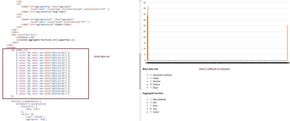
-- Problem: Consider a datasource where at least two date fields span a large time frame. We can build a chart that aggregates that data by small units (categoryAxis.baseUnits) such as 'days' or 'months'. That chart however contains many empty data points and the 'real' data is difficult to locate on the chart. This often requires zooming in and out many times to view the data one is looking for. However, it is still very valuable to be able to group by day or month, and to view this data in one succinct image.
-- Demo: The best way to experience this is to use the following Demo
https://dojo.telerik.com/eCILAMOB
This dojo is from the 'Date axis' chart demo on the demos.telerik.com site under Kendo UI for JQuery. Edit the example. There are 17 values in the datasource. Change the year on the last value to '2019'. All current values have dates between 2011-2012.
-- Required Chart Setup: Create a chart utilizing the following chart options
series.aggregate = 'avg'
categoryAxis.baseUnit = 'days'
dataSource with fields that contain at least one large date span
-- Suggestion
Add option to hide date aggregates chart points where no data exists within the datasource.
-- Image
Hi Team,
I'd like to request the ability to display a table for the X-Axis Label of the Kendo UI Chart as a built-in configuration.
Thank you.
Hi Team,
I would like to request the built-in functionality for the Kendo UI Chart to Select/Unselect all the series from the Legend. Perhaps a checkbox next to the Legend can be used to Select All/Unselect All. Currently, I have some custom logic where I am able to complete this, but it would be nice to have it built-in to the API.
Thank you!
Hi Team,
I would like to request a way to set the color/type of a series so if it makes a condition, the color/type would change. For example, if the series count reaches a certain amount, change the color of the line, and the type to dash. Perhaps setting the Series.Line.Color as a function would be great.
Thank you!
As per http://www.kendoui.com/forums/dataviz/chart/scatter-chart-with-different-point-colors.aspx your ScatterLine really needs the ability to set the color of the lines between the points. It seems like an oversight that just needs to be fixed.
I want Tooltips to have a default date format for each chart base unit, for any date, like #:category#, appearing in them. Right now I have to use a custom template script and do all kinds of clever math to figure out what the base unit is, if it's set to auto.

Also all Chart types should have access to category name in tooltip.format, using {1} or similar.
The only series.highlight option that seems to be supported by "column" charts is highlight.visible.

The other options, such as border and color should be supported.
Current Label Position, Padding & Rotaton helps to adjust the label. Am  looking to get implement a approch where each slice/Wedge represent with a unique name so like to show the x axis label in the middle of the slice/wedge instead of label appearing along with the line.

The same case in Y Axis to show the label in the middle of the circle instead on the line of the circle to make it clear on the each circle represnt the entire circle.

How to achive those or any alternative for the same
Currently, Category Axis Label Rotation will only rotate around the center of the label.  When labels are long, they do not align well with the chart (e.g. column chart).  See the following forum post for more info:
http://www.telerik.com/forums/categoryaxis-label-rotation---align-with-column-chart
We would like the ability to have the values of the data points on box plots to be displayed next to each plot. For example it would be useful to know what the high, low, median values were by having the actual numerical values displayed next to the plots on the chart.
the dashed line in the chart is showing correctly in IE 10, but when exporting to a png image with the function exportImage, the dashed line becomes a solid line. I've been told that this can be solved with kind of polyfilling, you guys should really make this work, the reason is that this works in Chrome, for the sake of your product consistency, this feature should also work in IE.

if there is a possibility to fix an issue, I think we'd better make it.

Regards

Z. Wang
One of the basic stock chart features for amcharts\yahoo\google charts is to recalculate a percent axis during comparisons.

http://www.amcharts.com/stock-chart/
https://www.amcharts.com/tutorials/disabling-or-enabling-value-axis-recalculation-to-percents/

The stockchart should be more of a widget that allows comparisons that automatically converts to percents during comparisons.

For example, in the amcharts you can add\remove stocks easily, and when there are two stocks to compare it automatically shifts to a percent axis. The chart itself does the calculations as they are very standard.

For us, this would also need to work in a virtual MVC scenario.

Currently, we have to do the calculations either on the client\server, insert\remove\hide\show price\percent axis and legend info etc....just to duplicate other charts that are built in with these features.
Kendo Chart has setting min/max for the axis. However, when zooming and/or dragging/panning the chart, the min/max values are no longer in effect, therefore the chart ends up displaying values outside of this range. If min/max is used to specify the current axis values, then there should be another to specify the general boundaries/range of the axis.
Example: if you have a plot with XAxis min=1950 and max=2050, when zooming the XAxis and depending on the data it will eventually display 1948 and 2060; or, it will stop at 2030 even though I requested XAxis to go up to 2050.
It would be very useful to have only some series of a kendo chart be stacked. For instance, to have series 1, 2, and 3 to be stacked with each other, but series 4 to not be stacked.