Hello,
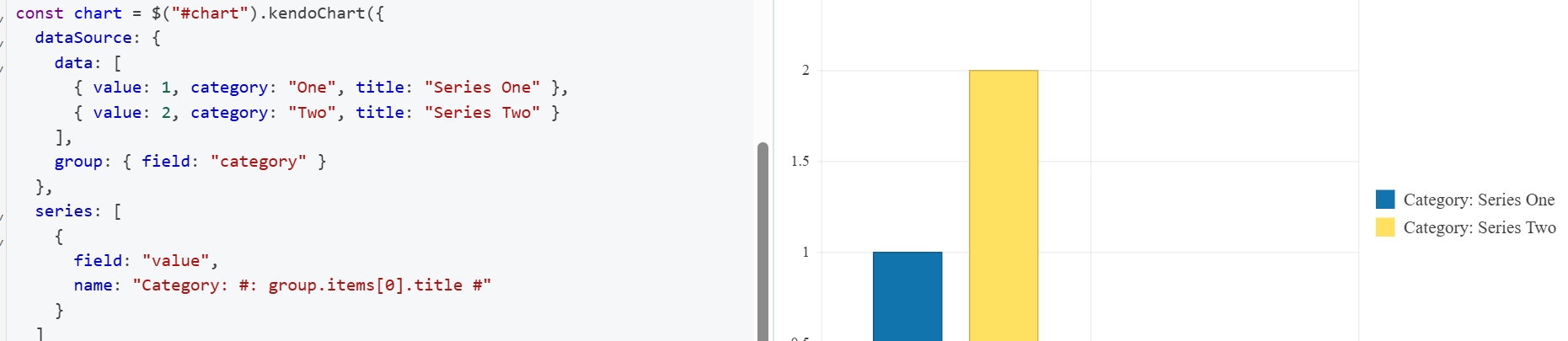
I noticed in some of my charts that when I call saveAsPDF, the series.name seems to be just a literal string of the series.name option, even when I use a template.
Please see the attached dojo to reproduce (I based this dojo off of the Chart API series.name as template dojo example).
https://dojo.telerik.com/ZgsUVIjM
I noticed that this behavior starts in 2024.4.1112. Prior versions evaluated the template for the PDF.
I do have a workaround for this, which is included in comments in my dojo. I just exportPDF and then use kendo.saveAs.
Additionally, I noticed that the bars in the chart are at 0 in the PDF. I'm not worrying about that at this time, I'm exclusively interested in the series.name template being evaluated on saveAsPDF.
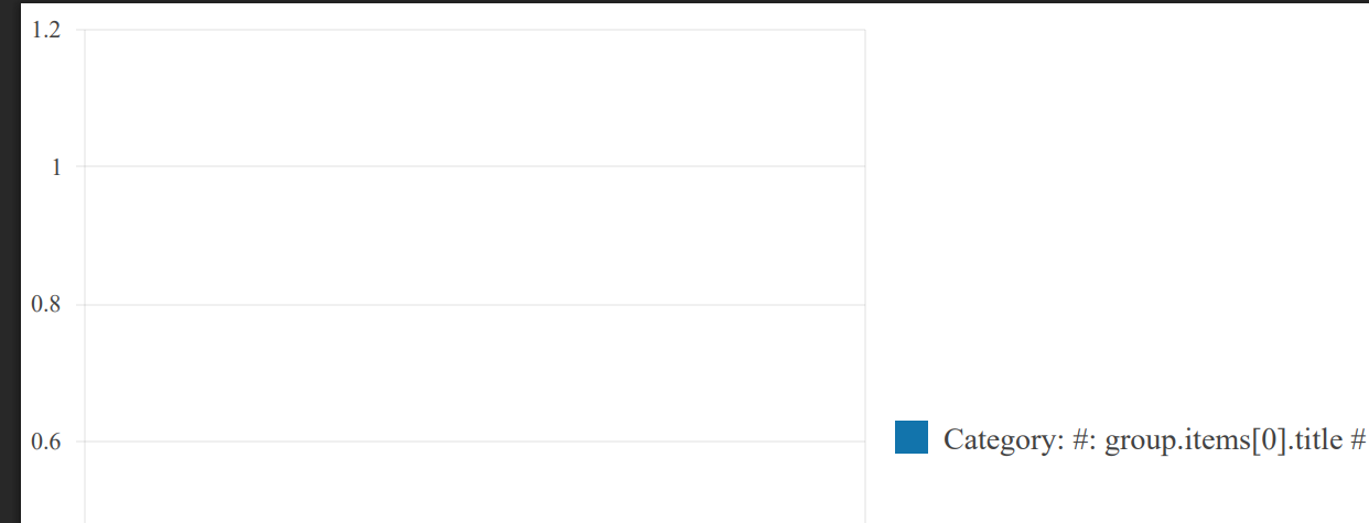
Here are some screenshots of the dojo and resulting pdf for v2024.4.1112:
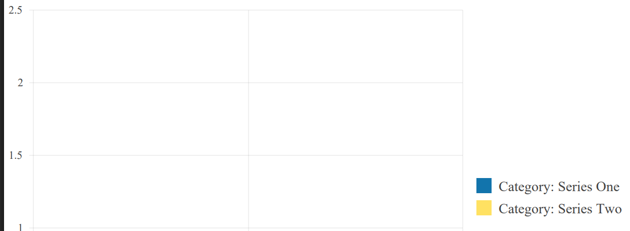
Here is a screenshot of the pdf when the same dojo is run on 2024.3.1015:
Please let me know if you'd rather I paste the dojo code directly into this ticket, or attach as a code file.
Thanks!
-Alexa
Bug report
Drawing API Tooltip for categoryAxis Chart labels do not show with v.2024.4.1112
Reproduction of the problem
https://docs.telerik.com/kendo-ui/knowledge-base/tooltip-for-category-axis-labels
Expected/desired behavior
The Charts should be exported to the selected file format
The issue is a regression starting with 2024.4.1112
Environment
jQuery: 3.4.1
Kendo UI version: 2024.4.1112
Browser: [all]
Bug report
Pie and Donut Chart can not be exported to PDF, Png or Jpg
Reproduction of the problem
- Open the demos - https://demos.telerik.com/kendo-ui/pdf-export/index or the Dojo - https://dojo.telerik.com/LfDhdqXf
- Try to export the Chart in any format
Current behavior
The pie and donut charts are missing.
Expected/desired behavior
The Charts should be exported to the selected file format
The issue is a regression starting with 2024.4.1112
Environment
- Kendo UI version: 2024.4.1112
- Browser: [all]
Bug Report
The diagram.exportImage() throws an error with v.2024.4.1112
"Uncaught TypeError: diagram.exportImage(...).done is not a function"
Regression with 2024.4.1112.
Reproduction of the problem
Run the example from the following API: https://docs.telerik.com/kendo-ui/api/javascript/dataviz/ui/diagram/methods/exportimage
Current behavior
The export is not working.
Expected behavior
No error shall be present and image must be generated.
Environment
Kendo UI version: 2024.4.1112
jQuery version: x.y
Browser: [all]
Description: When 'shared' tooltip is enabled (tooltip: {shared: true}) keyboard navigation through chart triggers JavaScript error and tooltip on focus is not shown, neither shared nor regular tooltip. It works without issues when 'shared' is disabled, but when it is enabled errors are triggered.
Steps to reproduce:
- Open Dojo example https://dojo.telerik.com/@oleksii.shumakov@thomsonreuters.com/UqixUyuj
- Open browser's console (F12)
- Run the script
- With mouse click on "India" legend item once -> India line is disabled
- Click on "India" legend item once more -> India line is enabled
- Using keyboard hit Shift+Tab -> Browser's console shows error: "Uncaught TypeError: Cannot read properties of undefined (reading 'format')"
- Using keyboard hit Tab -> Dot on chart line becomes highlighted but no tooltip is shown
Stack trace of the issue:
kendo.all.js:290271 Uncaught TypeError: Cannot read properties of undefined (reading 'format')
    at init.show (kendo.all.js:290271:1)
    at init._displayTooltip (kendo.all.js:302830:1)
    at init._focusFirstPoint (kendo.all.js:302653:1)
    at init._navigatePoints (kendo.all.js:302577:1)
    at init._keydown (kendo.all.js:302540:1)
show @ kendo.all.js:290271
_displayTooltip @ kendo.all.js:302830
_focusFirstPoint @ kendo.all.js:302653
_navigatePoints @ kendo.all.js:302577
_keydown @ kendo.all.js:302540
Versions of KendoUI with the issue: 2024.2.514, 2024.3.806
Charts support keyboard navigation. Currently, the focus indicator is rendered as a thick black border around the different chart items. Is there any way to customize it? We usually use dashed red borders throughout our application to indicate focused elements and it would be great to stay consistent.
I found this article which leverages the highlight and saw that the series.highlight.toggle setting allows modifying the highlight's visual element, but options are very limited and do not allow sufficient customization.
Bug report
The stack bar chart is not rendered as expected when stack.type is set
Reproduction of the problem
- Open d the Demos - https://demos.telerik.com/kendo-ui/bar-charts/stacked100-bar or the API
- https://docs.telerik.com/kendo-ui/api/javascript/dataviz/ui/chart/configuration/series.stack#seriesstacktype
- https://docs.telerik.com/kendo-ui/api/javascript/dataviz/ui/chart/configuration/seriesdefaults.stack.type
Current behavior
The Chart is not rendered correctly, the bars are misaligned.
Expected/desired behavior
The bars should be aligned.
Regression: The issue is reproducible starting with 2024.1.130 version
Environment
- Kendo UI version: 2024.1.130
- Browser: [all ]
Hi Team,
I would like to see a no-data-template be included for the Kendo UI Chart when there is no data.
Thank you!
We are using asp mvc, but the but it is completely reproduceable with only jquery as shown in the file attached.
When using a scatter chart with a date axis any zooming with the mouse wheel will crash most if not all browsers.
At the very least current versions of chrome (97.0.4692.99), firefox (96.0.1) and edge (97.0.1072.62).
Bug report
ValueAxis.labels.template function invokes twice when Chart is bound to data source
Reproduction of the problem
Check the following Dojo: https://dojo.telerik.com/oJUGixUy/4
Inspect the console
Expected/desired behavior
ValueAxis labels template function shall invoke just one time.
Corner case:
If ValueAxis.labels.font is specified template function is invoked correctly only once.
valueAxis: {
                labels: {
                  // With the font commented out, chart labels get resolved twice
                  font: '11px Arial, Helvetica, sans-serif',
                  template: shortLabels
                }
              },
Environment
**Kendo UI version: [all]
**jQuery version: [all]
**Browser: [all]
Pie chart labels are not properly rendered when exported to image.
The issue can be reproduced here:
Feature request
The Kendo UI ToolTip exposes the AutoHide functionality. However, this option could not be configured for the labels' tooltip of the Kendo UI Chart
Expected/desired behavior
Be able to configure the AutoHide of the chart's tooltips. When the user hovers out, the tooltip should be persisted until a mouse click is present.
Environment
* **Kendo UI version:** 2019.3.1023
* **jQuery version:** 1.12.4
* **Browser:** [all]
Per version "@types/kendo-ui": "2019.3.0" , typings chart label margins and padding (ChartLegendMargin, ChartLegendPadding, ChartLegendLabelsMargin, ChartCategoryAxisItemTitleMargin,... ) don't accept number values, only a dictionary with top, bottom, left and right.
Numbers are correct values for these properties, as shown on https://docs.telerik.com/kendo-ui/api/javascript/dataviz/ui/chart/configuration/series.labels.padding
The out of the box legend does not offer the ability to split its items and to show them as labels over the series (graphs).
Extract my attached zip file and look at the MSWord document which shows you where I would like to position the 2 legends.
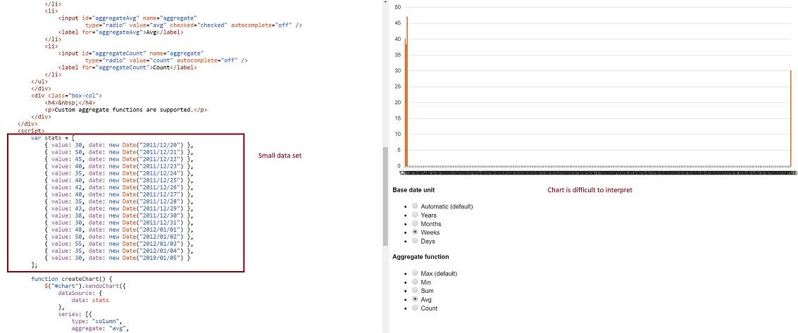
-- Problem: Consider a datasource where at least two date fields span a large time frame. We can build a chart that aggregates that data by small units (categoryAxis.baseUnits) such as 'days' or 'months'. That chart however contains many empty data points and the 'real' data is difficult to locate on the chart. This often requires zooming in and out many times to view the data one is looking for. However, it is still very valuable to be able to group by day or month, and to view this data in one succinct image.
-- Demo: The best way to experience this is to use the following Demo
https://dojo.telerik.com/eCILAMOB
This dojo is from the 'Date axis' chart demo on the demos.telerik.com site under Kendo UI for JQuery. Edit the example. There are 17 values in the datasource. Change the year on the last value to '2019'. All current values have dates between 2011-2012.
-- Required Chart Setup: Create a chart utilizing the following chart options
series.aggregate = 'avg'
categoryAxis.baseUnit = 'days'
dataSource with fields that contain at least one large date span
-- Suggestion
Add option to hide date aggregates chart points where no data exists within the datasource.
-- Image
Possibility to have half top, half bottom, half left, half right, quarter top left, quarter top right, quarter bottom left, quarter bottom right in additiont to circle and donut chart. Please add an option to be able to shape the Pie or Donut accordingly
I want the chart rendered with svg to be able to pan and zoom on a touch device.