Hi Team,
I would like to request the CategoryAxis to be sortable for the user to manipulate.
Thank you!
Hi,
When creating a stacked bar chart in KendoUI 2020.3.915 I noticed the following rendering error:
In case one of the categories is much higher than the other, the x-axis will start at a value other than zero.
This behavior might be desired to zoom in on the exact values.
The issue here is that the steps on the x-axis might repeat multiple times for the same x-value.
(96%, 96%, 97%, 97%, 98%, 98%...)
This increases with a bigger difference between the chart values.
I created a example and it happens even in the latest version:
https://dojo.telerik.com/AVeVuZig
There are a few bits that Telerik cant do at the moment, such as colour above the target line.
It would be nice to have a how-to section on migration and development.
Thanks
Doug
Hi Team,
I would like to request the built-in functionality for the Kendo UI Chart to Select/Unselect all the series from the Legend. Perhaps a checkbox next to the Legend can be used to Select All/Unselect All. Currently, I have some custom logic where I am able to complete this, but it would be nice to have it built-in to the API.
Thank you!
outliers: [0,0,0.5,6,7,11]I.e. For the list of outliers above, I'd like to have all even outliers green and odd outliers red.
Green: 0, 0, 6
Red: 0.5, 7, 11
In the Kendo UI Chart Widget, if labels are too close to each other, they end up overlapping, making the labels unreadable (as visible in the attached screenshot), thus rendering the widget unusable.
It would be really useful to have implemented a feature similar to Smart Labels (included in the WPF version and also documented in the attached screenshot)
Hi Team,
I'd like to request the ability to display a table for the X-Axis Label of the Kendo UI Chart as a built-in configuration.
Thank you.
Feature request
Introduce a regression line in the Kendo UI Chart that should be automatically calculated and included in the chart.
Current behavior
Explicitly calculate the values for the regression line based on the values from the main series and create a new series in the chart.
Pie chart labels are not properly rendered when exported to image.
The issue can be reproduced here:
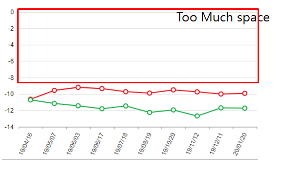
When the data values are all negative, if you create a line graph using kendo chart function, Autoscale on the Y axis is not applied properly. Please check if there is any possible solution.
The two attached figures are normally auto scaled, but the charts that combine the two graphs are not auotoscale normal.
Chart1
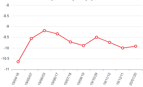
Chart2
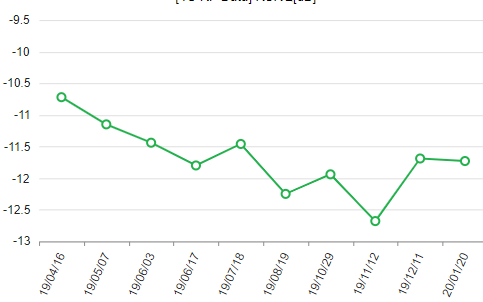
issue chart
Hi,
As the aggregate function is always very powerful to every chart type, and currently it's supported to most of the charts using category (ex. area line, bar, column, bullet), it would be very nice if you add functionality behind donut pie and funnel charts to handle category aggregation with easy instead of using datasource groupage. My request is to follow this example instead of that one
Best Regards, Boyan.
Hello,
We have an issue where encoded characters (for example: ö) in the chart category field cause the label to be misaligned.
You can see this in the following dojo example here: https://dojo.telerik.com/aMEYaziy
This dojo is based on your example (https://demos.telerik.com/kendo-ui/bar-charts/index) but I've added an encoded 'ö' character to the label for Februrary.
In our application we are passing our the labels down via ajax, and defining the field in series.categoryField (as oposed to the hard-coded values in your demo and dojo), but the effect is the same.
Please let us know what the problem is and how we can resolve it.
Thank you,
George
Hi,
As you can see in this dojo https://dojo.telerik.com/UTuPeMUw, there is a problem with the grid lines when I set the reverse property to true and the max property to 270 (the grid lines of angles 30, 60 and 90 are hidden).
Thank you
Feature request
The Kendo UI ToolTip exposes the AutoHide functionality. However, this option could not be configured for the labels' tooltip of the Kendo UI Chart
Expected/desired behavior
Be able to configure the AutoHide of the chart's tooltips. When the user hovers out, the tooltip should be persisted until a mouse click is present.
Environment
* **Kendo UI version:** 2019.3.1023
* **jQuery version:** 1.12.4
* **Browser:** [all]
Hi Team,
It would be nice to have a feature in Charts were we can drag and drop the series points especially with Line & Bar charts. This will allow the end user to interact with data visually.
Here is the example link: https://jsfiddle.net/gh/get/library/pure/highcharts/highcharts/tree/master/samples/highcharts/dragdrop/resize-column
Thank You,
Hitendra
Per version "@types/kendo-ui": "2019.3.0" , typings chart label margins and padding (ChartLegendMargin, ChartLegendPadding, ChartLegendLabelsMargin, ChartCategoryAxisItemTitleMargin,... ) don't accept number values, only a dictionary with top, bottom, left and right.
Numbers are correct values for these properties, as shown on https://docs.telerik.com/kendo-ui/api/javascript/dataviz/ui/chart/configuration/series.labels.padding
I would like to request the functionality to add an image into the series displayed in a Kendo UI Chart instead of it being a color.