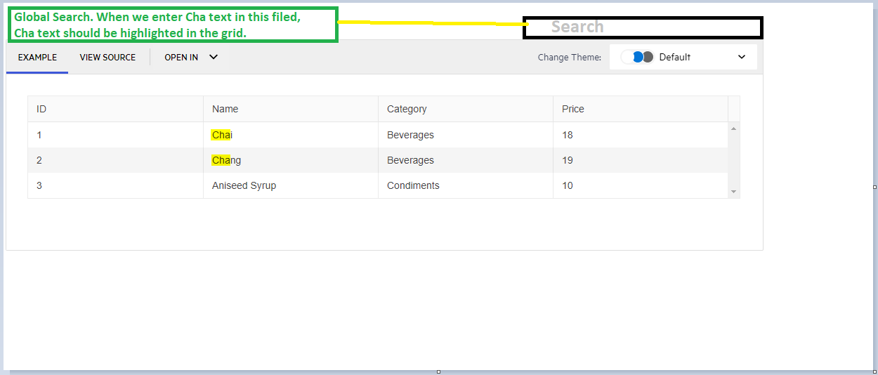
Highlight the text in the Grid with the filtered text. For example:
https://stackblitz.com/edit/angular-4bbepg?file=src%2Fapp%2Fapp.component.ts
The sort indicator (down arrow) remains after removing the sort (setting the [sort] input to undefined)
Thanks,
-Adam
Hi Team,
Requesting a feature to grid rows merge like below example for similar data. And by when we can expect this feature in Kendo grid.
| Col1 | Col2 | Col3 | Col4 | Col5 | Col6 |
| Row1 | Row1 | Row1 | Row1 | Row1 | Merge1 |
| Row2 | Row2 | Row2 | Row2 | Row2 | |
| Row3 | Row3 | Row3 | Row3 | Row3 | Merge2 |
| Row4 | Row4 | Row4 | Row4 | Row4 | |
| Row5 | Row5 | Row5 | Row5 | Row5 | |
| Row6 | Row6 | Row6 | Row6 | Row6 | Merge3 |
| Row7 | Row7 | Row7 | Row7 | Row7 | |
| Row8 | Row8 | Row8 | Row8 | Row8 | Merge4 |
| Row9 | Row9 | Row9 | Row9 | Row9 |
Thanks!
Hello
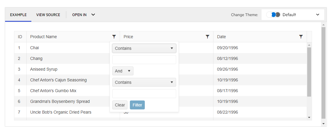
I have a grid cell with filter set to menu. So the popup appears with the list of default operators that are needed to be included in the popup.
Something like below:
<ng-template
kendoGridFilterMenuTemplate
...
>
<kendo-grid-numeric-filter-menu
...
>
<kendo-filter-eq-operator> </kendo-filter-eq-operator>
<kendo-filter-neq-operator> </kendo-filter-neq-operator>
<kendo-filter-gte-operator> </kendo-filter-gte-operator>
<kendo-filter-lte-operator> </kendo-filter-lte-operator>
<kendo-filter-isnull-operator> </kendo-filter-isnull-operator>
<kendo-filter-isnotnull-operator> </kendo-filter-isnotnull-operator>
</kendo-grid-numeric-filter-menu>
</ng-template>
What i am trying to achieve is to add another operator like 'In' that can accept comma separated values. Something like:
<kendo-filter-in-operator> </kendo-filter-in-operator>
I have looked at the doc (https://www.telerik.com/kendo-angular-ui/components/grid/filtering/filter-row/#toc-custom-filter-row-components/)
But i dont see a custom filter operator example.
Could you please let me know if its possible to do that or is there anyway i can achieve this.
Thanks
SM
When filter popup is opened, it need to be closed by click outside of it
However, popup is closed only after second click outside.
After popup was opened and closed for the first time - next times everything works correctly, so it can be reproduced only after refreshing the page with this component
It can be reproduced in example in your documentation: https://www.telerik.com/kendo-angular-ui/components/grid/filtering/filter-menu/#toc-custom-filters/
As there are browser-specific limitations to the maximum reliable height/width an HTML element can have (https://stackoverflow.com/questions/34931732/height-limitations-for-browser-vertical-scroll-bar), the virtual scrolling functionality of the Grid is affected (different issues appear depending on the browser).
It would be a nice enhancement to provide a way the virtual scrolling to work regardless of the total number of items in a given use case.
A possible solution is to keep track of a virtual window from 1 to 1,000,000 if the number of source records is greater than 1 million. On a scroll event, the scroll position can then be adjusted to reflect the position within the actual data set. For example, if the scroll position is 300,000 (within the max of 1,000,000) and the source data contains 50,000,000 records, the actual record index to start displaying data is 300000 / 1000000 * 50000000 = 15000000.
Workaround:
While the Grid built-in paging and virtual scrolling functionalities are alternatives for rendering the Grid data in portions (pages) they cannot be used together as they both rely on the same pageChange event to process the data.
The developer can introduce some custom implementation based on a custom paging UI placed below the Grid or in the Grid Toolbar template, for example the dedicated stand-alone Pager component.
Here is an example featuring a Grid that has 500k items per page (total 1 million). Each page utilizes virtual scrolling with pageSize=100:
https://stackblitz.com/edit/grid-paged-virtual-scrolling
Given: a kendo grid with resize enabled.
And: the input locked on kendo-grid-colum is undefined (by ex. due the component class property not initialized)
When: the user double click on the column resize handler
Actual: the column width is set to 0
Expected: the colum autofit behaviour remain consistent and set the column width as usual.
Add wildcard filtering in the Kendo UI Grid.
I have a groupable kendo grid. I'm utilizing the kendoGridGroupHeaderColumnTemplate directive.
I see that <kendo-grid-column> takes headerClass and headerStyle, but neither applies styles to the grouped header.
Please provide a groupedHeaderClass and groupHeaderStyle properties so that I can style the cell rendered by kendoGridGroupHeaderColumnTemplate.
Thanks,
-Adam
Hi,
I wanted to add the operator "doesnotendwith" and "doesnotstartwith" (present in the FilterOperator enum) in the "OPERATORS" drop-down of the STRING kendo-grid-string-filter-menu column filter.
I don't think there is a component I can add to the markup as explained in the following documentation:
https://www.telerik.com/kendo-angular-ui/components/grid/filtering/filter-menu/#toc-order-of-filter-operators
If possible I would like to avoid creating a new custom filter.
It's possible?
Thank you,
B.
When the column filter is set to date, it shows a built-in filter menu with the DatePicker and the operators dropdown. Can we have a similar feature where the filter Menu shows the DateTimePicker with the operators and logic dropdown?
Can we get an option to set default all collapsed when using the directive?
It seems to be not compatible with the provided methods.
Using the `kendoGridGroupBinding` directive in combination with the `kendoGridExpandGroupBy` directive or the `isGroupExpanded` callback is not supported. To use grouping with the `kendoGridGroupBinding` directive, set the Grid `groupable` property to `true`
I have being trying to implement the multiple row selection function but am unable to get multiple rows selected at once, even though I have multiple selected mode enabled,Is it possible to archieve this in Kendo ui grid in Angular?
Please see my function bellow. event=1 row always even though I select more one row.
if (event.length>0) {
Hi Team,
I would like to request a new event for the Kendo UI Grid which will determine when the Grid has been resized in height. Right now, I have created a custom directive which uses the changeNotification property to handle when the scrollbar is shown. But it would be nice if there was something built in.
Thanks!
Hi Team,
I'd like to request the Grid to have resize sensors to be able to determine when the Grid height changes.
Thank you!
Feature to add "Select All" option in the Column Chooser of the Grid.
Similar to the feature in jQuery Grid: Display SelectAll in the ColumnMenu for Showing and Hiding Columns | Kendo UI Grid for jQuery | Kendo UI for jQuery (telerik.com)