Hi,
Currently the kendo-datepicker submits the form when you press the enter key in the calendar popup.
I don't think this is the purpose? Can this be prevented please? If the current behaviour is useful in some scenarios, maybe provide a configuration option to alter this.
Thank you in advance.
Best regards,
Johan
https://stackblitz.com/edit/angular-niog8n-eldomz?file=app%2Fapp.component.ts
Recurrency "End On" date in datepicker is different with RecurrencyRule's one.
Steps to reproduce:
open series from the example, set Recurrency's End selector to date option, set date to Sep 9th.
Actual result: recurrency rule contains UNTIL=20200910T000000Z.
Save and open series again: recurrency's End date is now Sep 10th.
Changing it to Sep 9th and saving brings no changes.
How to reproduce:
1.- Make a grid with master detail
2.- In master detail make a grid
3.- Create a context menu with options for the grid with a method so that when you click an option from the context menu it does something (console.log('Hello') for example)
4.- Create a context menu with options for the subgrid with another method so that when you click an option from the context menu it does something different (console.log('Goodbye') for example)
5.- When you click on an option from the context menu of the subgrid it will not call its function (console.log ('Goodbye')), it will call the function that triggers the context menu of the grid that contains the subgrid (console.log('Hello')
Even if a function is not set in the context menu of the subgrid it calls the function from the top context menu.
I solved it using 1 function for all context menus, but it doesn't seem like the best way to me
https://demos.telerik.com/kendo-ui/wizard
If ComboBox is used in a form and its required, screen readers will not pick up this information since it is not passed on to the underlying input field.
The example a nice workaround, but a final solution should have this automatically implemented by the control.
https://stackblitz.com/edit/angular-2ck3gu
In the Kendo ComboBox, the selection part is not working with shadow dom.
1. Reproduction:
Please look at the below links,
With ShadowDOM:
https://stackblitz.com/edit/angular-evkasb?file=app%2Fapp.component.ts
Without ShadowDOM:
An example is provided in the below link under 'ENABLING SUGGESTION' section
https://www.telerik.com/kendo-angular-ui/components/dropdowns/combobox/suggestions/
Expected Result:
When user type 'C', the first word starts with C in the list 'Croatia' is suggested and 'roatia' is selected. But as soon as I type 'y' next to 'c', the combo box is suggesting 'Cyprus' and 'prus' should be selected
Actual Result:
As soon as I type the first word starts with C in the list is 'Croatia' is populated in the Combobox and 'roatia' is NOT selected. So the user cannot type ‘y’ in this case. But the user wants to select ‘CYPRUS’ but 'Croatia' is filled as the input and Cyprus is not suggested.
I have attached the video for the difference between with/without shadow dom.
Also, If you need any additional information, I have created a support ticket:
1. Reproduction
- open the StackBlitz from https://www.telerik.com/kendo-angular-ui/components/scheduler/views/day-week/#toc-configuration
- change the app.componet.ts file to
import { Component } from '@angular/core';
import { SchedulerEvent } from '@progress/kendo-angular-scheduler';
import { sampleData, displayDate } from './events-utc';

@Component({
    selector: 'my-app',
    template: `
      <button (click)="days=1">1 day</button>
      <button (click)="days=3">3 days</button>
        <kendo-scheduler [kendoSchedulerBinding]="events" [selectedDate]="selectedDate"
                         startTime="07:00" endTime="19:00"
                         style="height: 600px;">
            <kendo-scheduler-multi-day-view [numberOfDays]="days">
            </kendo-scheduler-multi-day-view>

            <kendo-scheduler-week-view>
            </kendo-scheduler-week-view>

            <kendo-scheduler-work-week-view>
            </kendo-scheduler-work-week-view>
        </kendo-scheduler>
    `
})
export class AppComponent {
    public selectedDate: Date = displayDate;
    public events: SchedulerEvent[] = sampleData;
    days = 1;
}- in app make sure, the multi-day view is active
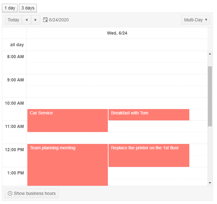
- you'll see one day
- click on button "3 days"
2. Expectation
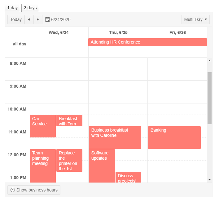
- I expect to see 3 days
3. Result
- I still see 1 day (like in the first screenshot)
- I have to switch view mode to e.g. week and back to get the desired result
4. Remarks
- In section "Additional Information" I'll note the information of my project, wich differ from the StackBlitz example. Anyhow the problem occurs in the StackBlitz an in my project
- I'll note browser and browser version. But the problem does also occur in the latest version of the other major browser.
Kendo version :
@progress/kendo-angular-buttons: 5.4.1
How to reproduce :
- Add a kendo dropdown button with some items
- Use appendTo='component' popupSetting
- Bind itemClick and close events
Stackblitz example : https://stackblitz.com/edit/kendo-dropdownbuttons-keyboardnavigation?file=app/app.component.ts
What happens :
- If you use arrows to navigate through items, is always skip one item.
- If you use enter or space to select item, the popup close and reopen immediately.
- If you prevent close as in the stackblitz example : enter and space will fire twice the itemClick event.
Provide a built-in Image Editor component such as Kendo UI ASP.NET AJAX:
https://demos.telerik.com/aspnet-ajax/imageeditor/examples/imageupload/defaultcs.aspx
I found a bug in your last update in this package:
https://www.npmjs.com/package/@progress/kendo-angular-dialog
The bug causes the modal not to show up.
In this bug you need to allways start the HTML files with the tag <kendo-dialog> and end the files </kendo-dialog> to fix the problem, which did not happen in previous versions of the package.
This bug is an issue because not even your tutorials work because of this.
Will you fix this?
Best regards André Lourenço
Provide a built-in Rating component similar to the jQuery Rating component:
Hello,
Currently, the kendo theme for bootstrap overrides the default bootstrap custom component styles.
For example, the kendo checkbox has a default #FFF background but the bootstrap custom checkbox has a grey-ish background, which is always the same as the disabled style.
$custom-control-indicator-bg <--- this should be #FFF
Could this be changed back to the default bootstrap values?
Please create a Kendo theme that supports Microsoft Office Fabric design.
Thank you
HI
When i input a value with 11111111111111111 on kendo-numerictextbox and lost focus (blur) event the value is always change to 11111111111111112 .Any solution to prevent this issue ?.
https://stackblitz.com/run/?file=app%2Fapp.component.ts
Please provide a Slide Menu component such as:
There is a dearth of browser inline editors for Word documents. It appears that the only viable solution currently out there is to implement WOPI and this standard is complex, poorly documented and extremely difficult to implement. There are some alternatives out there:
- https://www.zoho.com/officeplatform/integrator/wopi-alternative.html
- https://www.collaboraoffice.com/code/
The former is incredibly expensive because it charges per API call (effectively charging each time a document is opened or edited) and the latter is overly complex and for Linux users.
A further alternative is syncfusion's document editor. This editor is good but loses formatting.
Surely it would be possible to unravel Word's open xml format and load it into a modified version of the Rich text Editor?


