Hi,
When the first day of the week is changed dynamically through a custom IntlService, the Calendar weekday headers are updated, but the date cells are not repositioned. (The first day is changed as described in your guide: https://www.telerik.com/kendo-angular-ui/components/knowledge-base/calendar-first-day )
Reproduction (forked from your example): https://stackblitz.com/edit/angular-tqvypgwg
Click on "Set first day to Monday ": the weekday headers are updated to start with Monday, but the date cells remain in their previous positions.
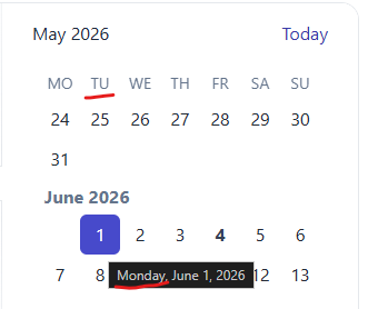
Best regards,
Michael
You're docs say
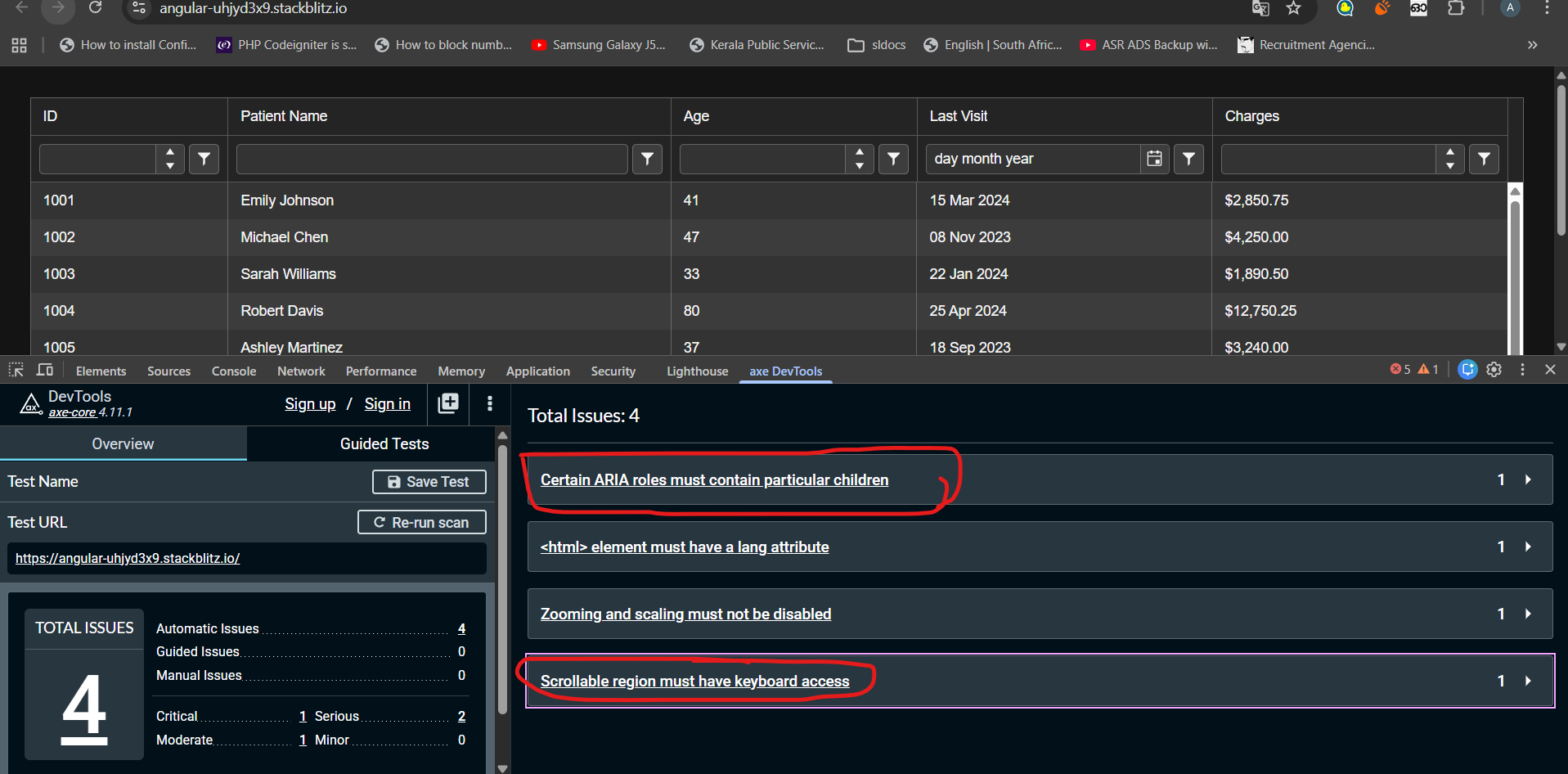
Open the example in a new window to evaluate it with Axe Core or other accessibility tools. for the Kendo angular grid
When i do that i see the attached error, which is the same issue i get in our product when running playwright axe
That suggests to me that it is not WCAG 2.2 compliant
Ensure elements with an ARIA role that require child roles contain them
more informationElement Location:
.demo-frame.loaded.demo-module--wrap--718a6 > .demo-module--demoWrap--d1437 > .demo-module--explorerWrap--4bf1f.flex-grow-1 > .demo-module--demoBody--97eee > iframe #k-fbe44131-4768-4755-93c3-e321b714780e<div role="grid" kendodragtargetcontainer="" kendodroptargetcontainer="" mode="manual" class="k-grid-aria-root" id="k-fbe44131-4768-4755-93c3-e321b714780e" aria-label="Data table" aria-rowcount="62" aria-colcount="5">To solve this problem, you need to fix the following:
Element has children which are not allowed: div[tabindex]
Related Node
It would be great if the <kendo-listbox> had the possibility to take in a list of selected values, which causes the matching items to be selected.
Currently, the only option I see is to inject the ListBoxComponent as viewChild, and call .select manually, which is quite cumbersome.
Suggestion:
- additionally to the "textField", provide a "valueField" property
- also add a "selectedValues" property, which takes in an array / signal of value properties, which then are automatically selected, whenever its value changes.
See https://www.telerik.com/kendo-angular-ui/components/listbox/api/listboxcomponent
I have tested kendo grid accessibility with AXE Dev tool. Found following errors that seems difficult to fix.
1)Certain ARIA roles must contain particular children
2)Scrollable region must have keyboard access
Any suggestion to fix these above-mentioned issues could be very helpful. Noticed these issues even exist in kendo grid demos published in kendo documentation. Check the link below
stack blitz link : https://stackblitz.com/edit/angular-uhjyd3x9?file=src%2Findex.html
When a tooltip of a dialog is shown and the dialog is closed, the tooltip is still present and is moved into the top left corner.
We use e.g. `kendo-dialog-titlebar` and the close button has a tooltip.
Hi,
if I use both the features locked columns and sticky rows, the sticky rows do not stick in the locked columns.
For me it would be logical if they would stick there too (now the UI looks inconsistent):
Reproduction (forked from your example): https://stackblitz.com/edit/angular-wak7v99i
Can you please take a look at it?
Best regards,
Michael
Hi,
if I change the [placeholder] input on a kendo-editor, the changes are not reflected.
Reproduction (forked from your example): https://stackblitz.com/edit/angular-uqbchubd
Can you please take a look at it?
Best regards,
Michael
Hi Team,
Please add a feature to add an option that allows choosing between the Dialog and the Window component when using the `View source` tool. so that view source window can be resized.
The DrawerAnimation interface isn't exposed in the index file.
DrawerItem, DrawerMode, and DrawerPosition are all exported but DrawerAnimation is missing.
In firefox, open the Kendo Radio Button documentation and slowly resize the window (https://www.telerik.com/kendo-angular-ui/components/inputs/radiobutton)
The radio button will kind of jiggle around and occasionally the white dot in the radio button will become off-center.

This also seems to happen in response to some material bouncy (cubic-bezier) animation transitions.
The directive `kendoGridColumnChooserTool` does not work correctly when having columns which are grouped. See this example: https://stackblitz.com/edit/angular-r9duqpcn?file=src%2Fapp%2Fapp.component.ts
- It shows that 0 items are selected ("0 Selected items") - This is incorrect because all columns are selected by default. In the example above, I would expect it shows that 4 items are selected.
- When unselecting an item in the list (popup), it does not actually hide any column.
- When using directive `kendoGridToolbarTemplate` with `kendo-grid-column-chooser` component, it works as expected. I would expect that `kendoGridColumnChooserTool` directive would work (behave) exactly the same way.
import { Component } from '@angular/core';
import { FormsModule } from '@angular/forms';
import {
  KENDO_GRID,
  KENDO_GRID_EXCEL_EXPORT,
  KENDO_GRID_PDF_EXPORT,
} from '@progress/kendo-angular-grid';
import { KENDO_TOOLBAR } from '@progress/kendo-angular-toolbar';
import { KENDO_LABELS } from '@progress/kendo-angular-label';
import { KENDO_INPUTS } from '@progress/kendo-angular-inputs';
import { KENDO_BUTTONS } from '@progress/kendo-angular-buttons';
import { Product } from './model';
import { products } from './products';

@Component({
  selector: 'my-app',
  standalone: true,
  imports: [
    FormsModule,
    KENDO_GRID_EXCEL_EXPORT,
    KENDO_GRID_PDF_EXPORT,
    KENDO_GRID,
    KENDO_BUTTONS,
    KENDO_TOOLBAR,
    KENDO_LABELS,
    KENDO_INPUTS,
  ],
  template: `
    <kendo-grid
      [kendoGridBinding]="products"
      [pageSize]="5"
      [pageable]="true"
      [sortable]="{ mode: 'multiple' }"
      [style.width.%]="gridWidth"
    >
      <ng-template kendoGridToolbarTemplate position="bottom">
        <kendo-grid-column-chooser></kendo-grid-column-chooser>
      </ng-template>

      <kendo-toolbar overflow="scroll">
        <kendo-toolbar-button kendoGridColumnChooserTool></kendo-toolbar-button>
      </kendo-toolbar>

      <kendo-grid-column-group title="TestA">
      <kendo-grid-column
        field="ProductName"
        title="Product Name"
      ></kendo-grid-column>
      </kendo-grid-column-group>

      <kendo-grid-column-group title="TestB">
      <kendo-grid-column
        field="UnitPrice"
        filter="numeric"
        title="Price"
      ></kendo-grid-column>
      <kendo-grid-column
        field="Discontinued"
        filter="boolean"
        title="Discontinued"
      ></kendo-grid-column>
      <kendo-grid-column
        field="UnitsInStock"
        filter="numeric"
        title="Units In Stock"
      ></kendo-grid-column>
      </kendo-grid-column-group>
    </kendo-grid>
  `,
  styles: [
    `
      .example-info {
        background: rgba(83, 146, 228, 0.1);
        border-radius: 2px;
        margin: 10px auto 10px auto;
        padding: 15px;
        border-left: 4px solid #5392e4;
        font-size: 14px;
      }
    `,
  ],
})
export class AppComponent {
  public gridWidth: number = 100;
  public products: Product[] = products;
}
Hello.
Provide support for the "kk" format in the DateInputs components.
Hello Support,
There is a feature request for this, but I see this as a bug. The Agenda view in the scheduler is advertised to work perfectly on mobile, but I would expect to see the event column one way or another. Now you can only see timeslots, which is not that useful. Can you fix it by making the event column available, maybe as part of the time as text or some other solution.
Allow defining buttons in ButtonGroup component using NgTemplateOutlet:
  <kendo-buttongroup>
    <ng-container *ngTemplateOutlet="buttonsList"></ng-container>
  </kendo-buttongroup>

  <ng-template #buttonsList>
    <button kendoButton size="small">Button 1</button>
    <button kendoButton size="small">Button 2</button>
    <button kendoButton size="small">Button 3</button>
  </ng-template>
So far, the ButtonGroup doesn't appear when using this markup.
Ran this on StackBlitz
import { Component } from '@angular/core';
import {
  LegendLabelsContentArgs,
  SeriesClickEvent,
} from '@progress/kendo-angular-charts';
import { IntlService } from '@progress/kendo-angular-intl';

@Component({
  selector: 'my-app',
  template: `
    <kendo-chart
      (plotAreaClick)="onClick($event)"
      [transitions]="false"
      title="World Population by Broad Age Groups"
    >
      <kendo-chart-legend position="bottom"></kendo-chart-legend>
      <kendo-chart-series>
        <kendo-chart-series-item
          type="donut"
          [data]="pieData"
          field="value"
          categoryField="category"
          explodeField="exploded"
          [labels]="{ visible: true, content: labelContent }"
        >
        </kendo-chart-series-item>
      </kendo-chart-series>
    </kendo-chart>
  `,
})
export class AppComponent {
  public pieData: Array<{
    category: string;
    value: number;
    exploded: boolean;
  }> = [
    { category: '0-14', value: 0.2545, exploded: false },
    { category: '15-24', value: 0.1552, exploded: false },
    { category: '25-54', value: 0.4059, exploded: false },
    { category: '55-64', value: 0.0911, exploded: false },
    { category: '65+', value: 0.0933, exploded: false },
  ];

  constructor(private intl: IntlService) {
    this.labelContent = this.labelContent.bind(this);
  }

  public labelContent(args: LegendLabelsContentArgs): string {
    return `${args.dataItem.category} years old: ${this.intl.formatNumber(
      args.dataItem.value,
      'p2'
    )}`;
  }

  public onClick(event: any): void {
    console.log('Click');
  }
}
When the event is seriesClick, it works as expected, and if I change the type to bar, it works as expected, but when it's as shown as above, the onClick event isn't triggered.
As I have donuts/pies that might not have data in it, I needed to use plotAreaClick (which I have done for the bar charts)
Thanks,
Add support for Angular's Trusted Types to eliminate CSP compatibility issues and errors when using the Kendo UI for Angular components in applications with strict Trusted Types security policies.
At the moment, the internal logic of the Kendo UI for Angular components uses innerHTML in various scenarios, like placeholder content for virtualization, dynamic rendering of icons and indicators, etc.
Thus, when applications have strict CSP with Trusted Types enabled, developers encounter a "This document requires 'TrustedHTML' assignment" error.
Although all content set via innerHTML is internally controlled and secure, the Kendo UI for Angular components should work seamlessly in applications with strict CSP and Trusted Types policies without requiring developers to modify their security configuration.
Our use case is a "search filter" grid:
This "search filter" has the following characteristics:
1) It can potentially result in 1000's of rows being "found" by the search criteria, the actual search is done by the server using various HTTP(S) REST API's.
2) Obviously we only load a small initial number of rows from the server and then as the user scrolls down we load additional rows from the server as required.
3) The initial load of rows and the incremental subsequent load of rows are all done asynchronous using various HTTP(S) REST API's, so the new rows arrive asynchronous. While loading rows, the user is allowed to scroll freely in the already loaded rows. For the rows being loaded we show skeleton rows if the user scrolls into the area of the "search filter" currently being loaded.
We would request a update to the Kendo Grid libs. to support concurrent scrolling, loading of data (trough the pageChangeEven) and virtual rows & columns, all at the same time.