I'd like to use the adaptive rendering but I also need to keep AllowCustom feature.
===
ADMIN EDIT
===
This request applies to all components that support AllowCustom feature and adaptive rendering: for example, ComboBox, MultiColumnComboBox.
Hi - this one is a feature request, not a bug. :)
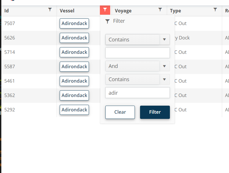
For the filter menu, when you enter a filter value, it would be nice if you could press enter to execute the filter instead of having to click "Filter."
I need to be able to allow our users to tab into the dropdownlist control and open it with enter (similar to standard HTML select).
Here is also a sample from the W3 documentation to compare against: DropDownList keyboard support.
In <TelerikTimePicker>, how can I enable format in the dropdown for minutes in two digits like 01, 02, 03, 04? Currently, I found these formats for Blazor Timepicker - https://demos.telerik.com/blazor-ui/timepicker/formats. All formats are showing single-digit minutes like 1, 2, 3, and 4.
I want to set the format in the dropdown for minutes to be two digits. Same as here https://demos.telerik.com/aspnet-mvc/timepicker/component-type.
I am working on a form where experienced agents need to input data quickly. Often enough they know the codes and so they can type them in the combo box, but they shouldn't have to look for the mouse to select the item, the combo box should select it when the user presses Tab to move to the next field.
This should happen only when the user has filtered the combo box so they see some items (and so the dropdown is open) - I want them to be able to select only items from the available options, AllowCustom does not work for me.
=====
TELERIK EDIT / TLDR
The desired behavior violates accessibility standards. That's why we will refrain from implementing it as a built-in feature. We suggest the following workaround that is now part of the documentation: Select focused ComboBox item on tab
The OnPaneResize (and SizeChanged) event does NOT fire when a pane is unpinned. When it flies out from the left, resizing the flyout does not fire events that would letus refresh the chart to fill the new size.
Reproduced in this REPL: https://blazorrepl.telerik.com/mfkqODwk35srscZe46
I would like to have possibility to put sorting and filtering icons in second row or at least second line in TelerikGrid header. To follow our project design I need to have 1 header row with header titles, and second row with sorting and filtering. Or at least one table header row with sorting and filtering icons in 2 line. Is this somehow possible to achieve?
I have a requirement to design our own custom add/edit template form for scheduler control.
I looked at custom edit form example and found very helpful, However this example does not demonstrate how to use RecurrenceEditor and use them in custom template.
When a user invokes a Search tool, their intention is to directly write a text to search, therefore the edit for the search text should be focused immediately. In the current implementation, users have to manually focus the edit all the time, which is really inconvenient.
One can generally loop through a collection of items to create several TabStrip instances as shown in the Tabs Collection article.
However, when I am dynamically adding or removing tabs I am hitting a variety of problems targeting:
- The active tab is not correctly set;
- The focus is not always set on the active tab;
- Upon adding/removing a tab, all tabs are re-created and thus their content cannot be persisted;
Please add support for dynamic tabs.
The feature request is to be able to customize the GridCsvExportOptions and GridExcelExportOptions from the API methods -
- ExportToExcelAsync
- ExportToCsvAsync
- SaveAsExcelFileAsync
- SaveAsCsvFileAsync
It will be useful to be able to customize the columns and data to be exported.
===
Telerik edit:
A possible workaround is to click the built-in Grid export buttons with JavaScript. With this approach, you will be able to use the built-in export options and events. Here is a REPL example.
Support the recurrence rule to create multiple appointments per time slot. Examples of such rules are:
FREQ=DAILY;BYDAY=MO,TU,WE,TH,FR,SA,SU;BYHOUR=08,09,10,11,12,13,14,15,16;BYMINUTE=50
It would be nice to be able to configure a show/hide animation for windows.
ADMIN EDIT: This might include a form of a Shown event so that you could know when the content is rendered and available to, for example, focus a button or input. For more details see here
Like https://docs.telerik.com/blazor-ui/components/combobox/custom-value and https://www.telerik.com/kendo-angular-ui/components/dropdowns/multiselect/custom-values/ so the user can input tags on their own without them being in the app data source.
---
ADMIN EDIT
The following sample may be useful in implementing this in the meantime: https://github.com/telerik/blazor-ui/tree/master/multiselect/add-new-item
---
I have a scenario in which we have user definable columns for a grid, including hundreds if not thousands that need to be ported from the old version of our product. This means these column keys would be strings that may contain spaces or even special characters - and as such cannot be a valid C# property name (which means using an ExpandoObject approach will not work)
It would be really beneficial if the TelerikGrid component could be given Data of an IEnumerable<Dictionary<string, object>> where the Field property of GridColumn (or a new property) would line up with a key in that dictionary rather than a field name for the component to then use reflection with.
A customer with multiple modules of our product installed may very well have columns with similar names, i.e "Some Key", "SomeKey", "Some_Key", "Some & Key" - so simply replacing spaces or special characters may not always still give unique keys.
Hi,
Are you planning to add a loader to the grid in the feature?
E.g as an isLoading attribute or exepnd the build-in one?
With method OnRead to fetch data, when grid is not yet loaded with data, it displays no records available.
Also when chenging data, loading is not starting, but there is an unsmooth transition after some time.
Thanks in advance for your time, Kacper