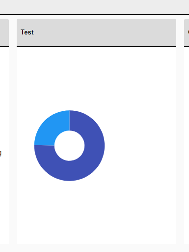
I am creating a Donut Chart and believe I have found a bug. On the initial load of the page, the donut chart element is not playing its animation when the label property "Visible=false". Instead, it pops on with no animation. The animations do play on the drilldown elements on their initial loads, but clicking the refresh chart button also causes this behavior even on drilldown levels. Resetting the drilldown also causes this behavior. The chart legend remains visible during the time when the chart is not. Setting the labels visible property to true causes the animations to play correctly. This proof of concept utilizes static data. The application was created using the telerik templates and is correctly injecting the telerik components as all other telerik components, including other chart components, are functioning as expected. I have isolated the code for the donut chart and posted it here.
<TelerikButton OnClick="@(() => DonutChart.Refresh())">Refresh Donut Chart</TelerikButton>
<TelerikButton OnClick="@(() => DonutChart.ResetDrilldownLevel(0))">Reset DrillDown</TelerikButton>
<!-- Donut Chart -->
<TelerikChart @ref="DonutChart">
<ChartTitle Text="Donut Chart" />
<ChartLegend Position="Telerik.Blazor.ChartLegendPosition.Right" />
<ChartSeriesItems>
<ChartSeries Type="ChartSeriesType.Donut"
Data="@donutData"
Field="@nameof(DonutModel.Number)"
CategoryField="@nameof(DonutModel.Category)"
ColorField="@nameof(DonutModel.SegmentColor)"
DrilldownField="@nameof(DonutModel.DrillDown)">
<ChartSeriesBorder Color="white" Width="2" />
<ChartSeriesLabels Position="ChartSeriesLabelsPosition.Above"
Visible="false"
Background="transparent">
</ChartSeriesLabels>
</ChartSeries>
</ChartSeriesItems>
</TelerikChart>
@code {
// Donut Chart
public TelerikChart DonutChart;
public class DonutModel
{
public string Category { get; set; }
public int Number { get; set; }
public string SegmentColor { get; set; }
public ChartSeriesDescriptor? DrillDown { get; set; }
}
public List<DonutModel> donutData = new List<DonutModel>
{
new DonutModel
{
Category = "Category 1 with Drilldown",
Number = 263,
SegmentColor = "#9d3cc7",
DrillDown = new ChartSeriesDescriptor
{
Name = "Drilldowns",
Type = ChartSeriesType.Donut,
Field = nameof(DonutModel.Number),
CategoryField = nameof(DonutModel.Category),
DrilldownField = nameof(DonutModel.DrillDown),
Data = new List<DonutModel>()
{
new DonutModel
{
Category = "Drill Down 1",
Number = 102,
SegmentColor = "#9d3cc7",
DrillDown = new ChartSeriesDescriptor
{
Name = "People",
Type = ChartSeriesType.Donut,
Field = nameof(DonutModel.Number),
CategoryField = nameof(DonutModel.Category),
Data = new List<DonutModel>()
{
new DonutModel
{
Category = "John Doe",
Number = 27,
SegmentColor = "#9d3cc7"
},
new DonutModel
{
Category = "David Smith",
Number = 45,
SegmentColor = "green"
},
new DonutModel
{
Category = "Mary Johnson",
Number = 63,
SegmentColor = "yellow"
},
new DonutModel
{
Category = "Robert Brown",
Number = 56,
SegmentColor = "orange"
}
}
}
},
new DonutModel
{
Category = "Drilldown 2",
Number = 67,
SegmentColor = "green",
DrillDown = new ChartSeriesDescriptor
{
Name = "People",
Type = ChartSeriesType.Donut,
Field = nameof(DonutModel.Number),
CategoryField = nameof(DonutModel.Category),
Data = new List<DonutModel>()
{
new DonutModel
{
Category = "John Doe",
Number = 15,
SegmentColor = "#9d3cc7"
},
new DonutModel
{
Category = "David Smith",
Number = 17,
SegmentColor = "green"
},
new DonutModel
{
Category = "Mary Johnson",
Number = 19,
SegmentColor = "yellow"
},
new DonutModel
{
Category = "Robert Brown",
Number = 16,
SegmentColor = "orange"
}
}
}
},
new DonutModel
{
Category = "Drilldown 3",
Number = 10,
SegmentColor = "orange",
DrillDown = new ChartSeriesDescriptor
{
Name = "People",
Type = ChartSeriesType.Donut,
Field = nameof(DonutModel.Number),
CategoryField = nameof(DonutModel.Category),
Data = new List<DonutModel>()
{
new DonutModel
{
Category = "John Doe",
Number = 3,
SegmentColor = "#9d3cc7"
},
new DonutModel
{
Category = "David Smith",
Number = 4,
SegmentColor = "green"
},
new DonutModel
{
Category = "Mary Johnson",
Number = 1,
SegmentColor = "yellow"
},
new DonutModel
{
Category = "Robert Brown",
Number = 2,
SegmentColor = "orange"
}
}
}
}
}
}
},
new DonutModel
{
Category = "Category 2 with no Drilldown",
Number = 31,
SegmentColor = "#fab933"
}
};
Currently the bubble sizes in the Chart are determined automatically, according to an internal algorithm.
Please add parameters for setting specific min and max bubble sizes by the application.
If a Chart is recreated at runtime and the mouse cursor is over the component, a JavaScript error may occur:
Error: Microsoft.JSInterop.JSException: null is not an object (evaluating 'e.top')
A possible workaround is to delay the Chart tooltip initialization a little:
<TelerikDrawer Data="@NavigablePages" Expanded="true" MiniMode="true" Mode="@DrawerMode.Push">
    <DrawerContent>
        <TelerikGridLayout>
            <GridLayoutItems>
                <GridLayoutItem Column="1">
                    <TelerikCard Width="300px" Height="400px">
                        <CardHeader>
                            <CardTitle>CARD 1</CardTitle>
                        </CardHeader>
                        <CardBody>
                            @if (IsLoading)
                            {
                                <span style="height:100%">...loading...</span>
                            }
                            else
                            {
                                <TelerikChart Transitions=@false>
                                    <ChartSeriesItems>
                                        <ChartSeries Type="ChartSeriesType.Donut" Data="@donutData"
                                                        Field="@nameof(MyDonutChartModel.SegmentValue)" CategoryField="@nameof(MyDonutChartModel.SegmentName)">
                                            <ChartSeriesTooltip Visible="@IsChartTooltipVisible" Background="#222731" Color="#FFFFFF">
                                                <Template>
                                                    @((context.DataItem as MyDonutChartModel)?.Tooltip)
                                                </Template>
                                            </ChartSeriesTooltip>
                                        </ChartSeries>
                                    </ChartSeriesItems>
                                </TelerikChart>
                            }
                        </CardBody>
                    </TelerikCard>
                </GridLayoutItem>
                <GridLayoutItem Column="2">
                    <TelerikCard Width="300px" Height="400px">
                        <CardHeader>
                            <CardTitle>CARD 2</CardTitle>
                        </CardHeader>
                        <CardBody>
                            <TelerikButton OnClick="@OnClickHandler">REFRESH CHART</TelerikButton>
                        </CardBody>
                    </TelerikCard>
                </GridLayoutItem>
            </GridLayoutItems>
        </TelerikGridLayout>
    </DrawerContent>
</TelerikDrawer>


@code{

    public bool IsLoading { get; set; } = false;
    public bool IsChartTooltipVisible { get; set; } = true;

    private async Task OnClickHandler()
    {
        IsLoading = true;
        IsChartTooltipVisible = false;
        // Simulate API call
        await Task.Delay(2000);
        IsLoading = false;
        // Force the Chart to render
        StateHasChanged();
        // Delay the Chart Tooltip initialization
        await Task.Delay(100);
        IsChartTooltipVisible = true;
    }

    List<DrawerItem> NavigablePages { get; set; } = new List<DrawerItem>
{
        new DrawerItem { Text = "Home", Icon = SvgIcon.Home }
    };

    public class DrawerItem
    {
        public string Text { get; set; }
        public ISvgIcon Icon { get; set; }
    }

    public class MyDonutChartModel
    {
        public string SegmentName { get; set; }
        public double SegmentValue { get; set; }
        public string Tooltip { get; set; }
    }

    public List<MyDonutChartModel> donutData = new List<MyDonutChartModel>
    {
        new MyDonutChartModel
        {
            SegmentName = "Product 1",
            SegmentValue = 2,
            Tooltip = "Tooltip 1"
        },
        new MyDonutChartModel
        {
            SegmentName = "Product 2",
            SegmentValue = 3,
            Tooltip = "Tooltip 2"
        },
        new MyDonutChartModel
        {
            SegmentName = "Product 3",
            SegmentValue = 4,
            Tooltip = "Tooltip 3"
        }
    };
}
---
ADMIN EDIT
Screen recording attached below, code to reproduce it too.
---
Hi, I can't figure how to use the Min/Max properties of the ChartCategoryAxis because if I set these properties, the chart disappears.
Please help me.
@page "/"

<TelerikChart>

    <ChartSeriesItems>
        <ChartSeries Type="ChartSeriesType.Line" Name="Test" Data="@mesures"
                     Field="@nameof(Mesure.Value)" CategoryField="@nameof(Mesure.Date)" Aggregate="ChartSeriesAggregate.Sum">
        </ChartSeries>
    </ChartSeriesItems>

    <ChartCategoryAxes>
        <!-- This is OK -->
        @*<ChartCategoryAxis BaseUnit="ChartCategoryAxisBaseUnit.Hours" Type="ChartCategoryAxisType.Date" BaseUnitStep="1"></ChartCategoryAxis>*@

        <!-- This isn't : nothing is displayed -->
        <ChartCategoryAxis Min="@MinDate" Max="@MaxDate" BaseUnit="ChartCategoryAxisBaseUnit.Hours" Type="ChartCategoryAxisType.Date" BaseUnitStep="1"></ChartCategoryAxis>
    </ChartCategoryAxes>

</TelerikChart>

@code {

    private DateTime MinDate { get; set; } = new DateTime(2019, 01, 01, 13, 0, 0);
    private DateTime MaxDate { get; set; }   = new DateTime(2019, 01, 01, 17, 0, 0);

    public class Mesure
    {
        public DateTime Date { get; set; }
        public int Value { get; set; }
    }

    public List<Mesure> mesures = new List<Mesure>()
    {
        new Mesure() { Date = new DateTime(2019, 01, 01, 13, 0, 0), Value = 1 },
        new Mesure() { Date = new DateTime(2019, 01, 01, 14, 0, 0), Value = 2 },
        new Mesure() { Date = new DateTime(2019, 01, 01, 14, 30, 0), Value = 3 },
        new Mesure() { Date = new DateTime(2019, 01, 01, 14, 35, 0), Value = 4 },
        new Mesure() { Date = new DateTime(2019, 01, 01, 15, 0, 0), Value = 5 },
        new Mesure() { Date = new DateTime(2019, 01, 01, 16, 0, 0), Value = 6 },
        new Mesure() { Date = new DateTime(2019, 01, 01, 17, 0, 0), Value = 7 },
    };
}Hi,
I would like to be able to show / hide a serie by clicking to a legend.
Is there a way to do it actually ?
Hello,
Please consider a built-in way to add spacing (gaps, margins, etc.) between the segments of a Donut and Pie charts. The <ChartSeries> tag has such parameters, but they are used for other settings or other series types.
Currently, it is possible to achieve the desired appearance with custom CSS, but that requires knowledge about the Chart rendering.
I want horizontal and vertical lines in the chart to act as markers (limits, thresholds). It would be awesome if there was a way to simply draw a horizontal and vertical lines, bound to a collection of y and x data respectively.
Something like the below would be nice
<TelerikChart>
<ChartSeriesItems>
<ChartSeries Type="@ChartSeriesType.Line" Name="@P_Name1" Color="blue"
Data="@P_Data1"
Field="@P_Field1"
CategoryField="@P_CategoryField1">
<ChartSeriesLabels Visible="true" Template="#=dataItem.P_Description#" />
<ChartSeriesMarkers Size="4" />
</ChartSeries>
<ChartHorizontalLines Data="@YLinesData"/>
<ChartVerticalLines Data="@XLinesData"/>
</ChartSeriesItems>
</TelerikChart>
@code{
List<double> YLinesData, XLinesData;
}
---
ADMIN EDIT
You can find some more details and ideas for workarounds here to consider in the meantime.
---
Our Site supports multiple themes that we have built using the SASS Theme Builder. For all Telerik Components we have used so far the theme changes on them as expected when using the example found here (Change Theme at Runtime). The problem seems to be the chart component will not adhere to the newly applied theme after its initial load. Seems like this is because it is shown as an SVG with hardcoded attributes on the element. Is there a workaround for this (other than reloading the components entirely)?
Before & After Theme Change:
Hi
We would like to be able to draw a label for a group of series in the chart axis while also labelling the series individually. See the following example:
In Kendo UI you can achieve this: https://dojo.telerik.com/ulIJihIF. In Blazor, we can force the text into the chart axis categories, but we cannot seem to position them accurately, REPL.
Thank you
It would be helpful to me if this chart type was supported.
In need a chart that has a shaded area between a max and min set of curves, indicating the allowable area
Like this one: https://demos.telerik.com/kendo-ui/range-area-charts/index
Hi,
Just a bug I have found. I have found something similar before with the DateTime format of a category axis.
Please note the single lowercase 't' in the below appears to be being interpreted by the compiler as 'time' identifier (AM or PM). In this case, it is printing on the chart label as 'a'.
<ChartValueAxes>
     <ChartValueAxis AxisCrossingValue="@AxisCrossingValue">
          <ChartValueAxisLabels Format="@("{0}" + " a b c d e f g h i j k l m n o p q r s t u v w x y z")"></ChartValueAxisLabels>
    </ChartValueAxis>
</ChartValueAxes>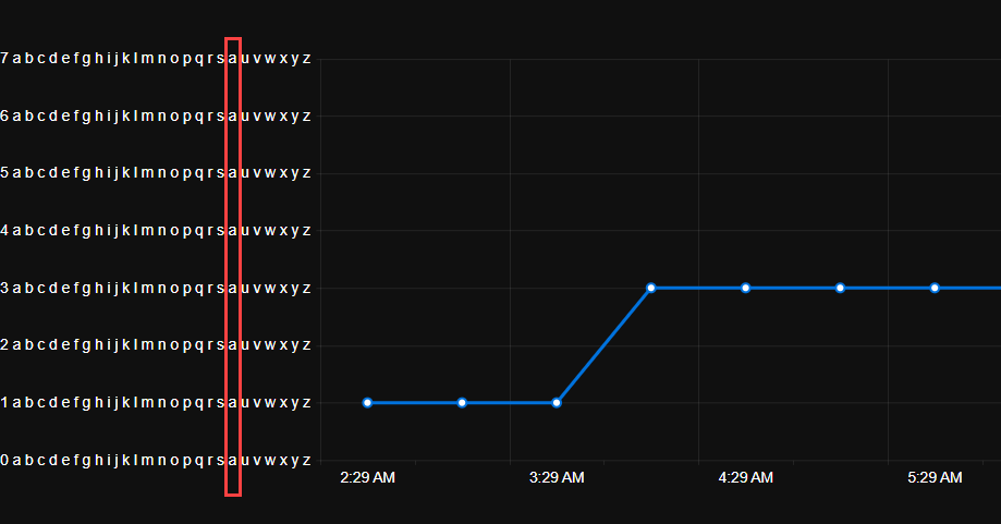
I discovered this as my original unit was 'Count' which was being displayed at runtime on the chart as 'Couna'.
I would like to control the font of the Value axis labels in a similar fashion to the way I can control the labels of the category axis:
    <ChartCategoryAxes>
        <ChartCategoryAxis Categories="@xAxisItems">
            <ChartCategoryAxisLabels Font="bold 12px 'Helvetica'"></ChartCategoryAxisLabels>
        </ChartCategoryAxis>
    </ChartCategoryAxes>
*** Thread created by admin on customer behalf ***
I am trying to customize the format of the ChartCategoryAxisLabels to render the abbreviated name of the day of the week using the following format:
<ChartCategoryAxisLabels Format="ddd dd/MM HH:mm"/>While it is a valid format, it seems that it doesn't work for the category labels.
---
ADMIN EDIT
---
For the time being, you can use the following to render the abbreviated name of the day of the week in the ChartCategoryAxisLabels:
<ChartCategoryAxisLabels Format="{0:EEE dd/MM HH:mm}"/>