Currently, the Chart does not plot anything when zero values are included in the dataset on a logarithmic axis.
Reproduction: https://blazorrepl.telerik.com/cdYgkWFH23W9PVon54
At least the "Success" data should be plotted.
I am trying to programmatically update the Chart data during runtime to display live data. The Chart does not seem to refresh and show this change in the viewport.
I've tried:
- using an Observable Collection;
- creating a new collection instance and reassigning the Data parameter;
- calling the Refresh method;
The result is the same - the Chart does not react to the data change. This applies to other component parameters as well.
===
ADMIN EDIT
===
A possible workaround for the time being is forcing the Chart to re-render. To do so, you may wrap the Chart in a custom component and call StateHasChanged() in this component when the data is updated.Here is a runnable sample: https://blazorrepl.telerik.com/wxEzwxbJ24WDjnMp11.
Hi,
Just a bug I have found. I have found something similar before with the DateTime format of a category axis.
Please note the single lowercase 't' in the below appears to be being interpreted by the compiler as 'time' identifier (AM or PM). In this case, it is printing on the chart label as 'a'.
<ChartValueAxes>
     <ChartValueAxis AxisCrossingValue="@AxisCrossingValue">
          <ChartValueAxisLabels Format="@("{0}" + " a b c d e f g h i j k l m n o p q r s t u v w x y z")"></ChartValueAxisLabels>
    </ChartValueAxis>
</ChartValueAxes>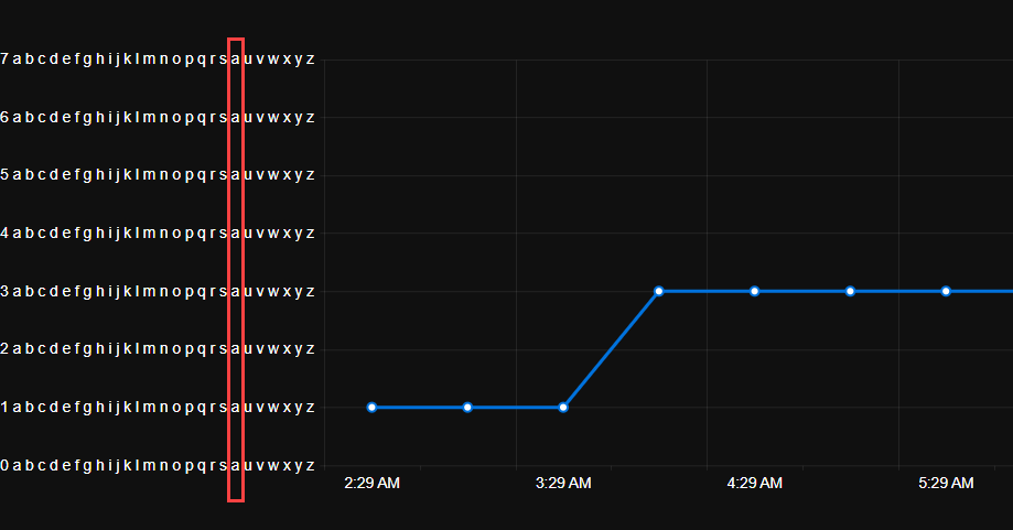
I discovered this as my original unit was 'Count' which was being displayed at runtime on the chart as 'Couna'.
Please see the links below to see examples of the scale break feature I'm looking for: Scale Breaks - ChartView - Telerik UI for WinForms.
https://docs.telerik.com/devtools/aspnet-ajax/controls/chart/features/scale-breaks
I know about Logarithmic Axis as well, but it's not exactly what I'm looking for.
I would like to control the font of the Value axis labels in a similar fashion to the way I can control the labels of the category axis:
    <ChartCategoryAxes>
        <ChartCategoryAxis Categories="@xAxisItems">
            <ChartCategoryAxisLabels Font="bold 12px 'Helvetica'"></ChartCategoryAxisLabels>
        </ChartCategoryAxis>
    </ChartCategoryAxes>
*** Thread created by admin on customer behalf ***
I am trying to customize the format of the ChartCategoryAxisLabels to render the abbreviated name of the day of the week using the following format:
<ChartCategoryAxisLabels Format="ddd dd/MM HH:mm"/>While it is a valid format, it seems that it doesn't work for the category labels.
---
ADMIN EDIT
---
For the time being, you can use the following to render the abbreviated name of the day of the week in the ChartCategoryAxisLabels:
<ChartCategoryAxisLabels Format="{0:EEE dd/MM HH:mm}"/>After updating the chart data, some elements remain in the DOM. This can clutter the browser if the data updates come in on intervals and the chart remains in operation for a while. A screenshot is attached below.
MCVE:
@using Telerik.Blazor@using Telerik.Blazor.Components.Button@using Telerik.Blazor.Components.Chart<h3>Chart</h3><TelerikButton Primary="true" @onclick="AddDataPoint">Add data point</TelerikButton><TelerikChart Transitions="false"> <TelerikChartSeriesItems> <TelerikChartSeries Type="ChartSeriesType.Line" Name="CPU Usage Data" Data="@simpleData"> </TelerikChartSeries> </TelerikChartSeriesItems> <TelerikChartValueAxes> <TelerikChartValueAxis Max="100" Color="black"></TelerikChartValueAxis> </TelerikChartValueAxes> <TelerikChartTitle Text="CPU Usage"></TelerikChartTitle> <TelerikChartLegend Position="Telerik.Blazor.ChartLegendPosition.Bottom"> </TelerikChartLegend></TelerikChart>@code { void AddDataPoint() { Random random = new Random(); var _val = Math.Round((random.NextDouble() * 100), 3); if (simpleData.Count >= 60) { simpleData = simpleData.TakeLast(59).ToList(); } simpleData.Add(_val); //StateHasChanged(); } public List<object> simpleData = new List<object>();}
If a chart is too narrow and x-axis labels overlap, the user can zoom out and refresh the charts to allow the labels to fit. This feature request is to allow the charts to reformat themselves as the zoom level is changed (without having to refresh the page). Steps to reproduce:
- Make browser narrow (say half screen)
- Change zoom to 500%
- Go to https://demos.telerik.com/blazor-ui/chart/line-chart
- See line chart is squished with overlapping x-axis labels
- Zoom out to 100%
- See line chart remains squished with overlapping x-axis labels even though there is a lot more room
- Now refresh the page
- See line chart is no longer squished with x-axis labels visible
Is it possible to use a different marker type other than the one provided by ChartSeriesMarkerType enum?
We would like to use a custom icon for some Scatter data but this doesn't seem to be supported out of the box. Please let us know if this is possible in the current framework, if not - can it be added as a feature?
Thanks,
Sean
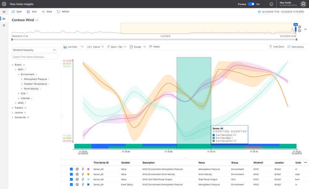
See attached image. I want an option to change position on ticks, like in Kendo (see here).
I can't find an option in docs to move the axis position.
Currently, I get the desired result using SyncFusion Chart Component, attribute LabelPlacement allow selection between OnTicks and BetweenTicks option.
Currently, scatter line plots do not support the stepped line style. This is something that would be hugely beneficial to us in our heavy utilization of scatter line plots with time series data.

It would be fantastic to be able to visualize boolean data on a time based chart. We have a lot of time series data, and a good bit of it is boolean. It would be very beneficial to be able to plot that data along side our numeric data to provide context to both.
Example (blue/green bar at bottom of chart):
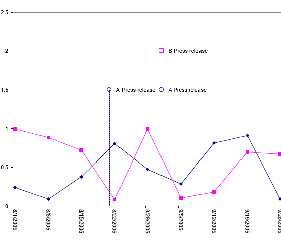
I would love to see the ability to put "pins" or "markers" for events on a time based chart. A lot of the work I'm doing with charts revolves around IoT, so we see a lot of value based data that needs to be contextualized with events.
Example: