Hi,
I would like to be able to show / hide a serie by clicking to a legend.
Is there a way to do it actually ?
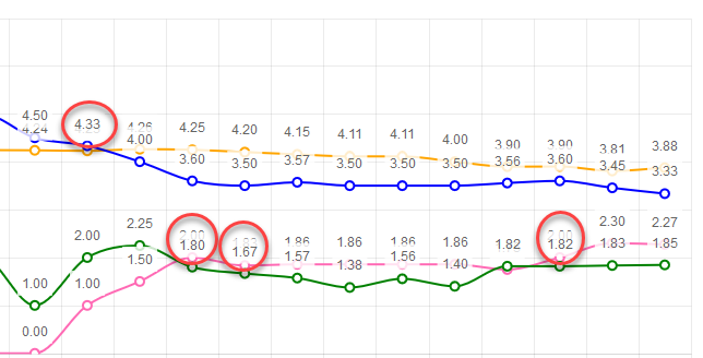
The idea is to ensure labels don't render on top of each other. If series values are close to each other, labels start overlapping. Having tooltips will let me remove the labels.
Example:
I want horizontal and vertical lines in the chart to act as markers (limits, thresholds). It would be awesome if there was a way to simply draw a horizontal and vertical lines, bound to a collection of y and x data respectively.
Something like the below would be nice
<TelerikChart>
<ChartSeriesItems>
<ChartSeries Type="@ChartSeriesType.Line" Name="@P_Name1" Color="blue"
Data="@P_Data1"
Field="@P_Field1"
CategoryField="@P_CategoryField1">
<ChartSeriesLabels Visible="true" Template="#=dataItem.P_Description#" />
<ChartSeriesMarkers Size="4" />
</ChartSeries>
<ChartHorizontalLines Data="@YLinesData"/>
<ChartVerticalLines Data="@XLinesData"/>
</ChartSeriesItems>
</TelerikChart>
@code{
List<double> YLinesData, XLinesData;
}
---
ADMIN EDIT
You can find some more details and ideas for workarounds here to consider in the meantime.
---
Hi!
I'm building a Blazor Component using your TelerikChart. To build my chart, I'm dynamically inserting the series name and the series data, which is pulled from a list. I also have a button on the page that changes the dataset (last month, this month, next month, etc). The button will rebuild the list of names and data, and Blazor will build the chart with a 'foreach' entry in the ChartSeriesItems section of the Chart Component.
The problem is that the Items are not cleared each time. When I click the button, I'm getting previous values. In the example below, I have 3 data sets. The first has 4 items, the second has 8 and the third has 6. If the user clicks the second, showing all 8, then clicks the first, the chart will show the new 4, and the previous 5-8 from the second set.
My chart description in HTML is:
...
<ChartSeriesItems>
@foreach(Tuple<string, object[]> t in myData)
{
<ChartSeries Type="ChartSeriesType.Column" Name=@t.Item1 Data=@t.Item2 />
}
</ChartSeriesItems>
...
I have checked my data through debugging to ensure that the myData variable is correct (i.e. when I click the first data, it only has 4 items). However, when the chart displays, it shows 8 items.
Is there a CLEARDATA method or something I can call on the Chart to ensure that the data is reset each time? I see that there is a Clear() in JavaScript, but I'm writing in only Blazor and C#, with no JavaScript.
I've attached the .razor page for your reference. (As this is my test code, I'm using random number generation to get the data.)
Thank you so much for your help!!
-Cheryl Simpson
It would be helpful to me if this chart type was supported.
In need a chart that has a shaded area between a max and min set of curves, indicating the allowable area
Like this one: https://demos.telerik.com/kendo-ui/range-area-charts/index
If a chart is too narrow and x-axis labels overlap, the user can zoom out and refresh the charts to allow the labels to fit. This feature request is to allow the charts to reformat themselves as the zoom level is changed (without having to refresh the page). Steps to reproduce:
- Make browser narrow (say half screen)
- Change zoom to 500%
- Go to https://demos.telerik.com/blazor-ui/chart/line-chart
- See line chart is squished with overlapping x-axis labels
- Zoom out to 100%
- See line chart remains squished with overlapping x-axis labels even though there is a lot more room
- Now refresh the page
- See line chart is no longer squished with x-axis labels visible
After updating the chart data, some elements remain in the DOM. This can clutter the browser if the data updates come in on intervals and the chart remains in operation for a while. A screenshot is attached below.
MCVE:
@using Telerik.Blazor@using Telerik.Blazor.Components.Button@using Telerik.Blazor.Components.Chart<h3>Chart</h3><TelerikButton Primary="true" @onclick="AddDataPoint">Add data point</TelerikButton><TelerikChart Transitions="false"> <TelerikChartSeriesItems> <TelerikChartSeries Type="ChartSeriesType.Line" Name="CPU Usage Data" Data="@simpleData"> </TelerikChartSeries> </TelerikChartSeriesItems> <TelerikChartValueAxes> <TelerikChartValueAxis Max="100" Color="black"></TelerikChartValueAxis> </TelerikChartValueAxes> <TelerikChartTitle Text="CPU Usage"></TelerikChartTitle> <TelerikChartLegend Position="Telerik.Blazor.ChartLegendPosition.Bottom"> </TelerikChartLegend></TelerikChart>@code { void AddDataPoint() { Random random = new Random(); var _val = Math.Round((random.NextDouble() * 100), 3); if (simpleData.Count >= 60) { simpleData = simpleData.TakeLast(59).ToList(); } simpleData.Add(_val); //StateHasChanged(); } public List<object> simpleData = new List<object>();}
---
ADMIN EDIT
Screen recording attached below, code to reproduce it too.
---
The code below does not produce a chart series with a line that is 50 width? What am i missing?
@page "/chartdemo"
Line series
<TelerikChart>
<ChartSeriesItems>
<ChartSeries Type="ChartSeriesType.Line" Name="Product 1" Data="@series1Data">
<ChartSeriesMarkers Size="10"></ChartSeriesMarkers>
</ChartSeries>
<ChartSeries Type="ChartSeriesType.Line" Size="10" Name="Product 2" Data="@series2Data">
<ChartSeriesLine Width="50"></ChartSeriesLine>
</ChartSeries>
</ChartSeriesItems>
<ChartCategoryAxes>
<ChartCategoryAxis Categories="@xAxisItems"></ChartCategoryAxis>
</ChartCategoryAxes>
<ChartTitle Text="Quarterly revenue per product"></ChartTitle>
<ChartLegend Position="ChartLegendPosition.Right">
</ChartLegend>
</TelerikChart>
@code {
public List<object> series1Data = new List<object>() { 10, 2, 5, 6 };
public List<object> series2Data = new List<object>() { 5, 8, 2, 7 };
public string[] xAxisItems = new string[] { "Q1", "Q2", "Q3", "Q4" };
}