Hi,
I would like to be able to show / hide a serie by clicking to a legend.
Is there a way to do it actually ?
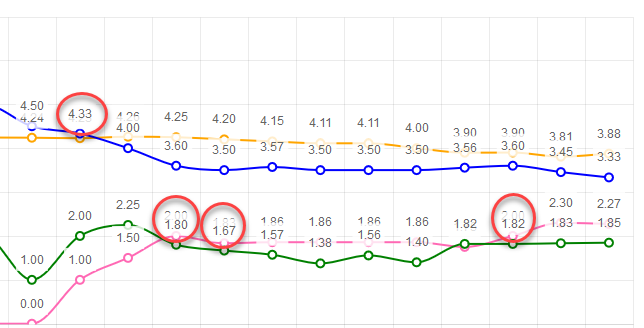
The idea is to ensure labels don't render on top of each other. If series values are close to each other, labels start overlapping. Having tooltips will let me remove the labels.
Example:
I want horizontal and vertical lines in the chart to act as markers (limits, thresholds). It would be awesome if there was a way to simply draw a horizontal and vertical lines, bound to a collection of y and x data respectively.
Something like the below would be nice
<TelerikChart>
<ChartSeriesItems>
<ChartSeries Type="@ChartSeriesType.Line" Name="@P_Name1" Color="blue"
Data="@P_Data1"
Field="@P_Field1"
CategoryField="@P_CategoryField1">
<ChartSeriesLabels Visible="true" Template="#=dataItem.P_Description#" />
<ChartSeriesMarkers Size="4" />
</ChartSeries>
<ChartHorizontalLines Data="@YLinesData"/>
<ChartVerticalLines Data="@XLinesData"/>
</ChartSeriesItems>
</TelerikChart>
@code{
List<double> YLinesData, XLinesData;
}
---
ADMIN EDIT
You can find some more details and ideas for workarounds here to consider in the meantime.
---
It would be helpful to me if this chart type was supported.
In need a chart that has a shaded area between a max and min set of curves, indicating the allowable area
Like this one: https://demos.telerik.com/kendo-ui/range-area-charts/index
If a chart is too narrow and x-axis labels overlap, the user can zoom out and refresh the charts to allow the labels to fit. This feature request is to allow the charts to reformat themselves as the zoom level is changed (without having to refresh the page). Steps to reproduce:
- Make browser narrow (say half screen)
- Change zoom to 500%
- Go to https://demos.telerik.com/blazor-ui/chart/line-chart
- See line chart is squished with overlapping x-axis labels
- Zoom out to 100%
- See line chart remains squished with overlapping x-axis labels even though there is a lot more room
- Now refresh the page
- See line chart is no longer squished with x-axis labels visible
The code below does not produce a chart series with a line that is 50 width? What am i missing?
@page "/chartdemo"
Line series
<TelerikChart>
<ChartSeriesItems>
<ChartSeries Type="ChartSeriesType.Line" Name="Product 1" Data="@series1Data">
<ChartSeriesMarkers Size="10"></ChartSeriesMarkers>
</ChartSeries>
<ChartSeries Type="ChartSeriesType.Line" Size="10" Name="Product 2" Data="@series2Data">
<ChartSeriesLine Width="50"></ChartSeriesLine>
</ChartSeries>
</ChartSeriesItems>
<ChartCategoryAxes>
<ChartCategoryAxis Categories="@xAxisItems"></ChartCategoryAxis>
</ChartCategoryAxes>
<ChartTitle Text="Quarterly revenue per product"></ChartTitle>
<ChartLegend Position="ChartLegendPosition.Right">
</ChartLegend>
</TelerikChart>
@code {
public List<object> series1Data = new List<object>() { 10, 2, 5, 6 };
public List<object> series2Data = new List<object>() { 5, 8, 2, 7 };
public string[] xAxisItems = new string[] { "Q1", "Q2", "Q3", "Q4" };
}
I would like to control the font of the Value axis labels in a similar fashion to the way I can control the labels of the category axis:
    <ChartCategoryAxes>
        <ChartCategoryAxis Categories="@xAxisItems">
            <ChartCategoryAxisLabels Font="bold 12px 'Helvetica'"></ChartCategoryAxisLabels>
        </ChartCategoryAxis>
    </ChartCategoryAxes>
*** Thread created by admin on customer behalf ***
Hi
We would like to be able to draw a label for a group of series in the chart axis while also labelling the series individually. See the following example:
In Kendo UI you can achieve this: https://dojo.telerik.com/ulIJihIF. In Blazor, we can force the text into the chart axis categories, but we cannot seem to position them accurately, REPL.
Thank you
Hi!
I'm more than a little impressed with your Blazor efforts to-date, but there's one component lacking: a CandleStick chart.