I would like to synchronize several Charts, so when I move the mouse through one of them, the other two Charts show crosshairs at the same position as the first hovered Chart.
===
ADMIN EDIT
===
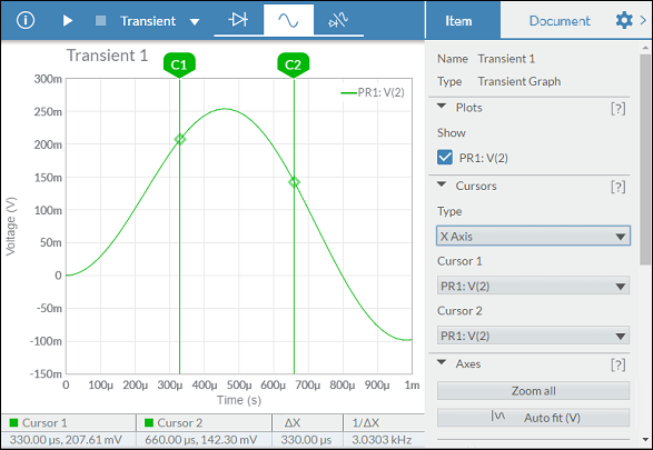
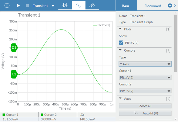
Prerequisite: Chart Crosshair
This functionality would be very useful for data analysis.
Moving the cursors within the chart itself, allows to define a range within the series, being able to offer useful data.
Examples:
Hello,
I want to connector to be directly connected with the chart.
See https://dojo.telerik.com/AkEHuSiq/3 for reference.
Thank you.
I would like to be able to stack series on a range chart. Currently the best hack recommended by Telerik is to show two charts on top of one another, with no interactivity or legends, https://blazorrepl.telerik.com/wHPclTFm28WuoSOp57.
Source: Is it possible to 'stack' series in a Range Column Chart? in UI for Blazor | Telerik Forums
Thank you
Enhance the Chart date axis label format, so that it's culture-aware in globalization scenarios, and there is no need to set ChartCategoryAxisLabels Format explicitly.
In the meantime, here are a few workarounds for the case when the ChartCategoryAxis BaseUnit is Days and the Chart shows MM/dd labels even to non-US users.
- The easier option is to use a standard format string:
<ChartCategoryAxis BaseUnit="ChartCategoryAxisBaseUnit.Days"
                    Type="ChartCategoryAxisType.Date">
    <ChartCategoryAxisLabels Format="d" />
</ChartCategoryAxis>
- The above contains the year, so another option is MonthDayPattern:
<ChartCategoryAxis BaseUnit="ChartCategoryAxisBaseUnit.Days"
                    Type="ChartCategoryAxisType.Date">
    <ChartCategoryAxisLabels Format="@( CultureInfo.CurrentUICulture.DateTimeFormat.MonthDayPattern )" />
</ChartCategoryAxis>
- To display a shorter numeric month, use the MonthDayPattern to detect the day-month order and then set a custom format string.
Razor
<ChartCategoryAxis BaseUnit="ChartCategoryAxisBaseUnit.Days"
                    Type="ChartCategoryAxisType.Date">
    <ChartCategoryAxisLabels Format="@( GetShortDayMonthPattern() )" />
</ChartCategoryAxis>
C#
    private string GetShortDayMonthPattern()
    {
        var mdp = CultureInfo.CurrentUICulture.DateTimeFormat.MonthDayPattern;
        var separator = CultureInfo.CurrentUICulture.DateTimeFormat.DateSeparator;
        string pattern = mdp.IndexOf("M") < mdp.IndexOf("d") ? $"MM{separator}dd" : $"dd{separator}MM";

        return pattern;
    }
Regards, Author nickname Progress Telerik
Hi
We would like to be able to draw a label for a group of series in the chart axis while also labelling the series individually. See the following example:
In Kendo UI you can achieve this: https://dojo.telerik.com/ulIJihIF. In Blazor, we can force the text into the chart axis categories, but we cannot seem to position them accurately, REPL.
Thank you
In Kendo-React chart i can set the property "maxDivision" like this:
<ChartCategoryAxis>
<ChartCategoryAxisItem
maxDivisions={30}
name="categoryAxisName"
categories={categories}
...
and the chart will show only 30 dates in the displayed range, even if zoom in.
Is there a way for doing the same thing in Blazor Chart?
I tryed Type"fit" and MaxDateGroup but i need to show always all the points and this isnot a good solution.
I tryed ChartCategoryAxisLabels Step="number_of_labels_to_render" but when i zoom in the chart
will not show other dates.
Regards,
Davide
i.e here I would like it to return: 2023/06/11 & 2023/06/18
I want to be able to set different colors for the separate series items.
===
ADMIN EDIT
===
A possible option for the time being is to add each item in a dedicated series where you can specify its color.Please see the links below to see examples of the scale break feature I'm looking for: Scale Breaks - ChartView - Telerik UI for WinForms.
https://docs.telerik.com/devtools/aspnet-ajax/controls/chart/features/scale-breaks
I know about Logarithmic Axis as well, but it's not exactly what I'm looking for.
Hello,
Please consider a built-in way to add spacing (gaps, margins, etc.) between the segments of a Donut and Pie charts. The <ChartSeries> tag has such parameters, but they are used for other settings or other series types.
Currently, it is possible to achieve the desired appearance with custom CSS, but that requires knowledge about the Chart rendering.