Sometimes with a dropdown button I would like to have Category headers or Separators to breakup the list. To accomplish a seperator it needs to be added to another existing DropDownItem. To create a category header you can style an existing DropDownItem, however it's still clickable so it becomes obvious to the user that this is a bit of a misuse of the control. Native support for Categories or Separators would be ideal, however, just having control over the click behavior and perhaps a Template property for full control over this one items rendering would make it more extensible.
Thank you,
-Andy
Hi Team,
It might be a better user experience if the user does not have a valid license key to either:
a) make it clear that if the downloader does not have a license assigned the downloaded license key will not be valid
or
b) do not let anyone without a license assigned download the key file (that seems preferable & probably easier to implement)
Thank you!
---
ADMIN EDIT
Screen recording attached below, code to reproduce it too.
---
The appointment drag and drop functionality of the Scheduler does not work on mobile devices. When you try to drag an item, the item does not move.
You can test it by running the Scheduler overview demo by using Chrome's mobile device emulator and trying to drag and drop an appointment.
Description
Entering/Removing spaces in between words does not trigger the ValueChanged event.
Steps To Reproduce
Run this example: https://blazorrepl.telerik.com/wzELPuOs30WSuvzv33
- Click between the "Lorem" and "ipsum" words.
- Press the Spacebar key a few times
- Press the Backspace key a few times
Actual Behavior
The ValueChanged event does not fire when you enter/remove spaces in between words. It fires correctly if you break a word with a space of if you remove all the spaces in between 2 words.
Expected Behavior
ValueChanged should fire on every entered/removed space.
Browser
All
Last working version of Telerik UI for Blazor (if regression)
No response
Pressing Shift+Tab initially when the Window is opened, moves the focus from the Window back to the Button that opens it.
Steps To Reproduce:
- Open REPL repro
- Click "Open Modal" Button
- Press "Shift+Tab"
I'd like to use the adaptive rendering but I also need to keep AllowCustom feature.
===
ADMIN EDIT
===
This request applies to all components that support AllowCustom feature and adaptive rendering: for example, ComboBox, MultiColumnComboBox.
Grid OnRead .Clear() Issue
With the following component:
@page "/counter"
@using System.Collections.ObjectModel
General grid with its most common features
<TelerikGrid Data="@MyData" Pageable="true" @bind-Page="page" PageSize="5" TotalCount="30" OnRead="@ReadItems" >
    <GridColumns>
        <GridColumn Field="@(nameof(SampleData.Id))" Width="120px" />
        <GridColumn Field="@(nameof(SampleData.Name))" Title="Employee Name" Groupable="false" />
        <GridColumn Field="@(nameof(SampleData.Team))" Title="Team" />
        <GridColumn Field="@(nameof(SampleData.HireDate))" Title="Hire Date" />
    </GridColumns>
</TelerikGrid>

@code {
    public List<SampleData> MyData { get; set; } = new List<SampleData>();
    //public ObservableCollection<SampleData> MyData { get; set; } = new ObservableCollection<SampleData>();
    private int page = 1;

    private void ReadItems(GridReadEventArgs args)
    {
        //MyData = new List<SampleData>();  //OK!
        //MyData = new ObservableCollection<SampleData>(); //OK!
        MyData.Clear();  //List: No update. ObservableCollection: System.StackOverflowException!
        Populate();
        StateHasChanged();
    }

    private void Populate()
    {
        foreach (var data in Enumerable.Range((page - 1) * 5, 5).Select(x => new SampleData
        {
            Id = x,
            Name = "name " + x,
            Team = "team " + x % 5,
            HireDate = DateTime.Now.AddDays(-x).Date
        }))
        {
            MyData.Add(data);
        }
    }

    public class SampleData
    {
        public int Id { get; set; }
        public string Name { get; set; }
        public string Team { get; set; }
        public DateTime HireDate { get; set; }
    }
}
I see the issues in the comment fields. Changing OnRead to async makes no difference.
The workaround is to assign a new List or ObservableCollection instead of using .Clear()
Hi Telerik Team!
We’ve noticed that your official website uses anchor scrolling (clicking on links to scroll to specific sections smoothly), and we’d love to see that as a Telerik Blazor component.
This would be super useful in scenarios where:
The only way to present content is via long scrollable pages
Tabs aren’t a good UX fit
What we’re looking for:
-Smooth scrolling to internal page anchors (sections)
-Scrollspy-like feature to highlight active section
-Optional scroll offset for sticky headers
-Lightweight, flexible integration (with or without Telerik Form/Layout components)
We feel this would be a great addition to the Telerik Blazor suite — especially for documentation-style pages, long forms, or configuration panels.
Thanks a lot and keep up the awesome work!
Best regards,
Bohdan
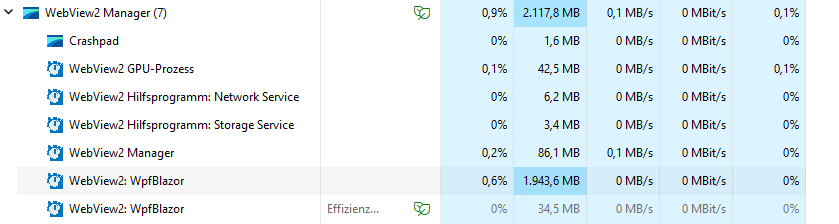
In our application we use some large datasets and present them in a TelerikGrid. We use WPF + Blazor Hybrid and noticed, that in some cases the memory usage of the Web View process grows up to some gigabytes.
Here a screenshot of the task manager with a lot of RAM usage for the web view.
Here a screenshot of the detached DOM elements after a two navigations. The container divs are not garbage collected.
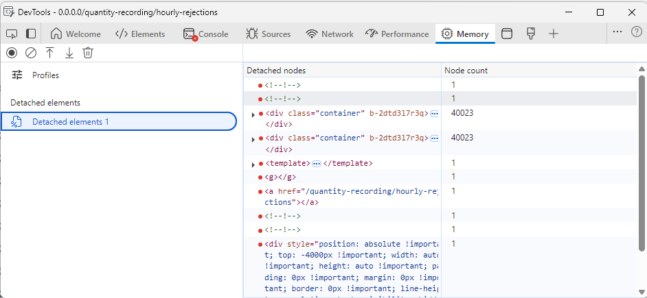
I tracked down the issue to come from the TelerikGrid, because when I remove it from the pages, everything runs fine. I also removed all GridColumns and the issue is still present. In the developer tools I noticed that one of the parent div elements remains in memory every time I navigate back and forth.
I also created a blank Blazor WebAssembly Standalone application and added a simple instance of the grid. Here, the issue is also present. I attach the one blazor page that causes the issue.
I've tested all major versions from 5.1 upwards, every version is affected.
Refreshing the Grid data frequently may cause performance issues.
Since <TelerikGrid> is implemented as two separate <table>s, one for the headers and a second for the grid, it does not show repeated headers on subsequent pages when using the browser's Print feature.
Due to limitations of the <TelerikGrid> export functionality, I use the browser print function to export PDFs.
I need the table headers to duplicate on subsequent printed and exported pages.
I wonder if there is a way to duplicate the <thead> info in the second table and suppress its display but enable it for @media Print.
More details in ticket 1691848
First of all – great job on the DockManager component! It’s one of the most powerful and flexible layout tools available for Blazor. I really enjoy using it in my application – the drag/drop docking behavior, pane resizing, and layout persistence are all incredibly useful. It feels like working in a full-featured IDE, which is awesome!
That said, I’d love to suggest a small usability improvement:
Could you consider adding a built-in toggle/collapse button to the splitter between docked elements?
It would be great to have it natively supported in DockManager. It would improve the UX, especially when users want to focus on the main content area and temporarily hide side panes.
Let me know if this feature is already possible or if there's a recommended workaround.
Thanks again for all your amazing work – Telerik UI for Blazor keeps getting better and better!
Attaching two screenshots of TelerikSplitter and TelerikDockManager to show better what is the case.
Best regards,
Bohdan