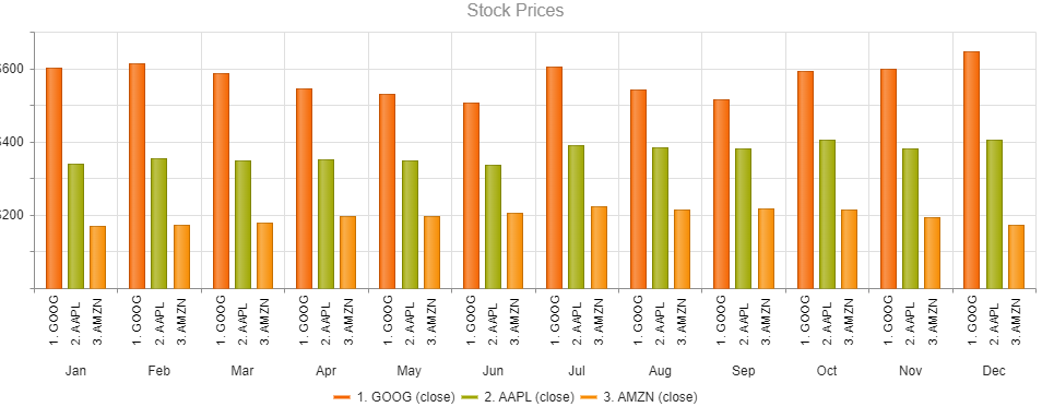
Enhance the Chart date axis label format, so that it's culture-aware in globalization scenarios, and there is no need to set ChartCategoryAxisLabels Format explicitly.
In the meantime, here are a few workarounds for the case when the ChartCategoryAxis BaseUnit is Days and the Chart shows MM/dd labels even to non-US users.
- The easier option is to use a standard format string:
<ChartCategoryAxis BaseUnit="ChartCategoryAxisBaseUnit.Days"
                    Type="ChartCategoryAxisType.Date">
    <ChartCategoryAxisLabels Format="d" />
</ChartCategoryAxis>
- The above contains the year, so another option is MonthDayPattern:
<ChartCategoryAxis BaseUnit="ChartCategoryAxisBaseUnit.Days"
                    Type="ChartCategoryAxisType.Date">
    <ChartCategoryAxisLabels Format="@( CultureInfo.CurrentUICulture.DateTimeFormat.MonthDayPattern )" />
</ChartCategoryAxis>
- To display a shorter numeric month, use the MonthDayPattern to detect the day-month order and then set a custom format string.
Razor
<ChartCategoryAxis BaseUnit="ChartCategoryAxisBaseUnit.Days"
                    Type="ChartCategoryAxisType.Date">
    <ChartCategoryAxisLabels Format="@( GetShortDayMonthPattern() )" />
</ChartCategoryAxis>
C#
    private string GetShortDayMonthPattern()
    {
        var mdp = CultureInfo.CurrentUICulture.DateTimeFormat.MonthDayPattern;
        var separator = CultureInfo.CurrentUICulture.DateTimeFormat.DateSeparator;
        string pattern = mdp.IndexOf("M") < mdp.IndexOf("d") ? $"MM{separator}dd" : $"dd{separator}MM";

        return pattern;
    }
Regards, Author nickname Progress Telerik
Hi
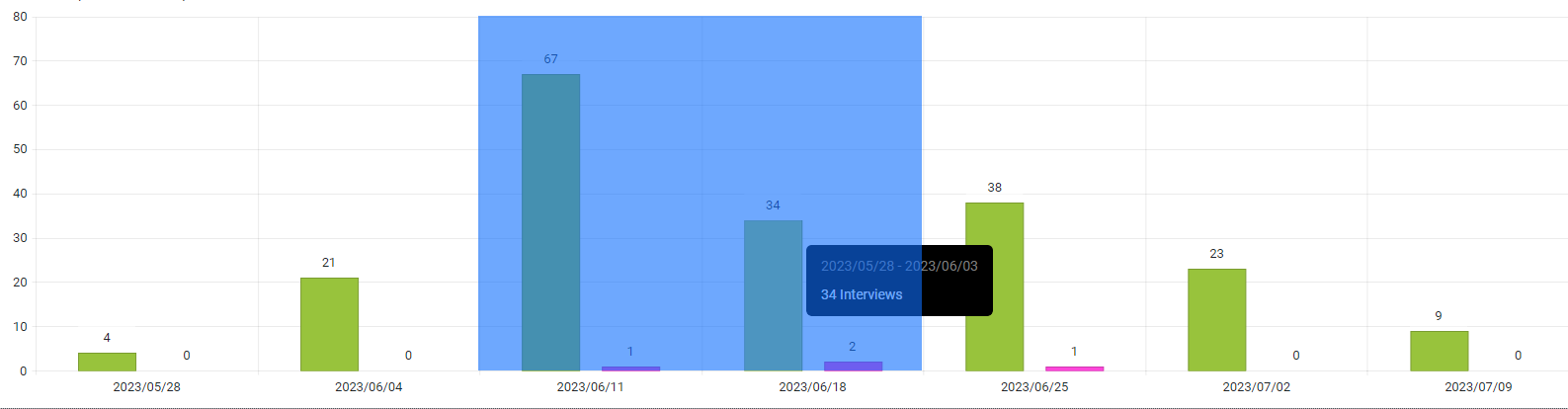
We would like to be able to draw a label for a group of series in the chart axis while also labelling the series individually. See the following example:
In Kendo UI you can achieve this: https://dojo.telerik.com/ulIJihIF. In Blazor, we can force the text into the chart axis categories, but we cannot seem to position them accurately, REPL.
Thank you
In Kendo-React chart i can set the property "maxDivision" like this:
<ChartCategoryAxis>
<ChartCategoryAxisItem
maxDivisions={30}
name="categoryAxisName"
categories={categories}
...
and the chart will show only 30 dates in the displayed range, even if zoom in.
Is there a way for doing the same thing in Blazor Chart?
I tryed Type"fit" and MaxDateGroup but i need to show always all the points and this isnot a good solution.
I tryed ChartCategoryAxisLabels Step="number_of_labels_to_render" but when i zoom in the chart
will not show other dates.
Regards,
Davide
To reproduce the problem, hover over the last value of the series. While the Tooltip enters, it causes horizontal and vertical scroll and flickers. Then, it is positioned correctly.
The issue is better observed if you increase the transition speed of the Tooltip wrapper.
Reproduction: https://blazorrepl.telerik.com/cREDloaV42j7Z19G13.
===
ADMIN EDIT
===
A possible workaround for the time being is to alter or stop the Tooltip animation with CSS. Here is a runnable sample demonstrating the approach: https://blazorrepl.telerik.com/QnEjvIOC04hXA6W709
The Scatterline Chart is flipped upside down if the Height is under 100px.
Reproduction1. Run this REPL
2. Set the height of the Chart to 90px
3. The chart is rendered upside down
Hi,
We are implementing chart control in our application and we noticed spikes in the chart when we are using time series that contains UTC timestamps with milliseconds that are divisible by 100. The issue is reproduceable on Telerik REPL as well and I am attaching the REPL link as well
I was wondering if you guys can provide some insight from your end as to whether that is indeed a bug and some work arounds and timeline on when we can resolution from your end.
Cheers,
Danish Shahid
i.e here I would like it to return: 2023/06/11 & 2023/06/18
I want to be able to set different colors for the separate series items.
===
ADMIN EDIT
===
A possible option for the time being is to add each item in a dedicated series where you can specify its color.Currently, the Chart does not plot anything when zero values are included in the dataset on a logarithmic axis.
Reproduction: https://blazorrepl.telerik.com/cdYgkWFH23W9PVon54
At least the "Success" data should be plotted.
I am trying to programmatically update the Chart data during runtime to display live data. The Chart does not seem to refresh and show this change in the viewport.
I've tried:
- using an Observable Collection;
- creating a new collection instance and reassigning the Data parameter;
- calling the Refresh method;
The result is the same - the Chart does not react to the data change. This applies to other component parameters as well.
===
ADMIN EDIT
===
A possible workaround for the time being is forcing the Chart to re-render. To do so, you may wrap the Chart in a custom component and call StateHasChanged() in this component when the data is updated.Here is a runnable sample: https://blazorrepl.telerik.com/wxEzwxbJ24WDjnMp11.
Hi,
Just a bug I have found. I have found something similar before with the DateTime format of a category axis.
Please note the single lowercase 't' in the below appears to be being interpreted by the compiler as 'time' identifier (AM or PM). In this case, it is printing on the chart label as 'a'.
<ChartValueAxes>
     <ChartValueAxis AxisCrossingValue="@AxisCrossingValue">
          <ChartValueAxisLabels Format="@("{0}" + " a b c d e f g h i j k l m n o p q r s t u v w x y z")"></ChartValueAxisLabels>
    </ChartValueAxis>
</ChartValueAxes>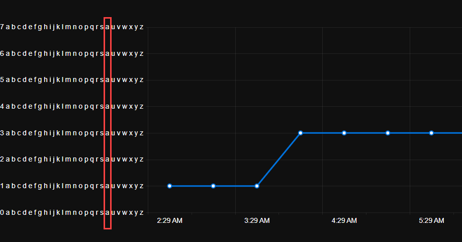
I discovered this as my original unit was 'Count' which was being displayed at runtime on the chart as 'Couna'.
Please see the links below to see examples of the scale break feature I'm looking for: Scale Breaks - ChartView - Telerik UI for WinForms.
https://docs.telerik.com/devtools/aspnet-ajax/controls/chart/features/scale-breaks
I know about Logarithmic Axis as well, but it's not exactly what I'm looking for.
Hello,
Please consider a built-in way to add spacing (gaps, margins, etc.) between the segments of a Donut and Pie charts. The <ChartSeries> tag has such parameters, but they are used for other settings or other series types.
Currently, it is possible to achieve the desired appearance with custom CSS, but that requires knowledge about the Chart rendering.