This might not be considered a bug but since this behavior changed when we upgraded to 3.0, it might be considered as such unless there is no documentation about this (we have not been able to find it). I am still unsure where we are to just ask support questions, as the feedback portal seem to force us into either choosing feature or bug.
After upgrading to Telerik Blazor 3.0, the captions are suddenly above the fields and no longer to the left of them. This might be preferable in some cases, but it should then be something you enable/change yourself.
How can we control this behavior (probably via CSS)?
Is it perhaps a way we can also control so that the grids popup form gets more compact, like perhaps displaying the fields in two columns instead of the default of just one?
Thanks.
---
ADMIN EDIT
The following should let the multiselect render above the custom yellow element, but it does not. A workaround is available as the second CSS snippet that you can uncomment.
<style>
    /*should work but does not*/
    .high-zindex {
        z-index: 124;/*note how this is higher than the z-index of the div element, and is higher than the default z-index of the component*/
    }

    /*workaround*/
    .k-animation-container {
        z-index: 15000;
    }
</style>

<div style="position: absolute; z-index: 123; width: 600px; height: 200px; background: yellow;">
    <TelerikMultiSelect Data="@Countries"
                        @bind-Value="@Values"
                        Placeholder="Enter Balkan country, e.g., Bulgaria"
                        ClearButton="true" AutoClose="false"
                        PopupClass="high-zindex">
    </TelerikMultiSelect>
</div>

@code {
    List<string> Countries { get; set; } = new List<string>();
    List<string> Values { get; set; } = new List<string>();

    protected override void OnInitialized()
    {
        Countries.Add("Albania");
        Countries.Add("Bosnia & Herzegovina");
        Countries.Add("Bulgaria");
        Countries.Add("Croatia");
        Countries.Add("Kosovo");
        Countries.Add("North Macedonia");
        Countries.Add("Montenegro");
        Countries.Add("Serbia");
        Countries.Add("Slovenia");

        base.OnInitialized();
    }
}
---
Hi Telerik,
I have been using MudBlazor for my latest project (smaller one), but we are scaling up for another larger project now and are looking at the Telerik UI for Blazor.
Does Telerik UI for Blazor have an equivalent to the MudBlazor AppBar, an application wide top bar which is persistent through out the application life cycle?
Its able to contain other controls ie drawer icon, login/out button, spacers etc.
PS: See attached screen dump of the app bar.
Best regards
Ulrik
Dear Telerik!
As a developer I am very pleased with the UI components that you are providing for .NET Blazor systems.
Even though, we often update the datasource of an autocomplete field (e.g.: TelerikMultiSelect) using an HTTP request. And invoking this endpoint on every new character is not the most economic approach. We did some workaround with timers and etc. but this way the code become needlessly complicated and introduced new bugs also.
Please consider creating a component or enabling the existing ones with an event that is fired on every input changes. But it waits a little time after the last input change and keeps collecting the additional characters so the event can present batches of inputs.
Kind regards,
Balázs Koncz
Is it possible to add to the carousel a thumbnail scrollable navigation below the "page/image"? I'm thinking this would be a nice addition, which would allow independent scrolling from that of the current page and also be clickable in the same way that the dots are in order to jump to the selected page.
----------ADMIN EDIT----------
The knowledge base article is now live - "Carousel Thumbnail Scrollable Navigation".
Thanks,
James
Thanks and best regards,
Sten
Blazor first steps bug in documentation, Primary="true" gives an error.
https://docs.telerik.com/blazor-ui/getting-started/server-blazor
Step 3 - Add a Telerik Component to a View
<TelerikButton OnClick="@SayHelloHandler" Primary="true">Say Hello</TelerikButton>
Primary = "true" gives an error with version 3, sb different for .net 6 and use ThemeColor
PopupHeight is no longer a valid property.
DatePicker shows format string when no value is selected. If you have a form a DatePicker bound to a nullable DateTime, it will show the formatting string when no value is selected, instead of just showing an empty box. This is very confusing to the end user compared to just an empty box. We have not found a way to change this.

In order to be able to easily work on mobile (tablet) and desktop browsers using touch it would be great if tree view supported multi select through a single click to select and click to unselect option without the need to hold down the ctrl key or anything like that
This can be worked around currently implementing a TreeView template and then the OnClick event to allow custom tracking of selected and unselected items but this feels like a common enough requirement for touch support that it would be great to support out of the box with the control
Would be nice to have a MapView for Blazor. Is this in the works?
---
ADMIN EDIT
In the meantime, you can use the Kendo Map widget in a fashion similar to this project.
---
In https://docs.telerik.com/blazor-ui/components/grid/manual-operations?_ga=2.192647914.1753502014.1641929648-330381368.1614276734
in the code section of Get Information From the DataSourceRequest you are using a @function instead of an @code. Still works, but so 2019.
The second issue, typo in https://github.com/telerik/blazor-ui/tree/master/grid/datasourcerequest-on-server readme, DataSourceRequet should be DataSourceRequest
See more details in the following KB article: https://docs.telerik.com/blazor-ui/knowledge-base/textbox-validate-on-change and if the behavior and solution there do not fit your needs, leave your comments and ideas on how you want this exposed for configuration and what the desired behavior is. Also, make sure to Vote for this enhancement so we can gauge the public interest in it.
Hi,
It seems when using popup form editing with the DataGrid, the displayformat is lost even though it is displayed correctly in non edit mode. This seem to be true regardless if you specify it with Data Annotations of as DisplayFormat in markup.
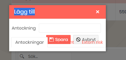
It seems that the TabBar convers some parts of the popup form from the Grid. See image. If we move the grid outside of the TabBar, the problem goes away.