When I select value that is right after first range I cannot scroll back to the previous range again due to a mechanism that makse scroling near to the selected value harder.
This is something I will continue to push for, and have been for two years. We NEED a Month View that is able to hold more than two appointments without showing the ellipse button. See my previous comments at https://feedback.telerik.com/blazor/1527587-allow-displaying-more-than-two-events-per-day-in-the-scheduler-month-view
Hello,
it seems there is a bug related to the subject. Run this REPL please https://blazorrepl.telerik.com/wRFaYnEq276w3dK528 and follow the steps in the attached video.
Very thanks.
Miroslav
Hi,
I see this feature request which is marked as COMPLETED in v2.28 (I`m running v3.7) but I don`t see how to achieve the functionality of having a blank placeholder for a DateTimePicker which has a null datetime variable bound it.
Are you able to help please?
Regards,
Tom
Per API documentation, the Decimals property defaults to what is set in the user's region (culture). This is a flawed design.
Why would one think that ALL properties of type double or float in grid models should be truncated to 2 decimal places (when my region is set to US and that is the default)?
This seriously limits property values. Not everything is a dollar and cent value! The region setting I believe is for how to format general currency values perhaps (I am not exactly sure what it is for, because there is a different tab for 'Currency' with a 'No. of digits after decimal' setting as well as the tab for 'Numbers' having the same thing. But this does not mean that Windows always formats numbers that way.
Suppose for example I have a property in my model named "Weight" (expressed in terms of pounds). The value 150.12345 (pounds) is perfectly valid. It should not be truncated to 150.12. Or another, "Length" (expressed in terms of Feet): 17.0625 (that's 17 feet, 1 inch) - should not be morphed into 17.06.
To work around this, developers currently either have to override a <GridColumn>'s <EditorTemplate> and place a <TelerikNumericTextBox> element bound to the same property that the <GridColumn> is, and explictly set the Decimals property themselves.
Or what I have found is a better workaround, although not desirable to have to do this at all, is to put this kind of code snippet in the Program.cs file, right after the line var app = builder.Build();
app.UseRequestLocalization(action =>
{
var currentCulture = CultureInfo.CurrentCulture.Clone() as CultureInfo;
currentCulture!.NumberFormat.NumberDecimalDigits = 10; // for example, to allow this many decimal places in everything numeric
var cultures = new List<CultureInfo>() { currentCulture };
action.SupportedCultures = cultures;
});
Please remove the default value for the Decimals property being tied to the culture. It should just allow as many decimal places as a normal float or double would allow for its precision. Perhaps just allow a developer to set it and honor that, but if not set, basically let it be unlimited, just like the number of digits to the left of the decimal point.
Hello there,
I encountered an issue with the TelerikForm component after upgrading Telerik.UI.for.Blazor from version 4.0.1 to 4.4.0. In the code below I have placed the two form items in a Bootstrap grid:
<TelerikForm Model="@person">
    <FormValidation>
        <DataAnnotationsValidator></DataAnnotationsValidator>
    </FormValidation>
    <FormItems>
        <div class="row">
            <div class="col-md-6">
                <FormItem Field="@nameof(Person.Id)" LabelText="Id"></FormItem>
            </div>
            <div class="col-md-6">
                <FormItem Field="@nameof(Person.FirstName)"
                        EditorType="@FormEditorType.TextArea"
                        LabelText="First name">
                </FormItem>
            </div>
        </div>
    </FormItems>
</TelerikForm>
With version 4.0.1, the two fields were displayed in two columns within the form element. However, with version 4.4.0, I noticed that the HTML code, specifically the div elements, are now rendered outside of the form element. The HTML structure looks like this:
<div class="row">
	<div class="col-md-6">
	</div>
	<div class="col-md-6">
	</div>
</div>
<form class="k-form telerik-blazor k-form-md" dir="ltr" style="">
	<div class="k-form-field">
		<label class="k-label k-form-label" for="a6cc8103-4d52-4377-8656-169e4a3de33a">
            Id
		</label>
		<div class="k-form-field-wrap">
......
I wanted to check with you if this change is intentional or if it might be a bug with the TelerikForm component in the latest version.
Best regards,
Ivaylo
Repl demo link: https://blazorrepl.telerik.com/cROhmgvP088tMZDF58
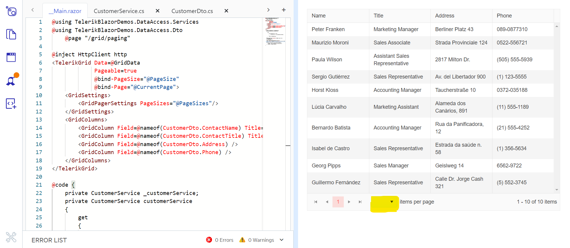
Unexpected scroll behaviour is seen after selecting an item in a DropDownList/Multiselect with a scroll mode set to virtualise. We are unable to easily scroll upwards using the scroll bar in the control or using a mouse/trackpad. The scroll position immediately snaps back to the selected item. Sometimes we are able 'escape' this by rapidly scrolling but this does not feel like intended behaviour.
Downward scrolling seems okay and using the keyboard arrow keys also seems unaffected. This is reproducible on the demo page: Blazor DropDownList - Virtualization - Telerik UI for Blazor and https://docs.telerik.com/blazor-ui/components/multiselect/virtualization.
Reproduction steps on Chrome:
- Navigate to demo page and render local example preview
- Select item "Name 27"
- try to scroll up with the arrow buttons on the scrollbar or the mouse wheel
Minimal reproducible example: Blazor MultiSelect - Virtualization - Telerik UI for Blazor
Hello,
I need to perform some tasks in case of pressing some keyboard shortcuts. For example when a user press Alt+Enter key combination. But it seems that your grid catches this key combination as well and performs its action (Editing the current cell and jumping to the next one below). How can I suppress this behavior please? Maybe not just for this key combination but more generally.
I attached a small sample to better demonstrate the problem. Just run the sample please, focus some cell in the grid and press Alt+Enter.
Very thanks.
Miroslav
Is there any scope to add a Blazor Ranged Bar/Column Chart component as seen in other products:
- Telerik Web Forms Range Column Chart - RadHtmlChart - Telerik UI for ASP.NET AJAX
- Demo of core features in jQuery Range Bar Charts widget | Kendo UI for jQuery (telerik.com)?
We attempted to work around this by adding an invisible stacked series underneath our dataset. However, without the Ability to customize the highlighted/hovered series item (telerik.com), we are not able to effectively hide the invisible series from the user. We will have to fall back into the jQuery Kendo UI components once again. Alternatively, are there any other known work arounds to achieve this in Blazor?
We have had major complaints from users when using the combo box. They use the filter, see the first item highlighted, then click tab and the item in not selected. They do a lot of data entry and don't want to use the mouse or use the down arrow to select it. They are used to a regular HTML select control which works that way. Is there any Javascript workaround for this? If not, I probably have to go back to using a standard select box. The reason I am using the combobox and not the dropdown is because your dropdown doesn't support tabbing out of the box and that was a deal breaker for them.
I saw an article on using the PopupClass for the ComboBox but that isn't a supported property.
Thanks!
In a cascading parent/child scenario (both DropDownLists), the args.Request.Skip property in the child's OnRead handler is not reset after rebinding the child data from the OnChange of the parent. This is a problem when the Skip is larger than the total amount of child items that are available from the back-end for the new parent. The api that is called in the OnRead handler returns nothing when for example the Skip still is 15 and there are only 10 items available.
I tried many things (in many different orders) to clear the child's state properly:
- set the model property which is bound to the child to it's default value
- called StateHasChanged()
- played around with Task.Delay
- set the child's value to it's default value
- set the child's Data property to null
- set the child's Data property to an empty list
- called child.Refresh()
- called child.Rebind()
- even tried to use reflection to reset the private proteced Skip property
Sort of a workaround:
In the OnRead handler after the api call compare the total item count with the skip and refetch with skip = 0 when skip > total item cound. This gives me the data I need but it is still shown at the old Skip position (with a buch of empty lines before that).
This bugreport (https://feedback.telerik.com/blazor/1558042-cascading-virtual-dropdownlist-does-not-reset-scrollbar) seems similar. In a response we are advised to clear the scrollbar position maually (which sounds a bit like the Skip position).
Please advise on how to reset the state manually because I don't see how. And if this is not possible, please add some functionality to do so. Perhaps something like the DataGrid's GetState, SetState methods?
Regards,
Harmen
Hello,
is there a way to use the kendo-popup from https://www.telerik.com/kendo-angular-ui/components/popup/ in Telerik UI for Blazor? Is it a planned feature for the future?
Thank you,
Christian
Please add organizational chart control similar with
https://demos.telerik.com/aspnet-ajax/orgchart/examples/overview/defaultcs.aspx
Hi we are using blazor for mobile apps.
For image upload via Camera, we need features where by compressed images can be upload.
Also zoom in and zoom out features when we are showing at front end app
It would be helpful to have a <WindowFooter> template inside Window, like <WindowTitle>, or <WindowContent> that stays 'sticky' to the window, so buttons and other content can be placed there , regardless on the height of the window and its contents.
Regards
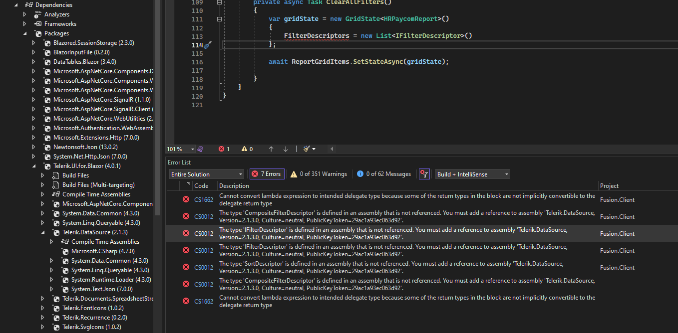
After the update
we're having this issue when trying to build our project.
The needed nuget package it's already added and even adding the Telerik.DataSource as a package that's not needed in theory we're not able to build.
Error CS0012 The type 'CompositeFilterDescriptor' is defined in an assembly that is not referenced. You must add a reference to assembly 'Telerik.DataSource, Version=2.1.3.0, Culture=neutral, PublicKeyToken=29ac1a93ec063d92'.
Title: WCAG 4.1.2: Ensures elements with ARIA roles have all required ARIA attributes (.k-splitbar)
Tags: Accessibility, WCAG 4.1.2, aria-required-attr
Issue: Ensures elements with ARIA roles have all required ARIA attributes (aria-required-attr - https://accessibilityinsights.io/info-examples/web/aria-required-attr)
Target application: xxx
Element path: .k-splitbar
Snippet: <div tabindex="0" role="separator" class="k-splitbar k-splitbar-vertical k-splitbar-draggable-vertical">
How to fix:
Fix any of the following:
Required ARIA attribute not present: aria-valuenow
Environment: Microsoft Edge version 111.0.1661.41
====
This accessibility issue was found using Accessibility Insights for Web 2.37.3 (axe-core 4.6.3), a tool that helps find and fix accessibility issues. Get more information & download this tool at http://aka.ms/AccessibilityInsights.
=================== code ===============================
<TelerikTabStrip TabPosition="Telerik.Blazor.TabPosition.Top" @ref="@TabStrip" Height="100%">@{
foreach (var console in ViewModel.AvailableConsoles)
{
<TabStripTab Title="@console.Title" Disabled="@console.Disabled">
<div style="height:100%">
@RenderContent(console)
</div>
</TabStripTab>
}
}
</TelerikTabStrip>