When user click into the date picker textbox, the placeholder value is changed to what's set to "format" for the date picker. For example, I have the following configured:
<TelerikTimePicker Placeholder="dd/mm/yyyy" Format="dd/MM/yyyy"></TelerikTimePicker>
The control will display "dd/mm/yyy" in the textbox, however, when user click into the textbox, the placeholder value changes to "dd/MM/yyyy".
I want to use a token to access the Telerik NuGet feed for my CI/CD builds, instead of using credentials.
---
ADMIN EDIT
At the moment, the options for that are:
- Have an account in your company that is assigned a license and is used for builds. A trusted human developer can also use it to access the components and do their daily work. They should make sure to not change their password, or to notify the people who can update it in the secrets in the CI/CD pipeline immediately.
- Make your own private nuget feed and ensure the Telerik packages you want in it are available there. It can be as simple as a network location internal to your company. Make sure that this feed is not publicly available, however. When you need to upgrade, make sure to copy the new packages to that feed too so automated builds can access them.
You can read more details and some troubleshooting tips in the CI and CD Automated Builds section of our documentation.
The goal of this request is to provide a way to detach the user credentials from the builds so that they can use their accounts freely, and only provide necessary keys to the build pipeline, and those keys can be updated/revoked as needed. This would also avoid manual work on downloading and copying new nuget packages to a custom feed.
---
<TelerikDatePicker Id="startDate" @bind-Value="@StartDate" Width="160px" Format="dd-MMM-yy"></TelerikDatePicker>
DateTime StartDate=DateTime.Now
When our users type to click on the year and type another one they lose one of the digits - so if they try typing 19 or 18 for instance then it sets the date to year 01
Current implementation of Theme Color is annoying.
- Setting the ThemeColor to be a static class instead of an ENum is bizarre. It makes it really annoying to pass a typed themeColor into an input parameter. I can understand the want to be more flexible and the inputs to your controls being a string
- You are re-using the ThemeColor in several different places where it is simply repeated. This makes things really annoying.
I recommend:
- Keeping the inputs to your controls for theme colors to be a string, so you can maintain the flexiblity (reason I assume you changed this in the first place)
- Use a single enum and in the documentation / examples say by default use "nameof(ThemeColor.Primary) for default themes" You can add your own custom theme by .... and pass in a string.
Hi
Passwords are not yet supported. There is a DataAnotations Datatype for that. So technically this is possible and should not be a big deal. Almost all apps have a password entry somewhere.
Example:
class LoginModel
{
[Required]
[Display(Name = "User Name")]
public string UserName { get; set; }
[Required]
[DataType(DataType.Password)]
[Display(Name = "Password")]
public string Password { get; set; }
}
Annoying because then you have to do the form fields all manually because of the password.
Thanks for considering.
Best regards, Michael
Hi. VS 2022 version 17.2.4, C#, Windows 11
I thought I'd have a look at blazor and selected the Telerik version in the new projects window and ran through the wizard.
I selected the dashboard look, .net 6, teleric UI for blazor 3.4.0 (Dev) and to enable localization, which is what I assume to be the cause of the following error message. There were no other hints and as I've never tried blazor or telerik for
blazor I don't know if there's anything missing from the solution. If I ran another wizard without localization there was no error.
An error occurred while running the wizard.
Error executing custom action Telerik.Blazor.VSX.Actions.CopyBlazorLocalizationResourcesAction: System.Collections.Generic.KeyNotFoundException: The given key was not present in the dictionary.
at System.ThrowHelper.ThrowKeyNotFoundException()
at System.Collections.Generic.Dictionary`2.get_Item(TKey key)
at Telerik.Blazor.VSX.Actions.CopyBlazorLocalizationResourcesAction.Execute(WizardContext wizardContext, IPropertyDataDictionary arguments, IProjectWrap project)
at Telerik.VSX.WizardEngine.ActionManager.ExecActions()
Hello,
Please add an expandable and collapsible panel (container), similar to the ExpansionPanel in Kendo UI.
Pretty simple. With each release the product examples in the Github repo should be updated.
For example, I am looking at the drawer -> sidenav example. Before I can even run the example, I now need to go through all the code to make the updates from 2.14.1 to 3.4.0. Some of the changes that I have to make are:
- TelerikButton no longer supports the Primary attribute
- Drawer content needs now needs to be in a <DrawerContent> element not <Content>
I should not have to make these updates to look at an example, especially when it is referenced from a forum posting.
I should just be able to compile and run the example.
Blazor load on demand (as users keys in) combo-box with multi column
Just Moving from Ajax UI to Blazor
Used the search box a lot - multi-columns, had first match as typed toward an item,filtering, a click return the item selected
Wonderful
please can we have a blazor version?
Nick
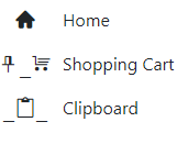
In the example below, the home icon is displayed correctly but the two with underscores are not. Moving the span outside the drawer does display correctly.
<TelerikRootComponent>
<TelerikDrawer Data="@NavigablePages"
@bind-Expanded="@DrawerExpanded"
MiniMode="true"
Mode="@DrawerMode.Push"
@ref="@DrawerRef"
@bind-SelectedItem="@SelectedItem">
<Template>
<div class="k-drawer-items">
<ul>
<li class="k-drawer-item" style="white-space:nowrap">
<span class="k-icon material-icons" style="margin-right: 8px;">home</span>
@if (DrawerExpanded)
{
<span class="k-item-text">Home</span>
}
</li>
<li class="k-drawer-item" style="white-space:nowrap">
<span class="k-icon material-icons" style="margin-right: 8px;">shopping_cart</span>
@if (DrawerExpanded)
{
<span class="k-item-text">Shopping Cart</span>
}
</li>
<li class="k-drawer-item" style="white-space:nowrap">
<span class="k-icon material-icons" style="margin-right: 8px;">content_paste_search</span>
@if (DrawerExpanded)
{
<span class="k-item-text">Clipboard</span>
}
</li>
</ul>
</div>
</Template>
<DrawerContent>
<div class="content px-4">
@Body
</div>
</div>
</DrawerContent>
</TelerikDrawer>
</TelerikRootComponent>
Hi good morning. I am implementing a FileManager control, but by business logic only certain users have permission to rename files. So in the onEdit method I validate the permission and if it doesn't have it I send a DialogFactory and after that I send an args.IsCancelled = true. And at the end of the event if I click on another item (file) inside the folder. throw an exception:
public async Task OnEdit(FileManagerEditEventArgs args)
    {
        Dialogs.AlertAsync(message, "FileManager");
        args.IsCancelled = true;
    }
crit: Microsoft.AspNetCore.Components.WebAssembly.Rendering.WebAssemblyRenderer[100]
Unhandled exception rendering component: Object reference not set to an instance of an object.
System.NullReferenceException: Object reference not set to an instance of an object.
at Telerik.Blazor.Extensions.ReflectionExtensions.GetPropertyValue(Object target, String propertyName)
at Telerik.Blazor.Components.TelerikFileManager`1[[XXX.WASM.Shared.HierarchicalFileEntry, XXX.WASM.Shared, Version=1.0.0.0, Culture=neutral, PublicKeyToken=null]].ConvertToFileEntry(Object dataItem)
at Telerik.Blazor.Components.FileManager.FileView.FileManagerFileViewBase`1[[XXX.WASM.Shared.HierarchicalFileEntry, XXX.WASM.Shared, Version=1.0.0.0, Culture=neutral, PublicKeyToken=null]].ConvertToFileEntry(Object dataItem)
at Telerik.Blazor.Components.FileManager.FileView.FileManagerListFileView`1.<>c__DisplayClass17_2[[XXX.WASM.Shared.HierarchicalFileEntry, XXX.WASM.Shared, Version=1.0.0.0, Culture=neutral, PublicKeyToken=null]].<BuildRenderTree>b__8(RenderTreeBuilder __builder3)
at Microsoft.AspNetCore.Components.Rendering.RenderTreeBuilder.AddContent(Int32 sequence, RenderFragment fragment)
at Telerik.Blazor.Components.ListView.ListViewItem`1[[XXX.WASM.Shared.HierarchicalFileEntry, XXX.WASM.Shared, Version=1.0.0.0, Culture=neutral, PublicKeyToken=null]].<BuildRenderTree>b__17_0(RenderTreeBuilder __builder2)
at Microsoft.AspNetCore.Components.Rendering.RenderTreeBuilder.AddContent(Int32 sequence, RenderFragment fragment)
at Microsoft.AspNetCore.Components.CascadingValue`1[[Telerik.Blazor.Components.ListView.IListViewCommandContainer, Telerik.Blazor, Version=3.3.0.0, Culture=neutral, PublicKeyToken=20b4b0547069c4f8]].Render(RenderTreeBuilder builder)
at Microsoft.AspNetCore.Components.Rendering.ComponentState.RenderIntoBatch(RenderBatchBuilder batchBuilder, RenderFragment renderFragment, Exception& renderFragmentException)
.jpg)
We're a paying customer for the Blazor software components under AVEVA.
We need to do a substantial amount of custom real-time drawing on top of a Blazor based map control using a layer rendered on top of the Tile Layer. The currently supported Map layers are somewhat specific to smaller map indicators and static overlays.
Our rendering subsystem doing this drawing will be using SkiaSharp/Skia on WebAssembly, drawing on a Skiasharp canvas in the browser (this already works). I'm assuming behind the scenes the Map is drawing with a standard HTML canvas.
I believe we need a solution which resembles the following:
- The Image is a layer rendered on top of the map viewport (as opposed to the entire map canvas)
- The Image layer can know the size of the ViewPort so it can create an identical size image (or perhaps this is handled automatically by the Map control)
- The Image layer can be re-rendered as often as the customer code desires (we're showing realtime data on top of maps, so we will want to re-render the Image layer say every 250ms.
- When the map viewport changes (pan, zoom, etc.), events are fired so the Image layer customer code can re-render the image based on the new viewport coordinates and zoom level.
- Click events are passed through the Image Layer for processing.
Since we're using a different rendering technology than the underlying map control, my assumption is the best way to keep this simple is our code draws to a SkiaSharp canvas then converts that to PNG/BMP/whatever so that can be injected into the Image layer for rendering.
It would be expected that every pan/zoom/viewport change causes an entire re-rendering of the Image layer.