Currently when setting up a new Blazor app I need to go to the docs each time or look at a reference project to remember the resource paths for the CSS files. Additionally once you have a project if you are relying on a CDN but later update the NuGet package your app will be referencing the wrong css bundle unless you remembered to also update your layout.
Instead of having this as a magic string that is required in each project, it would be great if a new helper class could be introduced. As an example it might look something like:
public class TelerikResources
{
    public class Cdn
    {
        public class Default
        {
            public string Path = "";
        }

        public class Bootstrap
        {
            public string Path = "";
        }

        public class Material
        {
            public string Path = "";
        }
    }

    public class Local
    {
        public class Default
        {
            public string Path = "";
        }

        public class Bootstrap
        {
            public string Path = "";
        }

        public class Material
        {
            public string Path = "";
        }
    }
}
This would have the benefit that in the layout you might simply have:
<link href="@TelerikResources.Cdn.Bootstrap.Path" rel="stylesheet" />
This has a few benefits. It's easier to remember, easier to discover the other available prebuilt styles, and removes issues with pointing at the wrong path after updating library versions (assuming that you're using the Cdn rather than local resource).
1) Validation of handwritten value after loosing focus.
When there are restrictions for min / max values of component, user can't picks invalid date with dropdown and validation works perfectly. However when user enters value as a string, telerik component lets him do that without any alerts. After loosing focus component sets date that match to chosen interval. The problem arrives when user clicks "Save button" after handwritten invalid date and Telerik corrects it by itself with valid but not always correct date from user side. Is it normal situation or there might be a solution to prevent possibility of entering of invalid date before loosing control?
2) Result date after handwritten input that out of accessible range.
After input of out of range date Telerik compute valid date and set it in component. May be situation when user entered correct value for the first time and then tried to change it to invalid, then he would lose his first entered date. Maybe should save last valid date for the next attempts of inputs or leave component logic in current condition?
There is example of situation:
1. TelerikDateTimePicker.Max = 11/1/2021 6:12 PM;
2. User picks date 11/1/2021 6:07 PM;
3. User decides to set 11/1/2021 6:35 PM and writes it in text field;
4. Telerik corrects its date to 11/1/2021 6:03 PM because it's valid, but previous user date was lost.
Hi,
I have found some evidence of a bug which I believe add to the portrait of this issue which has already been reported but declined. Could you please have a look at my recent comments and report it to follow on it (so it remains active)?
https://feedback.telerik.com/blazor/1532895-initcheckbox-was-undefined
Regards.
Maurice.
I just updated to Telerik.UI.for.Blazor 2.30.0 and the grid search boxes look a little screwy. Not a huge deal but thought I would report it.
Hello,
I'm using a numeric textbox and when I test my page for accessibility, Allyable reports the following:
Category: Ensure button or link have discernible text that is not repeated as image description
Selector: .k-form-field-wrap > .k-numerictextbox.k-widget > .k-numeric-wrap > .k-select > [role="button"].k-link-decrease
Severity: Critical
Here is my source code:
<TelerikNumericTextBox @bind-Value="@cardCleaner.Quantity" Id="cleanerQty" Width="100px" />
Is this really an accessibility issue?
Thanks,
Bernard
It seems that the TabBar convers some parts of the popup form from the Grid. See image. If we move the grid outside of the TabBar, the problem goes away.
After the upgrade to 3.0 the auto size feature of TextArea when used inside the Window component no longer works.
This might not be considered a bug but since this behavior changed when we upgraded to 3.0, it might be considered as such unless there is no documentation about this (we have not been able to find it). I am still unsure where we are to just ask support questions, as the feedback portal seem to force us into either choosing feature or bug.
After upgrading to Telerik Blazor 3.0, the captions are suddenly above the fields and no longer to the left of them. This might be preferable in some cases, but it should then be something you enable/change yourself.
How can we control this behavior (probably via CSS)?
Is it perhaps a way we can also control so that the grids popup form gets more compact, like perhaps displaying the fields in two columns instead of the default of just one?
Thanks.
Maybe I'm doing it wrong...
I have a Telerik Window that is modal=true
Within the Telerik Window, I have a component... and within that component, other components.
I want to post a TelerikDialog. "Do you want to save changes?"
If I add it to the component, it appears behind the main modal.
If I add it to the main Telerik Window, it doesn't appear at all.
How do you show a TelerikDialog on a TelerikWindow that is modal?
-Bert
When you have a TelerikNumericTextBox bound to a non nullable field (like int test) it will display a 0 like this which is correct

But when you start changing the value, that initial 0 will still remain like (1234 entered)

It will however sort itself out once you leave the field

But it is still confusing to users and also makes then try to remove the initial 0.
The initial 0 should not be displayed when user has switched focus to a field and started entering text. This problem does not seem to happen if you have already entered a value and revisit the textbox.
Ideally formatting (in this case currency) should also be displayed when in Edit but that is perhaps another topic.
Thanks.
Hi, we are using a tile layout for charts and are having an issue where the tooltips for the second row of tiles are appearing at the bottom of the screen away from the chart or not at all. Then when we scroll back to the first row of tiles the tool tips are out of alignment as well. The following screen shot shows an example.
We have a component that has a tab strip and the tile layout with the following code
<TabStripTab Title="@tabName">
	@((MarkupString)tabHeading)

	<TelerikTileLayout Columns="6"
						RowHeight="225px"
						ColumnWidth="285px"
						Reorderable="true"
						Resizable="true"
						OnResize="@ItemResize"
						OnReorder="@ItemReorder"
						@ref="@TileLayout">
		<TileLayoutItems>
			@foreach (CustomChartViewModel chart in tab.Charts)
			{
				int colSpan = 2;
				int rowSpan = 2;

				<TileLayoutItem RowSpan="@rowSpan" ColSpan="@colSpan">
					<HeaderTemplate>
						<div style="text-align: right">
							<TelerikButton OnClick="@(() => onDeleteChart(chart.Id, tab.Id))">X</TelerikButton>
						</div>
					</HeaderTemplate>
					<Content>
						<ChartComponent ViewModel="@chart" @ref="@charts[chart.Id]" />
					</Content>
				</TileLayoutItem>
			}
		</TileLayoutItems>
	</TelerikTileLayout>
</TabStripTab>
And then a chart component that renders the individual charts with a tooltip
<TelerikChart @ref="@ChartRef" Height="100%" Width="100%" OnSeriesClick="@OnSeriesClickHandler">
	<ChartTooltip Visible="true">
		<Template>
			<TelerikIcon Icon="information" />
                    @(context.Percentage.ToString("P", nfi))<br />
					@((context.DataItem as MyDataModel).toolTip)
		</Template>
	</ChartTooltip>
	<ChartSeriesItems>
		<ChartSeries Type="ChartSeriesType.Donut" Data="@Data" Field="value" CategoryField="category" ColorField="color">
			<ChartSeriesLabels Position="ChartSeriesLabelsPosition.OutsideEnd"
							   Visible="@ViewModel.ShowLabels"
							   Background="transparent"
							   Template="#= category #: #= value#">
			</ChartSeriesLabels>
		</ChartSeries>
	</ChartSeriesItems>

	<ChartTitle Text="@ViewModel.Name"></ChartTitle>

	<ChartLegend Position="ChartLegendPosition.Bottom" Visible="@ViewModel.ShowLegend"></ChartLegend>
</TelerikChart>
Not finding any examples or similar, so I wanted to see if there is a way to include a Gantt Chart into a WordsProcessing document. I am currently bringing the data into a table, but my end-user has requested to see the chart view of the same data.
if (JobMilestones.Count > 0)
        {
            editor.InsertText("MILESTONES").FontWeight = FontWeights.Bold;


            Table tblMilestone = editor.InsertTable(JobMilestones.Count + 1, 3);
            tblMilestone.PreferredWidth = new TableWidthUnit(720);
            Paragraph p = tblMilestone.Rows[0].Cells[0].Blocks.AddParagraph();
            tblMilestone.Rows[0].RepeatOnEveryPage = true;
            tblMilestone.Rows[0].Cells[0].Borders = tcb;
            tblMilestone.Rows[0].Cells[1].Borders = tcb;
            tblMilestone.Rows[0].Cells[2].Borders = tcb;

            editor.MoveToParagraphStart(p);
            editor.InsertText("Task").FontWeight = FontWeights.Bold;
            p = tblMilestone.Rows[0].Cells[1].Blocks.AddParagraph();
            editor.MoveToParagraphStart(p);
            editor.InsertText("Start").FontWeight = FontWeights.Bold;
            p = tblMilestone.Rows[0].Cells[2].Blocks.AddParagraph();
            editor.MoveToParagraphStart(p);
            editor.InsertText("End").FontWeight = FontWeights.Bold;
            int x = 1;
            foreach (FlatModel fm in JobMilestones)
            {
                p = tblMilestone.Rows[x].Cells[0].Blocks.AddParagraph();
                editor.MoveToParagraphStart(p);
                editor.InsertText(fm.TaskTitle);
                p = tblMilestone.Rows[x].Cells[1].Blocks.AddParagraph();
                editor.MoveToParagraphStart(p);
                editor.InsertText(fm.StartDate.ToShortDateString());
                p = tblMilestone.Rows[x].Cells[2].Blocks.AddParagraph();
                editor.MoveToParagraphStart(p);
                editor.InsertText(fm.EndDate.ToShortDateString());
                tblMilestone.Rows[x].Cells[0].Borders = tcb;
                tblMilestone.Rows[x].Cells[1].Borders = tcb;
                tblMilestone.Rows[x].Cells[2].Borders = tcb;
                x += 1;
            }
            editor.MoveToTableEnd(tblMilestone);
            //editor.InsertLine("");
            editor.InsertBreak(BreakType.LineBreak);
        }
I have a telerikdropdownlist in the EditorTemplate of a Grid. If a user uses the keyboard to speed the navigation of the dropdown (for example: they type a T to immediately scroll to the T section), then clicks on a selection further down in the list, the selected item becomes the item navigated to via the Keyboard, not the item that is actually clicked on. Clicking on an item (without using the keyboard navigation first) works as expected. I was able to replicate this behavior in REPL using the following code:
<br />
<br />
<TelerikDropDownList
    Data = "@People"
    @bind-Value="@SelectedUser"
    TextField="LastFirst"
    ValueField="Id"
    Width="400px"
/>
<br />
<br />
<TelerikGrid
    Data="@Assets"
    EditMode="GridEditMode.Inline"
    Width="800px"
    OnUpdate="@Update"
    >
   <GridColumns>
       <GridColumn Field="@nameof(Asset.AssetId)" Title="ID" Width="50px"/>
       <GridColumn Field="@nameof(Asset.BarCode)" Title="BarCode" Width="125px"/>
       <GridColumn Field="@nameof(Asset.UserId)" Title="User" Width="125px">
           <Template>
                @{
                    CurrentAsset = (Asset)context;
                    Person? p = People.FirstOrDefault<Person>(x => x.Id == CurrentAsset.UserId);
                    if(p != null)
                    {
                        <span>@p.LastFirst</span>
                    }
               }
           </Template>
           <EditorTemplate>
               @{
                    CurrentAsset = (Asset)context;
                   <TelerikDropDownList
                        Data = "@People"
                        @bind-Value="@CurrentAsset.UserId"
                        TextField="LastFirst"
                        ValueField="Id"
                   />

               }
           </EditorTemplate>
       </GridColumn>
        <GridCommandColumn Width="100px" Locked="true">
            <GridCommandButton Command="Save" Icon="save" ShowInEdit="true"></GridCommandButton>
            <GridCommandButton Command="Edit" Icon="edit"></GridCommandButton>
            <GridCommandButton Command="Delete" Icon="delete"></GridCommandButton>
            <GridCommandButton Command="Cancel" Icon="cancel" ShowInEdit="true"></GridCommandButton>
        </GridCommandColumn>
   </GridColumns>
</TelerikGrid>

<br />

@code {
    public List<Person> People = new();
    public List<Asset> Assets = new();
    int SelectedUser = 0;
    Asset CurrentAsset = new();

    protected override void OnInitialized()
    {
        LoadData();
        base.OnInitialized();
    }

    public void LoadData()
    {
        People.Add(new Person(1, "Brent", "Tuominen"));
        People.Add(new Person(2, "Tina", "Tuominen"));
        People.Add(new Person(3, "Casey", "Tuominen"));
        People.Add(new Person(4, "Ryan", "Tuominen"));
        People.Add(new Person(5, "Alex", "Tuominen"));

        Assets.Add(new Asset(1, "BC001"));
        Assets.Add(new Asset(2, "BC002"));
        Assets.Add(new Asset(3, "BC003"));
        Assets.Add(new Asset(4, "BC004"));
        Assets.Add(new Asset(5, "BC005"));
    }

    public void Update(GridCommandEventArgs args)
    {
        Asset a = (Asset)args.Item;
        Asset? asst = Assets.FirstOrDefault(x => x.AssetId == a.AssetId);

        if(asst != null)
        {
            asst.BarCode = a.BarCode;
            asst.UserId = a.UserId;
        }
        StateHasChanged();
    }

    public class Asset
    {
        public Asset()
        {

        }
        public Asset(int assetId, string barcode)
        {
            AssetId = assetId;
            BarCode = barcode;
        }
        public int AssetId{ get; set; }
        public string BarCode { get; set; } = string.Empty;
        public int? UserId{ get; set; }
    }

    public class Person
    {
        public Person(int id, string fName, string lName)
        {
            Id = id;
            FirstName = fName;
            LastName = lName;
        }
        public int Id{ get; set; }
        public string FirstName { get; set; } = string.Empty;
        public string LastName { get; set; } = string.Empty;
        public string LastFirst
        {
            get
            {
                return LastName + ", " + FirstName;
            }
        }
        public string FullName
        {
            get
            {
                return FirstName + " " + LastName;
            }
        }
    }
}
Hi I have noticed that if the dropdown for an enum cannot wordwrap the item then the styling is broken, see the following the screenshot:
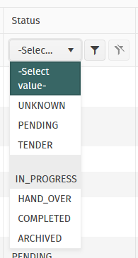
As you can see IN_PROGRESS is so long that it exceeds the column width and creates empty space above.
To me it appears as though an attempt to try to wordwrap the IN_PROGRESS but IN_PROGRESS has no applicable breaks in it.
Thanks,
Daniel
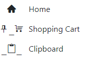
In the example below, the home icon is displayed correctly but the two with underscores are not. Moving the span outside the drawer does display correctly.
<TelerikRootComponent>
<TelerikDrawer Data="@NavigablePages"
@bind-Expanded="@DrawerExpanded"
MiniMode="true"
Mode="@DrawerMode.Push"
@ref="@DrawerRef"
@bind-SelectedItem="@SelectedItem">
<Template>
<div class="k-drawer-items">
<ul>
<li class="k-drawer-item" style="white-space:nowrap">
<span class="k-icon material-icons" style="margin-right: 8px;">home</span>
@if (DrawerExpanded)
{
<span class="k-item-text">Home</span>
}
</li>
<li class="k-drawer-item" style="white-space:nowrap">
<span class="k-icon material-icons" style="margin-right: 8px;">shopping_cart</span>
@if (DrawerExpanded)
{
<span class="k-item-text">Shopping Cart</span>
}
</li>
<li class="k-drawer-item" style="white-space:nowrap">
<span class="k-icon material-icons" style="margin-right: 8px;">content_paste_search</span>
@if (DrawerExpanded)
{
<span class="k-item-text">Clipboard</span>
}
</li>
</ul>
</div>
</Template>
<DrawerContent>
<div class="content px-4">
@Body
</div>
</div>
</DrawerContent>
</TelerikDrawer>
</TelerikRootComponent>
Current implementation of Theme Color is annoying.
- Setting the ThemeColor to be a static class instead of an ENum is bizarre. It makes it really annoying to pass a typed themeColor into an input parameter. I can understand the want to be more flexible and the inputs to your controls being a string
- You are re-using the ThemeColor in several different places where it is simply repeated. This makes things really annoying.
I recommend:
- Keeping the inputs to your controls for theme colors to be a string, so you can maintain the flexiblity (reason I assume you changed this in the first place)
- Use a single enum and in the documentation / examples say by default use "nameof(ThemeColor.Primary) for default themes" You can add your own custom theme by .... and pass in a string.