1) Validation of handwritten value after loosing focus.
When there are restrictions for min / max values of component, user can't picks invalid date with dropdown and validation works perfectly. However when user enters value as a string, telerik component lets him do that without any alerts. After loosing focus component sets date that match to chosen interval. The problem arrives when user clicks "Save button" after handwritten invalid date and Telerik corrects it by itself with valid but not always correct date from user side. Is it normal situation or there might be a solution to prevent possibility of entering of invalid date before loosing control?
2) Result date after handwritten input that out of accessible range.
After input of out of range date Telerik compute valid date and set it in component. May be situation when user entered correct value for the first time and then tried to change it to invalid, then he would lose his first entered date. Maybe should save last valid date for the next attempts of inputs or leave component logic in current condition?
There is example of situation:
1. TelerikDateTimePicker.Max = 11/1/2021 6:12 PM;
2. User picks date 11/1/2021 6:07 PM;
3. User decides to set 11/1/2021 6:35 PM and writes it in text field;
4. Telerik corrects its date to 11/1/2021 6:03 PM because it's valid, but previous user date was lost.
Currently when setting up a new Blazor app I need to go to the docs each time or look at a reference project to remember the resource paths for the CSS files. Additionally once you have a project if you are relying on a CDN but later update the NuGet package your app will be referencing the wrong css bundle unless you remembered to also update your layout.
Instead of having this as a magic string that is required in each project, it would be great if a new helper class could be introduced. As an example it might look something like:
public class TelerikResources
{
    public class Cdn
    {
        public class Default
        {
            public string Path = "";
        }

        public class Bootstrap
        {
            public string Path = "";
        }

        public class Material
        {
            public string Path = "";
        }
    }

    public class Local
    {
        public class Default
        {
            public string Path = "";
        }

        public class Bootstrap
        {
            public string Path = "";
        }

        public class Material
        {
            public string Path = "";
        }
    }
}
This would have the benefit that in the layout you might simply have:
<link href="@TelerikResources.Cdn.Bootstrap.Path" rel="stylesheet" />
This has a few benefits. It's easier to remember, easier to discover the other available prebuilt styles, and removes issues with pointing at the wrong path after updating library versions (assuming that you're using the Cdn rather than local resource).
With the default templates for a blazor project there are options for security.
We really need this for the telerik blazor templates or a sample telerik blazor projects using the different types of security.
Rendering the TelerikCalendar control produces HTML with ARIA roles like so:
- tbody - 'rowgroup'
- tr - 'presentation' <--- this should be 'row'
- td - 'gridcell'
- tr - 'presentation' <--- this should be 'row'
Documentation: https://developer.mozilla.org/en-US/docs/Web/Accessibility/ARIA/Roles/Gridcell_role
This seems small, but looks bad on accessibility reports, especially when a calendar has 42 'gridcells', The impact is significant when seen in summary.
Alternatively, or in addition, can ARIA roles be turned of for specific controls? In this case including role attributes in the markup is not actually necessary as the roles can be implied by the HTML tags. Including roles that are incorrect is more work for more confusion.
The demos and examples for storing and retrieving GRID state uses the JavaScript localStorage.setItem and localStorage.getItem that work great. As part of .NET 5 there's a Microsoft equivalent for accessing Local Storage using Microsoft.AspNetCore.Components.Server.ProtectedBrowserStorage. I've found the behavior of these demos and examples will not work by simply replacing the JavaScript with .NET equivalents. My experience is getting Circuit Handler exceptions that make these example not work.
Although not a requirement since there's a JavaScript solution for local storage, I would like to recommend that since you partner closely with .NET team at Microsoft. That your GRID development team test and provide examples with the Microsoft .NET 5 out-of-the-box local storage solution and resolve any incompatibilities for developers not wanting to use 1st party local storage solutions embedded within Microsoft Blazor.
----
ADMIN EDIT
I made a sample test and things seemed to work for me, so I made a public example, you can find it in this pull request until it gets merged. I'm also attaching it to this post, but for anyone seeing this after a time - the public repository linked above is a better place to look for this in case more updates and information have been added since the time of writing this.
---
Is it possible to show (modal confirmation) handle filtering before apply? Show pop-up modal, and when Confirm, start filtering, othewise cancel!!
Reloading the page described down below cause memory leak. Commenting lines with telerik button prevents the problem.
@page "/"

<h3 style="position:absolute; top: 0; z-index: 1000; margin-top: 10px">Home</h3>

↓ commenting these lines prevents the memory leak
<div>
    <TelerikButton OnClick="@SayHelloHandler" Primary="true">Say Hello</TelerikButton>
    <div>@helloString</div>
</div>
↑ commenting these lines prevents the memory leak

@code {
    List<string> strings = new List<string>();

    MarkupString helloString;

    protected override void OnInitialized()
    {
        // Attempt to clear memory with Garbage Collector
        GC.Collect();
        GC.WaitForPendingFinalizers();
        for (int i = 0; i < 1000000; i++)
        {
            string a = "asdasdasdasdddddddddasasdasdasdasdddddddddasasdasdasdasdddddddddasasdasdasdasdddddddddasasda";
            strings.Add(a + "b");
        }


        base.OnInitialized();
    }

    void SayHelloHandler()
    {
        string msg = string.Format("Hello from <strong>Telerik Blazor</strong> at {0}.<br /> Now you can use <b><u><i>C#</i></u></b> to write front-end!", DateTime.Now);
        helloString = new MarkupString(msg);
    }
}
MainLayout.razor:
@layout TelerikLayout
@inherits LayoutComponentBase


<style>
    .navmenu .k-drawer-items {
        margin-top: 3.5rem;
    }

    .navmenu .k-widget.k-drawer {
        background-image: linear-gradient(180deg, rgb(5, 39, 103) 0%, #3a0647 100%);
    }

    .k-drawer-container {
        height: 100vh;
    }

    .btn-margin, .btn-margin:hover {
        width: 48px;
        height: 56px;
        color: #FFF;
    }

    .navmenu .k-drawer {
        color: #ffffffd6;
    }

    .navmenu .k-drawer-item:hover, .navmenu .k-drawer-item.k-state-hover {
        color: #ffffffd6;
        background-color: #f0f0f012;
    }

        .navmenu .k-drawer-item:hover.k-state-selected {
            color: #ffffff;
            background-color: #7bafff94;
        }

    .navmenu .k-drawer-item:not(:hover).k-state-selected {
        color: #ffffff;
        background-color: #7bafffbd;
    }

    .navmenu .k-drawer:hover .k-drawer-wrapper {
        width: 240px;
    }

    .navmenu .k-drawer .k-drawer-wrapper {
        transition-duration: 300ms !important;
    }
</style>


<TelerikDrawer Data="@NavigablePages" MiniMode="true" Mode="@DrawerMode.Push" SelectedItem="SelectedItem" Class="navmenu sidebar"
                SelectedItemChanged="ChangeSelectedItem" TItem="DrawerItem">
    <Content>
        <div class="page">

            <div class="main">
                <div class="top-row px-4 auth">
                </div>


                <div class="content px-4">
                    @Body
                </div>
            </div>
        </div>
    </Content>
</TelerikDrawer>


@code {
    List<DrawerItem> NavigablePages { get; set; } =
        new List<DrawerItem>
        {
            new DrawerItem { Text = "Home", Url = "/", Icon = "home" }
        };

    public class DrawerItem
    {
        public string Text { get; set; }
        public string Url { get; set; }
        public string Icon { get; set; }
        public bool IsSeparator { get; set; }
    }
    DrawerItem SelectedItem { get; set; }

    private void ChangeSelectedItem(DrawerItem chosenItem)
    {
        SelectedItem = chosenItem;
    }
}
This code is example. The main problem was with TelerikGrid. Usage of any telerik component caused the same memory leak.
Hi,
If Telerik can, at some point, develop a design tool like the Radzen Design Time, that would really be nice!
Thanks
Allow "items per page" and "1 - X of Y items" on the pager configurable or even allow them to be hidden/removed.
On mobile devices the telerik pager takes up too much room and needs to be more responsive. I'm already aware of this feature request: https://feedback.telerik.com/blazor/1442883-responsive-layout-for-the-pager
But I would like to take it a step further and be capable of customizing/removing the text.
Add the following Parameters to the TelerikPager:
[Parameter] public bool ShowItemsPerPageText { get; set; } = true;
[Parameter] public bool ShowXofYItemsText{ get; set; } = true;
<TelerikPager ShowItemsPerPageText="false" />
<TelerikPager ShowXofYItemsText="false" />
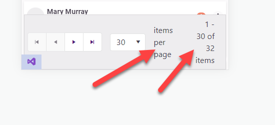
In my opinion this looks better
==============
ADMIN EDIT
==============
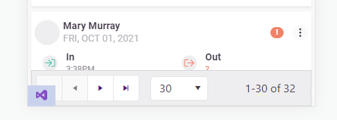
In the meantime, you can change the pager text through localization. It is important to keep the same number of placeholders, however, so that the string.Format() call it is used in will not throw.
This strings are behind the following keys:
- "items per page" - key: "Pager_ItemsPerPage"
- "1 - X of Y items" - key: "Pager_Display" . Default value is "{0} - {1} of {2} items".
I'd like to bind a model with a different field name to the TelerikCheckBoxListFilter in the filter menu. Currently, this does not work because the Data has to have a member with the same name as the Field, which is used to update the filter descriptors.
Current Situation:
I have a single API for retrieving lookup values for the filters, that are always called on-demand (when the menu displays). This also supports cascading filter menus. If I want to supply the values back to filter menu I have to make specific code for each field on the model that I want to filter. For example, if I have a FlightNumber column it looks something like this...
public async Task<IEnumerable<object>> FilterValues_FlightNumberAsync() =>
(await Service.GetFilterValuesAsync(nameof(MyModel.FlightNumber), GetLastGridRequest()))
.Select(v => new { FlightNumber = v.Value });
The results of FilterValues_FlightNumberAsync() are then passed in via FilterData below (where @Field would be set to "FlightNumber")
<TelerikCheckBoxListFilter Data="@FilterData" Field="@Field" @bind-FilterDescriptor="Filters" />
This leads to a bunch of tedious code that should not be needed... A specific FilterValues_ function is needed for every column that needs to be filtered
What would be preferable:
Being able to use a single method to retrieve filter values. e.g.
public async Task<IEnumerable<object>> FilterValuesAsync(string memberName) =>await Service.GetFilterValuesAsync(memberName, GetLastGridRequest()); // returns something like LookupValue[] which is a generic LookupValue { Value =... } class
To not break backwards compat, maybe could have an optional DataField parameter...
<TelerikCheckBoxListFilter Data="@FilterData" DataField="Value" Field="@Field" @bind-FilterDescriptor="Filters" />
This would take in LookupValues and and produce FilterDescriptors with MemberName set to Field
Or maybe event better, use generics and allow a callback to extract the filter value...
<TelerikCheckBoxListFilter Data="@FilterData" GetFilterValue="GetFilterValue" Field="@Field" @bind-FilterDescriptor="Filters" />
where GetFilterValue is a Func<TData, string> for example.
===========
ADMIN EDIT
===========
We will most likely keep the Field parameter as is (pointing to the field from the Grid data that will be used to take the distinct options) and expose something like TextField parameter that will point to the field form the TelerikCheckBoxListFilter data containing the distinct options/labels.
I am getting a combination of these two errors below when instituting SignalR
   connection = new HubConnectionBuilder()
                                             .WithUrl(nm.ToAbsoluteUri("DataHub"))
                                             .Build();
                                            connection.On("ReceivedSyncRecord", this.OnReceiveSync);
                                            StateHasChanged();

                                            await connection.StartAsync();
System.IO.InvalidDataException: Invalid negotiation response received. ---> System.Text.Json.JsonReaderException: '<' is an invalid start of a value. LineNumber: 2 | BytePositionInLine: 0. at System.Text.Json.ThrowHelper.ThrowJsonReaderException(Utf8JsonReader& json, ExceptionResource resource, Byte nextByte, ReadOnlySpan`1 bytes) at System.Text.Json.Utf8JsonReader.ConsumeValue(Byte marker) at System.Text.Json.Utf8JsonReader.ReadFirstToken(Byte first) at System.Text.Json.Utf8JsonReader.ReadSingleSegment() at System.Text.Json.Utf8JsonReader.Read() at Microsoft.AspNetCore.Internal.SystemTextJsonExtensions.CheckRead(Utf8JsonReader& reader) at Microsoft.AspNetCore.Http.Connections.NegotiateProtocol.ParseResponse(ReadOnlySpan`1 content) --- End of inner exception stack trace --- at Microsoft.AspNetCore.Http.Connections.NegotiateProtocol.ParseResponse(ReadOnlySpan`1 content) at Microsoft.AspNetCore.Http.Connections.Client.HttpConnection.NegotiateAsync(Uri url, HttpClient httpClient, ILogger logger, CancellationToken cancellationToken) at Microsoft.AspNetCore.Http.Connections.Client.HttpConnection.GetNegotiationResponseAsync(Uri uri, CancellationToken cancellationToken) at Microsoft.AspNetCore.Http.Connections.Client.HttpConnection.SelectAndStartTransport(TransferFormat transferFormat, CancellationToken cancellationToken) at Microsoft.AspNetCore.Http.Connections.Client.HttpConnection.StartAsyncCore(TransferFormat transferFormat, CancellationToken cancellationToken) at System.Threading.Tasks.ForceAsyncAwaiter.GetResult() at Microsoft.AspNetCore.Http.Connections.Client.HttpConnection.StartAsync(TransferFormat transferFormat, CancellationToken cancellationToken) at Microsoft.AspNetCore.Http.Connections.Client.HttpConnectionFactory.ConnectAsync(EndPoint endPoint, CancellationToken cancellationToken) at Microsoft.AspNetCore.Http.Connections.Client.HttpConnectionFactory.ConnectAsync(EndPoint endPoint, CancellationToken cancellationToken) at Microsoft.AspNetCore.SignalR.Client.HubConnection.StartAsyncCore(CancellationToken cancellationToken) at Microsoft.AspNetCore.SignalR.Client.HubConnection.StartAsyncInner(CancellationToken cancellationToken) at System.Threading.Tasks.ForceAsyncAwaiter.GetResult() at Microsoft.AspNetCore.SignalR.Client.HubConnection.StartAsync(CancellationToken cancellationToken) at TexicanInc.Pages.UserPages.ActiveWorkQueue.OnInitializedAsync() in C:\Users\ShawnRye\source\repos\TexicanInc\TexicanInc\Pages\UserPages\ActiveWorkQueue.razor:line 548
System.Threading.Tasks.TaskCanceledException: A task was canceled. at Microsoft.JSInterop.JSRuntime.InvokeAsync[TValue](Int64 targetInstanceId, String identifier, Object[] args) at Microsoft.JSInterop.JSRuntimeExtensions.InvokeVoidAsync(IJSRuntime jsRuntime, String identifier, Object[] args) at Telerik.Blazor.Components.Common.Animation.AnimationGroupBase.Dispose() at System.Threading.Tasks.Task.<>c.<ThrowAsync>b__140_0(Object state) at Microsoft.AspNetCore.Components.Rendering.RendererSynchronizationContext.ExecuteSynchronously(TaskCompletionSource`1 completion, SendOrPostCallback d, Object state) at Microsoft.AspNetCore.Components.Rendering.RendererSynchronizationContext.<>c.<.cctor>b__23_0(Object state) at System.Threading.ExecutionContext.RunInternal(ExecutionContext executionContext, ContextCallback callback, Object state) --- End of stack trace from previous location --- at System.Threading.ExecutionContext.RunInternal(ExecutionContext executionContext, ContextCallback callback, Object state) at Microsoft.AspNetCore.Components.Rendering.RendererSynchronizationContext.ExecuteBackground(WorkItem item)
This is useful for breaks (no appointments at lunch time) or holidays.
Hi,
I have a Blazor grid with multiple selection, and the selection is taken care of using the SelectedItemsChanged event. In that event, I want to check if the selected items satisfy certain criteria, and if not, ignore that particular selection change event.
In the attached sample project, if the EmployeeID is not 6, then the SelectedItems property would get updated. If you see the attached screenshot, that seems to almost work. Employee 6 is not highlighted like the other selected items. But the checkbox is still selected, and that would be confusing since the row is actually not a part of the selected items.
The sample project uses version 2.12, but in another project which runs 2.27, it happens there too.
Please let me know if there's something I missed.
Thanks!
I am implementing custom filtering by column in a data grid. The data source is very large so the filtering will be done by a stored procedure in the database. In order to avoid excessive calls to the procedure it would be great if the TextBox had a DebounceDelay property like the one in the SearchBox.
---
ADMIN EDIT
While not technically useful for the grid itself (see the bottom of this thread for more ideas and information on that, a built-in feature is coming there as well), there can be benefit in adding that to the inputs (e.g., the Editor has something like that already by default because it is designed for large content).
Thus, I am reopening this so we can gauge the interest.
In the meantime, using a few lines of application code can achieve debouncing of expensive api calls. Using the OnChange or OnBlur event may also be suitable workarounds, depending on the goal you are after.
---
The https://nuget.telerik.com/nuget/ is erroring when trying to restore the packages, it's currently breaking our main pipeline.
Retrying 'FindPackagesByIdAsyncCore' for source 'https://nuget.telerik.com/nuget/FindPackagesById()?id='runtime.native.System.Net.Http'&semVerLevel=2.0.0'.
Response status code does not indicate success: 500 (Internal Server Error).
  GET https://nuget.telerik.com/nuget/FindPackagesById()?id='runtime.native.System.Net.Http'&semVerLevel=2.0.0
  InternalServerError https://nuget.telerik.com/nuget/FindPackagesById()?id='Microsoft.Extensions.Hosting.Abstractions'&semVerLevel=2.0.0 290ms
  InternalServerError https://nuget.telerik.com/nuget/FindPackagesById()?id='Telerik.UI.for.Blazor'&semVerLevel=2.0.0 401ms
  InternalServerError https://nuget.telerik.com/nuget/FindPackagesById()?id='System.ServiceModel.Primitives'&semVerLevel=2.0.0 401ms
##[error]The nuget command failed with exit code(1) and error(Failed to retrieve information about 'Telerik.UI.for.Blazor' from remote source 'https://nuget.telerik.com/nuget/FindPackagesById()?id='Telerik.UI.for.Blazor'&semVerLevel=2.0.0'.
  Response status code does not indicate success: 500 (Internal Server Error).
Could you help with this?
Currently, any datepicker or dropdownlist works great in desktop, but when used in mobile, the dropdowns go off the bottom of the screen and don't fit the window correctly. Could the dropdowns and datepicker type of the controls have a special "mobile mode" for smaller screen sizes to give a more native mobile feel? Ex, the standard html select is handled much better by each device including wider options for fingers than the Telerik dropdownlist, but I'd like my site to be responsive for any screen size and not have to use two separate controls.