I'm using a numeric textbox to handle a decimal value with the Format is set to "#,0" (which it needs to be since the client's specification is to have a whitespace as a decimal separator). While the entered value is less than a thousand then the entire value gets selected when tabbing into the component, but once it's large enough to display a group separator tabbing just puts the cursor at the end of the input without selecting the value.
I believe this to be a bug.
Today I submitted ticket Telerik VS 2022 Extensions break IntelliSense/typing in Visual Studio 2022 Version 17.3.4 but it doesn't show on Support Center under 'Your Support Tickets'. The only ticket that shows is from 9 months ago.
BTW, I'm reporting this thicket and previous ticket under UI for Blazor because I didn't see how to report it for the Extensions and for Support Center. Maybe that's another thing you need to look at?
Below issue was submitted 6 days ago. Currently developers are disabling/uninstalling Telerik extensions. I don't see any relies from Telerik so submitting another bug report hoping you'll reply to this one.
Please fix it!!!
Telerik UI for Blazor 3.6.0 breaks intellisense/typing in Visual Studio 2022 Version 17.3.4
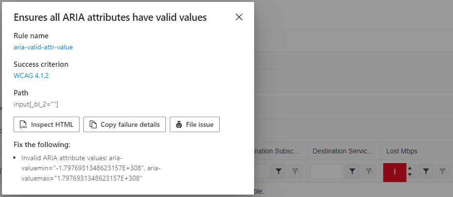
Tags: Accessibility, WCAG 4.1.2, aria-valid-attr-value
Issue: Ensures all ARIA attributes have valid values (aria-valid-attr-value - https://accessibilityinsights.io/info-examples/web/aria-valid-attr-value)
Target application: Hermes Home - https://localhost/TrafficLoss
Element path: input[_bl_2=""]
Snippet: <input tabindex="0" class="k-input-inner" role="spinbutton" aria-valuemin="-1.7976931348623157E+308" aria-valuemax="1.7976931348623157E+308" data-id="fe5748c4-0ddd-455e-ad61-aafc0e0367fb" _bl_2="">
How to fix:
Fix all of the following:
Invalid ARIA attribute values: aria-valuemin="-1.7976931348623157E+308", aria-valuemax="1.7976931348623157E+308"
Environment: Microsoft Edge version 105.0.1343.42
====
This accessibility issue was found using Accessibility Insights for Web 2.34.1 (axe-core 4.4.1), a tool that helps find and fix accessibility issues. Get more information & download this tool at http://aka.ms/AccessibilityInsights.
This is kind of hard to explain, so please see the attached Before and After videos. In these videos, I'm using a brand new .NET 6 console app.
In the Before video, the Telerik UI for Blazor extension is disabled. After I type `Console` and hit the period, I see intellisense like I expect to.
In the After video, the extension is enabled. I'm typing the same thing and hitting period, but something interrupts the period keystroke, and it never appears. Instead, it just closes the intellisense window.
I used a new console app as an example, but it's happening in all projects. It's also happening with other keys like semicolons, spaces, and tabs. It's causing a huge amount of typos and making so I often have to hit keystrokes twice in order for them to register.
I tried doing a full reinstall of Visual Studio. Everything's fine until I install the Telerik extension, then it starts. If I disable the extension, the issue goes away.
Hello.
I have a scenario where I need to make some nodes in a TreeView checkable and some not. It would be nice if there was an "IsCheckable" binding that determines whether a node should render a checkbox or not.
Although I've no use for it yet, the same could be done for "IsSelectable".
Is there some way to do this already, and I'm just not seeing it? I'd prefer not to use JavaScript interop, or recreate the checkbox functionality through an ItemTemplate.
As I'm quite enjoying the rest of the Telerik suite for Blazor, I'd like for this ability to be added in the Scheduler.
There are several ways to handle this, but one of the possible ways is what Syncfusion has done with SetWorkHoursAsync(List<DateTime>, String, String, Nullable<Int32>).
I'm usually showing either a specific day or a week, since my locations are possibly open every day of the week.
I'm currently handling breaks/no possible appointment windows during the work period with an uninteractable appointment, so at least I found a way through that.
The feature request is to be able to define different focused date for the calendar in the picker. The datepickers currently provide automatic focused date based on the selection:
- DateTime.Now if no selection is made
- Selected Date
It seems I'm missing Height, MinHeight, and MaxHeight settings here.
As an extension to a context menu a radial menu control would be a nice addition.
https://ux.stackexchange.com/questions/25002/are-circular-menu-button-interfaces-intuitive

I have found an issue with editing currency values.
Steps to reproduce:
1. Fill up a value 56.55
2. Try to click between 55
3. Cursor is at the end
The same issue about clicking between 56, the cursor will be before the dot.
When user click into the date picker textbox, the placeholder value is changed to what's set to "format" for the date picker. For example, I have the following configured:
<TelerikTimePicker Placeholder="dd/mm/yyyy" Format="dd/MM/yyyy"></TelerikTimePicker>
The control will display "dd/mm/yyy" in the textbox, however, when user click into the textbox, the placeholder value changes to "dd/MM/yyyy".
I would like to be able to change the multiselect tags, mainly colors, forground and background, of both dropdown elements (shown in list) and selected values shown in textbox like the image bellow
