The NumericTextBox renders two input elements. In a Grid inline editing scenario: https://demos.telerik.com/aspnet-mvc/grid/editing-inline one of inputs of the NumericTextBox editor does not render a title and there is no label for the inputs. This causes an error for missing form element label in Html static analysis (Wave).
One way for this to be avoided could be using aria-labelledby attribute instead of title. The same aria-labelledby value will be assigned to both inputs pointing to a span or div that contains the input value. This way both inputs will have label and won't trigger the missing label error.
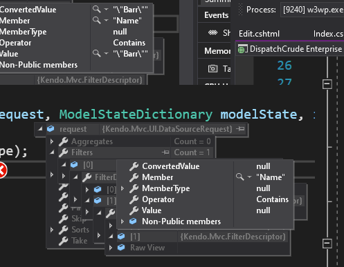
We set up a grid that auto-filters a name field to "does not contain" and the value it excludes is "[DEACTIVATED]". This column is also filtering out records that have a null in them if this filter is set. I had to change the datasource to return an empty string instead.
there seems to be a bug in your commands column and it's made worse when loading/saving grid layouts.
When i load a page with this grid column definition,
.Groupable()
                    .Columns(columns =>
                    {
                        columns.Command(cmd => cmd.Custom("Undelete")
                            .Click("undelete"))
                            .Width(60);
when you inspect the grid, the grid internally shows two classes for the command cell:
attributes: {class: 'k-command-cell k-command-cell'}
now, if i apply a grid layout, the problem gets worse. This sample code will cause the dom to end up with multiple k-command-cell classes on the grid's td element.
$("#UndeleteGrid").data("kendoGrid").setOptions($("#UndeleteGrid").data("kendoGrid").getOptions())<td class="k-command-cell k-command-cell k-command-cell k-command-cell k-command-cell k-command-cell k-command-cell k-command-cell k-command-cell" role="gridcell"><a role="button" class="k-button k-grid-Undelete" href="#" title="Undelete"><span class="k-icon k-i-undo"></span></a></td>
Describe the bug
Column headers do not resize properly in IE11 when scrollable is set to false. Regression introduced in 2021.3.914.
To reproduce
Steps to reproduce the behavior:
The column headers are squished to the left side.
Expected behavior
Columns headers must have the same width as the respective columns.
Workaround:
.k-ie .k-grid-header {
  display: table-header-group;
}
Affected package (please remove the unneeded items)
- theme-default
- theme-bootstrap
- theme-material
Affected suites (please remove the unneeded items)
- Kendo UI for jQuery
Affected browsers (please remove the unneeded items)
- IE version: 11
Build system information (please remove the unneeded items)
- Not Applicable
When using the Grid Endless Scrolling, is there a way to prevent the existing records from momentarily disappearing as the spinner appears?
Using endless scrolling on a large grid (full screen), the users eye tracks down the list as the mousewheel is turned. At the moment the next page is fetched, the view of the data is disrupted as the spinner appears and the data disappears. This can be quite jarring to the senses when browsing for a specific record in the list.
On a small grid such as that on the example page (https://demos.telerik.com/kendo-ui/grid/endless-scrolling-remote) it isn't quite as jarring on the senses, but with a large grid with many columns and rows, it can be very off-putting.
Ideally, if the existing records can remain opaquely visible in the background under the spinner whilst the next page of data is being retrieved, it would produce a much cleaner user experience.
Hi Team,
Bug Report
The Kendo UI Grid's toolbar with a template is not persisted when the Grid is loaded using setOptions.
Reproduction of the problem
With a toolbar containing a template with server tags, the toolbar content will disappear.
Expected Behavior
The Grid should retain the toolbar with the HTML contained when using setOptions.
Environment
Kendo UI version: 2022.2.510
jQuery version: all
Browser: all
Thanks!
Bug report
Reproduction of the problem
Dojo example: https://dojo.telerik.com/InUYAheR/4
Drag and drop a row from Grid2 to Grid1 by following the steps below:
- Click and hold down the mouse button within a Grid2 row, just before its ID value or a little after it.
- Drag the row to Grid1 and drop it over row 3 or row 4.
Current behavior
Grid1's first row values get updated, instead of the drop target row values. This is because e.target in the DropTarget's "drop" event does not return the actual target you drop over.
If you click and drag in the middle of the Grid2 row, drag it and drop it over a row in Grid1, the drag and drop functionality works as expected: e.target returns the correct target.
Expected/desired behavior
e.target should consistently return the target you drop over, regardless of where in the dragged row you have clicked.
Environment
- Kendo UI version: 2022.2.621
- jQuery version: x.y
- Browser: [all]
Bug report
Reproduction of the problem
Reproducible in the demos: https://demos.telerik.com/aspnet-mvc/grid/persist-state
- Inspect the rendering of the "Contact Name" header in the MVC and Kendo UI for jQuery demos.
Current behavior
The difference in the rendering is shown below. In the Kendo UI Grid's Html, there is a span with class "k-cell-inner" that wraps the ".k-link" span, whereas in the MVC Grid, only an anchor is rendered.
Kendo UI:
<th scope="col" role="columnheader" data-field="ContactName" aria-haspopup="true" rowspan="1" data-title="Contact Name" aria-label="Contact Name Press ctrl + space to group" data-index="0" id="a44eadd9-62c6-4154-9735-4351a9cb5064" class="k-header k-filterable" data-role="columnsorter" style="touch-action: none;">
  <span class="k-cell-inner">
    <span class="k-link">
      <span class="k-column-title">Contact Name</span>
    </span>
    <a class="k-header-column-menu" href="#" title="Contact Name edit column settings" aria-label="Contact Name edit column settings" tabindex="-1">
      <span class="k-icon k-i-more-vertical"></span>
    </a>
  </span>
</th>
MVC:
<th class="k-header k-filterable" data-field="ContactName" data-index="0" data-title="Contact Name" id="f28afe50-210a-474d-9943-113f6bd4ad15" scope="col" data-role="columnsorter" style="touch-action: none;">
  <a class="k-link" href="/aspnet-mvc/grid/persiststate_customers_read?grid-sort=ContactName-asc">Contact Name</a>
  <a class="k-header-column-menu" href="#" title="Contact Name edit column settings" aria-label="Contact Name edit column settings" tabindex="-1">
    <span class="k-icon k-i-more-vertical"></span>
  </a>
</th>
Expected/desired behavior
Identical rendering.
Environment
- Kendo UI version: 2022.2.802
- jQuery version: x.y
- Browser: [all ]
Bug report
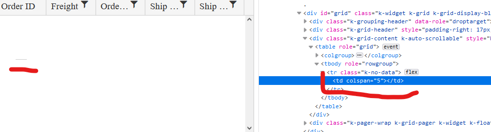
When the Grid AutoBind() configuration is set to false, the Grid is rendering an empty cell in the row element with class .k-no-data. (Image.png)
Reproduction of the problem
Set AutoBind configuration of Telerik UI for Asp.Net MVC Grid to 'false'. The Grid is rendered correctly except for the empty row and the empty cell in the table body.
Current behavior
An empty row with one empty cell is rendered.
Expected/desired behavior
The tbody element should be empty.
Environment
- Kendo UI version: 2022.2.621
- Browser: [all]
Bug report
Reproduction of the problem
- Set up a Grid to use server binding
- Add a custom command:
columns.Command(command => command.Custom("View Email"))
	.Title("Body")
	.Width(150);
Current behavior
When the Grid is configured to use server binding, it will render an anchor element. If remote binding is used, the Grid will correctly render a button element.
Expected/desired behavior
Consistency in the rendering. A button element should be rendered, regardless of using server or remote binding.
Environment
- Kendo UI version: 2022.3.913
- jQuery version: x.y
- Browser: [all]
Not sure if this is already in the works but when building mvc grids it would be helpful to have the ability to prevent a column from getting too big when the screen size is larger than the grid needs. Right now if columns are turned off and there is more space for the unlocked columns, they expand to fill the page which is normally fine but in some instances it looks silly to have a column for example that you would enter a 2 digit number in to be 300 plus px wide.
Bug report
When the scrollable option is disabled, on resizing the browser window by making it more narrow, at certain point the columns stop resizing and the whole table goes out of the right border of the Grid. Reproducible with the SASS and LESS themes.
Reproduction of the problem
Dojo example: https://dojo.telerik.com/ItIrEzEY/3
- Either resize the right pane or use Fullscreen and resize the browser window and make it narrower.
Current behavior
The table goes out of wrapping element (.k-grid).
Expected/desired behavior
The columns resize and the table remains within the borders of the Grid.
Environment
- Kendo UI version: 2023.1.117
- jQuery version: x.y
- Browser: [all]
Bug report
The attributes handler overload does not get executed when the column is initially marked as hidden.
Reproduction of the problem
- Open the following dojo.
- Change the
hiddenproperty of the ContactTitle field totrue.
Current behavior
The attributes handler is not executed when the column is hidden.
Expected/desired behavior
The attributes handler should be executed when the column is hidden.
Environment
- Kendo UI version: 2023.1.425
- Browser: [all]
Bug report
Not reproducible with the UI for ASP.NET Core Grid helper.
Reproduction of the problem
- Set the Total option of the DataSource in a Grid:
.DataSource(dataSource => dataSource
    .Ajax()
    .PageSize(15)
    .Read(read => read.Action("Orders_Read", "Grid"))
    .Total(50)
)
- Compare the rendering of the pager "next page" and "last page" buttons with the Total option set and without it.
Current behavior
The "next page" and "last page" buttons in the Grid's pager are rendered as anchor Html elements, when Total is set in the DataSource. When it is not set, the buttons are rendered as button Html elements.
Expected/desired behavior
The rendering of the pager buttons should be consistent and they should render as button Html elements.
Environment
- Kendo UI version: 2023.1.425
- jQuery version: x.y
- Browser: [all]
Bug report
Prerequisites: reordering a non-locked column before a locked column. There could be one or more locked columns.
This behavior appeared in v2021.3.1207.
Reproduction of the problem
Dojo example: https://dojo.telerik.com/UhExAXIv/5
- Click, hold and slowly drag the header of the OrderDate column over the locked ID column.
- Attempt to reorder the OrderDate column before the ID column.
Current behavior
The reorder hint appears only when you hover the left border of the ID cell. This makes dropping the header at the right spot difficult, since you have to be very precise and if you are too fast, you have to re-adjust the mouse cursor position right on top of the left border of the cell.
Expected/desired behavior
The reorder hint should appear when mouse cursor enters the boundaries of the target cell. For example, slowly drag ShipCity before ShipCountry. Note how the reorder hint appears once you enter the boundaries of the ShipCountry cell and you don't have to drag all the way to ShipCountry's left border.
Environment
- Kendo UI version: 2023.2.829
- jQuery version: x.y
- Browser: [all]
Bug report
The Grid cell does not enter edit mode on double tap on iOS in Chrome and Edge. Works correctly in Safari.
Reproduction of the problem
- Run this dojo example on iOS in Chrome or Edge: https://dojo.telerik.com/idOVAZiP/3
- Double tap a cell to edit its value
Current behavior
The cell does not enter edit mode.
Expected/desired behavior
The cell enters edit mode.
Environment
- Kendo UI version: 2023.3.1114
- jQuery version: x.y
- Browser: [iOS Chrome, iOS Edge]
Bug report
The rendering (structure and order of elements) of the th element of a column, for which a HeaderTemplate is set, does not match the Kendo UI Grid's rendering in a similar scenario. Prerequisites: HeaderTemplate, Sortable, Filterable enabled. For more context, see Ticket ID: 1639834.
Reproduction of the problem
Check the rendering of the header of the second column:
@(Html.Kendo().Grid<TelerikMvcApp1.Models.OrderViewModel>()
    .Name("grid2")
    .Columns(columns => {
        columns.Bound(p => p.OrderID).Filterable(false).Width(100);
        columns.Bound(p => p.Freight).HeaderTemplate("<span class='k-link'>My Template</span>");
        columns.Bound(p => p.OrderDate).Format("{0:MM/dd/yyyy}").Width(140);
        columns.Bound(p => p.ShipName);
        columns.Bound(p => p.ShipCity).Width(150);
    })
    .Sortable()
    .Filterable()
    .Pageable()
    .Scrollable()
    .HtmlAttributes(new { style = "height:430px;" })
    .DataSource(dataSource => dataSource
        .Ajax()
        .PageSize(20)
        .Read(read => read.Action("Orders_Read", "Grid"))
     )
)
Current behavior
The content of the th is the following:
<a aria-hidden="true" class="k-grid-filter-menu k-grid-header-menu">
    ...
</a>
<span class="k-link">
    ...
</span>
Expected/desired behavior
The th content should be rendered as follows:
<span class='k-cell-inner'>
    <span class='k-link'>
        ...
    </span>
    <a aria-hidden='true' class='k-grid-filter-menu k-grid-header-menu'>
        ...
    </a>
</span>
It should match the Kendo UI Grid's rendering: https://dojo.telerik.com/oTalIGir/8
Environment
- Kendo UI version: 2024.1.130
- jQuery version: x.y
- Browser: [all]
Bug report
Reproducible in MVC with a custom toolbar tool that has a ClientTemplate.
Reproduction of the problem
- Configure the Grid for incell editing and a custom command with a template to its toolbar configuration
@(Html.Kendo().Grid<TelerikMvcApp2.Models.OrderViewModel>()
    .Name("grid")
    .Columns(columns =>
    {
        columns.Bound(p => p.OrderID).Filterable(false);
        columns.Bound(p => p.Freight);
        columns.Bound(p => p.OrderDate).Format("{0:MM/dd/yyyy}");
        columns.Bound(p => p.ShipName);
        columns.Bound(p => p.ShipCity);
    })
    .ToolBar(toolbar =>
    {
        toolbar.Save();
        toolbar.Spacer();
        toolbar.Custom().ClientTemplate("<span>test</span>");
    })
    .Pageable()
    .Sortable()
    .Scrollable()
    .Filterable()
    .HtmlAttributes(new { style = "height:550px;" })
    .Editable(editable => editable.Mode(GridEditMode.InCell))
    .DataSource(dataSource => dataSource
        .Ajax()
        .PageSize(20)
        .Model(model => model.Id(p => p.OrderID))
        .Read(read => read.Action("Orders_Read", "Grid"))
        .Create("Orders_Create", "Grid")
        .Update("Orders_Update", "Grid")
    )
)
Current behavior
Duplication of the "Cancel" button.
Expected/desired behavior
A single "Cancel" button is rendered in the toolbar.
Environment
- Kendo UI version: 2024.1.130
- jQuery version: x.y
- Browser: [all]