Bug report
When ParseFormats is set in the DatePicker editor used in the Grid popup, the picker does not show the field value to which it is bound.
Reproduction of the problem
- Add a DateOnly? field to the model:
public DateOnly? OrderDate { get; set; }
- Bind a Grid column to the field.
- Set the default value in the DataSource:
.Model(model =>
{
    model.Id(p => p.OrderID);
    model.Field(p => p.OrderDate).DefaultValue(new DateOnly());
})
- Configure Popup editing in the Grid.
- Add a DateOnly.cshtml editor in EditorTemplates:
@model DateOnly?

@(Html.Kendo().DatePickerFor(m => m).ParseFormats(new string[] { "MM/dd/yyyy" }).HtmlAttributes(new { title = Html.ViewContext.ViewData.TemplateInfo.GetFullHtmlFieldName("") }))
Current behavior
When editing a record. The value of the OrderDate field is not displayed in the DatePicker.
If you remove the ParseFormats option from the DatePicker, it shows the value as expected.
Expected/desired behavior
The field value should be displayed in the picker, even when ParseFormats is set.
Environment
- Kendo UI version: 2024.4.1112
- Browser: All
This should be applied when using a Telerik UI for ASP.NET Core Grid with PopUp Edit Mode.
Bug report
The column format applied through the .Format() option is ignored, if the column is bound to a nullable DateOnly field.
Reproduction of the problem
- Declare a nullable DateOnly field in the view model:
public DateOnly? PaymentDate { get; set; }
- Bind a column to the field and set its format:
columns.Bound(p => p.PaymentDate).Title("Date").Format("{0:MM/dd/yyyy}").Width(160);
Current behavior
The specified format is ignored, e.g., the Grid shows 2025-01-21, instead of 01/21/2025
Expected/desired behavior
The specified column format is applied.
Environment
- Kendo UI version: 2024.4.1112
- Browser: [all ]
Current configuration: server-side filtering
Desired behavior:
- Grid searches are "anded" to any existing filters
- When the search box is cleared the pre-existing filters are retained
### Bug report
When the Grid is initialized in a hidden container (for example, in a non-selected tab of a TabStrip) and its initial data binding is disabled (autoBind: false), the pager information is not visible when the data is loaded afterward.
### Reproduction of the problem
1. Initialize a Grid into a non-selected tab of a TabStrip and set its autoBind option to "false".
2. Select the tab and check how the empty Grid is rendered.
3. Call the read() method of the Grid's DataSource in the browser console to request the data.
4. The data is loaded, but the pager information remains hidden.
A Dojo sample for reproduction: https://dojo.telerik.com/njVgBvza
### Expected/desired behavior
The pager information must be available when the data is loaded into the Grid.
### Environment
* **Kendo UI version: 2024.4.1112
* **jQuery version: 3.7.1
* **Browser: [all]
Bug report
Dynamic Grid produces a RunTimeException when the Filterable() configuration is enabled
Reproduction of the problem
- Configure the dynamic Grid based on the following example.
- Set the .Filterable() API configuration of the Grid.
- Notice that the application throws a
System.ArgumentNullException: Value cannot be null.
Example
@model System.Data.DataTable

@(Html.Kendo().Grid<dynamic>()
    .Name("gridItem")
    .Columns(columns =>
    {
        foreach (System.Data.DataColumn dcolumn in Model.Columns)
        {
            columns.Bound(dcolumn.ColumnName).Title(dcolumn.Caption);
        }
    })
     ...
    .Filterable()
)
The aforementioned declaration will work in the previous 2024.3.1015 version of the suite.
Current behavior
The Grid makes the application throw a runtime error.
Expected/desired behavior
The Grid makes the application should not throw a runtime error.
Environment
- Kendo UI version: 2024.4.1112
- Browser: [all]
Enhancement
Expose the sorts TagHelper for the Grid's column filter datasource taghelper
Overview
Currently, the Grid's Column Filter Datasource Taghelper exposes the following inner child TagHelpers.
Unlike its HtmlHelper counterpart which happens to expose the .Sort() API configuration. For example:
.Columns(columns =>
{
    columns.Bound(p => p.ShipName).Filterable(ftb =>
    {
        ftb.Multi(true);
        ftb.Search(true);
        ftb.CheckAll(true);
        ftb.DataSource(dataSource => dataSource
            .Custom()
            ...
            .Sort(sort =>
            {
                sort.Add("ShipName").Ascending();
            })
        );
    });
})
### Bug report
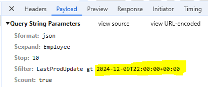
When the Grid is set up for OData-v4 binding, the columns that bind to DateOnly fields fail to filter. The date value in the filter expression contains the time portion and the following error is thrown:
"The binary operator GreaterThan is not defined for the types 'System.Nullable`1[System.DateOnly]' and 'System.Nullable`1[System.DateTimeOffset]'."
### Reproduction of the problem
1) Create a Grid that uses OData-v4 binding.
2) Bind a specified column to a DateOnly field.
3) Filter the column through the default column filter menu and open the browser DevTools to review the response of the request.
//Model
public DateOnly LastProdUpdate { get; set; }

//View
@(Html.Kendo().Grid<ProductViewModel>()
    .Name("grid")
     .Columns(columns =>
        {
            columns.Bound(p => p.LastProdUpdate).Format("{0:dd/MM/yyyy}");
        })
        ...
        .Filterable()
        .DataSource(dataSource => dataSource
        .Custom()
        .Type("odata-v4")
        .Transport(t =>
        {
            t.Read(read => read.Url("/odata/Products").Data("function() {return {'$expand': 'Employee'} }"));
        })
        .PageSize(10)
        .ServerPaging(true)
        .ServerFiltering(true)
        .ServerSorting(true)
     )
)
### Expected/desired behavior
The DateOnly fields must be filtered successfully as the DateTime fields.
### Environment
* **Kendo UI version: 2024.4.1112
* **Browser: [all]
Is it possible to implement template options for the "update" and "cancel" column commands of the Grid?
For example:
$("#grid").kendoGrid({
  columns: [{
    command: [{
        name: "edit",
        template: {
            update: "<button class='customUpdate'>Save</button>",
            cancel: "<button class='customCancel'>Cancel</button>",
          }
      }]
   }],
  ...
});
By default, when the "paste" command is added, the default option is "insert" mode ("Paste (Insert)"). Is it possible to add an option that allows setting the default paste mode to "replace" ("Paste (Replace)")?
Currently, when using the default Grid search functionality and the column filter menus, we observe the following:
- When a column filter is applied first, using the Search feature afterward overrides the column filters, applying the search filter with the "contains" operator to the specified columns.
- Conversely, when a search is performed first and then followed by a column filter, the grid generally functions as expected.
However, there’s a specific scenario where this does not work properly:
- If a search is performed and then a column filter is applied to a column where the search criteria are relevant, the Grid returns no data.
For example:
- After searching for "2018," the expected columns displayed in the filters (notably, the ContractNumber is among them).
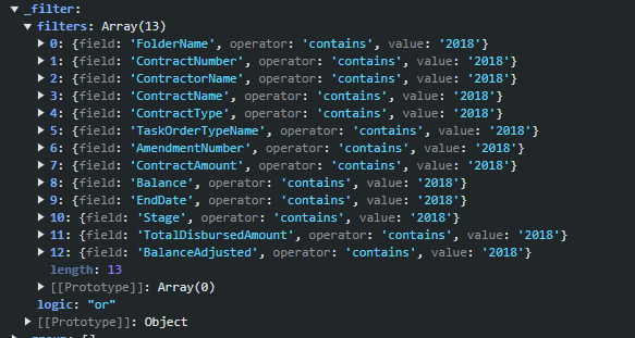
- When a column filter is subsequently applied to ContractNumber (e.g., setting it to "2018-CR0018"), the Grid removes the ContractNumber from the search filters and adds the column filter with an "AND" operator. This setup returns no data because of the search filters and the "AND" operator.
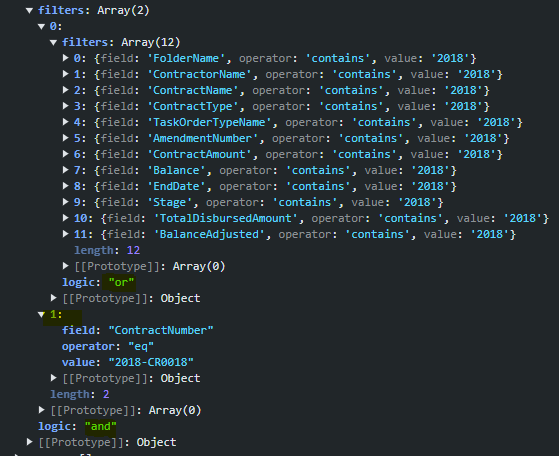
Expected Behavior and Alternative
This functionality behaves correctly in the Telerik UI for Blazor Grid component - the search and column filters are managed as separate objects.
Is it possible to enhance the Grid filtering similar to the Blazor Grid?
Hi, is there a way to configure the grid so that when it's grouped and later sorted, the grouping state (expanded/collapsed) is preserved?
Kind Regards
Erwin
It would be convenient to have built-in MultiColumnComboBox editing for the Grid.
I was hoping the component would show the addresses formatted in columns (as per a fields list) and then return the address concatenated into a single to the grid field (e.g. from .DataTextField("FullAddress")).
I'm in the process of rewriting all Kendo components to use CSP compatible templates. I'm looking at https://docs.telerik.com/aspnet-core/html-helpers/template/overview which shows how we'd use TemplateComponentName() for popup editors and that we would need to rewrite everything in the popup editor to use Kendo Template's AddHtml or AddComponent methods.
Original:
<div class="mb-2 row required">
	@Html.LabelFor(model => model.FileName, new { @class = "col-sm-4 col-form-label fw-bold text-sm-end" })
	<div class="col-sm-6">
		@(Html.Kendo().TextBoxFor(model => model.FileName).HtmlAttributes(new { @class = "w-100" }))
	</div>
</div>

<div class="mb-2 row">
	@Html.LabelFor(model => model.FileDescription, new { @class = "col-sm-4 col-form-label fw-bold text-sm-end" })
	<div class="col-sm-6">
		@(Html.Kendo().TextBoxFor(model => model.FileDescription).HtmlAttributes(new { @class = "w-100" }))
	</div>
</div>
Rewritten:
@(Html.Kendo().Template()
	.AddHtml("<div class='mb-2 row required'>")
	.AddHtml(@<text>
		@Html.LabelFor(model => model.FileName, new { @class = "col-sm-4 col-form-label fw-bold text-sm-end" })
	</text>)
	.AddHtml("<div class='col-sm-6'>")
	.AddComponent(c => c.TextBoxFor(model => model.FileName).HtmlAttributes(new { @class = "w-100" }))
	.AddHtml("</div></div>")

	.AddHtml("<div class='mb-2 row'>")
	.AddHtml(@<text>
		@Html.LabelFor(model => model.FileDescription, new { @class = "col-sm-4 col-form-label fw-bold text-sm-end" })
	</text>)
	.AddHtml("<div class='col-sm-6'>")
	.AddComponent(c => c.TextBoxFor(model => model.FileDescription).HtmlAttributes(new { @class = "w-100" }))
	.AddHtml("</div></div>")
)
While this works, this markup seems much harder to read than the original. Could this be made to be simpler? Ideally I'd like to be able to drop my existing mix of html and kendo components in one method and it'd parse through to render the template properly.
Bug report
When the Grid is nested in a relatively positioned container, during the export the Grid gets an overflow style to its wrapping element. Then the style is removed and re-added again. This happens in a loop, which results in a vertical scrollbar constantly appearing and hiding.
Reproduction of the problem
- Open this dojo example: https://dojo.telerik.com/IZoxOvOG/7
- Click the "Export to PDF" button in the Grid's toolbar
Current behavior
Flickering caused by a scrollbar appearing and hiding
Expected/desired behavior
The Grid should remain unchanged during the export and no scrollbar should appear and hide during the export.
Environment
- Kendo UI version: 2024.3.806
- jQuery version: x.y
- Browser: [all ]
Bug report
The custom ordering of the filter values in the Telerik UI ASP.NET Core Grid does not function correctly when using TagHelpers.
Reproduction of the problem
- Include operator configuration for string fields in the filterable settings.
- Add filter values
- The filter values are not shown in the configured order.
A REPL sample for reproduction: https://netcorerepl.telerik.com/wIYNvEvn00CAqNGL14
Expected/desired behavior
The filter values should be presented in the same order as specified in the Filterable configuration.
Environment
- Kendo UI version: 2024.3.806
When creating columns in a TagHelper Grid definition, the Width property allows only numbers:
                                <column field="OrderID" width="100">
                                </column>
This does not match the width property in the Kendo UI and HtmlHelpers Grid definitions which allow string values to be entered as well:
https://docs.telerik.com/kendo-ui/api/javascript/ui/grid/configuration/columns.width
That way, the developer will be able to add rem and other unit values in TagHelper syntax as well.
Also, it would be convenient if there is a new property similar to this:
                                <column field="OrderID" tooltip="Unique Number of the Order">
</column> <column field="Freight"
html-attributes='new Dictionary<string, object>{ ["style"] = "width: 30rem;" }'>
</column>
Bug report
Grid Hidden Column is set as exportable by default for Pdf and Excel
Reproduction of the problem
- Set a Column as hidden through the Hidden() API configuration.
- Add both the ToolBar.Excel() and ToolBar.Pdf() API configurations.
- Notice, that the hidden column is exported.
Current behavior
The Grid Hidden Column should be set as exportable by default for Pdf and Excel.
Expected/desired behavior
The Grid Hidden Column should not be set as exportable by default for Pdf and Excel.
Environment
- Kendo UI version: 2024.3.806
- Browser: [all]
Overview
At this stage, the ToolBar.Custom() API configuration does not expose built-in configurations for adding a handler and partial view. E.g:
        @(Html.Kendo().Grid <TelerikAspNetCoreApp455.Models.OrderViewModel>()
            .Name("grid")
            .ToolBar(toolbar => {
                toolbar.Custom().Name("Test1").ClientTemplateHandler("someHandler");
                toolbar.Custom().Name("Test2").ClientTemplateView(Html.Partial("_Test2"))
            })
            ...
        )
Current behavior
The ToolBar.Custom() API configuration does not expose built-in configurations for adding a handler and partial view.
Expected/desired behavior
The ToolBar.Custom() API configuration should expose built-in configurations for adding a handler and partial view.
Environment
- Kendo UI version: 2024.3.806
- Browser: [all]
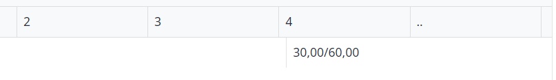
When it is not scrollable it will look like this and not correct aligned.
When I have enough items it i will look good but since my database is dynamic I cannot wait till it is full.
What should I do?
.Scrollable() --> this it the option which I use.