Unplanned
Last Updated:
31 Aug 2022 09:31
by Rami
Rami
Created on:
26 Aug 2022 04:53
Type:
Bug Report
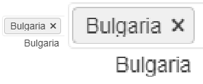
MultiSelect text cutting out
In some cases the text for the selected items does not display properly. Some letters, for example g, get their bottom cut off. This behaviour can be observed on for.ex. the Telerik page https://docs.telerik.com/blazor-ui/components/multiselect/overview The picture below was taken on the latest Edge browser, 1080p screen, 100% zoom level. Funnily enough, changing the zoom level either way makes the text fit in the selected items.
How can I increase the space for the text in the selected items so it's less likely to be cut off?
2 comments
Rami
Posted on:
31 Aug 2022 09:31
ADMIN
Dimo
Posted on:
30 Aug 2022 11:03

