The Floating Label component position is correct only when using it with medium-sized inputs.
Here is a possible workaround - please adjust the exact pixel values, according to the CSS theme and your preferences.
https://blazorrepl.telerik.com/QUuKYyPu56EBMuTm11 (uses the new Meridian theme by default)
<TelerikFloatingLabel Text="Your Name" Class="small-fl">
    <TelerikTextBox @bind-Value="@Name" Size="sm" Width="200px" />
</TelerikFloatingLabel>

<TelerikFloatingLabel Text="Your Name">
    <TelerikTextBox @bind-Value="@Name" Width="200px" />
</TelerikFloatingLabel>

<TelerikFloatingLabel Text="Your Name" Class="large-fl">
    <TelerikTextBox @bind-Value="@Name" Size="lg" Width="200px" />
</TelerikFloatingLabel>

<style>
    .small-fl {
        --kendo-floating-label-offset-y: 23px;
    }

    .large-fl {
        --kendo-floating-label-offset-y: 31px;
    }
</style>

@code {
    private string Name { get; set; } = string.Empty;
}
For the old Default theme, the workaround is:
    .small-fl {
        --kendo-floating-label-offset-y: 23px;
    }

    .large-fl {
        --kendo-floating-label-offset-y: 31px;
    }
Kendo SASS themes allow the definition of a variety of colors for grid rows that are applied in different situations:
- $grid-alt-bg defines the color of alternate rows
- $grid-selected-bg defines the color of selected rows
- $grid-selected-alt-bg defines the color of selected alternate rows
However, at least in @progress/kendo-theme-classic (v. 5.4.1), $grid-selected-alt-bg is only applied for locked columns. You can check that by doing a string-search for "$grid-selected-alt-bg" in dist/all.scss. I have not checked if the same happens when using other themes.
Bug Description
An unreadable and unprintable symbol †renders in dropdownlists in the classic-silver theme when it is loaded from unpkg -
Steps to Reproduce
Steps to reproduce the behavior:
- Go to this Dojo example - https://runner.telerik.io/fullscreen/SHuPXBQI/3
- Open the DropDownList
Expected Behavior
No unreadable symbols should be present in the DropDown's items
Actual Behavior
There's an unreadable symbol †at the start of the DropDownList's items
Affected Theme(s)
- All themes
Affected Suites
- Kendo UI for jQuery
Browser Information
- All browsers
When scrolling to the right and to the bottom the columns and rows are not aligned any more.
This is already visible in the example in the documentation: https://www.telerik.com/kendo-angular-ui/components/gantt
We use Bootstrap and Kendo and currently have to override several Bootstrap colours - and the Kendo equivalents - in order to meet accessibility requirements.
Kendo has a default-ocean-blue-a11y swatch, it would be good if there was a Bootstrap A11y swatch too.
Hi
No matter what this is set too on any of the map components the controls only show in the top left.
The enabled parameter works as expected still but not MapControlsPosition on any of its options.
Running the demo code in the REPL does the same thing.
Phil
See here:
https://github.com/twbs/bootstrap/blob/main/scss/_variables.scss#LL804C1-L804C24
$input-btn-border-width is now a custom variable.
(see bootstrap 5.2 version: https://github.com/twbs/bootstrap/blob/v5.2.3/scss/_variables.scss#L738 where $input-btn-border-width was a simple scss variable)
The main problem is that on file:
@progress\kendo-theme-bootstrap\scss\input\_variables.scss you are using:
$kendo-input-border-width: $input-border-width !default;
$kendo-input-border-height: ( $kendo-input-border-width * 2 ) !default;
so scss compilation gives me an error:
SassError: Undefined operation "var(--bs-border-width) * 2".
   ╷
10 │ $kendo-input-border-height: ( $kendo-input-border-width * 2 ) !default;
My temporary fix is to define, before importing _variables file:
$kendo-input-border-width: 1px !default;
Basically, the main problem is that package @progress/kendo-theme-bootstrap 6.4.0 with bootstrap 5.3 doesn't work anymore.
Thanks.
Diego
Kendo has a wide variety of icons which we already use in our project, however some icons which we'd expect to be included are missing.
For example, despite having icons for all different kinds of vehicles (concrete truck, sweeper, van, etc.), there are no icons of ships.
Ideally for our project, we would want icons included to denote a 'new' user (preferably something with the word 'new' in it, see the attached image for example), the ship icon mentioned above, plus another to denote a deceased person. Of course, any other additional icons would also be welcome.
When Gantt is used with bootstrap theme there is an accumulating error that leads to the row hover effect being misaligned with actual grid rows. This issue only appears on the Windows versions of Chrome and Firefox, Mac OS versions seem to be unaffected.
This Stackblitz was taken directly from angular gantt overview page.
Steps to reproduce:
- Open stackblitz
- Scroll to the end of the table
- Hover over one of the timeline rows
- Hover is misaligned
See attached video.
When bootstrap theme is used it seems that milestone symbol is slightly shifted to the left compared to the main theme.
See this 2 examples:
- https://stackblitz.com/edit/angular-te4cysht?file=src%2Fapp%2Fhierarchical-data.ts
- https://stackblitz.com/edit/angular-hse7ryxz?file=src%2Fapp%2Fhierarchical-data.ts
In both examples task and milestone start exactly at 2014-06-02T00:00:00.000. However, the bootstrap version appears to be slightly to the left.
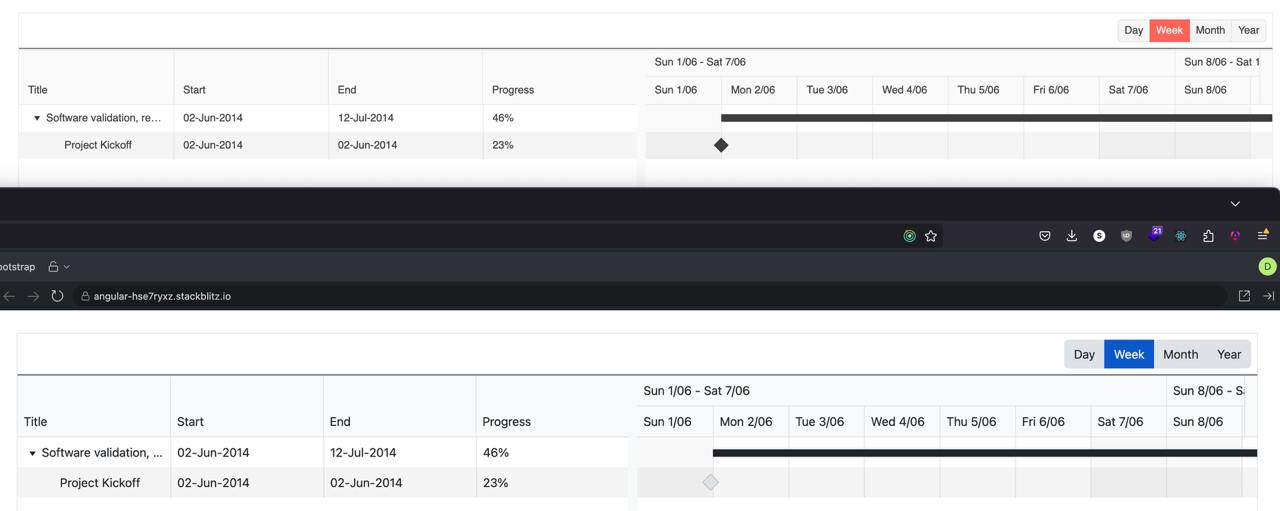
This is also visible on https://www.telerik.com/kendo-angular-ui/components/gantt.
The Fiori theme is elegant, more modern than the others and most closely resembles what my users want.  However, it styles all of the elements abnormally large.  This isn't optimal for a grid based data-centric application where there is a premium on window real estate.

Can you develop a Fiori Slim theme that is similar in appearance, but has vertical and horizontal dimensions similar to your other themes?

We have overriden many css properties to achieve this, but it is very time consuming and incomplete.
Hi Guys,
Have just upgraded to the Kendo UI v2024.3.806 along with kendo-theme-classic v8.2.1 and have noticed you can no longer set the $kendo-disabled-opacity & $kendo-disabled-filter variables to override their values because they are now being hard set in the following section within the 'all.scss' file.
// Backward compatibility
// #region @import "./color-system/_swatch-legacy.scss"; -> scss/core/color-system/_swatch-legacy.scss
@if ($kendo-enable-color-system) {
...
$kendo-disabled-opacity: .6;
$kendo-disabled-filter: grayscale(.1);
...
}
This is a regression from
@progress/kendo-theme-classic:8.0.1
where neither of these variables were being hard set.
Also can you confirm what version of the SASS themes are compatible with the latest Kendo UI because the latest version on NPM is now v9.0.0 which was released 3 days prior to Kendo UI v2024.3.806.
NOTE: kendo-theme-classic: 9.0.0 also has these two variables hard set.
Regards
Alan
Other way to diplay the check-box you can use clip-path, may be helpfull for this case.
An exemple working with variables
$kendo-checkbox-border-width: 3;
$kendo-checkbox-border: grey;
$kendo-checkbox-bg: lightgrey;
$kendo-checkbox-checked-bg: blue;
$border-radius: 5px;
$kendo-checkbox-md-size: 32px;

.cbstyle{
    appearance: none;
    position: relative;
    background-color: $kendo-checkbox-bg;
    border-width: $kendo-checkbox-border-width;
    border-style: solid;
    border-color: $kendo-checkbox-border;
    border-radius: $border-radius;
    height: $kendo-checkbox-md-size;
    width: $kendo-checkbox-md-size;
}

.checked::after{
  content: '';
  position: absolute;
  top: 50%;
  left: 50%;
  transform: translate(-50%, -50%);
  width: calc(#{$kendo-checkbox-md-size} * .8);
  height: calc(#{$kendo-checkbox-md-size} * .8);
  background-color: $kendo-checkbox-checked-bg;
  clip-path: polygon(20% 39%, 8% 39%, 45% 93%, 81% 13%, 70% 13%, 43% 74%); // checkbox icon
}
The documentation for the Telerik Design System says "Starting with themes version 9.0.0, the CSS Utilities are no longer included in the Telerik and Kendo UI themes package."
This will be an issue for how I use the Telerik UI for Blazor package. I use the CSS utilities extensively. They should continue to be included in the themes.
If they are no longer in the themes, it will be very inconvenient to acquire them using NPM. I have no other need for NPM in my Blazor project. If I have to load them separately (which seems like a mistake to me) it would be much more "natural" if they would be distributed via NuGet.
Please consider a USWDS Theme. I'm referring to the design system https://designsystem.digital.gov/
This support would be a great way to incorporate Telerik components into projects for US Goverment clients.
Material 3:
Request for Telerik UI for Blazor toolkit and Figma UI Toolkit to support Material Design 3 (versus 2) guidelines published late October 2021. Competitors are supporting it.
Website is https://m3.material.io/
Hi, Team!
Currently, the Kendo Material theme is compliant with Material Design 2. I would like to request compliance with Material Design 3.
I would like to request that Telerik host all of the required nuget packages for Telerik.ui.for.Blazor on Telerik's nuget server.
Currently, all of the packages are there except for Telerik.FontIcons and Telerik.SvgIcons which are hosted on nuget.org instead. This is inconvenient when using Package Source mapping, where ideally all Telerik.* packages can be sourced direct from Telerik.
The Kendo-UI "Classic" SASS theme supports the $kendo-calendar-cell-border variable. However, its value is never applied. This also means that variables like $kendo-calendar-cell-selected-border etc. do not have any effect, because they only set the border-color, but not the border itself.
Kendo Theme Version 7.0.2