We use Bootstrap and Kendo and currently have to override several Bootstrap colours - and the Kendo equivalents - in order to meet accessibility requirements.
Kendo has a default-ocean-blue-a11y swatch, it would be good if there was a Bootstrap A11y swatch too.
Kendo has a wide variety of icons which we already use in our project, however some icons which we'd expect to be included are missing.
For example, despite having icons for all different kinds of vehicles (concrete truck, sweeper, van, etc.), there are no icons of ships.
Ideally for our project, we would want icons included to denote a 'new' user (preferably something with the word 'new' in it, see the attached image for example), the ship icon mentioned above, plus another to denote a deceased person. Of course, any other additional icons would also be welcome.
The Fiori theme is elegant, more modern than the others and most closely resembles what my users want.  However, it styles all of the elements abnormally large.  This isn't optimal for a grid based data-centric application where there is a premium on window real estate.

Can you develop a Fiori Slim theme that is similar in appearance, but has vertical and horizontal dimensions similar to your other themes?

We have overriden many css properties to achieve this, but it is very time consuming and incomplete.
Other way to diplay the check-box you can use clip-path, may be helpfull for this case.
An exemple working with variables
$kendo-checkbox-border-width: 3;
$kendo-checkbox-border: grey;
$kendo-checkbox-bg: lightgrey;
$kendo-checkbox-checked-bg: blue;
$border-radius: 5px;
$kendo-checkbox-md-size: 32px;

.cbstyle{
    appearance: none;
    position: relative;
    background-color: $kendo-checkbox-bg;
    border-width: $kendo-checkbox-border-width;
    border-style: solid;
    border-color: $kendo-checkbox-border;
    border-radius: $border-radius;
    height: $kendo-checkbox-md-size;
    width: $kendo-checkbox-md-size;
}

.checked::after{
  content: '';
  position: absolute;
  top: 50%;
  left: 50%;
  transform: translate(-50%, -50%);
  width: calc(#{$kendo-checkbox-md-size} * .8);
  height: calc(#{$kendo-checkbox-md-size} * .8);
  background-color: $kendo-checkbox-checked-bg;
  clip-path: polygon(20% 39%, 8% 39%, 45% 93%, 81% 13%, 70% 13%, 43% 74%); // checkbox icon
}
The documentation for the Telerik Design System says "Starting with themes version 9.0.0, the CSS Utilities are no longer included in the Telerik and Kendo UI themes package."
This will be an issue for how I use the Telerik UI for Blazor package. I use the CSS utilities extensively. They should continue to be included in the themes.
If they are no longer in the themes, it will be very inconvenient to acquire them using NPM. I have no other need for NPM in my Blazor project. If I have to load them separately (which seems like a mistake to me) it would be much more "natural" if they would be distributed via NuGet.
Please consider a USWDS Theme. I'm referring to the design system https://designsystem.digital.gov/
This support would be a great way to incorporate Telerik components into projects for US Goverment clients.
Material 3:
Request for Telerik UI for Blazor toolkit and Figma UI Toolkit to support Material Design 3 (versus 2) guidelines published late October 2021. Competitors are supporting it.
Website is https://m3.material.io/
Hi, Team!
Currently, the Kendo Material theme is compliant with Material Design 2. I would like to request compliance with Material Design 3.
I would like to request that Telerik host all of the required nuget packages for Telerik.ui.for.Blazor on Telerik's nuget server.
Currently, all of the packages are there except for Telerik.FontIcons and Telerik.SvgIcons which are hosted on nuget.org instead. This is inconvenient when using Package Source mapping, where ideally all Telerik.* packages can be sourced direct from Telerik.
Some of our customers prefer a seamless design integration of their individual software solutions into the SAP ecosystem (e.g. in context of the BTP platform). So it would be nice to have a SAP Fiori theme like in Kendo UI for jQuery:
We would like to use Kendo React to build a micro frontend UI but we did not found any relevant information that this is currently supported.
The main issue we are facing is how it isolate Kendo theme styling between different micro frontends.
Let's say we have 2 micro frontends A and B:
- A is using Kendo v6.
- B is using Kendo v7 (or some other future/past version).
Both of them will include their global Kendo styles which will collide.
After some investigation, we came up with 2 possible approaches:
- Isolating micro frontends using shadow DOM. This is the most common technique but unfortunately not supported by Kendo React yet.
- Prepend custom class to all Kendo CSS selectors (for example ".microfronend-a .k-button" instead of just ".k-button").
We have experimented with the second approach and it seems like a way to go. It also required to append all popups to root DOM node of a micro frontend which can be done easily using PopupPropsContext.
But adding a class to all Kendo CSS selector is technically not a trivial task. It would be nice if Kendo supported this out of the box, for example by providing some SCSS configuration variable.
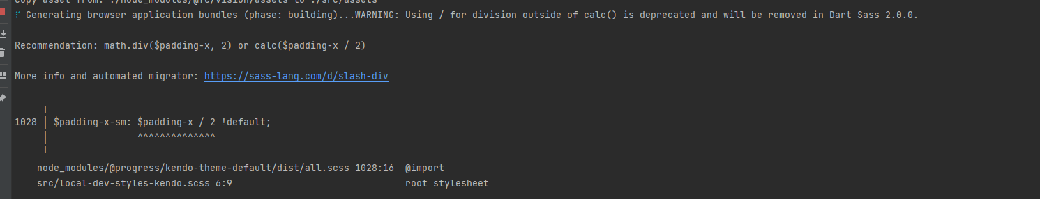
Are there plans to improve 2.0.0 compatibility with kendo themes? math/calc should still be backwards compatible.
When creating a custom build, it's highly impractical to trim down the theme css. The Less source breaks out common widget properties, but the primary themable file lumps all widgets together into a single massive file. It would be nice if this could be split apart further to trim out unused widget styles entirely.
It would be nice if Theme variables would be separated into a different file, to make it possible to import those variables into your own site.less.
This way colors etc can be re-used across the entire site.
With the new changes, many variables were removed (like $primary-button-hovered-bg).
It is now generated through internal sass functions - but unfortunately, it only supports mixing color with black/white. resulting in washed-out colors if you want a lighter hover color.
I would expect to have an option to have a more linear lighten/darken sass functions.
Looking at the Kendo theme - try-lighten / try-darken exist that take the same input parameters.
There is also $kendo-solid-button-shade-function - but it is not marked as !default and cannot be overwritten.