Hi Guys,
I'm trying to migrate my app from using the old @import (v.9.0.0) methodology to the new @use (v.10.0.1) methodology but things are not going well because it would appear only certain variables have the capability of being overridden.
To illustrate create an index file with the following contents:
@use "sass:map";

@use '@progress/kendo-theme-classic/scss/index.scss' as *;

// $kendo-colors: map.merge($kendo-colors, k-generate-color-variations('base',      red, 'classic'));
// $kendo-colors: map.merge($kendo-colors, (
//     app-surface: red,
// ));
// $kendo-checkbox-checked-text: red;
// $kendo-table-bg: red;
// $kendo-font-size-sm: 12px;
// $kendo-input-placeholder-opacity: 0.8;

@include kendo-theme--styles();

@debug k-color(base);
@debug k-color(app-surface);
@debug $kendo-checkbox-checked-text;
@debug $kendo-table-bg;
@debug $kendo-font-size-sm;
@debug $kendo-input-placeholder-opacity;
When compiled the following Debug values are output
Debug: var(--kendo-color-base, #ebebeb)
Debug: var(--kendo-color-app-surface, #ffffff)
Debug: var(--kendo-color-on-primary, #ffffff)
Debug: var(--kendo-color-surface-alt, #ffffff)
Debug: 0.75rem
Debug: 1
Now uncomment the variable overrides and recompile ... This time the Debug output is as follows
Debug: var(--kendo-color-base, red)
Debug: var(--kendo-color-app-surface, red)
Debug: var(--kendo-color-on-primary, #ffffff)
Debug: var(--kendo-color-surface-alt, #ffffff)
Debug: 12px
Debug: 1
So as you can see the
$kendo-checkbox-checked-text
$kendo-table-bg
$kendo-input-placeholder-opacity
variables have not been overridden.
Is this a bug with the new SASS files or can we no longer override all variables?
Regards
Alan
We would like to use Kendo React to build a micro frontend UI but we did not found any relevant information that this is currently supported.
The main issue we are facing is how it isolate Kendo theme styling between different micro frontends.
Let's say we have 2 micro frontends A and B:
- A is using Kendo v6.
- B is using Kendo v7 (or some other future/past version).
Both of them will include their global Kendo styles which will collide.
After some investigation, we came up with 2 possible approaches:
- Isolating micro frontends using shadow DOM. This is the most common technique but unfortunately not supported by Kendo React yet.
- Prepend custom class to all Kendo CSS selectors (for example ".microfronend-a .k-button" instead of just ".k-button").
We have experimented with the second approach and it seems like a way to go. It also required to append all popups to root DOM node of a micro frontend which can be done easily using PopupPropsContext.
But adding a class to all Kendo CSS selector is technically not a trivial task. It would be nice if Kendo supported this out of the box, for example by providing some SCSS configuration variable.
Hello,
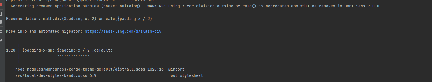
I'm adding sass-loader to my webpack build so that I can keep up to date with the latest theme builds more easily. We simply use the default theme.
Webpack is giving me the following warning, however ...
WARNING in ./node_modules/@progress/kendo-theme-default/dist/all.scss (./node_modules/css-loader/dist/cjs.js??ruleSet[1].rules[0].use[1]!./node_modules/postcss-loader/dist/cjs.js!./node_modules/sass-loader/dist/cjs.js!./node_modules/@progress/kendo-theme-default/dist/all.scss)
Module Warning (from ./node_modules/sass-loader/dist/cjs.js):
Deprecation Using / for division outside of calc() is deprecated and will be removed in Dart Sass 2.0.0.

Recommendation: math.div($a, $b) or calc($a / $b)

More info and automated migrator: https://sass-lang.com/d/slash-div

node_modules\@progress\kendo-theme-default\dist\all.scss 1039:15  k-math-div()
node_modules\@progress\kendo-theme-default\dist\all.scss 4138:21  root stylesheet

 @ ./node_modules/@progress/kendo-theme-default/dist/all.scss 8:6-188 22:17-24 26:7-21 52:25-39 53:36-47 53:50-64 57:6-67:7 58:54-65 58:68-82 64:42-53 64:56-70 66:21-28 77:0-158 77:0-158 78:22-29 78:33-47 78:50-64 55:4-68:5

1 warning has detailed information that is not shown.
Use 'stats.errorDetails: true' resp. '--stats-error-details' to show it.
Are there plans to improve 2.0.0 compatibility with kendo themes? math/calc should still be backwards compatible.
When creating a custom build, it's highly impractical to trim down the theme css. The Less source breaks out common widget properties, but the primary themable file lumps all widgets together into a single massive file. It would be nice if this could be split apart further to trim out unused widget styles entirely.
It would be nice if Theme variables would be separated into a different file, to make it possible to import those variables into your own site.less.
This way colors etc can be re-used across the entire site.
I made a repl to show the issue: https://blazorrepl.telerik.com/GcaGvdaw31AartTh17
The 3 differently sized text area's render with almost the same size. Inspecting the elements, the textarea is wrapped in a span which is given a k-input-[sm/md/lg] class, and the text area is given minorly different padding for each. This works fine for TextBox, but not what you would expect from textarea.
I would expect textarea to render 1 line for sm, 2 lines for md, and 4 lines for lg, or something similar. The padding is a fairly useless difference here for a text area.
Adding the form-control class from bootstrap to a textarea causes worng appearance especially when I have autosize set to true.
---
ADMIN EDIT
Here is a workaround:
<style>
    span.k-textarea.form-control {
        border: 0;
        box-shadow: none;
        width: 100%;
        height: auto;
    }

        span.k-textarea.form-control textarea {
            border: 1px solid rgb(206, 212, 218) !important;
            border-radius: 0.25rem !important;

        }
</style>

<TelerikTextArea @bind-Value="@theValue" Class="form-control" AutoSize="true" />

@*<textarea class="form-control" @bind="theValue"></textarea>*@

@code{
    string theValue { get; set; } = "one\ntwo\nthree\nfour";
}
---
Let us know whether do you need Office 365-like skin?