The Floating Label component position is correct only when using it with medium-sized inputs.
Here is a possible workaround - please adjust the exact pixel values, according to the CSS theme and your preferences.
https://blazorrepl.telerik.com/QUuKYyPu56EBMuTm11 (uses the new Meridian theme by default)
<TelerikFloatingLabel Text="Your Name" Class="small-fl">
    <TelerikTextBox @bind-Value="@Name" Size="sm" Width="200px" />
</TelerikFloatingLabel>

<TelerikFloatingLabel Text="Your Name">
    <TelerikTextBox @bind-Value="@Name" Width="200px" />
</TelerikFloatingLabel>

<TelerikFloatingLabel Text="Your Name" Class="large-fl">
    <TelerikTextBox @bind-Value="@Name" Size="lg" Width="200px" />
</TelerikFloatingLabel>

<style>
    .small-fl {
        --kendo-floating-label-offset-y: 23px;
    }

    .large-fl {
        --kendo-floating-label-offset-y: 31px;
    }
</style>

@code {
    private string Name { get; set; } = string.Empty;
}
For the old Default theme, the workaround is:
    .small-fl {
        --kendo-floating-label-offset-y: 23px;
    }

    .large-fl {
        --kendo-floating-label-offset-y: 31px;
    }
Kendo SASS themes allow the definition of a variety of colors for grid rows that are applied in different situations:
- $grid-alt-bg defines the color of alternate rows
- $grid-selected-bg defines the color of selected rows
- $grid-selected-alt-bg defines the color of selected alternate rows
However, at least in @progress/kendo-theme-classic (v. 5.4.1), $grid-selected-alt-bg is only applied for locked columns. You can check that by doing a string-search for "$grid-selected-alt-bg" in dist/all.scss. I have not checked if the same happens when using other themes.
Bug Description
An unreadable and unprintable symbol †renders in dropdownlists in the classic-silver theme when it is loaded from unpkg -
Steps to Reproduce
Steps to reproduce the behavior:
- Go to this Dojo example - https://runner.telerik.io/fullscreen/SHuPXBQI/3
- Open the DropDownList
Expected Behavior
No unreadable symbols should be present in the DropDown's items
Actual Behavior
There's an unreadable symbol †at the start of the DropDownList's items
Affected Theme(s)
- All themes
Affected Suites
- Kendo UI for jQuery
Browser Information
- All browsers
When scrolling to the right and to the bottom the columns and rows are not aligned any more.
This is already visible in the example in the documentation: https://www.telerik.com/kendo-angular-ui/components/gantt
Hi
No matter what this is set too on any of the map components the controls only show in the top left.
The enabled parameter works as expected still but not MapControlsPosition on any of its options.
Running the demo code in the REPL does the same thing.
Phil
See here:
https://github.com/twbs/bootstrap/blob/main/scss/_variables.scss#LL804C1-L804C24
$input-btn-border-width is now a custom variable.
(see bootstrap 5.2 version: https://github.com/twbs/bootstrap/blob/v5.2.3/scss/_variables.scss#L738 where $input-btn-border-width was a simple scss variable)
The main problem is that on file:
@progress\kendo-theme-bootstrap\scss\input\_variables.scss you are using:
$kendo-input-border-width: $input-border-width !default;
$kendo-input-border-height: ( $kendo-input-border-width * 2 ) !default;
so scss compilation gives me an error:
SassError: Undefined operation "var(--bs-border-width) * 2".
   ╷
10 │ $kendo-input-border-height: ( $kendo-input-border-width * 2 ) !default;
My temporary fix is to define, before importing _variables file:
$kendo-input-border-width: 1px !default;
Basically, the main problem is that package @progress/kendo-theme-bootstrap 6.4.0 with bootstrap 5.3 doesn't work anymore.
Thanks.
Diego
When Gantt is used with bootstrap theme there is an accumulating error that leads to the row hover effect being misaligned with actual grid rows. This issue only appears on the Windows versions of Chrome and Firefox, Mac OS versions seem to be unaffected.
This Stackblitz was taken directly from angular gantt overview page.
Steps to reproduce:
- Open stackblitz
- Scroll to the end of the table
- Hover over one of the timeline rows
- Hover is misaligned
See attached video.
When bootstrap theme is used it seems that milestone symbol is slightly shifted to the left compared to the main theme.
See this 2 examples:
- https://stackblitz.com/edit/angular-te4cysht?file=src%2Fapp%2Fhierarchical-data.ts
- https://stackblitz.com/edit/angular-hse7ryxz?file=src%2Fapp%2Fhierarchical-data.ts
In both examples task and milestone start exactly at 2014-06-02T00:00:00.000. However, the bootstrap version appears to be slightly to the left.
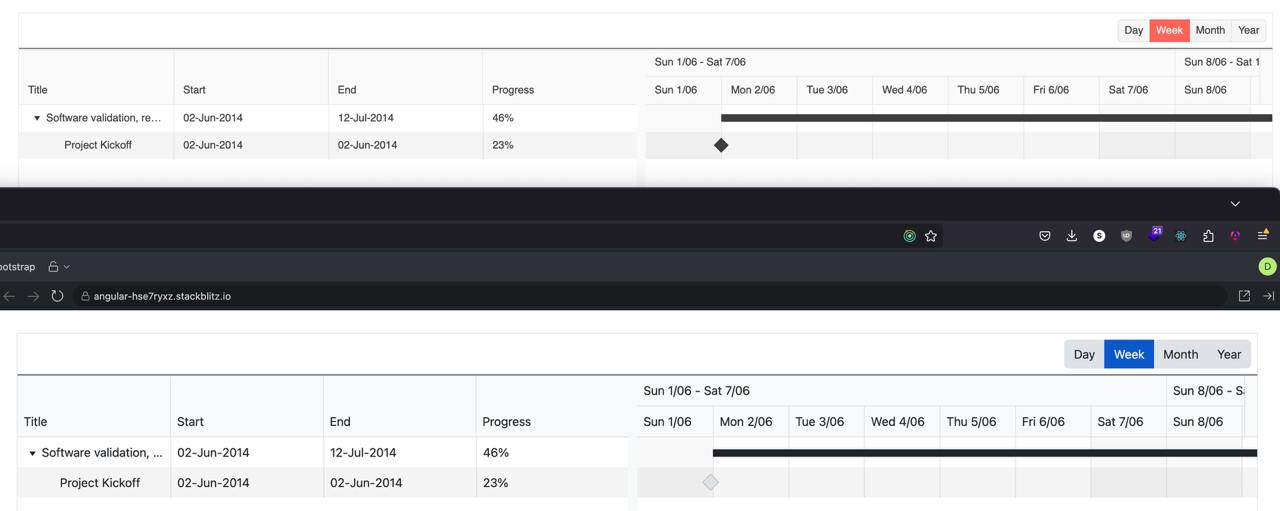
This is also visible on https://www.telerik.com/kendo-angular-ui/components/gantt.
Hi Guys,
I'm trying to migrate my app from using the old @import (v.9.0.0) methodology to the new @use (v.10.0.1) methodology but things are not going well because it would appear only certain variables have the capability of being overridden.
To illustrate create an index file with the following contents:
@use "sass:map";

@use '@progress/kendo-theme-classic/scss/index.scss' as *;

// $kendo-colors: map.merge($kendo-colors, k-generate-color-variations('base',      red, 'classic'));
// $kendo-colors: map.merge($kendo-colors, (
//     app-surface: red,
// ));
// $kendo-checkbox-checked-text: red;
// $kendo-table-bg: red;
// $kendo-font-size-sm: 12px;
// $kendo-input-placeholder-opacity: 0.8;

@include kendo-theme--styles();

@debug k-color(base);
@debug k-color(app-surface);
@debug $kendo-checkbox-checked-text;
@debug $kendo-table-bg;
@debug $kendo-font-size-sm;
@debug $kendo-input-placeholder-opacity;
When compiled the following Debug values are output
Debug: var(--kendo-color-base, #ebebeb)
Debug: var(--kendo-color-app-surface, #ffffff)
Debug: var(--kendo-color-on-primary, #ffffff)
Debug: var(--kendo-color-surface-alt, #ffffff)
Debug: 0.75rem
Debug: 1
Now uncomment the variable overrides and recompile ... This time the Debug output is as follows
Debug: var(--kendo-color-base, red)
Debug: var(--kendo-color-app-surface, red)
Debug: var(--kendo-color-on-primary, #ffffff)
Debug: var(--kendo-color-surface-alt, #ffffff)
Debug: 12px
Debug: 1
So as you can see the
$kendo-checkbox-checked-text
$kendo-table-bg
$kendo-input-placeholder-opacity
variables have not been overridden.
Is this a bug with the new SASS files or can we no longer override all variables?
Regards
Alan
Hi Guys,
Have just upgraded to the Kendo UI v2024.3.806 along with kendo-theme-classic v8.2.1 and have noticed you can no longer set the $kendo-disabled-opacity & $kendo-disabled-filter variables to override their values because they are now being hard set in the following section within the 'all.scss' file.
// Backward compatibility
// #region @import "./color-system/_swatch-legacy.scss"; -> scss/core/color-system/_swatch-legacy.scss
@if ($kendo-enable-color-system) {
...
$kendo-disabled-opacity: .6;
$kendo-disabled-filter: grayscale(.1);
...
}
This is a regression from
@progress/kendo-theme-classic:8.0.1
where neither of these variables were being hard set.
Also can you confirm what version of the SASS themes are compatible with the latest Kendo UI because the latest version on NPM is now v9.0.0 which was released 3 days prior to Kendo UI v2024.3.806.
NOTE: kendo-theme-classic: 9.0.0 also has these two variables hard set.
Regards
Alan
If I place the DateRangePicker inside a TelerikForm, the start and end input fields are stacked vertically.
If I were to place the control just inside a div, they are arranged horizontally.
How can I get the control to arrange itself horizontally when inside a form?
---
ADMIN EDIT
Here is a reproducible that begins with a short CSS workaround (remove the style to see the issue):
<style>
    .k-form .k-daterangepicker-wrap .k-floating-label-container {
        display: inline-block;
        width: auto;
    }
</style>


<div class="demo-section k-form k-form-vertical">
    <div class="k-form-field">
        <label for="outbound-date" class="k-label k-form-label">Travel Date</label>
        <div class="k-form-field-wrap">
            <TelerikDateRangePicker @bind-StartValue="@StartValue"
                                    @bind-EndValue="@EndValue"
                                    StartId="outbound-date">
            </TelerikDateRangePicker>
        </div>
    </div>
    <div class="k-form-field">
        <p>The selected travel date is: <strong>@StartValue.Value.ToLongDateString()</strong> and <strong>@EndValue.Value.ToLongDateString()</strong></p>
    </div>
</div>

<div class="demo-section">
    <h4><label for="outbound-date">Book your flight tickets</label></h4>

    <TelerikDateRangePicker @bind-StartValue="@StartValue"
                            @bind-EndValue="@EndValue"
                            StartId="outbound-date">
    </TelerikDateRangePicker>

    <div class="mt-lg">
        <h6 class="kd-demo-heading mt-sm">Selected Dates</h6>
        <div><strong>Departure: </strong> @StartValue?.ToString("dd MMM yyyy")</div>
        <div><strong>Return: </strong> @EndValue?.ToString("dd MMM yyyy")</div>
    </div>
</div>

@code {
    public DateTime? StartValue { get; set; } = new DateTime(2020, 4, 3);
    public DateTime? EndValue { get; set; } = new DateTime(2020, 4, 10);
}
---
When setting the Toolbar's "size" property to "none", the Kendo-UI SASS themes apply a default spacing of 0 between all items. This can be adapted by altering the $kendo-toolbar-spacing variable. However, adding a value bigger than 0 leads to additional space before the first toolbar item.
This DOJO reproduces the behavior (since SASS-variables cannot be adapted in the DOJO-editor, I have mimicked the effect by setting appropriate styles to the container).
Note that this only happens if the toolbar's size is set to "none".
Kendo Theme Version: 7.0.2
The Kendo-UI "Classic" SASS theme supports the $kendo-calendar-cell-border variable. However, its value is never applied. This also means that variables like $kendo-calendar-cell-selected-border etc. do not have any effect, because they only set the border-color, but not the border itself.
Kendo Theme Version 7.0.2
The Kendo-UI SASS themes support setting the amount of spacing between items using the $kendo-pager-item-spacing variable. However, no spacing is added between the next/previous buttons and the "number" section.
Also, spacing does not work properly if the "select" element is disabled and therefore not displayed.
Kendo Theme Version: 7.0.2
Using the latest Classic Kendo theme, when showing a grid with a pager, the button indicating the currently selected page has a background that's a function of the button's text color (opacity .2). This results in a background color that lacks sufficient contrast with the text color which is not compliant with WCAG contrast rules for display text.
https://webaim.org/resources/contrastchecker/?fcolor=F35800&bcolor=F1D2C0
#F35800 is the default primary button color in the default theme and F1D2C0 is the color that results from the interaction between a background with opacity .2 laid over the default background grey #F0F0F0. I've attached a screenshot of the PowerToys color picker showing the computed color of the button.
The button background color needs to pass all of the WCAG checks in the above link in our application and really should by default in my opinion.
Hello,
I'm adding sass-loader to my webpack build so that I can keep up to date with the latest theme builds more easily. We simply use the default theme.
Webpack is giving me the following warning, however ...
WARNING in ./node_modules/@progress/kendo-theme-default/dist/all.scss (./node_modules/css-loader/dist/cjs.js??ruleSet[1].rules[0].use[1]!./node_modules/postcss-loader/dist/cjs.js!./node_modules/sass-loader/dist/cjs.js!./node_modules/@progress/kendo-theme-default/dist/all.scss)
Module Warning (from ./node_modules/sass-loader/dist/cjs.js):
Deprecation Using / for division outside of calc() is deprecated and will be removed in Dart Sass 2.0.0.

Recommendation: math.div($a, $b) or calc($a / $b)

More info and automated migrator: https://sass-lang.com/d/slash-div

node_modules\@progress\kendo-theme-default\dist\all.scss 1039:15  k-math-div()
node_modules\@progress\kendo-theme-default\dist\all.scss 4138:21  root stylesheet

 @ ./node_modules/@progress/kendo-theme-default/dist/all.scss 8:6-188 22:17-24 26:7-21 52:25-39 53:36-47 53:50-64 57:6-67:7 58:54-65 58:68-82 64:42-53 64:56-70 66:21-28 77:0-158 77:0-158 78:22-29 78:33-47 78:50-64 55:4-68:5

1 warning has detailed information that is not shown.
Use 'stats.errorDetails: true' resp. '--stats-error-details' to show it.
Hi Kendo Team,
after we updated to version 2022.2.301 we decided to modify our theme by compiling the Metro theme from the source files and adjusting some of the variables provided.
When working on the multiselect styles however we noticed that changing the variable '@chip-solid-hover-text' in the 'type-metro.less' file did not lead to any change. The attached screenshot shows that the chip still keeps its black text color on hover even though the variable was set to white.
We inspected the _theme.less file in the folder Default/chip and noticed that the variable is not used by the theme (see screenshot). Looking at the code this also seems to be the case for the 'selected' styles.
We can add additional styles to fix that on our end but since there is a variable for both cases I am sure this is just an oversight and wasn't planned.
Thanks,
Markus
To reproduce, enable High Contrast mode in the OS and then go to any Splitter demo.
Bug report
Reproduction of the problem
Dojo example.
Current behavior
The mobile material theme does not apply specific styles to a button that has the "km-primary" class. Compare to the Nova mobile theme, which does have specific rules that use ".km-primary" selector.
Expected/desired behavior
CSS rules that use the ".km-primary" selector should be added to the theme.
Environment
- Kendo UI version: 2019.2.619
- jQuery version: x.y
- Browser: [all]
The problem is easily reproduced using the widget demo page https://demos.telerik.com/kendo-ui/dropdowntree/index
Simply switch to the High Contrast theme; the k-widget element is lacking the border-radius style hence looks different to the other widgets.
It looks like the k-dropdowntree class is missing from the following style rule:
.k-autocomplete, .k-block, .k-calendar-container, .k-colorpicker, .k-combobox, .k-datepicker, .k-datetimepicker, .k-drag-clue, .k-dropdown, .k-dropdown-wrap, .k-editor-inline, .k-grid .k-filter-options, .k-grouping-header .k-group-indicator, .k-inline-block, .k-list-container, .k-multiselect, .k-notification, .k-numeric-wrap, .k-numerictextbox, .k-picker-wrap, .k-slider-selection, .k-slider-track, .k-split-button, .k-textbox, .k-tile, .k-timepicker, .k-tooltip, .k-touch-scrollbar, .k-treeview .k-in, .k-upload, .k-window, .k-window-action, .k-window-titleless .k-window-content {
    border-radius: 13px
}