The Progress ThemeBuilder currently has the Fluent theme (by Microsoft), but only the light version is available.
As for the other themes (kendo, bootstrap, material) would it be possible to have the dark version too?
Thank you,
best regards
Roberto
Currently, we have templates for the different states of the Calendar cells:
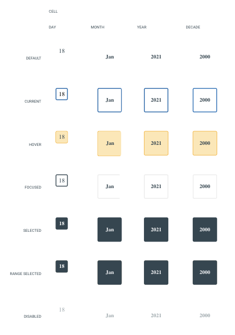
However, it's common to apply multiple states simultaneously. For example, the user may want to style a day cell that is considered current and selected or current, selected, and hovering at the same time. Consider exposing templates for the most commonly used combinations, such as the ones mentioned here.
Requested through t.1670882.
In ThemeBuilder Q1 2024 there are Grid templates for styling alternate rows and selected rows. However, there is no template for styling selected alternate row.
Consider providing templates for each rendering option.
Sometimes, when using the Export Font Icons functionality of the ThemeBuilder Plugin for Figma, the export freezes with "Sending data to server: 0%":
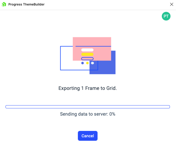
This is due to how Figma handles the export of icons.
Consider implementing a mechanism for indicating the problematic icons so that users can remove/update them and make them eligible for export.
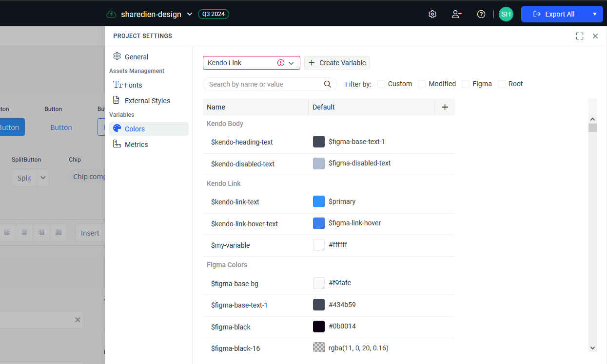
Starting from Q2 2024, new variables were introduced in the Kendo themes, such as primary-subtle, primary-subtle-hover, primary-subtle-active, etc., and they're all variants of some base color variable (e.g., primary).
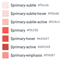
Currently, if users choose to use a different hue for such base variables, they must manually change all of their variants as well.
Consider implementing a feature allowing users to change all variants of a variable based on an internal algorithm when the base variable (e.g., primary) is modified.
There is a template in the Constructive Elements canvas of components, such as Grid, MultiSelect, etc., for Filter List Item. Currently, ThemeBuilder does not have an exposed component part for modifying its search icon. It becomes problematic when we use font icons, especially a different font file for the icons, which requires changing the character code.
Consider exposing a component part to modify this icon.
Sometimes, errors occur in ThemeBuilder due to various reasons.
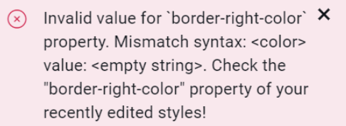
Consider including indicators in these errors to let the users know where they are located so they can possibly fix them through ThemeBuilder's user interface if applicable.
Requested through t.1667194.
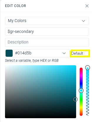
In Sass is possible to define à variable like this
$primary: red;
$primary-filter: rgba($primary, .5);
But this possibility is not supprted by ThemeBuilder
It may be usefull for variation of same color in theme whit only one variable to adjust.
_tokens.scss
tb-custom-primary: #014d5b !default; //Is the value if not defined in final scss
tb-primary: tb-custom-primary;
-----------------------------------------------
index.scss
$tb-custom-color: #34b232; //Now I can define the final value for variable
@import '_tokens'
it would be useful to add it in ThemeBuilder UI.
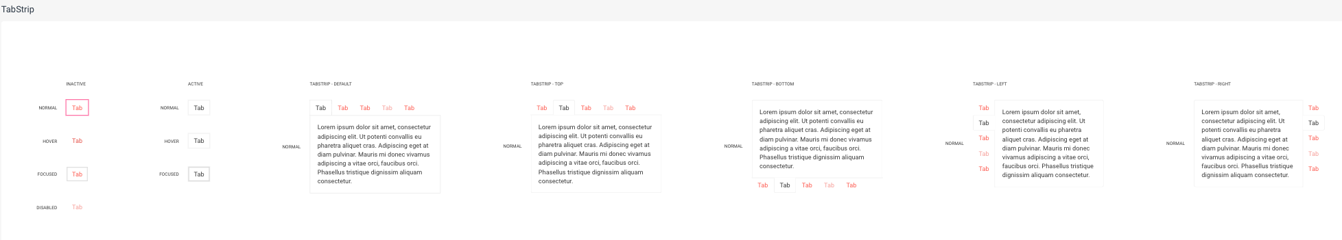
Currently, ThemeBuilder exposes templates for the states of the TabStrip items. However, the changes apply to all positions of the TabStrip. This is inconvenient if you want to apply changes only to one of its positions. Also, these items' states have specific styles coming with the keyword "!important", which the default templates do not override.
Consider exposing templates for these states based on the position of the TabStrip component.
Requested through t.1666111.
- Open a themebuilder project
- Click on the settings icon in the header bar on the right side
- Navigate to the colors section
- Try to navigate away from the color section
--> Create Variable Dropdown turns invalid and I can't navigate away from the section. Also there is no way to make it valid.
Consider providing an option to customize the text content for various components (like "Button", "Notification", etc.) so that users can test various scenarios like having longer strings, multiline strings, and similar scenarios.
For example, a user should be able to easily change the template text so that he can test sub-element alignment
Current template
Desired template with customized text
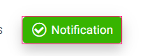
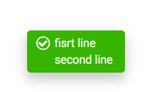
As of now, customization is only possible through the browser developer's tooling.
Currently, the Calendar that is used in ThemeBuilder is considered "infinite", where we can change the months by scrolling. However, in Telerik UI for Blazor, the only calendar available is the "modern" one, which uses arrow buttons to change months. As a result, some of the styles we apply to the calendar templates in ThemeBuilder don't work with this calendar. Additionally, we are unable to style certain elements, like the arrow buttons, using ThemeBuilder.
https://github.com/telerik/kendo-themes/tree/develop/tests/calendarConsider exposing templates for a "modern" Calendar component.
Hi there
I noticed that the timeline component isn't available in ThemeBuilder, and I wanted to share that we'd really love to be able to style it through the tool if possible.
Thanks so much for considering this!Cheers,
Davy
Currently, the Checkbox component doesn't have an exposed template for modifying the pseudo-element ::before. If they decide to use font icons to style the icons for the checked and indeterminate states, they cannot achieve this through ThemeBuilder.
Requested through t.1663139.
Currently, there is no exposed template for the nested span of the Notification component. It becomes problematic if you have applied some styles (e.g., the color of the text) to the HTML element "span" and you want to override them through ThemeBuilder.
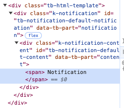
Consider exposing such component part.
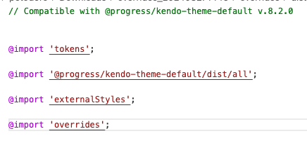
Currently, the external CSS files come before the overrides generated through ThemeBuilder. Therefore, it becomes problematic to override these ThemeBuilder overrides with external styles.
Consider allowing the user to choose the order in which the external styles are applied —whether they should come before or after the ThemeBuilder overrides.
Requested through t.1662556.