The Progress ThemeBuilder currently has the Fluent theme (by Microsoft), but only the light version is available.
As for the other themes (kendo, bootstrap, material) would it be possible to have the dark version too?
Thank you,
best regards
Roberto
Currently, the Calendar that is used in ThemeBuilder is considered "infinite", where we can change the months by scrolling. However, in Telerik UI for Blazor, the only calendar available is the "modern" one, which uses arrow buttons to change months. As a result, some of the styles we apply to the calendar templates in ThemeBuilder don't work with this calendar. Additionally, we are unable to style certain elements, like the arrow buttons, using ThemeBuilder.
https://github.com/telerik/kendo-themes/tree/develop/tests/calendarConsider exposing templates for a "modern" Calendar component.
Hi there
I noticed that the timeline component isn't available in ThemeBuilder, and I wanted to share that we'd really love to be able to style it through the tool if possible.
Thanks so much for considering this!Cheers,
Davy
Currently, the Checkbox component doesn't have an exposed template for modifying the pseudo-element ::before. If they decide to use font icons to style the icons for the checked and indeterminate states, they cannot achieve this through ThemeBuilder.
Requested through t.1663139.
Currently, there is no exposed template for the nested span of the Notification component. It becomes problematic if you have applied some styles (e.g., the color of the text) to the HTML element "span" and you want to override them through ThemeBuilder.
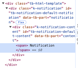
Consider exposing such component part.
Currently, the external CSS files come before the overrides generated through ThemeBuilder. Therefore, it becomes problematic to override these ThemeBuilder overrides with external styles.
Consider allowing the user to choose the order in which the external styles are applied —whether they should come before or after the ThemeBuilder overrides.
Requested through t.1662556.
There is a template in the Constructive Elements canvas of components, such as Grid, MultiSelect, etc., for Filter List Item. Currently, ThemeBuilder does not have an exposed component part for modifying its search icon. It becomes problematic when we use font icons, especially a different font file for the icons, which requires changing the character code.
Consider exposing a component part to modify this icon.
Currently you can only use and customize the default 6 Chart series colors (Kendo Colors Series A, B,C,D,E and F) using ThemeBuilder. Any additional ones needs to be defined in the component code. This is not ideal if you want to manage all colors from ThemeBuilder.
The request to have either have the ability to add new Chart series colors in the ThemeBuilder which you can use with the chart or have more variables exposed at the beginning 25+
Currently, the Drawer components (such as Drawer and Drawer Mini) come with a right border that can't be modified through ThemeBuilder:
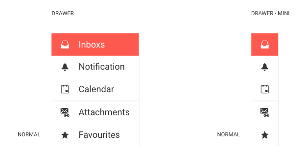
Consider exposing a template that allows to modify this border.
Currently, there is no way to style the different states (e.g. hover) of the Grid's Column Menu items through ThemeBuilder.
Consider exposing templates for those states.
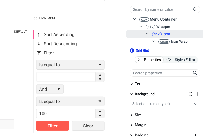
Requested through t.1661051.
Currently, there are no means to style the clear button of the DropDownTree component.
Consider exposing a template for the clear button (similar to the "(span) Input" component part).
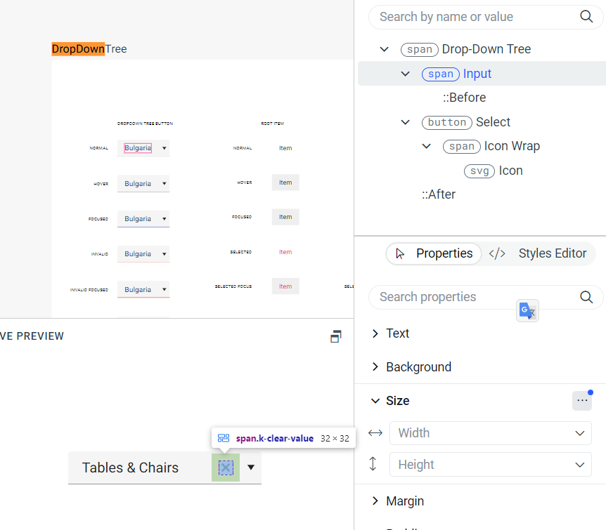
requested through t.1660254
Consider generating utility classes for variables to apply and reuse styles easily. For example, the user defines a color variable in ThemeBuilder called "component," and this makes ThemeBuilder generate utility classes:
.k-color-component {
  color: #ffeb3b;
}
.\!k-color-component {
  color: #ffeb3b !important;
}
.k-bg-component {
  background-color: #ffeb3b;
}
.\!k-bg-component {
  background-color: #ffeb3b !important;
}
These utility classes can then be applied and reused in code outside of ThemeBuilder:
<div class="k-color-component"></div>
Currently, in ThemeBuilder, the generated styles for the Telerik/Kendo component Breadcrumb are only for the collapse mode "wrap". However, in Telerik UI for Blazor, Kendo UI for Angular, and others, the Breadcrumb component supports different collapse mode values, such as "auto" and "none":
https://docs.telerik.com/blazor-ui/components/breadcrumb/collapse-modes
https://www.telerik.com/kendo-angular-ui/components/navigation/breadcrumb/collapse-modes/
Consider providing templates to allow the generation of styles for other collapse modes.
Requested through t.1660021
Consider exposing a template for the ContextMenu component in ThemeBuilder.
https://docs.telerik.com/kendo-ui/controls/menu/contextmenu/overview
https://docs.telerik.com/blazor-ui/components/contextmenu/overview
Requested through t.1658717
It would be helpful to add a feature to ThemeBuilder that allows users to create theme variable modes based on typography variables, similar to the existing feature that lets them create themes based on color and metrics.
This will enable users to generate different themes within a single project by simply changing the fonts used.
Requested through t.1656320
Currently, in ThemeBuilder there is a template that allows you to style the icon of a header cell that is filterable.
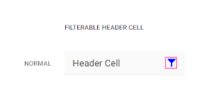
However, we need to be able to style the icon in a header cell that triggers the ColumnMenu (the more icon)

https://demos.telerik.com/aspnet-core/grid/column-menu
https://www.telerik.com/kendo-react-ui/components/grid/interactivity/column-menu/
requested through t.1655985
I need to be able to enter `rem` (or even `em`) values for metrics like `padding`.
With Kendo theme version 8.0.0 the some radius variables like $kendo-border-radius were removed and are no longer present.
Instead, there is now a new feature called kendo-border-radii that automates the creation of different border-radius variables (e.g. like $kendo-border-radius-sm aor $kendo-border-radius-lg)
More about the new variables in Kendo Themes 8.0.0 and above are available in the official documentation:
https://www.telerik.com/design-system/docs/themes/theme-material/theme-variables/#variables
Consider exposing border-radius variables as they were present in older version but are not accessible in TB Q3 2024.
Hello.
One of our component is styled in a way that makes it indistinguishable from the background, which is unfortunate and makes hard to review its visuals.
Could you add support for selecting different background in previews? Something like gray shades or a pattern?