Provide right to left support.
When having a RadCollectionView in the first tab for example, and switching tabs, the content inside the tabs does not update when scrolling the collectionview. When removing the RadCollectionView, the content updates.
This happens when using Telerik Maui 10.0.0 version and Maui 9.0.40
The TabView behaves erratically in RTL languages (e.g. Arabic). The tabs are correctly outlined from right-to-left but clicking on them leads to unexpected behaviour, as can be seen in the attached video. Clicking on a tab moves the selection to a completely different tab. Furthermore, the tab content is not displayed if any tab except the first one is selected.
Our product reaches an international market and is translated to more than 20 languages. Right-to-left language support is an integral part of our application. A similar bug has been reported almost two years ago (TabView: Right to Left support). Please fix this.
A VisualStudio solution has been attached to this bug report. It uses the sample code from your documentation (Telerik TabView for.NET MAUI—Tabbed UI with Native Look) to display three tabs.
Deploy the sample application to Android or iOS platforms to reproduce the issue.
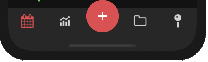
Similar to chrome browser tabs.

Hi Team,
Currently (as of 0.7.0) the RadTabview automatically collapses the tab header items panel when there are no tab headers to show.
I am requesting that you add a feature to the RadTabView that will allow me to keep the header items panel visible, even if there are no tab headers visible.
Thank you,
Brandon
> The reason I ask for this, is because sometimes I need to set some tabs to IsVisible=False, but I still want to see the header panel.
Provide an option for achieving the following using the TabView - add a button in the header's center and customize it:
empty TabView, start adding items to the control, tab headers are not visible.
You need to resize the window to show the headers.
When setting the second TabItem IsSelected property of Tabview, it does not take effect, and the first TabItem is still selected,and the second one alsodisplays the selection style.
Code
    <telerik:RadTabView x:Name="tabView" AutomationId="tabView">
        <telerik:TabViewItem HeaderText="Home">
            <Label Margin="10" Text="This is the content of the Home tab" />
        </telerik:TabViewItem>
        <telerik:TabViewItem HeaderText="Folder" IsSelected="True">
            <Label Margin="10" Text="This is the content of the Folder tab" />
        </telerik:TabViewItem>
        <telerik:TabViewItem HeaderText="View">
            <Label Margin="10" Text="This is the content of the View tab" />
        </telerik:TabViewItem>
    </telerik:RadTabView>
Please Refer to the attachment for the results.
This bug prevents the binding of the TabViewItem's properties to the underlying view-model. For example, the following code won't work:
<telerik:RadTabView x:Name="tabView">
    <telerik:TabViewItem HeaderText="{Binding SomeHeaderText}"
                                      ImageSource="{Binding SomeImageSource}">
    </telerik:TabViewItem>
</telerik:RadTabView>
As a temporary workaround, the BindingContext can be propagated manually instead:
<telerik:RadTabView x:Name="tabView">
    <telerik:TabViewItem BindingContext="{Binding BindingContext, Source={x:Reference tabView}}"
                                      HeaderText="{Binding SomeHeaderText}"
                                      ImageSource="{Binding SomeImageSource}">
    </telerik:TabViewItem>
</telerik:RadTabView>
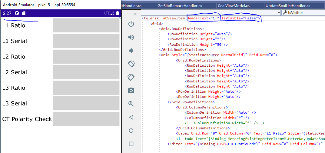
when the tab IsEnabled is set to False -> the style of the disabled tab changes, but the the disabled tab is still clickable.
when the tab IsVisible is set to False -> the tab is not visible, but its content is still visible.