Currently you can either set the position of a window by specifying the top or left positions on the screen. However once these are specified, the window is no longer draggable, or is only draggable in a specific direction, for example, set the :top="100" attribute on a window and the window is now locked to that height (100px) and can only be dragged left or right, instead of vertically and horizontally.
Please allow a window to be set to any position on the screen programatically at any time, and then allow it to be draggable if the draggable property is set to true. A use case would be where a window is opened up next to another element on the screen, the user moves the window to get access to any underlying content and then closes the window. It would be ideal to be able to programmatically specify where to open the window when the same method is called again.
Thanks.
The Upload component has the option to configure it to accept single or multiple files for upload.
When the component is configured to accept only one file, the text in its Select button should be in singular form - "Select file..." instead of "Select files..."
Hi.
I am looking for a Badge component in the Kendo UI for Vue suite. The component is available for the Angular suite(https://www.telerik.com/kendo-angular-ui/components/indicators/badge/) but not for Vue.
It will be nice to have this component available also for Vue.
Hi Team,
Can you consider the implementation of a Native TileLayout component?
It will be a very nice add-on to the Native Vue suite.
The DatePicker, DateTimePicker, TimePicker, and DateRangePicker components don't provide open and close events that are triggered when the popup of a component is opened/closed.
Hey there!
It would be great to add an option to the <Grid /> component that allows specifying a custom cell template specifically for the "select" column.
Looking at the documentation, there is an example that shows how to do something similar, but it overrides the complete CellRenderer for all columns.
Here is a minimum example of the API we could have:
<script lang="ts" setup>
  import { Grid } from '@progress/kendo-vue-grid';
</script>

<template>
  <Grid
    selected-field="selectedField"
    selected-cell="mySelectCell"
  >
    <template #mySelectCell="{ props }">
      <!-- Checkbox or whatever you want -->
    </template>
  </Grid>
</template>
Hello,
The StackLayout component is available in other Kendo UI suites like KendoReact for example but is still not provided for Vue. Can you add the StackLayout component to the Kendo UI for Vue Native suite?
Hello,
The GridLayout component is available in other Kendo UI suites like KendoReact for example but is still not provided for Vue. Can you add the GridLayout component to the Kendo UI for Vue Native suite?
The ScrollView provides one of the fundamental UI experience blocks on mobile apps - would like to see a wrapper implemented for Kendo UI for Vue to add support for it.
Hi,
I'm trying to figure out how to persist and restore state in the native Vue grid. Am I missing something; is this not available yet?
I found the article about doing it with the grid wrappers, but not native.
Thanks!
When using the chrome accessibility panel to inspect the filter operator button, there is no accessible name or title (hovering over the button does not give a tooltip with the name of the button).
The clear filter button does have an accessible name and title.
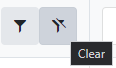
Please correct the filter operator button in order to meet WCAG Accessibility Standard 1.1.1 (Non-Text Content) and 4.1.2 (Name, Role, Value)
Hello there,
I am looking for a loading spinner solution to use with Vue Native Grid. I could not find something on the docs.
Is there any way I can show some kind of loading indicator while loading the data?
I am not using data source from Kendo, just basic method to populate `:data-items="items"`
Thank you!
Add functionality that allows the users to configure the Native Grid's Pager in a way it has the "All" option in its page sizes DropDownList.
The "All" option is available in the Kendo UI for jQuery suite(check the second example on the page). When the "all" option is selected, all Grid records are loaded on one page.
Can you please provide a native Vue Wizard Control like the JQuery one:
Demo of core features in jQuery Wizard widget | Kendo UI for jQuery (telerik.com)
I would really like to see the following:
- combobox with cascading,
- treeview.
Vue docs say it's incompatible with jquery, so I don't understand how I could use jquery based components.
The PanelBar component is currently available only as a Wrapper component.
To use all the benefits provided by the Vue ecosystem, it will be very convenient if the component is available as a Native one.
It would be nice if we can see a native version of the component.
Currently, if we want to set the height of a Pie Chart, its labels are appearing outside the visible area of the component. This behavior can be seen in this StackBlitz example.
While the Kendo UI for Angular and Kendo UI for jQuery have the autoFit property available in the seriesItems' configuration, this property is missing in the Native Vue Charts. making this property available in the Vue Charts will help in the implementation of specific Chart scenarios.