In this example the 'expanded' prop is set to true by the filter is not expanded - https://stackblitz.com/edit/uquwh8-1e5npd?file=src/ColumnMenu.vue
a possible workaround - uncomment the line in the mounted function.
I want to use filterGroupByField to indicate that a column that has a GridColumnMenuCheckboxFilter. Naturally, there can be more than 2 items selected. If more than 2 items are selected, the filterGroupByField returns null.
See this example (select more than 2 product id's):
https://stackblitz.com/edit/i58xwv?file=src/main.vue
Describe the bug
With version 3.0.4 of the Grid component, there is a regression in the way the component displays date fields.
Till version 3.0.3, date fields defined like '2021-05-13T00:00:00' were correctly displayed. From version 3.0.4 fields defined as '2021-05-13T00:00:00' are not displayed in the Grid.
To Reproduce
Steps to reproduce the behavior:
- Open this StackBlitz example
- See the 1st and 3rd row in the Date column
Expected behavior
All dates in the Date column should be visible as in this StackBlitz example.
Describe the bug
In scenarios when we dynamically add data to the beginning of the Grid, the component re-renders elements whose re-rendering can be skipped.
To Reproduce
- Open this StackBlitz example
- Click on the "add row to beginning" button
Expected behavior
The onUpdated method should not be called when adding a new row to the beginning of the Grid. Instead, if you open the browser's console, the result is that "updating..." is logged three times.
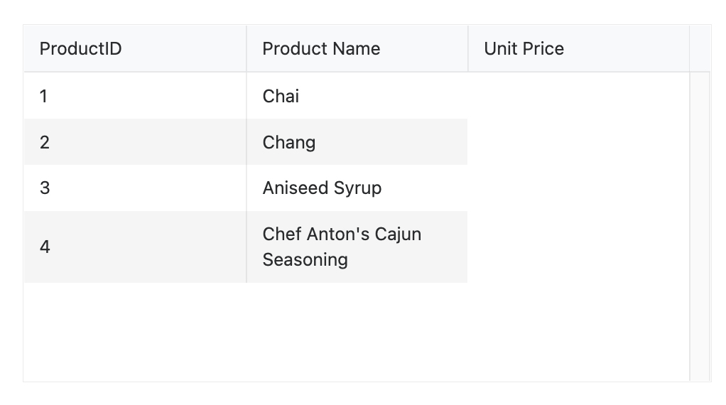
Describe the bug
When using a slot template inside the Grid, the content of the template should always have only one DOM element on the root level. If there are multiple elements on the root level, only the first element will be rendered.
In scenarios when we add a comment inside the slot template as a first element, the Grid recognizes it as the first element in the template and nothing will be rendered.
To Reproduce
- Open this StackBlitz example
- See the Unit Price column
Expected behavior
The rendering of the slot template shouldn't depend on the number of root elements inside it. The template should be rendered in scenarios with both single and multiple elements in the root.
Screenshots
Describe the bug
When we use the Native Grid with a sortable configuration set to "{ mode: 'multiple' }" and we have a ColumnMenu, once the sorting functionality of the column menu is used, the sorting is reset.
To Reproduce
- Open this StackBlitz example
- Apply sort to the Name and Unit Price columns by clicking on each column header.

- Select the column menu of the Discounted column and click the sort Ascending or Descending button.

- Notice that the previous nested sort applied in the above steps is cleared and only the Discontinued column has an applied sorting.
Expected behavior
The sorting shouldn't be reset no matter which Grid sorting functionality is used. In the above example, the sorting of the Discontinued column should be added to the complex sorting.
Currently, the Native Grid implementation doesn't provide an option for the implementation of the scenario from the following screenshot.
The thing that can be currently customized in the grouping toolbar of the Native Grid is only its text.
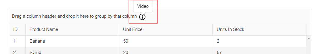
Please provide an option by which we can define a custom template for the grouping toolbar.
Add active class to the column menu icon once something in it is different from default
Currently we recommend using custom class on the header(https://www.telerik.com/kendo-vue-ui/components/grid/columns/column-menu/#toc-styling-the-column-menu-icon), yet not visualising that the menu is populated seems like a UI misleading issue when using the component so we should add it by default
Describe the bug
Grid rowRender is triggered for every more than once in in-cell editing scenario vue 2
To Reproduce
https://codesandbox.io/s/confident-wind-50llik
1 Click on some cell
Current: RowRender is triggered for every row
Expected: RowRender is triggered only for the clicked row
The native Grid allows you to lock selected columns inside it. When we have locked columns, these are constantly visible inside the Grid, while the unlocked columns can be horizontally scrolled to see their content.
The width of the area in which the unlocked columns can be scrolled depends on a combination of the following:
- The number of locked columns
- The width of the locked columns
- The width of the Grid
Having the above, there are some scenarios in which the area where the unlocked columns are displayed can be covered by locked columns or its size can become so small that the Grid data cannot be read.
Some examples of how the area that displays the unlocked column can become invisible or minified in size are:
- In a Grid with many columns, define many of them as locked
- In a Grid with resizable columns, resize one or a few of the columns in a way their sum width is bigger than the Grid's width
- A few Grid columns are locked but the Grid's width is too small
The current Feature request is about a property that defines the minimum width of the area in which the unlocked columns are scrolled. It could be a property like minUnlockedColumnsVisibleAreaWidth. Having this property defined, it should have a bigger priority over the defined column widths. This means that if there is not enough space to display the different locked columns with their pre-defined widths, the locked columns should be resized in a way the minimum visible area for the unlocked columns has enough width to display data.
https://stackblitz.com/edit/mzrap6-afgvuk?file=src%2Fmain.vue
reorder the second column
result the innderHTML is NOT visible
Expected behavior
result the innderHTML is visible
workaround: use inner array instead of innerHTML - https://stackblitz.com/edit/mzrap6-y35krb?file=src%2Fmain.vue
Describe the bug
When expanding/collapsing grouped data in the Grid re-renders all Grid rows while only the collapsed ones should be re-rendered.
To Reproduce
- Open this CodeSandbox
- Collapse a group
- Open the browser's console and see that row-render has been called 1000 times
Expected behavior
The row-render method should be called for the rows that hold the collapsed data, not for all Grid rows.
Describe the bug
The value of the data-grid-row-index attribute of the different Native Grid rows is always -1, no matter the scenario in which the component is used.
To Reproduce
- Open this StackBlitz example
- Inspect a random Grid row and see its attributes
Expected behavior
The different rows inside the Grid should have different values for the data-grid-row-index attribute.
Describe the bug
When activating the keyboard navigation inside the Native Grid and there are custom cells in this Grid, the navigation between the cells(in a specific scenario) is slow.
Scenario: In a Grid whose cells are all custom, focus a random cell in the first column. Then press and hold the right keyboard arrow. The focused cell starts moving to the right and then freezes until the last Grid column is reached.
Here is a video demonstrating the described scenario: https://user-images.githubusercontent.com/41293735/202707680-1964d01e-dbd3-4a35-93c4-1dbcfd45e887.mp4
- The issue is replicable on Chrome and Chromium-based browsers, on Windows 10.
- Testing the scenario on Firefox(Windows 10), the issue cannot be reproduced.
To Reproduce
Steps to reproduce the behavior:
- Open this StackBlitz example on Windows and Chrome/Chromium-based browser
- Focus a cell in the first column of the Grid
- Press and hold the right keyboard arrow
Expected behavior
The movement of focus inside the Grid should be smooth and visible
Describe the bug
There is a blank space at the bottom of the Grid when the user scrolls the data. This blank space appears on a specific configuration where the Native Grid is configured with virtual scrolling and the groupable property is set as follows:
:groupable="{ footer: 'visible' }"
- The issue is replicable in both Vue 2 and Vue 3
- The issue is not replicable if the groupable prop is defined like this:
:groupable="true"
To Reproduce
- Open this StackBlitz example
- Scroll the data items to the bottom of the Grid
Expected behavior
There shouldn't be any white/blank spaces at the bottom of the Grid
Screenshots

Describe the bug
When defining a footer in a locked native Grid column, the footer of the column is moving when the content of the Grid is scrolled horizontally.
To Reproduce
- Open this CodeSandbox example
- Scroll the content of the Grid to the right
Expected behavior
The footer inside the ID column should not move when scrolling the Grid's content
Screenshots
Describe the bug
When exporting the Kendo UI for Vue Native Grid data to a PDF file and the paper-size property is set to true, if there are locked columns inside the Grid, these columns are exported as empty columns.
- Workaround - a possible workaround is demonstrated in this StackBlitz example
To Reproduce
- Open this StackBlitz example
- Press the button above the Grid and save the exported file
- Open the saved file and see how the locked columns have been exported
Expected behavior
All Grid columns should be correctly visualized in the exported PDF file, no matter if they are locked or unlocked.
Screenshots

Additional context
If we set the paper-size to a pre-defined value like 'A4', the issue is not replicable
Describe the bug
A clear and concise description of what the bug is.
To Reproduce
https://codesandbox.io/p/sandbox/beautiful-tristan-5nvvfy?file=%2Fpackage.json
open the console and click the export button.
Expected behavior
No error in console
Describe the bug
The column virtualization functionality doesn't work when the Grid is configured to work in RTL direction.
To Reproduce
- Open this StackBlitz example
- No data is visualized inside the Grid
- If we remove the
:dir="'rtl'"configuration the Grid data is correctly displayed
Expected behavior
The Grid's column virtualization should work with both LTR and RTL configurations.