Test Environment:
OS: Windows_11Screen Reader: NVDA (2021.3)
Repro Steps:
1. Open URL: SMB Scheduler (agentcalendardevone.azurewebsites.net) page in Edge Browser.
7. Observe an issue that Incorrect role 'link' is defined on button controls.
Actual Behavior:
Incorrect role 'link' is defined on button controls present on 'Calendar' popup.
Expected Behavior:
In this case, the expected role is {button}. All components need a proper role attribute, ideally with semantics. In rare cases a role attribute should be added to give full context and information to assistive technology. Learn more by reading about when to use an aria role and the html/aria role mappings.
Environment Details:
OS: Windows11 version 21H2 (OS build 22000.856)
Edge Browser version: 104.0.1293.47
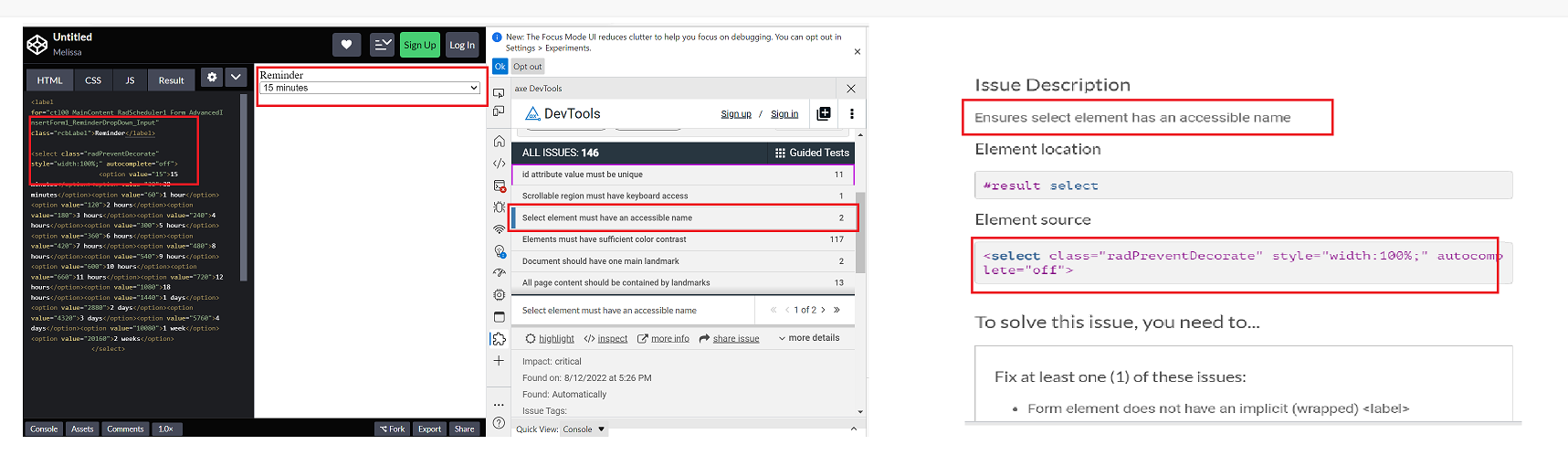
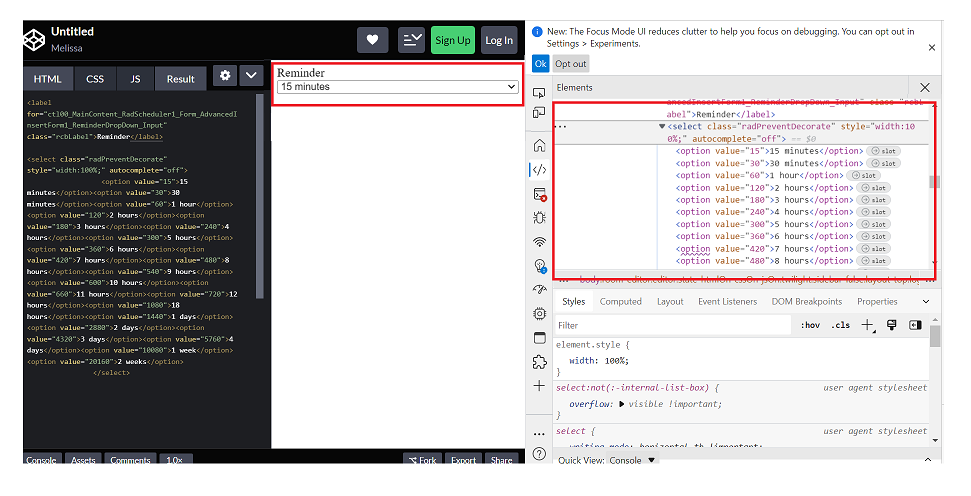
Repro steps:
1. Open Code Pen: https://codepen.io/m1mrt/pen/VwXjEzJ page in Edge Browser.2. Run Axe dev tools3. Observe an issue that select element has an accessible name.
Actual Result:Select element does not have an accessible name.
Expected Result:
All components need an accessible name, ideally using semantic elements and attributes. In rare cases, aria-label or aria-labelled by may be needed to alter the name.
Screenshot attachment:
Actual Result:
While navigating in table, Narrator is not announcing as 'enter table' and it is also not announcing rows and column information. while navigating in table, With arrow keys or table navigation keys or tab key, Narrator is announcing as 'end of line/blank'.
With caps-arrow keys, Narrator is giving row and column information.
Expected
While navigating in table, Narrator should announce as enter table and it should also give row and column information. And while navigating with arrow keys or table navigation keys or tab key, Narrator should not announce as 'end of line/blank' instead it should give row or column information
- This issue is observed with all three screen readers.
- Same issue is observed in chrome browser as well.
- Turn on Screen Readers:
- Narrator: Win + Shift + Enter
- NVDA: Ctrl + Alt + N
- JAWS: Ctrl + Alt + J
- Verbosity:
- Narrator: Default
- JAWS: Beginner, Highest
- NVDA: Default
- Open the URL: Agora Home Page (PPE) in latest edge browser.
- Press tab key to move to the 'Save as' control present in the page and activate it using enter key.
- Save as dialog gets displayed.
- Press tab key to move to the 'workspace to be saved as in' edit field and activate it using 'Alt + down arrow key'.
- Enter any invalid data in the search edit field.
- Now Verify whether screen reader is announcing the search result information on giving invalid data in the search edit field in windows or not.
- This issue is observed with all three screen readers.
- Same issue is observed in chrome browser as well.
- Name is not properly defined for once control. Screen reader is narrating the name twice for the once control as "Once check box not checked report frequency: once"
Path: Home > Header > Reports > Schedule a report button > Schedule a Report pop-up.
Refer Attachment: Name is not properly defined for once control.png
- Turn on Screen Readers:
- Narrator: Win + Shift + Enter
- NVDA: Ctrl + Alt + N
- JAWS: Ctrl + Alt + J
- Verbosity:
- Narrator: Default
- JAWS: Beginner, Highest
- NVDA: Default
- Open the URL: Agora Home Page (PPE) in latest edge browser.
- Press tab key to move to the 'Alerts' control present in the page and activate it using enter key.
- 'Alert Definitions' page gets displayed.
- Press tab key to move to the 'Functions? Filter' control and activate it using 'Enter key'.
- Navigate through the radio buttons in the displayed popup using arrow keys and verify whether screen reader is announcing incorrect name for the radio buttons present in the filter dropdown in windows or not.
@progress/kendo-react-inputs@9.0.0
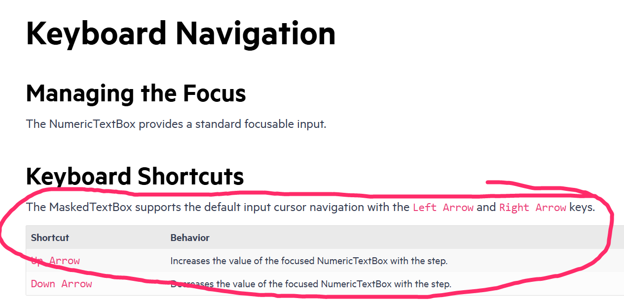
going back to this ticket, we'd like to use CTRL+up/down for our own purposes... as such, you can now disregard that feature request in lieu of fixing this bug =)
since this is undocumented behavior (documentation screenshot below) i believe we have a legitimate bug claim.
also, other controls like DateTimePicker reliably ignore the CTRL+up/down while implementing bare up/down as documented.
- Open URL: React Charts Library & StockChart - StockChart - KendoReact Docs & Demos (telerik.com in Edge browser.
- "Kendo React Stock Chart Overview" chart will appear.
- Navigate to the second chart present under Example using tab key.
- Now verify whether the single Pointer options alternative is provided for adjusting the graph points or not.
Test Environment:
- Open URL: https://www.telerik.com/kendo-react-ui/components/charts/chart/elements/axes/#toc-displaying-time-series
- Kendo React home page will appear.
- Navigate to the "Displaying Time Series" bar graph using tab key.
- Navigate using arrow keys through the chart controls.
- Verify whether the Screen reader is announcing the complete data points information of the "Displaying time Series" bar graph or not.
Hello,
Our team is using MobX-State-Tree (MST) and KendoReact TreeList control with virtual scrolling enabled. According to documentation MST model stores data as an observable array (https://mobx-state-tree.js.org/API/#array and https://mobx.js.org/api.html#observablearray).
The MST model’s field ‘tree’ is not a regular array, but a LegacyObservableArray.
From UI standpoint:
initially all tree nodes are collapsed
user clicks on i.e. 3rd tree node
selection is not displayed on any tree node (3rd node expected to be selected)
user expands 1st tree node - selection is set on the 3rd tree node
The following warning appears in the browser console.
Warning: Failed prop type: Invalid prop `data` of type `object` supplied to `TreeList`, expected `array`.
in TreeList (created by wrappedComponent)
in wrappedComponent (created by wrappedComponent)
in div (created by wrappedComponent)
in div (created by wrappedComponent)
in wrappedComponent
Model is defined as:
const TreeViewModel = types
.model('TreeViewModel', {
selectedItemUUID: types.maybe(types.string),
tree: types.optional(types.array(TreeNodeModel), []),
isLoaded: types.maybe(types.optional(types.boolean, false)),
treeTypes: types.optional(types.array(TreeNodeTypeModel), []),
})
.views((self) => ({
get treeCollection(): any {
return self.tree;
},
}))
Component is defined as:
return (<>
{!viewModel.isLoaded && loadingPanel}
<div className='treeListContainer' ref={stageCanvasRef}>
{treeListContainerHeight && <TreeList
style={{ maxHeight: `${treeListContainerHeight}px`, overflow: 'auto', }}
data={viewModel.treeCollection}
expandField={expandField}
subItemsField={subItemsField}
columns={columns}
selectedField={selectedField}
rowHeight={40}
scrollable="virtual"
/>}
</div>
</>);
The following workaround allows converting an observable array to a regular array.
.views((self) => ({
get treeCollection(): any {
return JSON.parse(JSON.stringify(self.tree)); // or self.tree.slice()
},
}))
This solution affects performance due to array copy.
Besides this TreeList uses an array copy. User’s selection and expanding don’t trigger related changes in the initial observable array in the model.
Related event handlers (i.e. onSelectionChange, onExpandChange) should be extended to make appropriate changes in the MST model.
Can you please extend KendoReact controls to support observable arrays?
Is there a better solution?
Hi Team,
If you take a look at my demo, I have 2 scheduler events, and I've created a custom SchedulerItem that renders the background of one of them to be blue.
When dragging the items around, the dragItem mains the same color with a bit of opacity, cool.
When resizing, the orange (?) one works great, this is the default color theme. However when I resize the blue one, while resizing, the resizeItem is an opaque blue, but the SchedulerItem underneath reverts back to the original default color scheme thereby mixing the colors.
Please advise.
Thanks,
Grant
Test Environment:
OS: Windows_11Browser: Version 103.0.1264.71 (Official Build) (64-bit)
Prerequisite steps:
1. Go to system settings.
2. Navigate to 'Accessibility' and activate it.
3. Navigate to 'Contrast theme' and activate it.
4. Select 'Desert/Aquatic' High Contrast theme in the combo box.
Repro Steps:
1. Open given URL https://canvasjs.com/docs/charts/chart-options/axisx/viewport-minimum/ in Edge.
2. Graph page will be open.
3. Turn on High contrast theme.
4. Verify that Graphs are not adapting high contrast Aquatic and Desert modes or not.
Actual Behavior:
Graphs are not adapting high contrast Aquatic and Desert modes. They remain same as in normal mode.
Expected Behavior:
Graphs should adapt high contrast Aquatic and Desert modes as defined. All elements should adapt to respective modes properly.
Hi there,
Im use chart component, and sometimes the tooltip on grid disappear, i dont know why, and if i put the same code on the telerik this bug doesnt happen, here is an exemplo with the same data
import * as React from 'react'
import * as ReactDOM from 'react-dom'

import {
    Chart,
    ChartSeries,
    ChartSeriesItem,
    ChartCategoryAxis,
    ChartCategoryAxisItem,
    ChartTitle,
    ChartLegend,
    ChartTooltip,
    ChartValueAxis,
    ChartValueAxisItem
} from '@progress/kendo-react-charts';

import 'hammerjs';


	const valueAxis = [
		{
			name: "",
			format: "{0:n1}",
			font: "10px Roboto",

		},
	];


const seriesValues = [
		{
			type: "bar",
			toolTipFormat: "{0:n2}",
			title: "Teste 1",
			spacing: 1,
      data: [27869.8616],
		},
		{
			type: "bar",
			toolTipFormat: "{0:n2}",
			title: "Teste 2",
			spacing: 1,
      data: [13277.95],
		},
		{
			type: "bar",
			toolTipFormat: "{0:n2}",
			title: "Teste 3",
			spacing: 1,
      data: [95164.9968],
		},
		{
			type: "bar",
			toolTipFormat: "{0:n2}",
			title: "Teste 4",
			spacing: 1,
      data: [115579.184],
		},
    {
			type: "bar",
			toolTipFormat: "{0:n2}",
			title: "Teste 4",
			spacing: 1,
      data: [null],
		},
        {
			type: "bar",
			toolTipFormat: "{0:n2}",
			title: "Teste 4",
			spacing: 1,
      data: [616.7145289747288],
		},
	];

const ChartContainer = () => (
  <Chart>
      <ChartTooltip
    shared={true}
    />
 <ChartValueAxis>
    {valueAxis.map((e, idx) => (
      <ChartValueAxisItem
        key={idx}
        name={name}
        labels={{
          visible: e.visible !== undefined ? e.visible : true,
          format: e.format,
          rotation: "auto",
          font: e.font,
        }}
      />
    ))}
  </ChartValueAxis>
    <ChartSeries>
      {seriesValues.map((item, idx) => (
        <ChartSeriesItem
          key={idx}
          type={item.type}
          data={item.data}
          name={item.name}
          spacing={item.spacing}
          labels={{
            font: '10px',
            format: "{0:n2}"
          }}

                />))}
    </ChartSeries>
  </Chart>
);

ReactDOM.render(
  <ChartContainer />,
    document.querySelector('my-app')
);
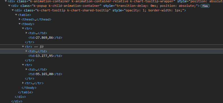
I inspected the page and realized this, that div is the tooltip and thats working normally, k-animation-container-show class, top and left properties on style;

and this one, is the tooltip that doest appear in the screen, does not have all class and style, just doesnt show up,

However, the component inside that div was rendered, as can you see
Im using this version
Repro:
- Create a DateTimePicker.
- Use its value prop to programmatically control the value the control uses.
- Add clickable Button (or other means) to programmatically set the value to an invalid date (i.e. something like new Date("invalid!").
- Click the Button. The date displayed becomes "NaN/NaN/NaN 12:NaN PM". I suppose this is reasonable.
- Now, click the calendar popup icon on the right-hand side of the component.
Expected:
Displays a calendar popup, perhaps defaulting to the current date & time.
Actual:
Throws an exception visible in the JavaScript console. Replaces the UI with an error message.
Proof-of-Concept:
https://stackblitz.com/edit/react-gvipiu?file=app%2Fmain.tsx
import * as React from 'react';
import * as ReactDOM from 'react-dom';

import {
  DateTimePicker,
  DateTimePickerChangeEvent,
} from '@progress/kendo-react-dateinputs';
import { Button } from '@progress/kendo-react-buttons';

const App = () => {
  const [date, setDate] = React.useState(new Date());

  const handleChange = (event: DateTimePickerChangeEvent) => {
    setDate(event.value);
  };

  const handleClick = () => {
    setDate(new Date('invaild!'));
  };

  return (
    <React.Fragment>
      <div className="example-wrapper">
        <p>
          (use Alt+<code>↓</code> to open the date-time selector, <code>←</code>{' '}
          and <code>→</code> to navigate, <code>↑</code> to increment and{' '}
          <code>↓</code> to decrement the value)
        </p>
        <DateTimePicker onChange={handleChange} value={date} />
      </div>
      <Button onClick={handleClick}>
        Click me, then the calendar, to break the DateTimePicker.
      </Button>
      <div>{date?.toString()}</div>
    </React.Fragment>
  );
};

ReactDOM.render(<App />, document.querySelector('my-app'));
Hi Team,
I have found an issue in the Grid Component that I think needs some attention, see below.,
## Current behavior
My GridColumns are not styling correctly when i hide/show them based on an edit state (for example). Some that have no width restrictions will the shortened then not lengthed.
## Current Version
KendoReact 4.8.0
## Expected behavior
If I hide/show a GridColumn, its width should not affect other GridColumns, only the Grid overall.
## Minimal reproduction of the problem with instructions
Example: https://stackblitz.com/edit/react-ngpvuj?file=app%2Fmain.jsx
Instructions:
1. View how age is the only column visible with a width attr
2. Click "Switch Mode" and notice how 'Id' is not added, but a width of 80 is now applied to the 'lastname' column, the same width as age
3. Click "Switch Mode" back to view, and see how id is removed and a width of 60 is applied to the 'firstname' column.
## Investigation:
Some investigation in the DOPM revealed that the issue is centred around the <colgroup> of the Grid's <table>:
- step 2 does the following to the <col>s in the <colgroup>
- add a new col to the beginning with a width, for the Id column
- add a new col to the end with a width, for the Age column
- DOES NOT clear the width of the col group that used to be the age column
- step 3
- Simply removes the last <col> in the group. Does not affect hte attributes of the remaining <col>s
I hope this was informative and can be resolved soon.
Kind Regards,
Grant
- Open the https://answers.microsoft.com/en-us/msoffice/ using valid credentials.
- open any related article.
- Navigate to 'Reply' button and invoke it.
- Navigate to 'ordered list' button and invoke it.
- Navigate to the edit region and type some ordered list items.
- Now, Navigate to the ordered list items and listen to Narrator announcement.
Actual Result:
On navigating to ordered list items with arrow keys, Narrator is only announcing first letters of the text and while navigating with 'caps-arrow' keys, Narrator is only announcing position details of the list items.
Note: this issue is not observed with nvda
Nvda version: 2020.2
Expected
On navigating to ordered list items with 'arrow keys' or using 'caps-arrow' keys, Narrator should announce the whole text of the list item including position details.
User Impact
Knowing how many items are in a list is extremely useful to assistive technology users as they can know if they should attempt to skip the list, navigate to the end, help them recall placement of certain items, or orient themselves within the list.
The navigation sidebar smooth scroll animation doesn't work for the Calendar component.
Here is a codesandbox that showcases the issue: https://codesandbox.io/s/hopeful-river-sk4oc?fontsize=14&hidenavigation=1&theme=dark
Thanks in advance for fixing this :-)
Hi there!
I've written this component for a custom message input box for the Chat in Conversational UI for React:
import { ChatMessageBoxProps } from '@progress/kendo-react-conversational-ui'
import { FC } from 'react'

const CustomChatMessageBox: FC<ChatMessageBoxProps> = (props) => {
  return (
		<>
			<input
				type="text"
				name="message"
				className="h-full w-full text-base md:text-sm focus:outline-none"
			/>
			{props.sendButton}
		</>
  )
}

export default CustomChatMessageBox
I'm supplying this component to the `messageBox` prop of the Chat component. However, sending the message doesn't work; neither by pressing enter or pressing the send button. If I replace the input with props.messageInput, it works.
Any help in fixing this will be greatly appreciated!
Thank in advance :-)
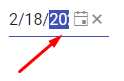
The width of the Kendo React DatePicker can become small due to the container width.
In such case, consider the following use case
Users select the date part (year) and start incrementing it by the "up" key. The year date part is selected, but is partially visible,
and the users do not see the date part that they are currently modifying, while they can fully see the other date parts that are not currently in focus.
The DateInput needs a horizontal scrolling to ensure that a focused date part is fully visible to the users in case if the width of the component is narrow.
Please check the case here
https://stackblitz.com/edit/react-8dqy6j-gvgwtk?file=app%2Fmain.jsx