As stated in the subject. To reproduce:
- Create a blank react project as per the KendoReact Data Grid Getting Started documentation e.g.
npx create-react-app my-app --template typescript
- Change the react and react-dom dependencies in the generated package.json file from ^19.0.0 to ^18.0.0, add corresponding "@types/react": "^18.0.0" and "@types/react-dom": "^18.0.0" entries to devDependencies, and add a standard tsconfig.json file e.g.
{
    "compilerOptions": {
      "target": "es6",
      "lib": [
        "dom",
        "dom.iterable",
        "esnext"
      ],
      "allowJs": true,
      "skipLibCheck": true,
      "esModuleInterop": true,
      "allowSyntheticDefaultImports": true,
      "strict": true,
      "forceConsistentCasingInFileNames": true,
      "noFallthroughCasesInSwitch": true,
      "module": "esnext",
      "moduleResolution": "node",
      "resolveJsonModule": true,
      "isolatedModules": true,
      "noEmit": true,
      "jsx": "react-jsx"
    },
    "include": [
      "src"
    ]
}- Install required @progress packages as per the KendoReact Data Grid Getting Started documentation e.g.
npm i @progress/kendo-react-grid @progress/kendo-data-query @progress/kendo-react-data-tools @progress/kendo-react-inputs @progress/kendo-react-intl @progress/kendo-react-dropdowns @progress/kendo-react-dateinputs @progress/kendo-drawing @progress/kendo-react-animation @progress/kendo-licensing @progress/kendo-react-buttons @progress/kendo-react-treeview @progress/kendo-react-popup @progress/kendo-svg-icons @progress/kendo-theme-default
- Delete content generated by create-react-app which is not required e.g. App.test.tsx, logo.svg, reportWebVitals.ts, setupTests.ts and corresponding references
- Confirm you can run npm start with no webpack errors or warnings (see screenshot)
- Add a <Grid> with <GridNoRecords> to App.tsx e.g.
<div className="App">
<header className="App-header">
<Grid>
<GridNoRecords>This generates TS2786</GridNoRecords>
</Grid>
</header>
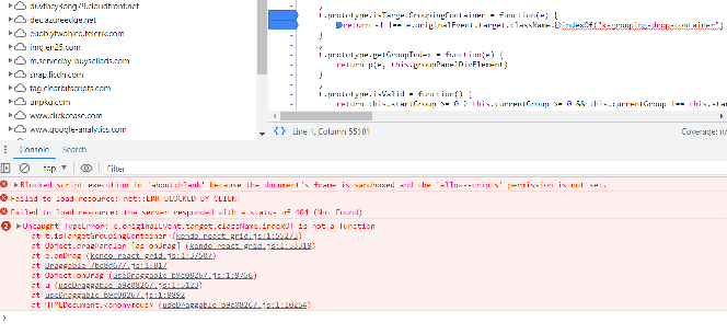
</div>Confirm that npm start results in error TS2786 (see screenshot).
Please see attached for the sample project (with the node_modules folder removed). I believe this error was introduced in v9.0.0 as part of the migration from classes to functional components.
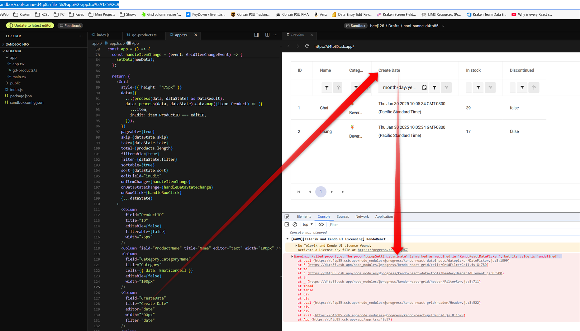
in latest v9.3.1 it appears GridFilterCell isn't passing properties shaped as 'isRequired' on DatePicker popupSettings
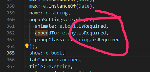
this does seem to be a regression because i just recently noticed it in latest upgrade which we need for other bug fixes.
i pursued patching myself by populating animate in GridFilterCell.mjs which seemed to work but then i got warning for the next required property "appendTo". however, populating appendTo yields warning "Warning: Failed prop type: Invalid prop `appendTo` supplied to `Kendo React Popup`. Validation failed." so it's not easily reconcilable that way... therefore i tried removing isRequired on all 3 DatePicker popupSettings properties which of course avoided warnings and i didn't see any negative side effects.
here is a codesandbox repro minimally tweaked to include a date field from kendo grid's "getting started" demo: https://codesandbox.io/p/sandbox/cool-sanne-d4tp85
admittedly this is just a warning but it does create unnecessary noise in browser debug which detracts from issues truly requiring attention during development.
screenshot with the warning from that demo repro:
there seems to be an issue when changing the value of a DateTimePicker from null to a Date object and the specified format includes seconds.
Reproduction:
1. Open https://stackblitz.com/edit/react-hnfuerwc?file=app%2Fapp.tsx
2. Choose a value from the DateTimePicker
Actual Behaviour
The chosen value does not show up in the input box. Works OK in 8.5.0
Expected Behaviour
The chosen value should appear in the input box
Browser
Chrome, version 131.0.6778.205
OS
Windows 11
Hi, there is a problem with filter filter popups in Data Grid.
Steps to reproduce:
1. Go to https://www.telerik.com/kendo-react-ui/components/grid/filtering
2. Open the date filter popup in the "FirstOrderOn" Column and click on any date
3. Open and close the filter combo in "Disconinued" column couple of times.
Actual Behavior
On version 9.1.0 besides Opening the "Disconinued" filter combo, the date popup also openes. On version 8.5.0 seems to work fine
Expected Behavior
Only the popup from "Discontinued" column should be Opened / Closed
Chrome
Browser version
131.0.6778.205
OS type
Windows11
here's a simple repro project minimally tweaked from an original kendo demo:
https://codesandbox.io/p/sandbox/suspicious-lovelace-8nmzgj?file=%2Fpackage.json
just start dragging a column resize handle and you should see the "jitter" right away. in our experience, the jitter is so pronounced that resizing columns is no longer practically usable.
please note this bug is definitely related to putting the kendo grid inside of a css-grid, see that definition in the parent <div style>
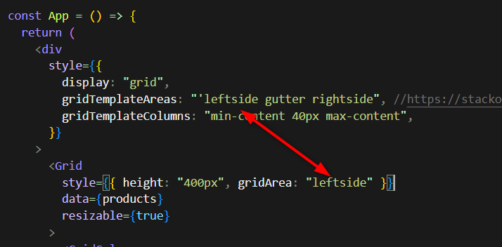
as you may imagine, we use css-grid for our overall page layout which i believe is still modern best practice and we really hope you can fix this regression within that usage context.
note, the bug manifests regardless of the gridTemplateAreas or gridTemplateColumns, you can eliminate those entirely and it's still present.
When there are many items in the menu, the height should not exceed the page size. Now the scroll is not displayed.
https://stackblitz.com/edit/react-kxderjef
It refers to version 9.1.0, version 8.5.5 works fine
Thank you
There is a bug when rendering nested `PanelBarItem` components into a `PanelBar`. This error began in version 8.0 and still exists in 8.2.0.
In the linked example sandbox, you can see that I am rendering an empty array of children and it causes an error. This used to not cause any issues.
An empty array is needed because we render some `PanelBarItems` that come from an AJAX query and so the children starts off as an empty array until the requests completes.
Thank you,
Ryan
Trying to drag an event in the scheduler duplicates (doubles) the event drag hints, but only in DayView.
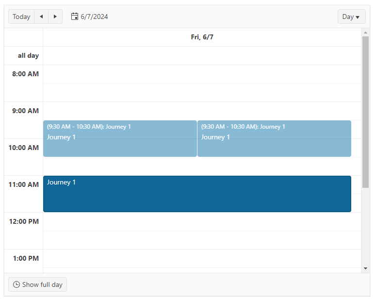
Reproduction:
https://codesandbox.io/p/sandbox/still-cloud-xrrx72?file=%2Fapp%2Fmain.tsx%3A21%2C26
Workaround:
The problem occurs when the event data doesn't have isAllDay property set. Even if you simply set it to false seems to resolve the issue. Problem is - Kendo's docs say that "The DataItem type does not limit the user to a specific fields in the data array", however the presence of this field is mandatory for the proper functioning of the DayView.
Hello,
We are encountering an issue with duplicate entries in our Kendo Grid with drag & drop functionality. When the grid is scrolled, clicking on any of the header cells multiple times results in the first entry being duplicated. This problem occurs on the example provided on your website as well: Kendo React Grid Row Reordering
Reproduction Steps:
- Scroll down within the grid.
- Click on any header cell multiple times.
- Scroll back to the top of the grid.
You will notice that the first entry is duplicated multiple times. It appears that the reorder logic is being triggered when a header cell is pressed.
We are using version 6.1.0. Please refer to the attached video for a visual representation of the issue.
Thank you for your assistance.
This is a bug on your documentation website.
Go to https://www.telerik.com/kendo-react-ui/components/grid/ for example to see that the side panel on the left is empty in an Edge browser. It flickers then it disappears.
It works fin in Chrome and Firefox.
To reproduce on your site at https://www.telerik.com/kendo-react-ui/components/dateinputs/multiviewcalendar/
Click on this month label
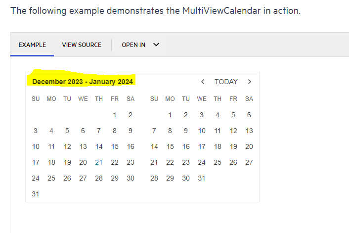
Then click any other month than the one you were in
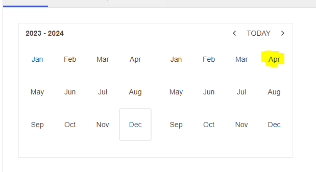
Then it shows the wrong (previous) month
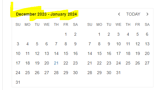
If you keep clicking up and down from here you will find it seems to be navigating to your previous click each time, not the current click. Please correct this as its a bug in my new application going to production soon.
Thanks.
Attempting to select a comboBox value with a down arrow key press when there is only a single item in array results in a crash.
I'm adding a link to a modified version of combobox demo showcasing the error.
Steps for reproduction:
- Select comboBox field
- Click arrow key down to select first and only entry in the comboBox
Hi team,
Im my example (see here), I've added a 'name' attribute to the 'Persons' resource data, and changed the textField mapping to use the 'name' field, however the scheduler is still displaying the results of the 'text' attribute.
Leading me to think that the scheduler is hardcoded to only look for the text attribute, because if its changed/removed, the scheudler does not display anything, regardless of what the 'textField' value is.
Please advise.
Thanks,
Grant
The issue can be seen on your demo at https://www.telerik.com/kendo-react-ui/components/grid/
Steps:
1) Load the demo from https://www.telerik.com/kendo-react-ui/components/grid/
2) Click on (x) in customerID grouping
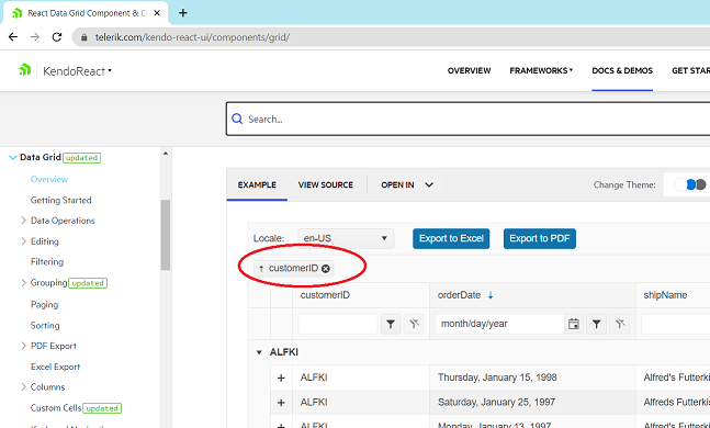
3) Look at the console and see the line with exception:
The problem is that `e.originalEvent.target` is an svg object and it's className property is an object, not a string. The object is `SVGAnimatedString {baseVal: '', animVal: ''}` and it doesn't have the method indexOf.
Please fix asap.
In our project we control column widths manually as we have complex logic on how wide each column should be, based on a number of external criteria. However, those widths are not fixed and might change during the lifetime of the data grid.
This was not causing any problems up to version 5.11.0 but after we upgraded the Kendo packages this controlled behavior of the column widths broke:
kendo-react-grid v5.11.0 example (working):
https://codesandbox.io/s/crazy-bird-ss7mgl?file=/app/main.tsx
kendo-react-grid latest example (broken):
https://codesandbox.io/s/dazzling-antonelli-wxsflj?file=/app/main.tsx
If we inspect the elements of the data grid, we can see that there is an inline style attribute on the header and body tables, setting the total width of those <table> elements to the sum of its columns. However, that value is not updating after the initial mount as it was prior to v5.12.0 which effectively makes the column widths uncontrollable.
https://codesandbox.io/s/keen-panka-vctttd?file=/app/main.tsx
In the attached video I am showing the steps taken to reproduce the bug from the reproduction link. Basically if you change the year in DatePicker's calendar - no matter which year you select - the year gets reset back to 1911. I was not able to reproduce this in Kendo's CodeSandbox examples until I noticed that they were using the legacy ReactDOM.render() instead of the new React 18's createRoot. As soon as I replaced it I was able to reproduce the bug.
Another strange observation is that I am able to reproduce this bug in only half of my tries after refresh, another colleague reproduces it in 20-25% of his tries, so it doesn't happen all the time but eventually it will. That's why I've recorded a video on a fresh reload of the attached reproduction. Also, you can sometimes see the year is already wrong after selecting it, or after subsequently selecting the month, or sometimes you don't see the year is reset to 1911 until after you select the specific date and the popup closes.
Although there are other ways to reproduce this issue, the one shown in the video is the easiest to hit the bad scenario. Also, we were not able to reproduce the issue on the DateTimePicker, although it seems to use the same Calendar component underneath.
Our assumptions having previously reported similar problems in Kendo after migrating to React 18 is that due to the concurrent rendering / batching of state updates in React 18's createRoot - something breaks the virtual scroll used in the calendar (in the video when I point to 1912 being the next year after the selected 2021, if we scroll a bit, the virtual scroll picks up and updates the incorrect years) so we end up with stale data for the year when selecting the month/date. This means that there might be other unwanted side effects that we just haven't stumbled upon.
This is a severe bug for our application's end users as they are unable to change the year in the date picker reliably. Falling back to the deprecated ReactDOM.render is not an option.
Pre- requisites: Open Settings -> Accessibility -> Contrast Themes -> Select Aquatic/Desert modes.
Repro-Steps:
- Open the above URL and login with valid credentials.
- Now check some checkboxes (e.g., Bold, Underline, Insert ordered list, etc.)
- Now apply high contrast themes and try to differentiate between the checked and unchecked checkboxes.
Actual Result:
Unable to distinguish between the checked and unchecked checkboxes in high contrast Aquatic/Desert themes.
User should be able to distinguish between the checked and unchecked checkboxes in high contrast themes also.
User Impact:
Users with low vision who rely on high contrast will not be able to distinguish between the checked and unchecked checkboxes in high contrast Aquatic/Desert themes.
Hello,
Seems the link to the GridColumnMenu accessibility page from the DataGrid accessibility page is broken.
Our tools are also warning us about empty links, caused by the GridColumnMenu button. How would we solve these?

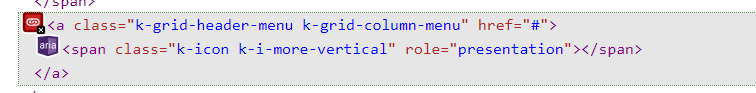
Thank you,
Kristiyan Dimitrov