Hi.
The Calendar component does not allow for selecting multiple dates or range selection. Only single selection of dates is possible.
As implemented in the MultiViewCalendar component, it should be possible out of the box to add a "mode" attribute and set it to "multiple" or "range". This would make the two components more consistent and aligned.
Thanks,
Regards,
Bernd
On this page: https://www.telerik.com/kendo-react-ui/getting-started/
There's a syntax mismatch in end-of-line semicolons.
This line ends with a semicolon:
```js
import '@progress/kendo-theme-default/dist/all.css';
```
This line does not end with a semicolon:
```js
import { Calendar } from '@progress/kendo-react-dateinputs'
```
All teams that I know of consider it to be an error to do both ways in the same file.
The solution is to pick one way then be consistent. The broader solution is to use a linter, such as ESLint, that can process the code to ensure you're using your expected syntax and formatting.
I would like to use my custom component as the chat input. Is it possible to add new prop to chat component? Similar to DatePicker's "dateInput" prop.
To Whom It May Concern,
I am requesting the Kendo team to implement a new feature of programmatically setting a Grid's page for the Kendo React Grid.
This can be accomplished by having a listener for the Grid's state. For example, when the Grid's skip props is changed, the Grid's page will also change to the number of elements skipped.
Please consider implementing this feature.
Thank you.
Sincerely,
Andrew J. Yang
Keysight Technologies
Submitting here as it is an important regression with React 18 breaking all popup animations.
According to https://www.telerik.com/kendo-react-ui/components/installation/source-code/#toc-source-repository the repo should be updated nightly. However it does not seem to be.
~/Projects/kendo-react-private (master)   git remote -v
origin https://kendo.git.progress.com/kendo-react-private.git (fetch)
origin https://kendo.git.progress.com/kendo-react-private.git (push)

~/Projects/kendo-react-private (master)   git fetch --tags

~/Projects/kendo-react-private (master)   git pull origin master
From https://kendo.git.progress.com/kendo-react-private
 * branch                master     -> FETCH_HEAD
Already up to date.

~/Projects/kendo-react-private (master)   git tag | grep v5
v5.0.0
v5.0.0-dev.202201182040 ~/Projects/kendo-react-private (master)   git log
commit 4bf2535e414ba2f342ddbef8daac9ec052f04cc2 (HEAD -> master, tag: v5.0.0, origin/master, origin/HEAD)
Author: kendo-bot <kendouiteam@progress.com>
Date:   Tue Jan 18 22:41:34 2022 +0200

    chore(release): publish 5.0.0-dev.202201182040
v5.0.0 seems to be the latest tag. Could someone verify that the github repo is actually being updated?
Thanks for any help!
Hi,
the current filter is great but a little bit difficult to use. I would like to see an inline filter like the following screenshot:
It is used by many applications. Just to name a few
* Gitlab (where the screenshot is from)
* Contentful (CMS)
* Google Cloud Console

Currently there is no Autoscroll feature for the treelist...so when I want to drag and drop an item somewhere outside of the viewed area its klunky have to drop then scrool then drag and drop again etc.
Would really like to be able to autoscroll through the treelist
I know there you gave me an example of how to do this with custom code - is there a reason this can't be built in? It's important and is a pain to custom implement when using custom editors for the cells
Thanks
Michael
toODataString throw exception on text filter changed from is null to contains.
https://stackblitz.com/edit/react-ertg4z?file=app%2Fmain.jsx
Repro step:
1. Choose filter by Name which is using text filter.
2. Change filter from Is null to contains.
3. toODataString threw exception.
Click icon to close as well as open
Currently, it is required to have the same height for the items, but this can be very hard in cases when the items are dynamic with various height.
Hi,
I have Scheduler vertical timeline with an user group and more users I add the wider is every slot. Example 2 users https://stackblitz.com/edit/react-dttghr?file=app%2Fmain.jsx . Example 4 users https://stackblitz.com/edit/react-dttghr-a3nor3 the slot is double in width in comparation with 2 users. Can I control this somehow?
Hi Guys,
In GridProps for KendoReact Grid there is an error in the type information:
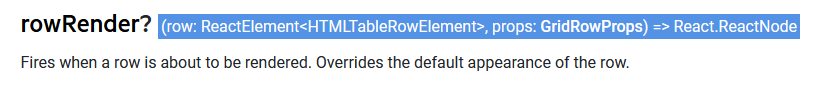
Found here: https://www.telerik.com/kendo-react-ui/components/grid/api/GridProps/#toc-rowrender
In the GridProps.d.ts file it is:
/**
* Fires when a row is about to be rendered. Overrides the default appearance of the row.
*/
rowRender?: (row: React.ReactElement<HTMLTableRowElement>, props: GridRowProps) => React.ReactNode;
This should be changed to:
rowRender?: (row: React.ReactElement<React.HtmlProps<HTMLTableRowElement>>, props: GridRowProps) => React.ReactNode;
Note that the React.ReactElement definition is:
interface ReactElement<P = any, T extends string | JSXElementConstructor<any> = string | JSXElementConstructor<any>> {
type: T;
props: P;
key: Key | null;
}
So the first type parameter should be the props typ.
I noted this while making use of it. After changing it it behaves sensibly. Worked around in my case by using 'as any' to void the type clash.
Cheers,
Stuart
Hi,
I created a solution using KendoReact Editor.
The editor is set to enable the creation of tables (EditorTools.InsertTable).
When the property 'defaultEditMode' is set to 'iframe', the editor inserts a correct table with a width of 100% and visible cell borders.
If I set the 'defaultEditMode' to 'div' and insert a table the table has a width of some pixels and no borders are shown. In other words, the inserted table is not usable.
I need to set the editMode to 'div' because otherwise the editor doesn't adjust its look to the other parts of the page. The font is wrong etc.
How can I get the tables to work in 'div' mode?
Kind regards
Christian
- open the given URL using valid credentials.
- Select 'reply' button.
- Now Run the fast pass using Accessibility Insights for web and observe the failure aria required children.
Actual results:
Elements with Aria role is not containing child role with in them.
Expected results:
Elements with Aria role should contain child role with in them.
User Impact:
For each role, WAI-ARIA explicitly defines which child and parent roles are allowable and/or required. ARIA roles missing required child roles will not be able to perform the accessibility functions intended by the developer.
Grid Header shifting when filtering column.
When a column is half visible, and it is filtered, a misalignment will occur between the header and the Grid content.
Video: https://www.screencast.com/t/PhOonptY2