- open the given URL using valid credentials.
- Navigate to 'Reply' button and invoke it.
- Navigate to 'color group' and invoke it.
- Now, Navigate to the colors in color group and listen to Narrator announcement.
Actual Result:
On navigating to colors, Narrator is staying mute and not announcing anything.
Expected
On navigating to colors, Narrator should announce the name of the color.
When interactive elements have an incorrect name, it is difficult for people using assistive technology (like screen readers) to understand the purpose of control and its relationship to other content.
The ListView component has an item prop that allows you to specify the render component. That component receives ListViewItemProps. The ListViewItemProps type is not exported and cannot be properly imported elsewhere.
Hello,
The Form component does not allow me to submit unless I modify the initial values. We have a Form that is provided with initial values that may not need to be modified by the user first - the data is all valid and acceptable. The user, currently, would need to purposefully modify one of the Field values in order to get the Form to realize that it can be submitted.
I'm aware of the submit click event but that event does not perform any validation.
I believe there needs to be some middle area where the Form can be provided initial values and be allowed to submit without having to modify the form first.
I have created a code sample showing the scenario below ...
https://stackblitz.com/edit/react-wf5veh-reyjj3?file=app/main.jsx
Thank you
Hi Team,
we are looking same property in Kendo Tree View React Version.
https://docs.telerik.com/kendo-ui/api/javascript/ui/treeview/configuration/dataspritecssclassfield
could you pls check the feasibility and add the same?
Hi,
I've got a large form I'm making. When the page the form is on first renders, I maker a server call and get back a large javascript object:
serverData = {id: "1", ClientID: "1423", EstSentDate: "2021-07-08", .... }. The date strings are ODCB standards for date strings.
The form displays the current values of all these fields. For all the other field types, I give the form the prop initialValues={serverData}, and if the field names match the object keys, it populates the field with the data nicely.
The datePicker is encountering an error though. It looks like it expects a Date object and not just a string. Is there something I can do within the DatePicker component, or the field containing it, to resolve this, without having to parse the entire data set I receive for all dates and convert them to Date objects, and feed that into a new object to pass to the form?
Being able to populate the entire form with the simple line initialValues={serverData} would be the best outcome for us.
Hello,
I am using tooltip component for a long desciption field in my grid cell. And I am using it as it will encapsulate Grid component (like the example below) as it is suggested in this page.
<Tooltip openDelay={100} position="right" anchorElement="element"> <Grid>... </Grid> </Tooltip>
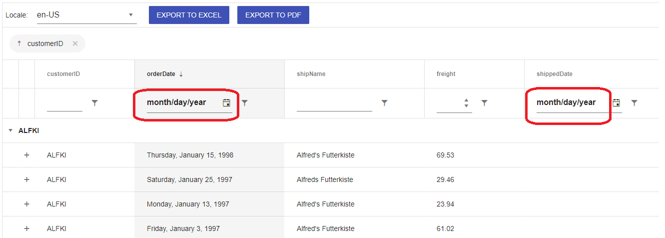
My grid has a date field and I am using columnMenu for filtering (GridColumnMenuFilter). An error occurs when I hover the text of date field and says :
Tooltip(...): Nothing was returned from render. This usually means a return statement is missing. Or, to render nothing, return null.
I also trid to replicate the problem in the example on this page and it gives the same error. I forked the project and you can check it from https://react-ed5jns.stackblitz.io/
Simply move the cursor over month/day/year in a date filter area and see the problem. This seems like a bug. Or if there is any solution to this, I would like to see a workaround.
Thanks
Hi,
The Kendo React Form Handle Submit event provides complete data over all fields, even the unchanged ones. While this is good for traditional submits, we are building upon a REST service that has HTTP patch support, wherein we intend to submit only those fields (properties) that have changed.
While a deep compare with initialValues and handleSubmit data property is possible, we were wondering if the Kendo Form component itself has some property Or method that allows us to get the changed values only. This will save us the deep compare efforts, time and issues, especially with forms that have hundreds of fields.
If Kendo library has some deep compare method available, please do include that as well.
Kindly advise.
Currently the TileLayout will allow you to drag a Tile when you click and drag anywhere within the Tile. This doesn't combine very well with content within a Tile that might have click-and-drag functionality or even just click functionality. A small click within a Tile causes the Tile to visually "lift up" in preparation for dragging.
It'd be nice if there were a setting to enable dragging only on the Tile header portion or somewhere.
Currently I have to add a toggle somewhere on the page that disabled or enables dragging.
Currently, it only gets the value and the name of the Field:
https://www.telerik.com/kendo-react-ui/components/form/api/FieldValidatorType/
Hello team,
We work on a product that features a large set of input components that are based on the Kendo inputs and dropdowns. We have custom designs that require us to customize the Popups of comboboxes, multi-selects, color pickers, etc with specific layout and styling, open/close animations, blur handling and keyboard interactions (e.g. closing on Esc). This is done fairly easy with the Date Input components (DatePicker, DateTimePicker, DateRangePicker, TimePicker) as they expose such property:
popup?: React.ComponentType<PopupProps>;
However most other controls that use a Popup internally expose just PopupSettings that is not enough for us even with the "appendTo" option.
We would be happy to see a similar ability (as in Date Inputs) to inject the Popup component in:
- Components in the "@progress/kendo-react-dropdowns" package.
Most of them simply reuse the same ListContainer component that renders the Popup. - ColorPicker in the "@progress/kendo-react-inputs" package.
I guess that customizing the popup in the DropDownButton, FloatingActionButton and SplitButton would also be nice to have but for those CSS styling does good enough job for us.
Regards
Currently, the TabStrip has a built-in Fade animation.
We provide a property to allow setting different types of animations like Slide, Push etc.
if (_this.element && document.activeElement === _this.element) {
                _this.element.setSelectionRange(selection.start, selection.end);
            }
@progress/kendo-react-dateinputs": "^4.3.0"
DatePicker and DateInput React components malfunction when rendered inside iFrame.
For example, key navigation between date parts is not working for the DateInput/DatePicker rendered inside iFrame.
When user clicks on the month part of the date, the month part does not get selected.
Same for day or year part.
The reason is a code similar to this in DateInput.js:
if (_this.element && document.activeElement === _this.element) {
                _this.element.setSelectionRange(selection.start, selection.end);
            }
if (document.activeElement !== _this.element) This code references the top level "document".
If the React component is rendered inside iFrame, we need to use the contentDocument of the iFrame to have this code working as expected.
Could replace "document" with "_this.element.ownerDocument" to make it work inside iFrame as well as in the top level window.
Now "document.activeElement" always returns the reference to the iFrame element rather than the expected date input element inside iFrame.
The SVG element does not have a title attribute but instead is using an <title> element.
We currently use grouping in the Kendo Grid, however the groups are always sorted alphabetically by the name of the group.
In our case, we want the groups to be sorted another way: an order value that corresponds to the group name.
To do this, it would be good if we could specify a comparison function, and have it take a object we provide (a map between the group name and order value).
We currently work around this by prepending a character to the group name to have it sort correctly (see screenshot). As you can see, it's not very appealing.
We are using @progress/kendo-react-grid@4.6.0
Hi there,
I would like know how can we customize the TimePicker of the DateTime picker?
We can perform the customization of calendar as guided by the link below.
My question is how can I customize the Time Picker of the Datetime Picker since I can't find the time picker relevant props from the DateTimePickerProps?
Thank you!
Dear Support Team,
I have numbers of kendo charts in my app, but I need to modify the boder-radius for the tooltip of my donut chart.
I've checked, with the browser, the existence of a couple of CSS classes I can work on, but they are generic and they work for all the charts in the app:
.k-sparkline-tooltip-wrapper>.k-popup, .k-chart-tooltip-wrapper>.k-popup (classes for the ChartTooltip component: for this I can ad an ID)Inside this component the Kendo library creates a new component, which I can't configure any IDs on and owns the css class k-chart-tooltip k-chart-tooltip-inverse needed to override the border-radius property.
Is there a workaround or any other configuration to set the border radius for a tooltip of a single chart, without modify all other charts in my app?
Thank you
Kind regards
Description of the problem
In the Grid component with infinite scrolling, when a user scrolls down, the grid will bounce them back up to the first row when loading the next couple of rows. We get this same behavior in our application so it doesn't seem to be a mistake in the demo. We've encountered this issue in both version 1.x and the most recent version of Kendo.
To reproduce:
- go to the demo for this component;
- slowly scroll down in the grid component.
Code, screenshots, etc
Since this is also broken in the docs, I don't think it's necessary to add screenshots or code.
Navigating the items in the DropDownList by the first letter of the item is something that is supported by the KendoUI for jQuery DropDownList.
In this demo, you can see the behavior for the Categories field. When Categories has focus, you can type "c" and it navigates to the first "c" category "Condiments". If you type "c" a second time, it navigates to "Confections".
https://demos.telerik.com/kendo-ui/dropdownlist/index
We have replaced some of our pages that used to use KendoUI for jQuery with React pages using Kendo React, and we are getting user complaints that this behavior is no longer supported for our drop downs.
I understand that we can use the "filter" functionality for the Kendo React DropDownList, but we would rather have the previous "first letter navigation" functionality supported by Kendo React.
Implement Gantt as a React Component so that a Wrapper is not required. This is not currently listed in your Roadmap as a specific short or long-term goal.
Hi Team,
I am looking for PickList / duallist component but I am not getting it on kendo UI
Through this list we can move items from one list to another and vice versa.
Using buttons ,left,right,rightAll,LeftAll,Up,Down etc like "react-dual-list" component
In addition to that i want drag and drop feature to be enabled between the list
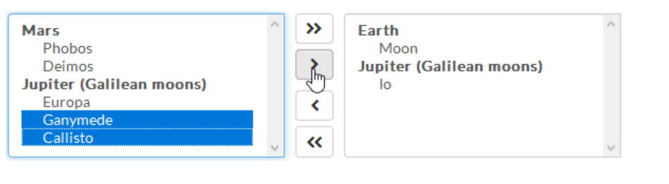
Can someone please help me to fine such component on Kendo UI