Hello Support Team,
We are migrating our ASP MVC application to React JS and need your help in scheduler time-line view. In ASP MVC you provided the functionality to render the custom template for Resource Title or we can say for the user name. But we are unable to implement the same functionality in react js, and this is the important module of our application. Our application client strictly say he needs 100% same application as it is in ASP MVC version.
We request you to please add this feature to the Scheduler in the coming updates & this would be useful to the other users also.
Thank You.
Hi Team,
I am facing one challenge to create a Calendar view with multiple date selection with multiple colors.
Please suggest and share class component references to achieve the same.
Please refer attached video or do let me know if you have any questions.
Thanks.
If you show a Grid with no rows, the Kendo Grid displays a `k-grid-norecords` row. The generated HTML for this is:
<tr class="k-grid-norecords" aria-rowindex="2"><td colspan="5">No records available</td></tr>If you run Axe accessibility checks (axe-core 4.4.1) against this, it reports:
Impact: critical
Elements must only use allowed ARIA attributes
ARIA attribute is not allowed: aria-rowindex="2"
- It seems that according to Axe, this <tr> element should have `role="row"` to make it compliant.
- Normal data rows, where there is data, do include `role="row"`. Only the 'no records' row seems to be missing it. Can this role be added?
Currently the MultiSelectTree Component doesn't have Virtualization therefore is unable to provide infinite scrolling.
Please can this be added.
Thank you,
Hello,
After updating the kendo version in my project to "^5.1.0" I've noticed that some errors are appearing in our console when we are trying to resize items in the Scheduler.
"use-resize-item.js:53 Unable to preventDefault inside passive event listener invocation."
I have attached a video with the error.
Thanks!
Any chance you could provide simple sample code (stackblitz ideally) demonstrating how to combine multiple PDFExport's into a single PDF file?
The need to combine comes from wanting page numbering to start at 1 within each individual pdf render.
Totally open to using the lower level exportPDF from the drawing library... perhaps there's a straightforward path to combining the individual DataURI's? also open to using additional 3rd party npmjs libraries.
The data tool Filter component allows me to build an AND/OR filter query. It has a button for adding additional Group objects for nesting query parameters.
Can you please add an option that disables that button so that the user can only add basic AND/OR filters? No additional Groups?
Thank you,
Ryan
We are currently passing a React.Node which contains both text and custom icons to the DropDownButton text property. The automatically generated aria-label of the DropDownButton returns [object Object] instead of any recognizable text.
Steps to Reproduce:
- Create a DropDownButton with text property set to a React.Node - eg:
<DropDownButton text={<div>test text</div>}>- Inspect the DropDownButton aria-label value using the developer console
Expected Result:
aria-label contains the text inside the React.Node
aria-label="test text dropdownbutton"Actual Result:
aria-label contains [object Object]
aria-label="[object Object] dropdownbutton"
In the Checkbox onChange callback, event.nativeEvent.target.checked seems to be set differently depending on whether the input was toggled by mouse click or by pressing space.
After clicking on the Checkbox, event.value and event.nativeEvent.target.checked will have the same value, consistent with the Checkbox's new state.
After pressing space with the Checkbox focused, event.value and event.nativeEvent.target.checked will have different values, with event.value containing the Checkbox's new state and event.nativeEvent.target.checked containing the Checkbox's old state.
I would expect event.nativeEvent.target.checked to be set the same way regardless of whether I am toggling the Checkbox with mouse or keyboard. Furthermore, I would expect event.value and event.nativeEvent.target.checked to always be equal to each other.
I made a code sandbox to demonstrate the bug here: https://codesandbox.io/s/kendo-react-checkbox-bug-26f7ur
Is It Possible to Add Persian Datetime format In Datetime Picker
Thanks
Test Environment:
OS: Windows_11Screen Reader: NVDA (2021.3)
Repro Steps:
1. Open URL: SMB Scheduler (agentcalendardevone.azurewebsites.net) page in Edge Browser.
7. Observe an issue that Incorrect role 'link' is defined on button controls.
Actual Behavior:
Incorrect role 'link' is defined on button controls present on 'Calendar' popup.
Expected Behavior:
In this case, the expected role is {button}. All components need a proper role attribute, ideally with semantics. In rare cases a role attribute should be added to give full context and information to assistive technology. Learn more by reading about when to use an aria role and the html/aria role mappings.
scroll pagination is available in ListView but item selection is not there and in other side item selection is available in ListBox but scroll pagination is not availed,
we have mostly very common and frequent requirement user can select a item from a big data list, where we need pagination to improve component performance.
this only we can achieve only if ListBox supports scroll pagination
Environment Details:
OS: Windows11 version 21H2 (OS build 22000.856)
Edge Browser version: 104.0.1293.47
Repro steps:
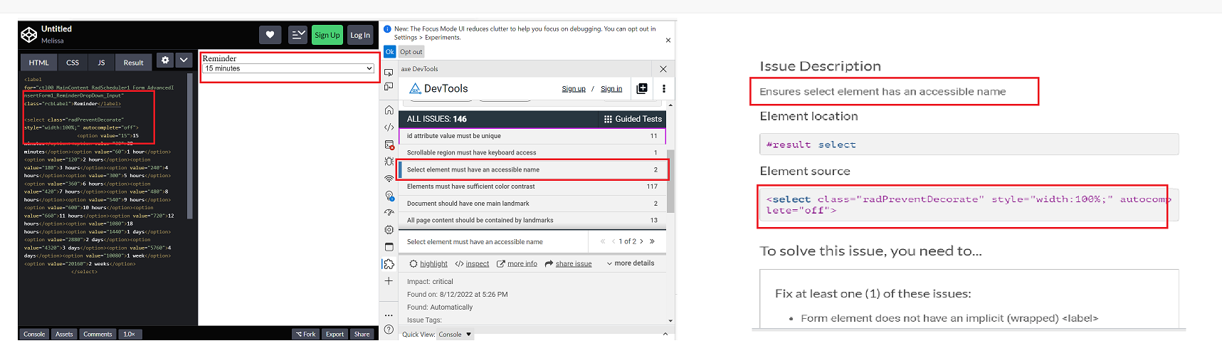
1. Open Code Pen: https://codepen.io/m1mrt/pen/VwXjEzJ page in Edge Browser.2. Run Axe dev tools3. Observe an issue that select element has an accessible name.
Actual Result:Select element does not have an accessible name.
Expected Result:
All components need an accessible name, ideally using semantic elements and attributes. In rare cases, aria-label or aria-labelled by may be needed to alter the name.
Screenshot attachment:
Just as a first note, the documentation on how to write a custom `messagesMap` function for use in the `Pager` component is extremely vague. Without access to the KendoReact source code, it would have been near impossible.
First request: on the `GridProps` API page, the `pager` prop is defined as being the type "null" or `ComponentType<PagerProps>`. Please convert the text "ComponentType<PagerProps>" into a link to the `PagerProps` page. This will greatly aid in quickly linking to the appropriate documentation.
Second request (and the bulk of the feature request): please make (at least) the pager-related constants and default messages (string templates) available to consuming components. As of v5.4.0 of `@progress/kendo-react-data-tools`, the constants are exported from {kendo-react-private}/packages/datatools/src/messages/index.ts and they are consumed within the `Pager` (and subcomponents), but are not re-exported.
Not having access to the pager-related constants (`pagerInfo`, `pagerFirstPage`, `pagerPreviousPage`, `pagerNextPage`, `pagerLastPage`, `pagerItemPerPage`, `pagerPage`, `pagerOf` and `pagerTotalPages`) means it's a complete shot in the dark at how to write an override function to supply as the `messagesMap` prop. Not only that, but without access to the pager-related default messages (string templates) and given the way the `Pager`'s `render` method is written, we are unable to change just one or just a couple messages; we have to address all nine.
Right now in v5.4.0, the way the `Pager`'s `render` method is written, it simply checks to see if `messagesMap` is non-null (lines 214 through 223 of Pager.tsx, lines 38-43 of PagerInput.tsx and lines 36 and 37 of PagerPageSizes.tsx). This means that if we pass in a custom function for `messagesMap`, the custom function will be used to evaluate the message/string-template for `pagerFirstPage`, `pagerPreviousPage`, `pagerNextPage`, `pagerLastPage`, `pagerInfo`, `pagerPage`, `pagerOf`, `pagerTotalPages` and `pagerItemPerPage` (just in those three, aforementioned files). This means that we have to somehow know that `pagerInfo`, for example, will come through to the custom function as the string "pager.info" or that `pagerPage` will come through as "pager.page" so that the custom function knows which `messageKey` it's being passed so it can send out the object with the appropriate message/string-template as the object's `defaultMessage` property.
Instead, if the pager-related constants and default messages were exposed, we could very easily write a custom `messagesMap` function that could address any number of the nine default messages.
As an example, the Telerik/Kendo default string template for `pagerInfo` is "{0} - {1} of {2} items" that could be better scoped to the type of data the grid shows. Let's say the grid displays products and we'd like the pager to show "Displaying products 5 - 10 of 302" in the bottom right. If the pager-related constants and messages were exposed, this becomes a very simple task while not disturbing all other Telerik/Kendo default messages:
import React from 'react';
import { Grid, GridColumn, GridNoRecords, GridColumnMenuFilter } from '@progress/kendo-react-grid';
import { pagerInfo, pagerOf, messages as defaultPagerMessages, Pager } from '@progress/kendo-react-data-tools';

export default function MyComponent() {
    const customMessagesMap = messageKey  => {
        switch (messageKey) {
            case pagerInfo: return { messageKey, defaultMessage: 'Displaying products {0} - {1} of {2}' };
            default: return { messageKey, defaultMessage: defaultPagerMessages[messageKey] };
        }
    };

    const CustomPager = () => (
        <Pager
            skip={...}
            take={...}
            total={...}
            buttonCount={...}
            type="numeric"
            info={true}
            pageSizes={[...]}
            messagesMap={customMessagesMap}
    );

    return (
        <div className='my-component'>
            <Grid data={[...]} pager={CustomPager}>
                <GridColumn ... />
            </Grid>
        </div>
    );
};
Test Environment:
OS: Windows_11Browser: Version 103.0.1264.71 (Official Build) (64-bit)
Prerequisite steps:
1. Go to system settings.
2. Navigate to 'Accessibility' and activate it.
3. Navigate to 'Contrast theme' and activate it.
4. Select 'Desert/Aquatic' High Contrast theme in the combo box.
Repro Steps:
1. Open given URL https://canvasjs.com/docs/charts/chart-options/axisx/viewport-minimum/ in Edge.
2. Graph page will be open.
3. Turn on High contrast theme.
4. Verify that Graphs are not adapting high contrast Aquatic and Desert modes or not.
Actual Behavior:
Graphs are not adapting high contrast Aquatic and Desert modes. They remain same as in normal mode.
Expected Behavior:
Graphs should adapt high contrast Aquatic and Desert modes as defined. All elements should adapt to respective modes properly.
Hi,
I would like to request a feature for the scatter line type chart for the crosshair line depending on axis to snap to points on the scatter chart.
An example of this would be like showing X axis crosshair only and having on hover of mouse to snap to nearest dot. (not showing crosshair between points, but always on a point.)
The closest working example I can find of this on kendo react is the bar chart for crosshair tool tip first example https://www.telerik.com/kendo-react-ui/components/charts/chart/elements/crosshairs/ but after talking to support it does not support scatter line chart.
but only with category axis(X axis).
The desired behavior would be the above but on a scatter line chart using separate axis y or x crosshair only and having them to snap to points instead of hovering between points. If you do hover between points, it should snap to nearest point to mouse cursor.
This sandbox has the behavior but only for a bar chart. https://stackblitz.com/edit/react-qnn9h4?file=app%2Fmain.jsx
We have the requirement to have a data grid with drag and drop configured to support auto scroll when the data grid has no fixed height set and overflow/scrollbar is enabled on the a parent element (div or body).
Full details as per support ticket 1571735.
Dear Kendo,
I'm currently working on a data grid that has virtual scrolling enabled. When a user is scrolling fairly quickly, the screen will constantly flash white. See video in attachment.
I see this same behaviour in the example provided in the docs here: https://stackblitz.com/run/?file=app%2Fmain.jsx although it is slightly less noticeable.
What can we do to fix this?
Thanks in advance.
Kind regards,
Peter
Hi,
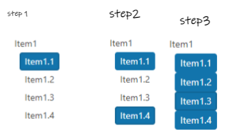
I would like to be able to select all items from the treeview using a keyboard combination, I mean something like select an item +press and hold shift key and select another item and all items in between get selected.I know there is a way to select all items using a button but the user does not want this approach.
Next image is the functionality that we want and we want to know if there is a way to achieve it
Hi Team,
While browsing i came across a feature called social control+login+singup in 1 place. Does Kendo react has anything like below
exportdefaultLogin
and profile template like below: