- open the https://answers.microsoft.com/en-us/msoffice/ using valid credentials.
- Select 'reply' button.
- Navigate to 'Insert image' button and invoke it.
- Now Run the fast pass using Accessibility Insights for web and observe the failure 'label'.
Actual results:
Aria label attribute is not defined for button in 'Insert image' dialogue.
Narrator is announcing as 'No file chosen, choose file, button'.
Expected results:
Aria label attribute should be defined for button in 'Insert image' dialogue.
User Impact:
Adding effective form labels is absolutely necessary to make forms accessible. The purpose of form elements such as a checkboxes, radio buttons, input fields, etc. is often clear for sighted users, even if the form element is not programmatically labeled. This isn't usually the case for screen reader users. Adding a label to all form elements eliminates ambiguity and contributes to a more accessible product.
Click icon to close as well as open
- Open the https://answers.microsoft.com/en-us/msoffice/ using valid credentials.
- open any related article.
- Navigate to 'Reply' button and invoke it.
- Navigate to 'ordered list' button and invoke it.
- Navigate to the edit region and type some ordered list items.
- Now, Navigate to the ordered list items and listen to Narrator announcement.
Actual Result:
On navigating to ordered list items with arrow keys, Narrator is only announcing first letters of the text and while navigating with 'caps-arrow' keys, Narrator is only announcing position details of the list items.
Note: this issue is not observed with nvda
Nvda version: 2020.2
Expected
On navigating to ordered list items with 'arrow keys' or using 'caps-arrow' keys, Narrator should announce the whole text of the list item including position details.
User Impact
Knowing how many items are in a list is extremely useful to assistive technology users as they can know if they should attempt to skip the list, navigate to the end, help them recall placement of certain items, or orient themselves within the list.
Hi Team,
I have found an issue in the Grid Component that I think needs some attention, see below.,
## Current behavior
My GridColumns are not styling correctly when i hide/show them based on an edit state (for example). Some that have no width restrictions will the shortened then not lengthed.
## Current Version
KendoReact 4.8.0
## Expected behavior
If I hide/show a GridColumn, its width should not affect other GridColumns, only the Grid overall.
## Minimal reproduction of the problem with instructions
Example: https://stackblitz.com/edit/react-ngpvuj?file=app%2Fmain.jsx
Instructions:
1. View how age is the only column visible with a width attr
2. Click "Switch Mode" and notice how 'Id' is not added, but a width of 80 is now applied to the 'lastname' column, the same width as age
3. Click "Switch Mode" back to view, and see how id is removed and a width of 60 is applied to the 'firstname' column.
## Investigation:
Some investigation in the DOPM revealed that the issue is centred around the <colgroup> of the Grid's <table>:
- step 2 does the following to the <col>s in the <colgroup>
- add a new col to the beginning with a width, for the Id column
- add a new col to the end with a width, for the Age column
- DOES NOT clear the width of the col group that used to be the age column
- step 3
- Simply removes the last <col> in the group. Does not affect hte attributes of the remaining <col>s
I hope this was informative and can be resolved soon.
Kind Regards,
Grant
When a user focus an empty DatePicker input using tab, the caret starts at the end (right side) of the input.
We need it to start at the left side, so the user can type without having to go all the way back to the left.
toODataString throw exception on text filter changed from is null to contains.
https://stackblitz.com/edit/react-ertg4z?file=app%2Fmain.jsx
Repro step:
1. Choose filter by Name which is using text filter.
2. Change filter from Is null to contains.
3. toODataString threw exception.
Repro:
- Create a DateTimePicker.
- Use its value prop to programmatically control the value the control uses.
- Add clickable Button (or other means) to programmatically set the value to an invalid date (i.e. something like new Date("invalid!").
- Click the Button. The date displayed becomes "NaN/NaN/NaN 12:NaN PM". I suppose this is reasonable.
- Now, click the calendar popup icon on the right-hand side of the component.
Expected:
Displays a calendar popup, perhaps defaulting to the current date & time.
Actual:
Throws an exception visible in the JavaScript console. Replaces the UI with an error message.
Proof-of-Concept:
https://stackblitz.com/edit/react-gvipiu?file=app%2Fmain.tsx
import * as React from 'react';
import * as ReactDOM from 'react-dom';

import {
  DateTimePicker,
  DateTimePickerChangeEvent,
} from '@progress/kendo-react-dateinputs';
import { Button } from '@progress/kendo-react-buttons';

const App = () => {
  const [date, setDate] = React.useState(new Date());

  const handleChange = (event: DateTimePickerChangeEvent) => {
    setDate(event.value);
  };

  const handleClick = () => {
    setDate(new Date('invaild!'));
  };

  return (
    <React.Fragment>
      <div className="example-wrapper">
        <p>
          (use Alt+<code>↓</code> to open the date-time selector, <code>←</code>{' '}
          and <code>→</code> to navigate, <code>↑</code> to increment and{' '}
          <code>↓</code> to decrement the value)
        </p>
        <DateTimePicker onChange={handleChange} value={date} />
      </div>
      <Button onClick={handleClick}>
        Click me, then the calendar, to break the DateTimePicker.
      </Button>
      <div>{date?.toString()}</div>
    </React.Fragment>
  );
};

ReactDOM.render(<App />, document.querySelector('my-app'));
Hi Team,
I would like to report the following Major bug for KendoReact v4.9.0:
Duplicate:
1) Open the Datepicker Demo page
2) Open any of the datepickers and click the month name, as you will see a few months are hidden on the right had side.
The same behaviour continues if you click the year or decade.
Thanks and kind regards,
Grant
PS. This feedback form only allows me to select a "KendoUI for jQuery" version number.
Looking at the deliver1.PNG, there is a grid with a 'MultiColumnComboBox' component inside one of the columns. When a name is removed from a role in one row (deliver2.PNG), then that row is deleted/removed, the row below it moves up but loses its name on the UI but the data is not effected (deliver3.PNG).
Can confirm all data is intact when passing information to the 'MultiColumnComboBox' component, it's just a UI bug which doesn't display the value that was selected in the unedited/deleted row. Can also confirm this bug exists in other grids with 'MultiColumnComboBox' components.
The code path is as follows in images code1.PNG, code2.PNG, and code3.PNG. It can be seen there is a UserComboBoxCell element which returns a component called 'EditableGridMultiColumnComboBoxCell'. It is this component that uses the the 'MultiColumnComboBox' component.
Hi team,
Im not sure if this is a bug or an incomplete feature, so please advise.
1) TabStrip / Window behavior in v4.8.0 with bootstrap theme 4.40.0, see https://stackblitz.com/edit/react-wdzeyo?file=index.html
Please note the style and behaviour of the window, its above the modal and can be dragged anywhere on the screen, even though it was rendered from within the TabStripTab component
2) TabStrip / Window behavior in v4.9.0 with bootstrap theme 4.42.0, see https://stackblitz.com/edit/react-zhkfdp?file=app%2Fmain.jsx
As you can immediately see in this example, the TabStripTab heading is also above the modal, an obvious bug
My concerns are around how the window can no longer be dragged outside the TabStripTab container. Is this by design, beacuse in my use case, my tabs are smaller than my windows.
Note: I have not tested the windows with any other components.
Please advise.
Many Thanks,
Grant
Narrator is being mute while navigating through the menu items present in combo box. Here keyboard focus and narrator focus are not in sync while navigating through them.
Expected:
Narrator shouldn't be mute , keyboard focus and narrator focus should be in sync and narrator should announce the info about the menu items clearly
User Impact:
Users with visual impairment who rely on screen readers will face difficulties if narrator is not announcing any information about the menu items present in combo box while navigating through them.
Hi,
the current filter is great but a little bit difficult to use. I would like to see an inline filter like the following screenshot:
It is used by many applications. Just to name a few
* Gitlab (where the screenshot is from)
* Contentful (CMS)
* Google Cloud Console
Hello Team,
With respect to the ticket - https://www.telerik.com/account/support-center/view-ticket/1547304
Currently, when we drag and drop items between multiple trees, item is getting removed from source and added to the destination. Would be nice, if there is an option to copy the item (while dragging) instead of removing from the source.
Introduce a Format painter/brush tool that will allow copying the format from one selection to another (as in MS Word for example)
The format painter lets you copy all of the formatting from one object and apply it to another one – think of it as copying and pasting for formatting. Select the text or graphic that has the formatting that you want to copy.
Right now you have the ability to mark a field "Optional" in the label component. This is fine unless you have a large form and almost everything is optional. It will then look cluttered.
On the other hand, you don't have a "Required" option.
I would like to add a prop for subtext so that I can change the subtext from "optional" to anything I would like such as * or (Required).
What I would like to see is a full height Panel anchored to the body tag similar to a drawer, but the panel would allow me to set the Title, Close Button, and Content manually. My intent is to create forms in the panel or to use the panel to display details of a single row of data. What you have appears to be geared towards navigation or the display of discrete data only.
<Panel
isOpen={boolean}
hasCloseButton={boolean}
isBlocking={boolean}
footerIsSticky={boolean}
titleIsSticky={booelan}
width={number or string}
panelPosition={"start", "end" - similar to flex positions
header={JSX.Component or string}
title={JSX.Component or string}
/>
<Content>{Placeholder for Content}</Content>
<Footer>{Placeholder for Footer Content}</Footer>
</Panel>
The layout would be
------- Top Sticky
Header Close Icon
</hr>
Title (could be in the sticky or not)
------ End Top Sticky
Content - Scrollable
Footer
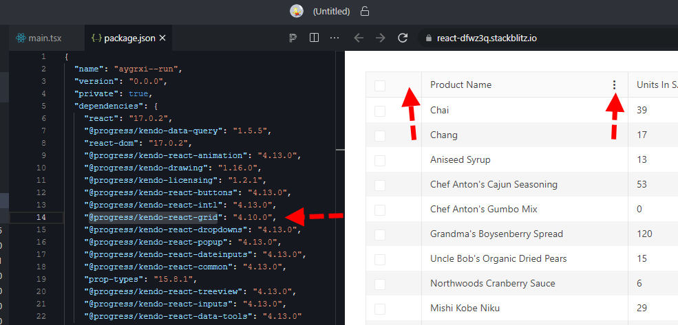
here is a quick repro: https://stackblitz.com/edit/react-dfwz3q?file=package.json
in package.json just switch @progress/kendo-react-grid from 4.10.0 back to 4.9.0 and the column menu renders.
bug still present up through 4.11, 4.12, and @latest 4.13


