I noticed that the value prop of the TextAreaChangeEvent is defined as string | number | string[].
When will this value be number or string[]?
Won't it always be string due to the fact that it's a text area input?
Description:
When the NumericTextBox is set to "c0" format and has a value of 0 ($0), it doesn't capture the first digit entered.
Reproduction Steps:
- Set the field value to 0 ($0)
- Hit "Tab" to blur the field
- Hit "Shift-Tab" to focus the field (field contents will be highlighted)
- Enter "123"
- Repeat steps 2 through 4
Browser:
Chrome -- Version 89.0.4389.114 (Official Build) (64-bit)
Expected Behavior:
- After step 4, field shows "$123"
- After step 5, field shows "$123"
Observed Behavior:
- After step 4, the field shows "$230"
- After step 5, the field (correctly) shows "$123"
Notes:
- This bug seems to occur when the field has a value of 0 ($0) before gaining focus
- This doesn't occur when the specified format is "c2" or "n0"
Code Snippet:
<NumericTextBox format="c0" />
Description:
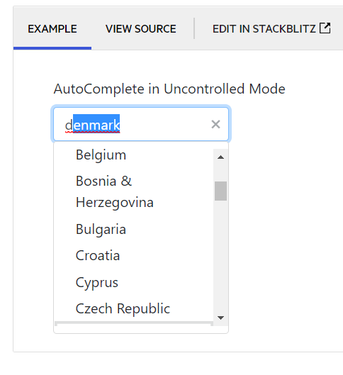
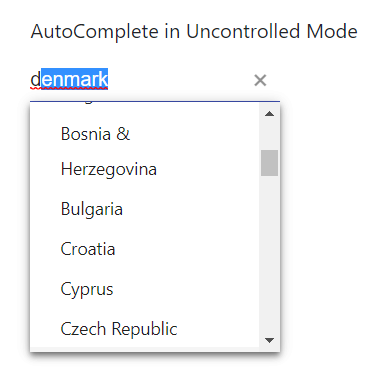
When typing into a React autocomplete with the "suggest" prop, the component does not always display the suggestion in the dropdown. It appears that in Chrome, only the very top of the suggestion is visible in the dropdown, while in Edge, it isn't at all.
Reproduction Steps:
- Navigate to https://www.telerik.com/kendo-react-ui/components/dropdowns/autocomplete/suggestions/
- Type "d" into the AutoComplete in Uncontrolled Mode example
Browser:
- Chrome -- Version 89.0.4389.114 (Official Build) (64-bit)
- Edge -- Version 89.0.774.68 (Official build) (64-bit)
Expected Behavior:
- The suggestion is fully visible in the dropdown
Observed Behavior:
- The suggestion is either not visible, or only partially visible
Screenshots:
Chrome:
Edge:
Step by step instructions on how to reproduce the problem
Try entering a negative value in the filter column using the StackBlitz example here https://stackblitz.com/edit/react-dx7cna?file=app/main.jsx
This works using "ES" as locale (your example) https://stackblitz.com/run/?file=app/main.jsx
Github issue here https://github.com/telerik/kendo-react/issues/897
DateTimePicker opens above or below the link to open it, however when it's in the middle of a page, it will choose to open below and sometimes require scrolling to see all the buttons.
Would be better, if it were to open offscreen, it should be "pinned" to the bottom edge. Same for right/left/top borders of the screen.
Certain containers also make it impossible to scroll down to see the buttons, so that creates a real problem. The above proposal would fix this.
using fairly vanilla implementation of the component:
<DateTimePicker
      defaultValue={new Date(ActivationDate.toString())}
      onChange={handleActivationChange}
      width={'8rem'}
 />
The Tooltip component has a className property. Providing a class name there does not seem to apply the class to the DOM element. See my below code and attached screenshot ...
            <div className="col">
              <label className="d-block">Name</label>
              <Input value={name} required={true} onChange={handleNameChange} />
              <Tooltip className="d-inline">
                <i className="k-icon k-i-info" title="The name of the Taxonomy" />
              </Tooltip>
            </div>
Hi there,
Im use chart component, and sometimes the tooltip on grid disappear, i dont know why, and if i put the same code on the telerik this bug doesnt happen, here is an exemplo with the same data
import * as React from 'react'
import * as ReactDOM from 'react-dom'

import {
    Chart,
    ChartSeries,
    ChartSeriesItem,
    ChartCategoryAxis,
    ChartCategoryAxisItem,
    ChartTitle,
    ChartLegend,
    ChartTooltip,
    ChartValueAxis,
    ChartValueAxisItem
} from '@progress/kendo-react-charts';

import 'hammerjs';


	const valueAxis = [
		{
			name: "",
			format: "{0:n1}",
			font: "10px Roboto",

		},
	];


const seriesValues = [
		{
			type: "bar",
			toolTipFormat: "{0:n2}",
			title: "Teste 1",
			spacing: 1,
      data: [27869.8616],
		},
		{
			type: "bar",
			toolTipFormat: "{0:n2}",
			title: "Teste 2",
			spacing: 1,
      data: [13277.95],
		},
		{
			type: "bar",
			toolTipFormat: "{0:n2}",
			title: "Teste 3",
			spacing: 1,
      data: [95164.9968],
		},
		{
			type: "bar",
			toolTipFormat: "{0:n2}",
			title: "Teste 4",
			spacing: 1,
      data: [115579.184],
		},
    {
			type: "bar",
			toolTipFormat: "{0:n2}",
			title: "Teste 4",
			spacing: 1,
      data: [null],
		},
        {
			type: "bar",
			toolTipFormat: "{0:n2}",
			title: "Teste 4",
			spacing: 1,
      data: [616.7145289747288],
		},
	];

const ChartContainer = () => (
  <Chart>
      <ChartTooltip
    shared={true}
    />
 <ChartValueAxis>
    {valueAxis.map((e, idx) => (
      <ChartValueAxisItem
        key={idx}
        name={name}
        labels={{
          visible: e.visible !== undefined ? e.visible : true,
          format: e.format,
          rotation: "auto",
          font: e.font,
        }}
      />
    ))}
  </ChartValueAxis>
    <ChartSeries>
      {seriesValues.map((item, idx) => (
        <ChartSeriesItem
          key={idx}
          type={item.type}
          data={item.data}
          name={item.name}
          spacing={item.spacing}
          labels={{
            font: '10px',
            format: "{0:n2}"
          }}

                />))}
    </ChartSeries>
  </Chart>
);

ReactDOM.render(
  <ChartContainer />,
    document.querySelector('my-app')
);
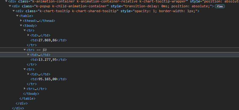
I inspected the page and realized this, that div is the tooltip and thats working normally, k-animation-container-show class, top and left properties on style;

and this one, is the tooltip that doest appear in the screen, does not have all class and style, just doesnt show up,

However, the component inside that div was rendered, as can you see
Im using this version
Hi,
I was just running through the new features of KendoReact 2021 R2 and am very keen to start implementing.
One of my colleagues pointed out that there is an ellipses after each checkbox when using checkboxes under Grid Selection, see https://www.telerik.com/kendo-react-ui/components/grid/selection/#toc-customizing-the-selection). It sees this is the casein MS Edge and Chrome. I use Firefox, so didnt notice it.
Thanks for the new features, keep it up.
Regards,
Grant
It's annoying because:
1) Every time I go to a new page or refresh my browser it comes up bright yellow
2) It blocks the search bar which I use a lot
3) The seminar is over which just annoys me more
I'm OK if you want to tell me once like a privacy notice, but don't tell me every time my web page refreshes and overwrite part of the page.
Dear Support Team,
I have numbers of kendo charts in my app, but I need to modify the boder-radius for the tooltip of my donut chart.
I've checked, with the browser, the existence of a couple of CSS classes I can work on, but they are generic and they work for all the charts in the app:
.k-sparkline-tooltip-wrapper>.k-popup, .k-chart-tooltip-wrapper>.k-popup (classes for the ChartTooltip component: for this I can ad an ID)Inside this component the Kendo library creates a new component, which I can't configure any IDs on and owns the css class k-chart-tooltip k-chart-tooltip-inverse needed to override the border-radius property.
Is there a workaround or any other configuration to set the border radius for a tooltip of a single chart, without modify all other charts in my app?
Thank you
Kind regards
Please allow the Switch component to accept a title prop so that the Tooltip component can be used with Switch. Switch doesn't really support long labels, or labels at all in some themes, so it would be nice to be able to use Tooltip component with Switch component.
Currently the TileLayout will allow you to drag a Tile when you click and drag anywhere within the Tile. This doesn't combine very well with content within a Tile that might have click-and-drag functionality or even just click functionality. A small click within a Tile causes the Tile to visually "lift up" in preparation for dragging.
It'd be nice if there were a setting to enable dragging only on the Tile header portion or somewhere.
Currently I have to add a toggle somewhere on the page that disabled or enables dragging.
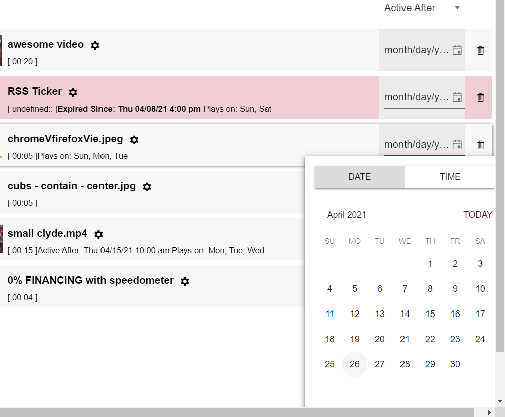
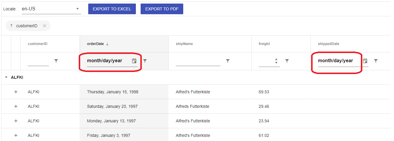
Hello,
I am using tooltip component for a long desciption field in my grid cell. And I am using it as it will encapsulate Grid component (like the example below) as it is suggested in this page.
<Tooltip openDelay={100} position="right" anchorElement="element"> <Grid>... </Grid> </Tooltip>
My grid has a date field and I am using columnMenu for filtering (GridColumnMenuFilter). An error occurs when I hover the text of date field and says :
Tooltip(...): Nothing was returned from render. This usually means a return statement is missing. Or, to render nothing, return null.
I also trid to replicate the problem in the example on this page and it gives the same error. I forked the project and you can check it from https://react-ed5jns.stackblitz.io/
Simply move the cursor over month/day/year in a date filter area and see the problem. This seems like a bug. Or if there is any solution to this, I would like to see a workaround.
Thanks
Hi,
I've got a large form I'm making. When the page the form is on first renders, I maker a server call and get back a large javascript object:
serverData = {id: "1", ClientID: "1423", EstSentDate: "2021-07-08", .... }. The date strings are ODCB standards for date strings.
The form displays the current values of all these fields. For all the other field types, I give the form the prop initialValues={serverData}, and if the field names match the object keys, it populates the field with the data nicely.
The datePicker is encountering an error though. It looks like it expects a Date object and not just a string. Is there something I can do within the DatePicker component, or the field containing it, to resolve this, without having to parse the entire data set I receive for all dates and convert them to Date objects, and feed that into a new object to pass to the form?
Being able to populate the entire form with the simple line initialValues={serverData} would be the best outcome for us.
Hi Team,
we are looking same property in Kendo Tree View React Version.
https://docs.telerik.com/kendo-ui/api/javascript/ui/treeview/configuration/dataspritecssclassfield
could you pls check the feasibility and add the same?
The ListView component has an item prop that allows you to specify the render component. That component receives ListViewItemProps. The ListViewItemProps type is not exported and cannot be properly imported elsewhere.
Hi Team,
I'm facing below issue when manually enter the value in the datepicker.
Control : DatePicker
<DatePicker defaultValue={value} format="dd/MM/yyyy" />
Step 1: Manually I'm trying to enter the data as 01/01/2021 and clicked outside the datepicker control ( now the focus is out of the datepicker ).
Step 2: Now try to change the date (day) by entering "2". (Our Expectation is system should display the date as 02/01/2021 instead it is appending the date and displaying as 12/01/2021)
Every time system is expecting the user to clear the existing value and then enter the new value.
Can you take this as feature request. Value should not get append to existing value. It should overwrite.
Reference Ticket URL : https://www.telerik.com/forums/datepicker-when-user-enter-the-date-manually-the-value-getting-appended-with-the-previous-value
If this is taken as feature request when will it get delivered.