We have database constraints on certain fields e.g. varchar(10) and would like to prevent the user from entering invalid data into the combo box fields. If it's not too much trouble a minLength field would also be convenient.
They can be set as with key value.
Like in the jQuery counterpart, when I click on a cell to edit the value - I should be able to tab over to the next cell to edit it.
};
<Grid
}}
<Column field="Date"filter="date"format="{0:d}"/>
In this way,the date will be sorting with Month, How can I sorting start with year instead of month
I don't know how to implement rowspan
Add on Add and onRemove events for the MultiSelect.
Also, the onChange event may receive additional parameters instead:
1) Action - Add or Remove
2) DataItem - It will contain the selected or the deselected item
The SVG element does not have a title attribute but instead is using an <title> element.
This will allow to programmatically show and hide the Tooltip.
The typographical kerning defined by the font is not respected when exporting components to pdf.
The text has the same aspect as if the following css property had been defined:
element {
  font-kerning: none
}
It will be nice to support font-kerning on pdf export.
When setting filter type in column to `boolean` it breaks when opening the column menu with the following JS error inside `filterCommon.js`:
TypeError: Cannot read property '0' of undefined
Here's a sandbox to see. Click the column menu next to each column header. Notice `Discontinued` column will cause a JS error:
https://stackblitz.com/run/?file=app%2Fmain.jsx
The sandbox was taken from https://www.telerik.com/kendo-react-ui/components/grid/columns/column-menu/
We're using v3.1.0 but the sandbox has 3.2.0. Both versions have this bug. It seems 2.11.0 is the last working version.
Grid Header shifting when filtering column.
When a column is half visible, and it is filtered, a misalignment will occur between the header and the Grid content.
Video: https://www.screencast.com/t/PhOonptY2
How to merge rows in React Data Grid?
Only ColSpan did not find RowSpan in the GridCellProp
Currently, it is required to have the same height for the items, but this can be very hard in cases when the items are dynamic with various height.
Hello Kendo React Team!
We noticed in our Review and Retro that the drop down to select how many items per page is not styled. The user on my team had a green theme to their desktop and the picker was green. Our main colors or blues so it stuck out. The jQuery grid has that drop down styled so it matches the theme used for Kendo. Would it be possible to use a custom component instead of a regular input?
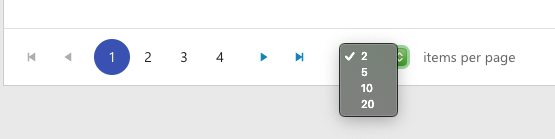
Thanks!
In order to display KendoReact Chart on mobile phones on a horizontal screen, CSS "rotate(90deg) translate(...)" is applied to KendoReact Chart,
but the coordinates of tooltip are incorrect.
let w = window.innerWidth || document.documentElement.clientWidth || document.body.clientWidth;
let h = window.innerHeight || document.documentElement.clientHeight || document.body.clientHeight;
let x = (h-w)/2;
let ts = "rotate(90deg) translate("+x+"px,"+x+"px)";
const maxstyle={
transform:ts,
width:h,
height:w,
top:0,
left:0,
paddingLeft:5,
paddingRight:5,
paddingTop:5,
transformOrigin:"center center",
background:'#f5f5f9',
overflow:"hidden",
position:"fixed",
zIndex:10000
};
When then CSS "rotate(90deg) translate(...)" is applied to KendoReact Chart, the coordinates of tooltip are incorrect.
In order to display KendoReact Chart on mobile phones on a horizontal screen, CSS "rotate(90deg) translate(...)" is applied to KendoReact Chart,
but the coordinates of tooltip are incorrect.
sourcecode:
let w = window.innerWidth || document.documentElement.clientWidth || document.body.clientWidth;let h = window.innerHeight || document.documentElement.clientHeight || document.body.clientHeight;
let x = (h-w)/2;
let ts = "rotate(90deg) translate("+x+"px,"+x+"px)";
const maxstyle={
transform:ts,
width:h,
height:w,
top:0,
left:0,
paddingLeft:5,
paddingRight:5,
paddingTop:5,
transformOrigin:"center center",
background:'#f5f5f9',
overflow:"hidden",
position:"fixed",
zIndex:10000
};
<div style={maxstyle}>
<img src={closeImage} onClick={this.onBack.bind(this)} className="closeImage"/>
{this.renderSingleBlock()}
</div>