I noticed that the value prop of the TextAreaChangeEvent is defined as string | number | string[].
When will this value be number or string[]?
Won't it always be string due to the fact that it's a text area input?
Hey
Small question: it is exists some approach to make Tabs in TabStrip reordable ?
Best
Serge
The KendoReact MaskedTextBox value cannot be cleared once a value is set. See this forum post for examples and a proposed workaround: https://www.telerik.com/forums/maskedtextbox-cannot-be-cleared
I would like for a user to be able to clear the MaskedTextBox value without having to code it as a special case in the onChange event handler. I believe this should be done by default as per the Kendo jQuery MaskedTextBox, but it could also be optional via a prop or clear button.
Despite having a similar intention (typing and selecting), the components MultiSelect and ComboBox look and behave quite differently:
- The ComboBox has a button on the right side and only opens when this button is clicked or when the user types in the input field.
- The MultiSelect has no such button but opens when clicking inside the input field.
It would be great if the MultiSelect component also has a button on the right and only opens when the button is clicked or when the user starts typing in the input field.
Hi,
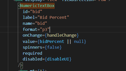
I'm using the NumericTextBox to receive a value stored in a state, it has a percent "p3" format so it display numbers like this "0,000 %". When the state change, the value displayed in the NumericTextBox loses its format. If I click in the field and press space or any other key, the format comes back. The expected result was the NumericTextBox always keeping the format, what can be done in this situation?
NumericTextBox code
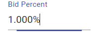
This is the textbox when I change the value direct in the field, it works fine
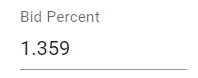
The state is shared between 2 NumericTextBox. if I change the value in the other textbox, it loses the format in this textbox
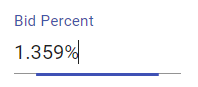
If I go in this textbox and just hit space, the format comes back
What can be done to keep the textbox format?
Thank you
The className prop on the ChipList component is ignored in version 3.18.0. A simple addition of class strings does not appear in the compiled product, e.g.
  return (
    <ChipList
      className='flex-layout --wrap --end'
      data={chipData}
      onDataChange={onDataChange}
      chip={props => (
        <Chip removable removeIcon='k-i-close' {...props} />
      )}
    />
  )
I've looked through the transpiled source in node_modules, and it seems the className property passed to the React.createElement() function totally ignores the prop class names.
Hi,
I am using Kendo react richtext editor and insert image plugin as it is shown in this page
https://www.telerik.com/kendo-react-ui/components/editor/images/
I am able to insert/upload image, but not able to resize image after adding it, similar to MS word.
After inserting image it should be resizable, so that user can easily resize the image as required.
Please let me know how can I achieve image resizing through mouse in above example.
Thanks
Vikram E
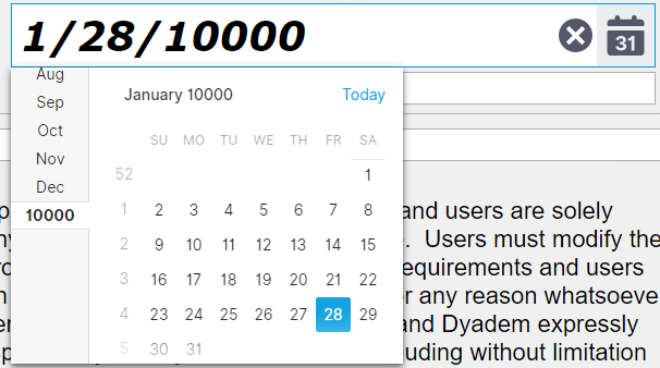
Defined a date rang. But it allows to enter a date larger than a max date of the range. Both via calendar and manually.
const minDate = new Date(1, 1, 1);
const maxDate = new Date(9999, 12, 31);

          return (

              <DatePicker value = {this.state.value}

                  min={minDate}
                  max={maxDate}

              />
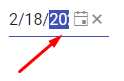
The width of the Kendo React DatePicker can become small due to the container width.
In such case, consider the following use case
Users select the date part (year) and start incrementing it by the "up" key. The year date part is selected, but is partially visible,
and the users do not see the date part that they are currently modifying, while they can fully see the other date parts that are not currently in focus.
The DateInput needs a horizontal scrolling to ensure that a focused date part is fully visible to the users in case if the width of the component is narrow.
Please check the case here
https://stackblitz.com/edit/react-8dqy6j-gvgwtk?file=app%2Fmain.jsx
We can add one of the following options:
1) Add style props to the ComboBox popupSettings. This will allow the developer to set a custom min-width.
2) Provide an option that will set the minWidth to the same as the ComboBox width.
We try to cover the following case:
The Popup will auto grow based on the longest item, but its widht should not be shorted than the ComboBox.
Hi
I noticed in the PDF Export component limitations (https://www.telerik.com/kendo-react-ui/components/drawing/limitations-browser-support/) that it does not support iFrames. This is a major issue for us as we have data containing full HTML markup and <style> tags, which we want to embed in a PDF. We need to use an iFrame otherwise the styles will bleed into the rest of the document. Is there any plans to support iFrames in the future?
Hi
We use the directory upload feature in our MVC app using Kendo. We are now redeveloping the app using React but this feature is missing.
Is this feature on the roadmap for a future update (soon)?
Kind regards
Rakesh
The DatePicker component has a `toggleButton` prop which we use for customisation, but this prop is missing from DateTimePicker and TimePicker, this makes an inconsistent API and is frustrating for us because we cannot easily apply the same customisation to them.
Please can you add `toggleButton` prop to DateTimePicker and TimePicker.
Hi There,
This is the kendo ui for jQuery scheduler we use in our older version of product. Note that the resources are across the top, and dates down the side.
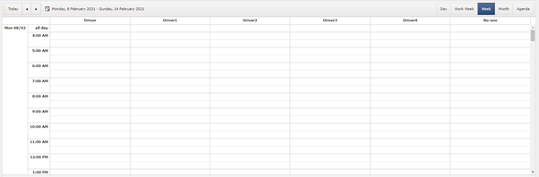
We have switched to react and we want similar view. This is the closest we can get.
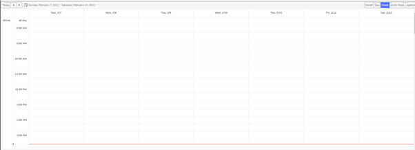
The resources are on left hand side so we cannot see all the resources.
Kendo-ui for jQuery has an additional boolean property ‘date’ (https://docs.telerik.com/kendo-ui/api/javascript/ui/scheduler/configuration/group) which groups the view by date down the left hand side, and resources across the top. There is no alternate property available in kendo-react-ui which will result in same appearance as it does in kendo-ui.
We are using kendo scheduler version 4.0.0.
Is there any way to achieve this? Do we have to implement a custom view? If so how?
- Papiya
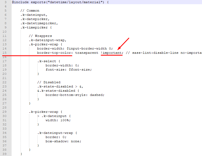
The SCSS files from the kendo-theme-material contain !important rule, that makes it difficult to override the styles in the consuming application.
We have a requirement to customize the DatePicker Kendo React component so that it has a border around all 4 sizes, as by default the theme has the border only on the bottom.
We have applied a new custom style to k-picker-wrap and added the
border-top-color: $datetime-border !important;
style
But due to the !import rule in the file
@progress\kendo-theme-material\scss\datetime\_layout.scss, line 15
the custom style that we applied in the consuming application does not get applied.
Please find screenshots with the details of the problem.
The screenshots indicate that the custom style for the border-top-color did not get overriden, and the box is missing the top border.
Kindly advise approach that we can use to customize the CSS styles that has !important CSS rule, so that we can override the styles defined in the material theme.