Currently when viewing the scheduler timeline view on tablet/mobile, in order to scroll the timeline back and forward you need to drag on an empty part of timeline. If the drag is started on an event then you are unable to scroll.
Would it be possible to make it so that if editing was disabled that dragging an event would scroll the timeline?
Currently there is no Autoscroll feature for the treelist...so when I want to drag and drop an item somewhere outside of the viewed area its klunky have to drop then scrool then drag and drop again etc.
Would really like to be able to autoscroll through the treelist
Hi,
the current filter is great but a little bit difficult to use. I would like to see an inline filter like the following screenshot:
It is used by many applications. Just to name a few
* Gitlab (where the screenshot is from)
* Contentful (CMS)
* Google Cloud Console

Hello,
I am creating a list of rows using the Sortable control. The issue that I am running into is when I grab an item and want to move it further down the list, then what shows on the page, the list will not scroll. Once I get to the bottom of the list I can not move the item further, without droping it and manually scrolling. Is there a way around this?
You can see what I am talking about by going to your sample (Under "Events" header): https://www.telerik.com/kendo-react-ui/components/sortable/
Shrink the page to where items stack and the list goes off the page. Try to take the top item and place it on the bottom. What I would hope it would do is automatically scroll the page once you reach the bottom, but it doesn't.
Thanks,
Matt Heuerman
DealerCarSearch
Narrator is being mute while navigating through the menu items present in combo box. Here keyboard focus and narrator focus are not in sync while navigating through them.
Expected:
Narrator shouldn't be mute , keyboard focus and narrator focus should be in sync and narrator should announce the info about the menu items clearly
User Impact:
Users with visual impairment who rely on screen readers will face difficulties if narrator is not announcing any information about the menu items present in combo box while navigating through them.
Hi team,
Im not sure if this is a bug or an incomplete feature, so please advise.
1) TabStrip / Window behavior in v4.8.0 with bootstrap theme 4.40.0, see https://stackblitz.com/edit/react-wdzeyo?file=index.html
Please note the style and behaviour of the window, its above the modal and can be dragged anywhere on the screen, even though it was rendered from within the TabStripTab component
2) TabStrip / Window behavior in v4.9.0 with bootstrap theme 4.42.0, see https://stackblitz.com/edit/react-zhkfdp?file=app%2Fmain.jsx
As you can immediately see in this example, the TabStripTab heading is also above the modal, an obvious bug
My concerns are around how the window can no longer be dragged outside the TabStripTab container. Is this by design, beacuse in my use case, my tabs are smaller than my windows.
Note: I have not tested the windows with any other components.
Please advise.
Many Thanks,
Grant
Looking at the deliver1.PNG, there is a grid with a 'MultiColumnComboBox' component inside one of the columns. When a name is removed from a role in one row (deliver2.PNG), then that row is deleted/removed, the row below it moves up but loses its name on the UI but the data is not effected (deliver3.PNG).
Can confirm all data is intact when passing information to the 'MultiColumnComboBox' component, it's just a UI bug which doesn't display the value that was selected in the unedited/deleted row. Can also confirm this bug exists in other grids with 'MultiColumnComboBox' components.
The code path is as follows in images code1.PNG, code2.PNG, and code3.PNG. It can be seen there is a UserComboBoxCell element which returns a component called 'EditableGridMultiColumnComboBoxCell'. It is this component that uses the the 'MultiColumnComboBox' component.
Hi Team,
I would like to report the following Major bug for KendoReact v4.9.0:
Duplicate:
1) Open the Datepicker Demo page
2) Open any of the datepickers and click the month name, as you will see a few months are hidden on the right had side.
The same behaviour continues if you click the year or decade.
Thanks and kind regards,
Grant
PS. This feedback form only allows me to select a "KendoUI for jQuery" version number.
Repro:
- Create a DateTimePicker.
- Use its value prop to programmatically control the value the control uses.
- Add clickable Button (or other means) to programmatically set the value to an invalid date (i.e. something like new Date("invalid!").
- Click the Button. The date displayed becomes "NaN/NaN/NaN 12:NaN PM". I suppose this is reasonable.
- Now, click the calendar popup icon on the right-hand side of the component.
Expected:
Displays a calendar popup, perhaps defaulting to the current date & time.
Actual:
Throws an exception visible in the JavaScript console. Replaces the UI with an error message.
Proof-of-Concept:
https://stackblitz.com/edit/react-gvipiu?file=app%2Fmain.tsx
import * as React from 'react';
import * as ReactDOM from 'react-dom';

import {
  DateTimePicker,
  DateTimePickerChangeEvent,
} from '@progress/kendo-react-dateinputs';
import { Button } from '@progress/kendo-react-buttons';

const App = () => {
  const [date, setDate] = React.useState(new Date());

  const handleChange = (event: DateTimePickerChangeEvent) => {
    setDate(event.value);
  };

  const handleClick = () => {
    setDate(new Date('invaild!'));
  };

  return (
    <React.Fragment>
      <div className="example-wrapper">
        <p>
          (use Alt+<code>↓</code> to open the date-time selector, <code>←</code>{' '}
          and <code>→</code> to navigate, <code>↑</code> to increment and{' '}
          <code>↓</code> to decrement the value)
        </p>
        <DateTimePicker onChange={handleChange} value={date} />
      </div>
      <Button onClick={handleClick}>
        Click me, then the calendar, to break the DateTimePicker.
      </Button>
      <div>{date?.toString()}</div>
    </React.Fragment>
  );
};

ReactDOM.render(<App />, document.querySelector('my-app'));
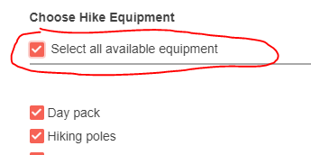
Is there a component or property similar to "CheckBoxGroup" for Kendo React, to enable checkbox implementation like "Select all"?
E.g. https://demos.telerik.com/aspnet-mvc/checkboxgroup
Thank you and Regards,
Leo Emmanuel E. de Guzman
LDeGuzman@synergyonline.com
What we need is an ability to get all the field keys automatically from the form whether they're filled or not.
As a short example, if we have fields name, email and description on the form, when the user fills name and email, but leave description blank, the form doesn't send description key, only name and email keys.
But the API where we send the data expects all the keys be present. The values can be empty or null.
What Form sends: {name: "example name", email: "email@example.com" }
What we would like to send: {name: "example name", email: "email@example.com", description: can be null or empty string, but the key should be present}
It can be done via initialValues object, but it's quite troublesome when we have very long form with many fields.
Br, Miika
toODataString throw exception on text filter changed from is null to contains.
https://stackblitz.com/edit/react-ertg4z?file=app%2Fmain.jsx
Repro step:
1. Choose filter by Name which is using text filter.
2. Change filter from Is null to contains.
3. toODataString threw exception.
Actual Result:
Given I have a conteneditable div component in my web application, when I run FastPass using Accessibility Insights for Web, I get the follow error message:
Snippet
<div aria-label="Post a question or answer" contenteditable="true" class="ProseMirror"><p data-prewrap="true"><br></p></div>
How to fix
Fix the following:
ARIA attribute cannot be used, add a role attribute or use a different element: aria-label
Expected behavior
Given I have a conteneditable div component in my web application, when I run FastPass using Accessibility Insights for Web, then I should not receive the following error message above
Hi,
Hope you are doing good.
We have requirement that, there are some cards (Each cards are separate component like chart, grid, etc). Also have separate multiple grids like 2*2, 4*4. We need to drag the cards and drop it in any of the grid.
For your ref, the feature is somewhat like this https://demos.telerik.com/kendo-ui/cards/drag-and-drop .
Please let me the example. Also revert me if you have any doubts.
Thanks,
Gokul
Our customers use case would require multiple tasks on same row in the Gantt diagram. Is this possible to implement somehow by customizing the Gantt diagram? Customer feels having each task on its own row wastes vertical space since the tasks are usually back to back.
When a user focus an empty DatePicker input using tab, the caret starts at the end (right side) of the input.
We need it to start at the left side, so the user can type without having to go all the way back to the left.
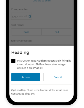
Hi support,
I would like to know what's the best way to set the modal dialog to the bottom of the page, and add animation for it to slide up to open and slide down to close.
Thanks!