### Bug report
The column menu of the Kendo UI Grid widget with componentType set to 'modern' has missing translations in the default filter menu.
### Reproduction of the problem
1. Create a filterable grid and enable the column menu with componentType 'modern';
2. Include the localization script for "fr-CA" in the document from the CDN;
3. Open the column menu and expand the filter menu of a specified column. The logic operators "And" and "Or" are not translated.
A Dojo sample for reproduction: https://dojo.telerik.com/UYIrABUw
### Expected/desired behavior
When the column menu type is set to "modern", the operators of the filter menu should be translated as in the "classic' column menu.
### Environment
* **Kendo UI version: 2021.3.914
* **jQuery version: 1.12.4
* **Browser: [all]
Updating a single row by default expands ALL collapsed groups. Removing a single row or inserting a single row does the same. This design lacks granularity: an isolated change to a single row should not cause the expanded/collapsed state of all groups to change.

If the user is focusing on flu cases in New York City and a new flu case is added to the Los Angeles group, why should every group in the grid be expanded?

 Only the group affected by the change should change its UI state. The grid should listen for the change event of the observed  *row* and if it is felt that a change to the row's data should cause a UI change, only the group to which that row belongs should be changed.
It would be nice to have the option to configure different column titles for the column menu. For example, when there is a multi-header Grid, you could use this functionality to add the header title to the column title.

https://www.screencast.com/t/qgeK9fFMPP
https://www.screencast.com/t/NRl61JFzFH
Hi Team,
I would like to request the functionality to allow the Kendo UI Grid to scroll up to request the next page of data. This would allow the Grid to show new items to first, and older items to be requested upon scrolling up.
Thank you!
Dear Team,
The following example code works well for exporting multiple grids in to the same pdf file. Will you please make the method _drawPDF() as public method?
Also it would be nice if you can give the public method with the options to provide the array of grid widgets to be exported in the same pdf.
So that we will be confident enough to make this feature in our solution, otherwise it would be a problem for us if the backward compatibility is not supported in the future releases of the Kendo UI.
https://docs.telerik.com/kendo-ui/knowledge-base/export-multiple-grids-in-the-same-pdf-file
Regards,
Velusamy
When grouping one column on a large table, all rows (groups) are expanded by default which consumes CPU/memory. Render time grows.

Please add bool property defaultCollapsed. In this case grid would not expand all rows(groups) by default.

Current work around is to call collapseGroup, but performance would be a lot better if rows could be collapsed by default.
Hi Team,
I would like to request a sortable icon or indicator for columns which are sortable. In other words, if the column is not sorted, but is sortable, have an icon show(like an up arrow next to a down arrow).
Thank you!
Hi Team,
I'd like to request the functionality to add an unsort option to the Kendo UI Grid's Groupable sort direction.
Thank you
We have a requirement from customers to allow date columns to be filtered by the following criteria:
- IsToday
- IsBeforeToday
It should appear the grid as follows:
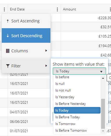
This would mean the filter is based on current date, rather than a date selected in a datepicker.
Rather than ask for this specific functionality we would like to be able to specify custom operators for date. As per the link:
https://docs.telerik.com/kendo-ui/api/javascript/ui/grid/configuration/filterable.operators.date
You can currently only alter the text on pre configured operators. We would like to be able to add new operators, like this.
kendo.ui.FilterMenu.fn.options.operators.date.today = "Is Today";
kendo.ui.FilterMenu.fn.options.operators.date.lttoday = "Is Before Today";
We would then need to be able to configure the logic used for the new operators.
Add property that defines a delay before requesting new items when scrolling.

This would prevent sending multiple request when dragging the scrollbar and passing more than one page.
The new event should fire as soon as the grid is fully rendered und ready to take user input or focus.

We need this for automated UI Testing. SetTimeout does not work reliable.
Autofitting grid's columns according to its contents might be a pretty expensive operation, especially if there is are many rows.

How about extending the 'autoFitColumn' function by a parameter which specifies how many rows should be taken into account when determining column's width. That would speedup autofit operations while maintaining a pretty good (good enough) estimation on column's width.
Currently with large number of records in the grid when column is resized quickly resize may not actually occur.In this case, the browser's JavaScript engine is not able to fire the appropriate events fast enough, due to the large number of records, which impose a performance hit on the page.
Suggested solution:
it is possible to improve the column resizing performance if the columns are not resized real-time during dragging, but only after the user drops the resize handle.
Currently kendo UI web grid component does not read the DescriptionAttribute of a enum type. So, if a have a enum named Gender with values {F, M}, kendo grid will show those values instead "Female", "Male". Example

public enum FooType
{
    [System.ComponentModel.Description("Foo Description")]
    Foo = 0,
    [System.ComponentModel.Description("Bar Description")]
    Bar = 1
}

As the example above kendo grid should use "Foo Description" or "Bar Description" for showing those enum values. Same apply to generating dropdowns for the Filtering columns feature.

Thanks and sorry for my english.
We are running into a situation where our users need to copy values from a row in a Grid. The Grid also uses multiple row selection, and the allowCopy is getting in the way by copying too much data onto the clipboard.

Would it be possible to set a field list in the options for allowCopy so that we can specify which columns are actually copied?

Example:
allowCopy: {
  delimiter: '\t'.
  fields: [
    'column1', 'column2'
  ]
}

We are also running into another situation where we need to use templated fields, and allowCopy seems to be copying the cell text resulting in very ugly clipboard data. It would be nice if we could specify the datasource value to be copied instead of the cell text

Example:

allowCopy: {
  delimiter: '\t'.
  fields: [
    { field: 'column1', source: true },
    { field: 'column2' }
  ]
}

In both examples, the field name corresponds to the field name specified for the Grid Column.
Kendo UI Grid - In batch update mode, currently, during save operation three separate events are fired for created, updated and deleted records. This really creates a problem when all the changes needs to be transactions. There needs to be an option, in which only one event is fired for all the changes.
When configuring grid column commands, there is no easy way to control certain aspects of the generated buttons without template and CSS gymnastics.

Here are several specific ideas:

* Add a "title" option so that the underlying button automatically creates a theme-specific tooltip. Currently, tooltips have to be added to the grid element using crazy filters, and they do look like the button tooltips.

* Add support for icon-only buttons through a means other than setting the "text" to "". The CSS for icon-only buttons is slightly different (margins/padding) to ensure the icons are centered and the margins/padding are not too large. By automatically applying a distinct class to represent an icon-only button, the CSS can be more reliably controlled.

* When applying a className value to the "edit" command, that className value is not applied to the "update" and "cancel" buttons that are automatically generated when the edit button is clicked. This might have been a potential work around to the previous item, except that the class is not applied to the generated buttons.
Steps to reproduce the problem:
Have a grid with:
- specified width (e.g: 1000)
- column virtualization
- multiple columns with a width of 100, but most of them hidden in initial state (e.g.: 50 total, but only 8 shown)
- columnMenu true
- resizable true
When running the code that create the grid, the initial state looks like this:
Current behavior:
The header columns are filling the width of the grid (each bigger than the specified 100), but the rows columns cells have the specified width of 100, causing a misalignment.
However, changing the width of a column with the resize handle fixes all the widths (header + rows).
Same thing for adding/removing a column from the menu.
See the attached video for an example.
If in the initial state there are more shown columns so they can fill the grid width (and have the horizontal scrollbar), the issue is not present.
Expected behavior:
Rows columns should always match the width of the header.
Dojo example:
Here's an example, based on the one from https://demos.telerik.com/kendo-ui/grid/column-virtualization
https://dojo.telerik.com/@pgarand/UfEkIGiD
Hi Team,
I'd like to request the functionality to use the search panel with only the enter button with the built-in API. Maybe add a search.minLength or search.SearchOnEnter configuration.
Thank you!