As per support ticket 806897

Telerik: "By design both seriesClick and plotAreaClick events of Kendo UI Chart  don't contain information about the clicked button or mouse coordinates. We will appreciate it if you submit this idea as a feature request at our UserVoice portal - this way the community would be able to evaluate it and if the suggestion gains popularity we will consider its implementation for future releases."

Original request:

We are using mvvm binding to your Chart events

seriesClick
plotAreaClick

both of these events I am unable to determine which mouse button caused the click.

Is is possible or should I raise a user-voice for this?

I want to run different code if the user right-clicked or if the user normal clicked on the chart.

I would also like to know the x,y pixel position of the mouse (or tap, or tap-hold) event because depending if they interact with the top of a bar chart bar or the bottom I want to run different code...

I cannot find any of this information in the event object.

When I wrap the chart in a data-role touch widget and use the touch widgets event handling I can get this information, but it would be better that the chart events make this available.
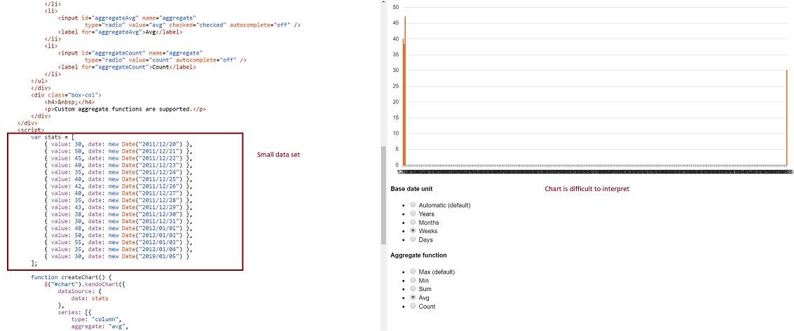
-- Problem: Consider a datasource where at least two date fields span a large time frame. We can build a chart that aggregates that data by small units (categoryAxis.baseUnits) such as 'days' or 'months'. That chart however contains many empty data points and the 'real' data is difficult to locate on the chart. This often requires zooming in and out many times to view the data one is looking for. However, it is still very valuable to be able to group by day or month, and to view this data in one succinct image.
-- Demo: The best way to experience this is to use the following Demo
https://dojo.telerik.com/eCILAMOB
This dojo is from the 'Date axis' chart demo on the demos.telerik.com site under Kendo UI for JQuery. Edit the example. There are 17 values in the datasource. Change the year on the last value to '2019'. All current values have dates between 2011-2012.
-- Required Chart Setup: Create a chart utilizing the following chart options
series.aggregate = 'avg'
categoryAxis.baseUnit = 'days'
dataSource with fields that contain at least one large date span
-- Suggestion
Add option to hide date aggregates chart points where no data exists within the datasource.
-- Image
Currently, Category Axis Label Rotation will only rotate around the center of the label.  When labels are long, they do not align well with the chart (e.g. column chart).  See the following forum post for more info:
http://www.telerik.com/forums/categoryaxis-label-rotation---align-with-column-chart
A bubble chart without nothing inside is not that helpful, if you can set an icon or image inside the bubble itself can give quickly a hint of what it is. Also it would be nice, if the same bubble value changes position, to have an animation where it grows or shrinks while moving to the next position, instead of completely redrawing the bubble.
Would like to have automatic text wrapping enabled feature as was available in obsolete charts in the HtmlChart control as well.

https://docs.telerik.com/devtools/aspnet-ajax/controls/chart/features/automatic-text-wrapping#automatic-text-wrapping
Currently long text in chart notes makes them wide which usually results in overlapping notes. It would be great if note text is wrapped at some point. For example, if icon width can be specified and the text is wrapped to fit that width.
User clicking on legend currently hides/shows that series on the chart. Would be great to have a public method that does the same so we can show/hide a series programmatically. (Like the private _legendItemClick method currently does.)
Add an option for AxisLabelHover (similar to LegendItemHover) on the Chart. Because labels can be long, I truncate the text that is shown on the graph. I need to make the full text available via the hover.
The bar chart I got is drawn form the values which are normalized. I have 7 bar charts which are drawn by looping a csv file and all the values are normalized. When I hover mouse on the bar, I want to see actual values not the normalized. So I need to include a variable in tooltip object of CSS part. But it is not working, please make something regarding this.
I use it to upload a chart, I'd like to prevent showing the uploaded chart in the browser. Prefer to just upload and then get control back and let my app decided what to do next.
I would like to set dashtype, line color, line width and other line segment properties for individual line segments (between two points) of a line type series in kendo chart.

this functionality is available in Microsoft charts.

note, I can set the dashtype for the entire line no problem. I have a requirement to change the dashtype for different sections of the line. maybe starting dashed, then long dash, then solid to indicate different aspects of the data being charted.

it would be great to be able to use a function to return dashtype, line color, line width and other line segment properties based on a e.dataitem.?
As per http://www.kendoui.com/forums/dataviz/chart/scatter-chart-with-different-point-colors.aspx your ScatterLine really needs the ability to set the color of the lines between the points. It seems like an oversight that just needs to be fixed.
We need functionality to allow annotations to charts (e.g. free text).

We need to annotate our charts with text that is:

- not a series value or note
- not a category note
- has no relationship with the plot data
- not a title

An example is text outlining the source of the data,

We have succeeded in annotating charts with Snap.svg.js but the annotations do not survive the imageDataUrl() function for download (or the svg() function).

Axis & series notes won't achieve what we want to do.

We need to place free text (for example) at the top-left, top-right, bottom-left or bottom-right of the SVG.  Most importantly, it would need to be incorporated in the imageDataUrl and svg methods.
In the current version the legends for charts containing groups and series has a flat list of the series for each group. This is unreadable and toggling is not of any use.

The suggested improvement is a legend containing groups (e.g.) sex and series (e.g. age 0-19, 29-39 etc). Toggling of groups should be provided. Toggling of series would also be useful, but less important than toggling groups.
it would be good if there is a feature to export to excel the charts.
The only way to wrap text in category axis labels on charts is to introduce the new line character ('\n'). This is fine on fixed-width charts where labels are known at design-time. However, when dynamically adding series to charts and resizing within a responsive site, it is impossible to know where and when to use '\n'. Can a feature be implemented whereby labels flow within the bounds of their corresponding group in the chart?
Extend the chart notes functionality to accept an image or any styled element, or a new type of data annotation where an element can
be placed on the chart at a specific X and Y value
It would be very helpful if we could catch the click on a plotband to enable interaction or create clickable regions on the chart
A way to show differences between the labels for example assigning color red to a negative value
When hovering over a chart data item (e.g. circle), the jqeury "mouseleave" is activated almost immidiately - the "mouseleave" event is fired before I actually leave the circle.  This causes the tooltip to remain, the circle itself is shown as "onHover" (e.g. filled) - but the line is removed, since "mouseleave" is fired and this is where I remove the line.

here's an example based on kendoui example: http://dojo.telerik.com/eqaLO
Note the "Status" at the bottom of the chart - it is "Hover" when you start the hover and "Left" after leaving the circle (according to the event).

I believe a "seriesLeave" event could solve this.