Add built-in support for guidelines that will be visible as an infinite grid of lines, with a snap-to capability.
Its good to have minimize and maximize the shapes drawn with kendo diagram as seen in this example
https://gojs.net/latest/samples/IVRtree.html

it will very useful when we are drawing with a huge data. we can clearly see the actual flow as required
When connections are detached from shapes or drawn via API with coords instead of shape ends, they don't move with selection when multiple shapes/connections are selected. When these "floating" connections are selected in a multiselect scenario, they should move with the rest of the selection.
I save the diagram json to everlive by using the save method and load it into the widget with the load method. My problem is that connection blocks cannot be edited now. I don't think CRUD should be required for this ability.
It would be nice if, in addition to "polyline" and "cascading", if there were other options for the shape of the diagram connectors.  I would like to see a "spline" option that possibly follows a similar path to the "cascading" square shape, but flows with curves.   Maybe even a configuration object, instead of a string that could define the parameters of the shape.

{
type: "spline",
mode: "bezier", // or "natual" or any other spline algorithm //
maxCurves: 3, // max number of inversion points in the spline //
curveRadius: 100 // size in pixels //
// any additional properties for configuring the curve, like bezier length, instead of curve radius &c. //
}
At the moment, "resizing" shapes is merely a scale transformation.
Proper resizing would be much better looking!
as demo'd here : https://gojs.net/latest/samples/sankey.html
Problem:
Currently when a Rectangle together with a large TextBlock is contained by a Shape where the Rectangle should enclose the TextBlock it is not resized by the size of the TextBlock, but the TextBlock is overflowing the Rectangle.

Possible solution:
Make the Rectangle a "visual group" so child elements like e.g. TextBlock or Image can be added to it and it will resize with the size of it's children.

Related Forum post: http://www.telerik.com/forums/how-to-avoid-text-overflow-in-shape
Large texts doesn't wrap inside a shape of a Diagrama
It would be nice if the diagram control could support complex shape json export (diagram.save()) and import (diagram.load()), like shapes contains TextBlocks, etc.
Please can you add support for Venn diagrams with drop and drop support for data items to allow dynamic generation.
Fish Bone diagram is a nice feature which is very useful for the applications to provide the root cause analysis in any vertical.
Syncfusion is having a nice in built control to do the same.
https://ej2.syncfusion.com/demos/diagram/fishbone-diagram/
A similar feature from Kendo UI is needed to include it in our existing applications.
Hi,
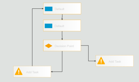
I have to design the flow chart as below using the kendo diagram.
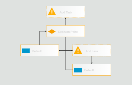
After dragging the connection from bottom shape (Add task) to top shape (Default) as per the requirement it is showing like below. Actually both are same but the design look & feel is completely changed. i want to see the flowchart as like above one. Kindly provide solution for this.
Thanks,
Bhanu N
Hi,
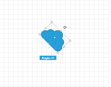
Your documentation mentions the rotation-thumb and also allows for some styling:
https://docs.telerik.com/kendo-ui/api/javascript/dataviz/ui/diagram/configuration/editable.rotate
The only problem is, I cannot get it to display.
See: https://jsfiddle.net/6qmgj521/
Beware: I do NOT mean the 90 degree rotation buttons in the toolbar, but the rotation-thumb adorner!
I expect to see:

Kind regards,
Hans van Essen
Bug report
When exporting a diagram as a PDF, hidden shapes still visible.
Reproduction of the problem
1. Run this dojo - https://dojo.telerik.com/oRUPUHOb/4
2. Click on "Mask" button
3. Click on "Save as PDF"
4. Open the exported PDF file
The shape State 1 must not be present on the exported PDF
Please provide a way to change the styling of lines used to connect shapes in the Diagram widget. Specifically, I would like to have smooth/spline style lines between points similar to http://bit.ly/1t3LU0j or http://bit.ly/1nxzWLB.

Having labels on lines similar to the first picture above would also be quite useful.
The data item is available to the event arguments of the function handler for shapeDefaults.content.visual function but it is not available to connectionDefaults.content.visual Function. Here is an example illustrating the issue: https://dojo.telerik.com/EMAzeruG
Can it be added?


