Bug report
On Safari, the Scheduler throws an error.
Reproduction of the problem
- Open and run this Dojo example - https://dojo.telerik.com/UZATyPgT/10
- Check the browser console
Current behavior
An error is thrown on the browser console
Expected/desired behavior
No errors should be thrown
Environment
- Kendo UI version: 2025.1.227
- OS: iOS 15.4.1
- Browser: [Safari18.4]
With Kendo version 2025.2.520 the filterInput text has been set and the current value is 'Filter'. However, there is no built-in option in the API that provides the possibility to change the text. As the text is not part of the messages, it can not be localized in case another language is used.
Dojo - https://dojo.telerik.com/zidaocyO
Add the filter input text to the messages so localization and customizing the text are possible.
Hi Team,
I would like to request a way to include multiple items in one operation of the Kendo UI Filter. For example, providing two DropDownLists in one operation.
Thank you!
Bug report
If a ContextMenu is opened near the screen border, opening a third level of items doesn't show any nodes.
Reproduction of the problem
- Open this Dojo example - https://dojo.telerik.com/VfhJXsuX
- Click to open the ContextMenu
- Expand Settings, and then expand Preferences, without scrolling the page or the Menu
Current behavior
The Preferences node doesn't contain any items
Expected/desired behavior
The Preferences node should show the items
Environment
- Kendo UI version: 2025.2.702
- Browser: [all]
Steps to Reproduce:
Login to My APP and navigate to the Asset List page.
Select an asset with multiple child videos.
Click the collapse button to expand and view child videos — works as expected.
Click the asset file name to navigate to the playback screen.
Click the "Go to Back" button to return to the Asset List.
Click the collapse button again — child videos do not appear.
Press F5 to refresh the page once.
Click the collapse button — functionality works normally again.
kendo version :2014.2.1008
Bug Report
When building with NPM, the glob is mismatched. This is currently related to the source code build.
Reproduction
- Build with version 2025.2.702 in NPM.
Current behavior
Receiving the specific error message:
[!] SyntaxError: The requested module 'glob' does not provide an export named 'default'
Environment
- Kendo UI version: 2025.2.702
- jQuery version: All supported versions
- Browser: all
Environment (OS, Application, Versions):
OS Version: 22H2 (OS Build 25352.1)
Edge Dev: Version 121.0.2277.112 (Official build) (64-bit)
Third Party Name: Kendo
Repro Steps:
1. Open https://codepen.io/oneID/pen/LYaGREP and turn on NVDA.
2. Navigate to 'Populate' grid and activate it using enter key.
3. Navigate to Expand button present under domain in Export to excel table.
4. Observe if the screen reader is announcing correct role and name for the expand button or not.
Actual Results:
Accessible name for the 'expand' button is not correct, Expand button is defined as link.
Expected Results:
Accessible name of 'expand' button should be sufficient for screen reader user. Accessible name should contain value available in domain as well.
Role should be defined as 'Button' as its behaving as button.
Bug Title: Columns are not programmatically associated with their table headers.
Severity: Sev2 (High)
Test Environment:
OS Version: 22H2 (OS Build 25352.1)
URL: https://ppe.oneidentity.core.azure-test.net/
Edge Dev: Version 114.0.1807.6 (Official build) dev (64-bit)
Screen Reader: Narrator
Repro steps:
1.Open kendoSample (codepen.io)
2.Navigate through tables.
Actual Result:
Table header and their data are in different tables. Columns are not associated programmatically with their headers.
Expected Result:
Columns should be associated programmatically with their headers.
Bug report
In a ContextMenu with three levels of items, if you click on a third level item, the popup remains visible.
Small video showing the issue: https://somup.com/cT10iOLyCT
Reproduction of the problem
- Open this Dojo example - https://dojo.telerik.com/wVarfqux
- Open the ContextMenu, and open a third level of items
- Click on an item
Current behavior
The target item's popup remains visible, while the parent popups close
Expected/desired behavior
All popups should close when an item is clicked.
Environment
- Kendo UI version: 2025.2.520
- Browser: [all]
Bug report
In the Grid, when a new row is added, resized, and then the cancel changes button is clicked, an error is thrown.
Reproduction of the problem
- Open this Dojo example - https://dojo.telerik.com/SnPOwoBq/3
- Add a new row
- Resize the newly added row
- Click the cancel changes button
Current behavior
An error is thrown
Expected/desired behavior
No errors should be thrown
Environment
- Kendo UI version: 2025.2.520
- Browser: [all]
Bug report
The enable options does not take effect
Reproduction of the problem
- Open the Dojo - https://dojo.telerik.com/yztUtuvn
Current behavior
Both buttons appear enabled, although the first one has enable: false set.
Expected/desired behavior
The buttons in the Grid toolbar should appear disabled when the enable is set to false,
The issue is a regression starting with 2025.2.520
Dojo with the previous version - https://dojo.telerik.com/DWbDiIJr
Workaround:
Add the 'k-disabled' class programmatically:
$('.k-grid-toolbar .k-button:eq(0)').addClass('k-disabled')
Dojo - https://dojo.telerik.com/yztUtuvn
Environment
- Kendo UI version: 2025.2.520
- Browser: [all ]
Bug report
When a user edits a cell/row and presses enter, the cell is marked as dirty. However, the Save and Cancel buttons remain disabled, thus the user should focus on a different cell before being able to save changes.
Reproduction of the problem
- Dojo - https://dojo.telerik.com/JuMumnqH
- Edit a cell and press 'Enter'
Current behavior
The cell is closed and marked as dirty, the 'Save changes and 'Cancel changes' buttons remain disabled.
Expected/desired behavior
The buttons should be enabled once the cell is marked as dirty.
Workaround
cellClose: function(e){
                e.sender._toggleToolbarEditingItemsVisibility()
},
Environment
- Kendo UI version: 2025.2.520
- Browser: [all ]
Currently, when Chrome Translate is activated and the user presses 'Enter' key in the Editor, the text is translated.
Also, when Translate is enabled and the user types fast, some characters disappear, as Chrome rewrites the inner text of elements. I know that this can be controlled by adding a translate attribute.
However, I would like to have the option to control this by the built-in Editor configuration options (for example, translate: false).
Bug report
Custom ContextMenu tool in Editor does not trigger close in built-in ColorPicker tools (probably others as well) after 2025.1.211
Reproduction of the problem
1. Open the Dojo - https://dojo.telerik.com/vkqfrNLN
2. Click on Background color ColorPicker
3. Click on custom ContextMenu
Both popups overlap
Expected/desired behavior
Wokraround
Manually close popups of pickers
// Get the editor instance
          var editor = $("#editor").data("kendoEditor");

          // Close other dropdowns when clicking your custom tool
          $("#" + controlID).on("click", function () {
            var foreColor = editor.toolbar.element.find("input[data-command='foreColor']").data("kendoColorPicker");
            var backColor = editor.toolbar.element.find("input[data-command='backColor']").data("kendoColorPicker");

            foreColor.close();
            backColor.close();
          });
Environment
Kendo UI version: 2025.1.211 or newer
Browser: [all]
Bug report
In the Editor's accessibility demo, you cannot initially navigate to the textarea using tab. After focusing the paragraph tool, pressing tab again will move the focus to the browser navigation bar. If you break the sequence and navigate to another tool before trying to navigate to the textarea, the issue disappears. The issue doesn't reproduce on the Keyboard Navigation demo.
Reproduction of the problem
- Open the Editor's accessibility demo - https://demos.telerik.com/kendo-ui/accessibility/editor
- Try to navigate to the textarea using tab
Current behavior
The textarea will not be focused
Expected/desired behavior
You should be able to navigate to the textarea on the first iteration
Environment
- Kendo UI version: 2025.2.520
- Browser: [all]
Bug report
When there is iconClass option set in the Grid toolbar an extra span with 'k-sprite' class is rendered. If icon: 'none' is added to the items configuration, then the additional span does not appear.
Reproduction of the problem
- Open the Dojo - https://dojo.telerik.com/JkrjieZO
- Open the overflow menu and inspect the last two items
Current behavior
All items except the last one have the span as in the image below:

The span leads to an extra space.
Expected/desired behavior
There should be no extra spaces when the iconClass option is used.
Wokraround
<style>
    .k-sprite{
      display: none
    }
  </style>
https://dojo.telerik.com/mLcNnDXS
Environment
- Kendo UI version: 2025.2.520
- Browser: [all]
Bug report
Grid in adaptive mode does not allow column resizing on mobile devices
Reproduction of the problem
adaptiveMode: "auto"Dojo: https://dojo.telerik.com/wrQNuNbR
Run on a mobile device and try to resize
Environment
jQuery: 2025.2.520
Kendo UI version: 2025.2.520
Browser: [all ]
The horizontal space between all OrgChart nodes on the same level is one and the same and it is equal to the horizontal space needed to show the child nodes of the parent with most child nodes. It is represented by the red squares on the image below. This results in excessive empty horizontal space between nodes with no child nodes or no visible child nodes.
This may be observed on the following Dojo runner. Currently the OrgChart has empty space between the first level nodes, and also there is empty space after the last node:
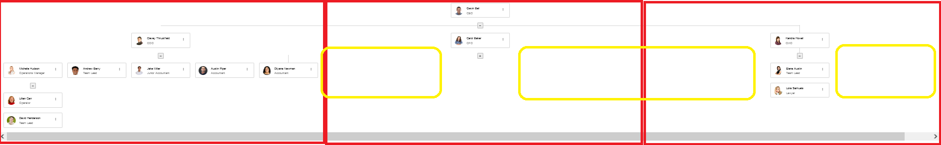
Suggested behavior:
There is no empty horizontal space between nodes on the same level - highlighted in yellow on the image above. In the above scenario, there should be no empty space between the first level's second and third node and no space after the third node, which may be observed, when the first node has no expanded child node:
Bug report
Locked Rows wrong height calculation with line-height
  td {
      line-height: 1.1em;
  }
A regression introduced in version 2025.1.211.
Reproduction of the problem
Dojo: https://dojo.telerik.com/AgrtkKSN
Environment
jQuery: 3.4.1
Kendo UI version: 2025.1.211 or newer
Browser: [all ]
Hi Team,
I would like to request to include the PMT function for the Kendo UI Spreadsheet.
Thank you!