https://stackblitz.com/edit/angular-pxppfk-s4ix7b?file=tsconfig.json
Change target in tsconfig in this stackblitz to targer es2022 to recreate bug
The inner circle of radio buttons are incorrectly scaled/positioned in Bootstrap themes. The radio buttons in bootstrap theme are by default dependent on "rem" unit. For applications, that specify different base for "rem" unit, than 16px, it is possible to naturally override dimensions of the radio button without any specific overrides.
In example application, the following points are important:
1. :root specifies font-size=24px. So 1rem=24px.
2. Radio buttons uses size="small". The width and height then defaults to 0.75rem=18px.
Important note, is that the wrong positioning of inner circle is most visible when scaling down the browser view. There is offset by 1px to the sides. The image in the attachments is screenshot from the application and demonstrates the offset in pixels from the sides. The first number above the radio button is the offset of the inner circle in pixels from the left, the second number after "/" is the offset of inner circle from the right.
This issue appears only if the dimensions are being increased/decreased in respect to the default "medium" size. If the radio button is scaled using "scale" CSS function, then the scaling is correctly preserved. Also I didn't notice any problem for the "medium" sized radio button in any browser view. The root font-size might not be important for bug to be reproducible, but inconsistencies are then more visible.
Using the Editor component with Form Support, if I choose the style Heading 1 and type some letter.
I clean the value using only backspace key on the keyboard and the value of the form control is <h1></h1>.
This is reproductible on the demo : https://www.telerik.com/kendo-angular-ui/components/editor/forms/#toc-template-driven-forms
- Choose Heading 1 style
- Type AAA
- The form value = <h1>AAA</h1>
- Clean the value using backspace
- The form value = <h1></h1>
Expected result
- The form value should be empty
Severity: Sev2 (High)
Test Environment: OS: Windows 11 22H2
OS Build: 23620.1000
Pre-Requisite: Turn on NVDA/Narrator.
Repro steps:
1.Now turn on NVDA/Narrator
2.Open this url "app.component.ts - nodebox - CodeSandbox".
3.Tab till preview tab which is present at right down corner.
4.Tab till quick filter input box and press enter.
5.Observe that NVDA/Narrator is not announcing Search results whether result is found or not.
Actual Result:
Narrator/NVDA is not announcing Search results whether result is found or not.
Expected Result:
Narrator/NVDA should announce Search results whether result is found or not.
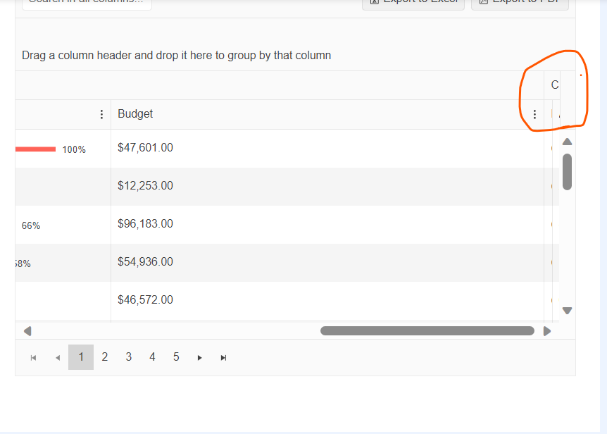
minimized the last column to smallest and it's difficult to expand this column. Could you please help how to expand this column . Thanks.
https://stackblitz.com/edit/angular-5elhtu?file=src%2Fapp%2Fapp.component.ts
When a detail row is used, the moment you expand one row and scroll, it automatically loads the last items from the dataset.
Ex expand row 1 - start scrolling, and it suddenly loads 5xx th row+;
When grouping is also enabled - expanding the detail row under one group, expands it under all groups.
The stackbliz is from the kendo demo page for virtualscroll (with the added detail row).
If you have a kendo grid table with some data over multiple pages and you go e.g. to the last page and then reload the data, resulting with less pages - the table is empty and you have to manually click on the first page to see the data. Here is a working example:
https://codesandbox.io/s/upbeat-lamarr-d67m8k?file=/src/app/app.component.ts
Step 1. Go to the last page
Step 2. Click on the button "'Reset data" <- you see no data
Step 3. Click on the first page <- You see the data
Test Environment:
Browser: Edge browser Version 114.0.1823.51 (Official build) (64-bit)
OS: Windows 22H2
Steps to Reproduce:
- Open the URL - https://angular-kendo-dropdown-list.stackblitz.io/ in edge browser.
- Press Tab key and navigate to “Select gender” dropdown.
- Run fastpass in Accessibility insights for web extension.
Actual Result: Fastpass run shows "Ensures every ARIA input field has an accessible name" error for “Select gender” dropdown.
Expected Result: Every ARIA input field has an accessible name
Fix ONE of the following:
aria-label attribute does not exist or is empty
aria-labelledby attribute does not exist, references elements that do not exist or references elements that are empty
Element has no title attribute
- Open link https://angular-kendo-dropdown-list.stackblitz.io/
- Tab to the “Select gender:” dropdown.
- Run fastpass in Accessibility insights for web extension
Ensures all ARIA attributes have valid values
Fix ONE of the following:
Required ARIA children role not present: group, option
Element has no aria-busy="true" attribute
User Impact:
When an assistive technology encounters an element with an invalid ARIA attribute value, it might ignore the attribute or respond to it in an unexpected way. As a result, people who use assistive technologies might find the element difficult or impossible to use.
- Hit enter link https://angular-kendo-dropdown-list.stackblitz.io/
- Tab to 'Run project' button and press ENTER to activate it.
- Tab to the “Select gender:” dropdown.
- Run fastpass in Accessibility insights for web extension
Ensures elements with an ARIA role that require child roles contain them
Fix ONE of the following:
Required ARIA children role not present: group, option
Element has no aria-busy="true" attribute
User Impact:
Reproduce the bug with
import { Component } from "@angular/core";

@Component({
  selector: "my-app",
  template: `
    <button (click)="show = !show">Show/hide</button>
    <ng-container *ngIf="show">
      <div class="example-config">
        Selected value is: {{ value | kendoDate: "MM/dd/yyyy" }}
      </div>
      <div class="example-wrapper" style="min-height: 400px">
        <p>Select a date:</p>
        <kendo-datepicker
          [(value)]="value"
          fillMode="outline"
        ></kendo-datepicker>
        <p>
          (use Alt+↓ to open the calendar, ← and → to navigate, ↑ to increment
          and ↓ to decrement the value)
        </p>
      </div>
    </ng-container>
  `,
  styles: [
    `
      kendo-datepicker {
        width: 170px;
      }
    `
  ]
})
export class AppComponent {
  public show = false;
  public value: Date = new Date(2000, 2, 10);
}
error displayed:
"TypeError: Cannot read properties of undefined (reading 'nativeElement')
at set fillMode [as fillMode] (progress-kendo-angular-dateinputs.mjs:9186:53)
at Object.ngOnChangesSetInp"
in file
node_modules/@progress/kendo-angular-dateinputs/fesm2020/progress-kendo-angular-dateinputs.mjs
at
 /**
     * Sets the fillMode of the component.
     *
     * The possible values are:
     * * `solid` (Default)
     * * `flat`
     * * `outline`
     * * `none`
     *
     */
    set fillMode(fillMode) {
        this.renderer.removeClass(this.wrapper.nativeElement, getFillModeClass('input', this.fillMode));
        this.renderer.removeClass(this.toggleButton.nativeElement, getFillModeClass('button', this.fillMode));
        this.renderer.removeClass(this.toggleButton.nativeElement, `k-button-${this.fillMode}-base`);
        const newFillMode = fillMode ? fillMode : DEFAULT_FILL_MODE;
        if (newFillMode !== 'none') {
            this.renderer.addClass(this.toggleButton.nativeElement, getFillModeClass('button', newFillMode));
            this.renderer.addClass(this.toggleButton.nativeElement, `k-button-${newFillMode}-base`);
            this.renderer.addClass(this.wrapper.nativeElement, getFillModeClass('input', newFillMode));
        }
It works when the code changes in
import { AfterViewInit, Component } from "@angular/core";

@Component({
  selector: "my-app",
  template: `
    <button (click)="show = !show">Show/hide</button>
    <ng-container *ngIf="show">
      <div class="example-config">
        Selected value is: {{ value | kendoDate: "MM/dd/yyyy" }}
      </div>
      <div class="example-wrapper" style="min-height: 400px">
        <p>Select a date:</p>
        <kendo-datepicker
          [(value)]="value"
          [fillMode]="fillMode"
        ></kendo-datepicker>
        <p>
          (use Alt+↓ to open the calendar, ← and → to navigate, ↑ to increment
          and ↓ to decrement the value)
        </p>
      </div>
    </ng-container>
  `,
  styles: [
    `
      kendo-datepicker {
        width: 170px;
      }
    `
  ]
})
export class AppComponent implements AfterViewInit {
  public show = false;
  public value: Date = new Date(2000, 2, 10);

  public fillMode = "solid";

  ngAfterViewInit() {
    Promise.resolve().then(() => (this.fillMode = "outline"));
  }
}
It only appears in DateInputs Components, other Inputs work well
Hi,
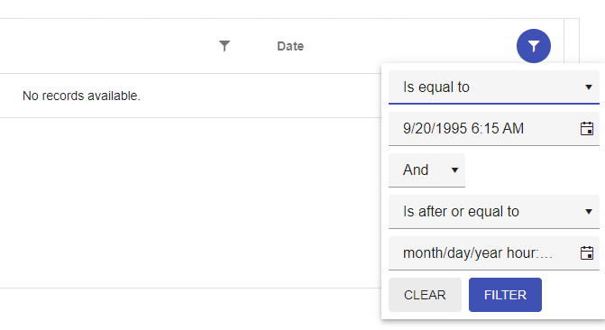
Filter operator 'equalTo' doesn't work properly with columns that has DateTime format. I set 'format' property on column, so filter will have the same format, but after providing exact same day and time the result is "no records ".
Here is a reproduction in Stackblitz based on one of the examples from https://www.telerik.com/kendo-angular-ui/components/grid/filtering/filter-menu/.
Description
We are using RecurrenceEditor :
<kendo-recurrence-editor [formControl]="formGroup.get('recurrency')">
</kendo-recurrence-editor>
Repro Steps
Context : Date = 2023-03-06
- Double click on the 2023-03-09
- The editor is open :
- We choose the repeat rule Monthly :
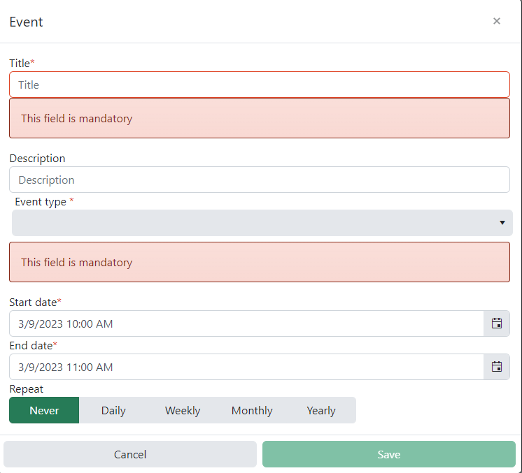
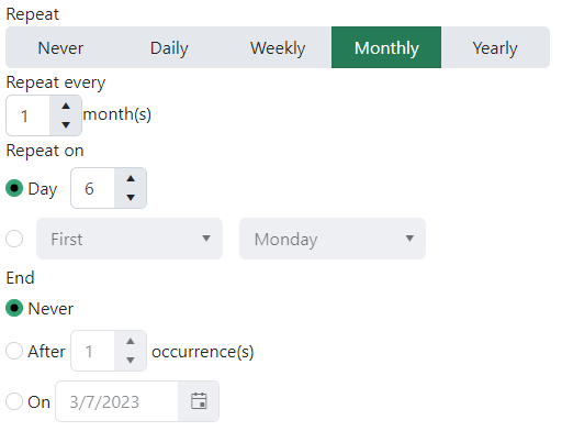
We can see the context of RecurrenceEditor is 2023-03-06 instead of 2023-03-09.
Expected Result
When we create an event on different date of today, the RecurrencyEditor context should the creation date.
- The input "Day" default value should be 9
- The input "On" default value should be 2023-03-10
- First Monday => First Thuesday
Same problem with other repeat rule (Daily, Weekly and Yearly)
Due to recent changes to kendoButton directive behaving like a component, this directive is no longer compatible.
This was important for buttons used in grid editing to extend the themes and styles of the kendoButton.
Now this however leads to
ERROR Error: NG0300: Multiple components match node with tagname button: ButtonComponent and AddCommandDirective. Find more at https://angular.io/errors/NG0300
In dialog, if we close it giving `false` as a result i.e.
```
this.dialog.close(false)
```
Actual return is empty object.
Additional thing is result itself in `DialogRef` is force-typed as `DialogResult` despite that actual `dialogRef.close()` allows us to return any value.In such case I'd understand mapping to empty object (probably some truthy-based if which maps to empty object) but then close method should also force-type taken argument. So can we return any value or not?
Ideally it should return `undefined` in case of no result value is provided (also mapped to empty object) and return `false` if we return `false`
This happens if the TimePicker is visible on the page and you change your system timezone (like from +2 to +12) and try to open the timepicker.
Dear Support Team,
I had a problem with the Scheduler-Component
So my Problem was that the Resource[] in the Scheduler-Component did not work as an Array. It always used only the first entry.
I tried to create multiple Resources and filled the Array with them, but I only could use the first Entry to style an event.
Because of this "bug" I had to do a huge workaround to colorize multiple different type of events.
When the user enters each character into the combobox, the system should validate that the resulting value is valid. If not, the system should not display the character
Step to produce:
Give focus to combobox
Type res
System should select Residential
Type z
System should not accept z character (both values in list that start with res do not have a z as the next character)
Type t
System should select Restaurant
Type y
Tap Tab
Expected Result: Restaurant should be selected
<kendo-combobox class="kendo-combobox" [ngClass]="{'inactive-color' : custColor}"
         #comboboxComponent [openOnKendoFocus]="comboboxComponent"
          formControlName="CustType" [data]="custTypes" textField="Description" valueField="CustTypeID"
          [suggest]="true" [valuePrimitive]="true" [allowCustom]="false" (selectionChange)="onCusttypechange($event)">
          <ng-template kendoComboBoxItemTemplate let-dataItem>
            <span class="template_lbl" [ngClass]="{'inactive-color' : dataItem.QInactive}">
              {{ dataItem.Description }}</span>
          </ng-template>
        </kendo-combobox>