Please provide a built - in rows reordering functionality that isn't based on the public HTML drag and drop api. Also please allow to customize the content of the drag hint. Something similar to the drag and drop feature of the TreeView.
thank you
https://stackblitz.com/edit/angular-4bbepg?file=src%2Fapp%2Fapp.component.ts
The sort indicator (down arrow) remains after removing the sort (setting the [sort] input to undefined)
Thanks,
-Adam
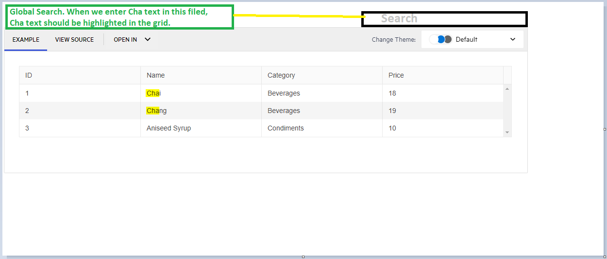
Highlight the text in the Grid with the filtered text. For example:
Hi Team,
Requesting a feature to grid rows merge like below example for similar data. And by when we can expect this feature in Kendo grid.
| Col1 | Col2 | Col3 | Col4 | Col5 | Col6 |
| Row1 | Row1 | Row1 | Row1 | Row1 | Merge1 |
| Row2 | Row2 | Row2 | Row2 | Row2 | |
| Row3 | Row3 | Row3 | Row3 | Row3 | Merge2 |
| Row4 | Row4 | Row4 | Row4 | Row4 | |
| Row5 | Row5 | Row5 | Row5 | Row5 | |
| Row6 | Row6 | Row6 | Row6 | Row6 | Merge3 |
| Row7 | Row7 | Row7 | Row7 | Row7 | |
| Row8 | Row8 | Row8 | Row8 | Row8 | Merge4 |
| Row9 | Row9 | Row9 | Row9 | Row9 |
Thanks!
Hello
I have a grid cell with filter set to menu. So the popup appears with the list of default operators that are needed to be included in the popup.
Something like below:
<ng-template
kendoGridFilterMenuTemplate
...
>
<kendo-grid-numeric-filter-menu
...
>
<kendo-filter-eq-operator> </kendo-filter-eq-operator>
<kendo-filter-neq-operator> </kendo-filter-neq-operator>
<kendo-filter-gte-operator> </kendo-filter-gte-operator>
<kendo-filter-lte-operator> </kendo-filter-lte-operator>
<kendo-filter-isnull-operator> </kendo-filter-isnull-operator>
<kendo-filter-isnotnull-operator> </kendo-filter-isnotnull-operator>
</kendo-grid-numeric-filter-menu>
</ng-template>
What i am trying to achieve is to add another operator like 'In' that can accept comma separated values. Something like:
<kendo-filter-in-operator> </kendo-filter-in-operator>
I have looked at the doc (https://www.telerik.com/kendo-angular-ui/components/grid/filtering/filter-row/#toc-custom-filter-row-components/)
But i dont see a custom filter operator example.
Could you please let me know if its possible to do that or is there anyway i can achieve this.
Thanks
SM
Hi Team,
I would like to request a new event for the Kendo UI Grid which will determine when the Grid has been resized in height. Right now, I have created a custom directive which uses the changeNotification property to handle when the scrollbar is shown. But it would be nice if there was something built in.
Thanks!
Hey Kendo Team,
you already have a solution in jQuery for my problem (https://docs.telerik.com/kendo-ui/knowledge-base/grid-group-remove-footer-header-one-record).
Unfortunately this solution did not work in Angular.
Desirable solution would be a flag in GroupHeaderTemplate which removes header if group size is one.
Another solution could be; allow a class field in GroupHeaderTemplate, so that we can set display to none if group size is one.
Best regards,
Matthias
Now I can configure possible filter operators and default operator on column basis. Doing so I have much copy-pasted code for each grid column.
I want to have a grid level option to configure this on "type" basis with a reusable js object (e.g. public constant shared across components):
<kendo-grid [filterOptions]="GridFilterOptions" ...Where GridFilterOptions:
public const GridFilterOptions: ... = [
{ type: "string", default: "contains", operators: ["contains", "doesnotcontain"]},
{ type: "number", default: "eq", operators: ["eq", "neq"]}
];
Hello,
As I explained in this post, I would like to set max-width on certain columns of a grid to force them to not becoming bigger than a certain size if there is a remaining width in the parent container. However, I do need to distribute the remaining width across other columns if they don't have max-width.
For example in this project https://stackblitz.com/edit/max-width-request?embed=1&file=app/app.component.ts, I want the first column which shows the ID of products would never be bigger than 15. I'm advised to leave one of the columns without setting width, so that column will occupy the remaining width and as a result the width of columns with width will be respected as max-width. However, that is not good because in big screens you will end up with a very big column while other columns are still suffering from lack of space.
Thanks,
Mojtaba
As there are browser-specific limitations to the maximum reliable height/width an HTML element can have (https://stackoverflow.com/questions/34931732/height-limitations-for-browser-vertical-scroll-bar), the virtual scrolling functionality of the Grid is affected (different issues appear depending on the browser).
It would be a nice enhancement to provide a way the virtual scrolling to work regardless of the total number of items in a given use case.
A possible solution is to keep track of a virtual window from 1 to 1,000,000 if the number of source records is greater than 1 million. On a scroll event, the scroll position can then be adjusted to reflect the position within the actual data set. For example, if the scroll position is 300,000 (within the max of 1,000,000) and the source data contains 50,000,000 records, the actual record index to start displaying data is 300000 / 1000000 * 50000000 = 15000000.
Workaround:
While the Grid built-in paging and virtual scrolling functionalities are alternatives for rendering the Grid data in portions (pages) they cannot be used together as they both rely on the same pageChange event to process the data.
The developer can introduce some custom implementation based on a custom paging UI placed below the Grid or in the Grid Toolbar template, for example the dedicated stand-alone Pager component.
Here is an example featuring a Grid that has 500k items per page (total 1 million). Each page utilizes virtual scrolling with pageSize=100:
https://stackblitz.com/edit/grid-paged-virtual-scrolling
Add wildcard filtering in the Kendo UI Grid.
I have a groupable kendo grid. I'm utilizing the kendoGridGroupHeaderColumnTemplate directive.
I see that <kendo-grid-column> takes headerClass and headerStyle, but neither applies styles to the grouped header.
Please provide a groupedHeaderClass and groupHeaderStyle properties so that I can style the cell rendered by kendoGridGroupHeaderColumnTemplate.
Thanks,
-Adam
Add icons for grid filter operators to easily understand current operator (DevExpress example):
https://gyazo.com/3806906633b2c1ca66f6cacc2b32ba88
Can we get an option to set default all collapsed when using the directive?
It seems to be not compatible with the provided methods.
Using the `kendoGridGroupBinding` directive in combination with the `kendoGridExpandGroupBy` directive or the `isGroupExpanded` callback is not supported. To use grouping with the `kendoGridGroupBinding` directive, set the Grid `groupable` property to `true`